
The other day my colleague requested me to test out brand emailers specifically in the dark mode. This was just to see how the different elements of the email render out for viewers who use dark mode on their screens to reduce eye strain or maybe just prefer the calm of dark background against an overdose of bright colors. Guess what? My phone’s settings were already turned towards dark mode!
The point is ever since Android and iOS started rolling out the option of switching on system-wide dark modes for their gadgets, people have been turning to it like a fish turns to water! Yes, the transition is that natural, and it is here to stay.
Therefore as an email marketer, it makes sense to ensure that you test and optimize your email elements for good renderability and accessibility for users who prefer the dark mode.
In today’s blog, we will separate fact from fiction when it comes to decoding the meaning behind the term dark mode and ways to optimize your email’s image elements so that they render equally well in every mode across email clients and serve the purpose that they were intended to fulfill.
Does dark mode mean color inversion?
Well, it’s not just that; here’s how Litmus defines dark mode as a “reversed color scheme utilizing light-colored typography, user interface (UI) elements, and iconography on dark backgrounds.”
Though Windows 10 kickstarted the turn toward the dark side in late 2018, however, Apple’s recent release has indeed turned iOS users into fans of the dark mode. While this may seem like an aesthetic trend that will see its rise in popularity and eventually plateau, however, the statistics tell a different story. According to Litmus’s latest infographic, “On average, 35.4%* of subscribers using an Apple email client use dark mode.” Thus it makes sense for email marketers to enhance the email experience for subscribers who prefer to view their emails in the dark mode.
Wondering why so many users prefer to consume content in the dark mode? Here are some reasons why it’s so on trend right now,
1. It’s easy on the eyes and causes less eye strain for those with vision issues such as myopia.
2. It may prolong battery power and extend the screen lifespan of commonly used devices.
3. Users can adjust contrast and brightness when in a low-light environment.
4. Helps reduce screen glare and caters to those with photosensitivity.
5. Enhances content legibility and readability.
Currently, there are three types of color schemes that email clients deploy to add dark mode to emails, namely;
- No color changes (Apple Mail in certain instances when you leave out the Dark Mode meta tags, AOL, Gmail Desktop, and Yahoo Mail)
- Partial color invert: Here, the areas with light backgrounds are inverted into dark colors, and the dark text becomes light. For instance, Outlook.com (Outlook 2019, Mac OS) is known to partially invert colors.
- Full-color invert: One of the most invasive color schemes, this will invert areas with light backgrounds to dark ones and invert dark backgrounds as well, which is not the case in partial color invert as it leaves the areas with dark backgrounds untampered with. This tactic is deployed by Outlook 2021 (Windows), Gmail App (iOS), Office 365 (Windows), and Windows Mail.
Now that we are familiar with the basics of the dark theme and how different email clients render emails differently in the dark mode, let’s get around to optimizing email images for greater accessibility for those who like to view their emails in the dark setting.

When you begin designing your email for dark mode, there are the following considerations that you need to keep in mind.
While not all email clients allow you to customize your emails to render well in the dark mode, for those that do, you may try to target them using CSS:
- @media (prefers-color-scheme: dark)
- [data-ogsc]
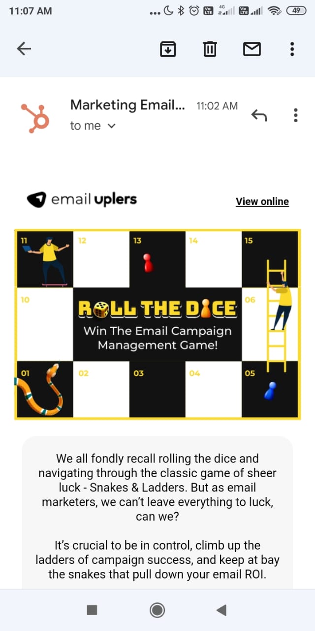
Developers at Email Uplers integrate requisite code that ensures uniform rendition even in dark mode settings. Check out the email below, (yes, I always enable dark mode viewing!)
Also, while designing, always design for clients where dark mode cannot be forced because you have the least control over them and end up optimizing your imagery and colors in tandem with your brand’s guidelines.
Begin with creating an MVP (Minimum Viable Product) that is functional, looks clean, and gets the job done. When you begin to structure your email with progressive enhancement in mind, you can add the bells and whistles later.
Your brand’s logo should stand out in every mode. Let’s begin with ways to optimize that for users who prefer dark mode.
If your logo comes with a white background, it might just render all fine in the light mode, but in the dark mode, it won’t come across as truly professional. The most sensible thing to do is to erase the background from the logo, turn it into a .png and then load it on your email. It will keep your email sorted either on a black or white background.
If your logo makes use of dark colors, then you can consider deploying either of the two aforementioned methods:
- You can either consider adding a light stroke around your logo so that it is clearly visible on a dark background, or
- You can create a banner of your choice, add the logo on top, and use the image as such in emails. This will ensure uniform rendition irrespective of the background color enforced by the respective email clients.
Also, play with mid-tones so that you can account for accessible color contrast ratios. Ensure that you choose a color that contrasts equally well with both white and black since it lies in the middle of the value range.
It is advisable to use transparent images or .png wherever possible to optimize images for rendering in dark mode. If you are not using transparent backgrounds or imagery, ensure that there is enough padding to provide for any awkward space or juxtaposition issues.
When you are mindful of the color palette in use, you choose standard brand colors and their respective dark equivalents for seamless rendering across clients and settings.
Checking for contrast is also a wise decision, as you can steer clear of using overly saturated colors and deploy a good balance of darker background colors and lighter foreground ones to meet accessibility and contrast standards.

Testing your emails for good rendition in dark mode is always a good move. If you use HubSpot to create and send out email campaigns, then this is how you can preview your email’s appearance in different clients’ dark modes.
- Open your HubSpot account and hit Marketing > Email.
- Choose the name of an existing pre-drafted email.
- Towards the top right of the email editor, you will spot the Actions dropdown menu. Click on Preview.
- Click on Clients in the Preview section
- In the Dark Mode sub-section, click on the checkbox next to the client you wish to test your email for.
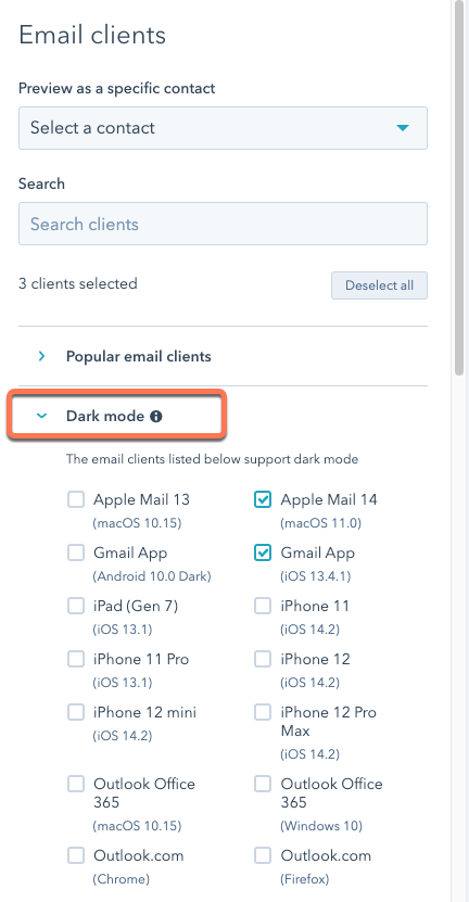
- Towards the upper right section, hit Test My Email Now.
Testing for different clients lets you know in advance about how the subscribers on the other end will perceive your emails, and thus you can make necessary changes before hitting the Send button!
Summary
Some people prefer adding a glow effect to their logos for better accessibility in dark mode viewing, while other’s prefer to go the Animated PNG way because GIFs don’t really support transparency. Whatever rocks your boat and works out well for your subscribers’ bespoke needs is what you need to work on while optimizing your email’s imagery for dark mode. Would you rather have a team of seasoned professional email designers and developers to look into it? Then Email Uplers is your perfect option. Hit us up now!
Naina Sandhir
Latest posts by Naina Sandhir (see all)
A Deep Dive Into Customer Journey Mapping In Mailchimp
Using ChatGPT in Email Marketing: 5 Ways to Get You Started!