
Forget that you’re a realtor for a while, and put yourself in the shoes of your prospect. Now think: what’s the most important thing you’d be looking for in a realtor? That they should be well-informed, right?
Your prospects may differ in their interests. Someone may want to buy/sell their home; while another may need help with office spaces, warehouses, etc. In all events, as a realtor, you’re expected to give them the right information.
But you may have all the information, and yet lack the funnel to direct it to those in need of information. Being informed and being able to inform – bridging the gap between the two often requires a calculated leap rather than a mere stepping-over. And this is where real estate landing pages prove useful.
A proper landing page informs and educates. By the end of this post, you’ll know what exactly such a landing page looks like and consists of.
- What is a landing page in real estate?
- 5 real estate landing page examples
- Real estate landing page design best practices
- Real estate landing page development best practices
What Is A Landing Page in Real Estate?
A real estate landing page is a web page that visitors “land on” upon clicking an ad or a specific SERP result for your business.
Now, a landing page need not be your website’s homepage. All homepages may be landing pages, but not all landing pages are homepages. Unlike a homepage, a landing page is dedicated to a single goal.
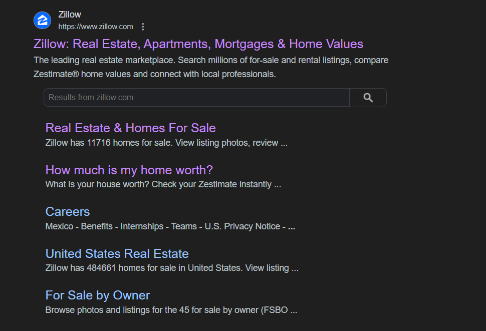
The first result for Zillow below redirects the user to Zillow’s homepage. The URLs further down are dedicated landing pages for specific search queries.
For more related information, read: The Thin Line between Landing Pages and Microsites.
Now that you know the difference between a homepage and a landing page, over to the real estate landing pages examples!
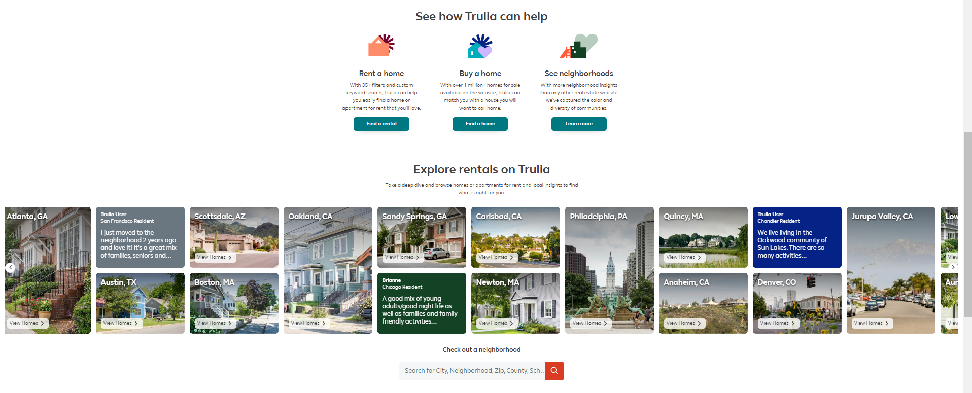
1. Trulia
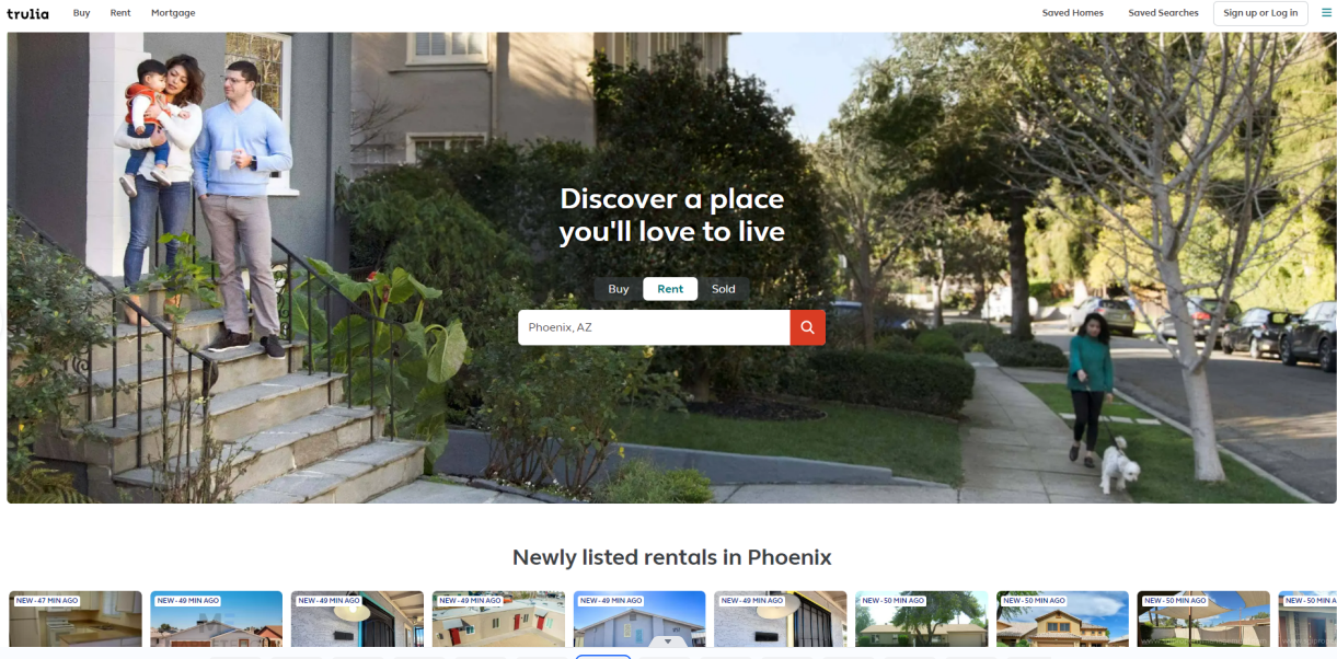
Trulia’s landing page above the fold uses minimal content and sleek design to eliminate viewing distractions. Look at the use of white space in the hero section; it draws attention to the midpoint of the banner where the action is.
Below the fold, the page provides information on newly listed rentals in Phoenix, how Trulia can help with renting or buying homes, etc. The second search bar right below the static carousel allows the user to search without having to scroll back to the top again. This eliminates an extra step, minimizing effort.

2. Beycome
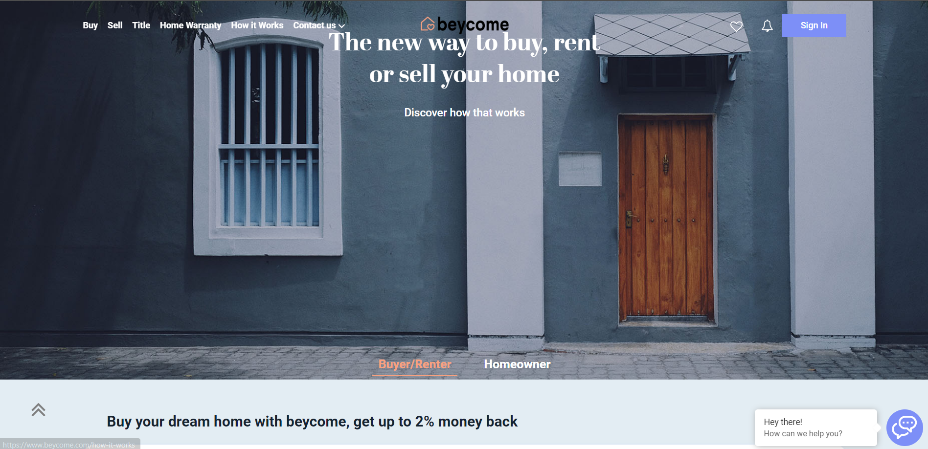
Beycome’s dedicated landing page for explaining how the buying/selling/renting process works deploys a directional strategy. The hero section does not contain the information the user’s looking for. But the content points to the details below the fold. (Don’t miss the chatbox, which is helpful to keep for more urgent visitors.)
As you scroll further down, you can see the process explained. Note the caret on the right of the landing page. No matter where you are on the page, clicking on the caret will zip you back to the top, eliminating scrolling. Both that and the chatbox are outside the navigational hierarchy. All this is to make the page user-friendly.
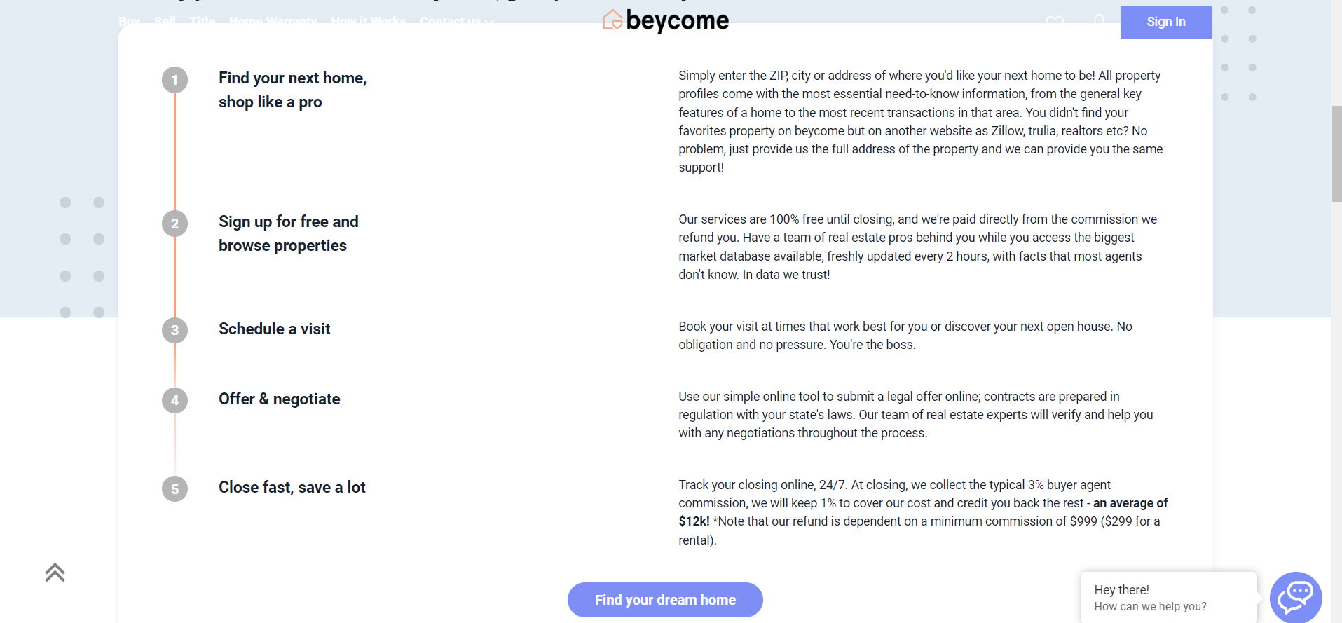
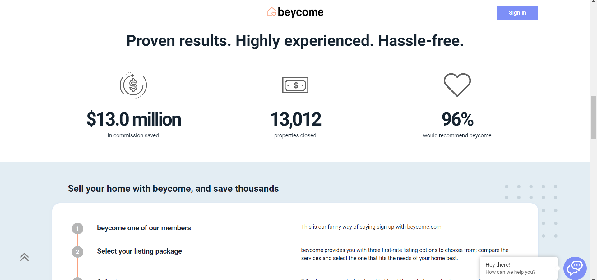
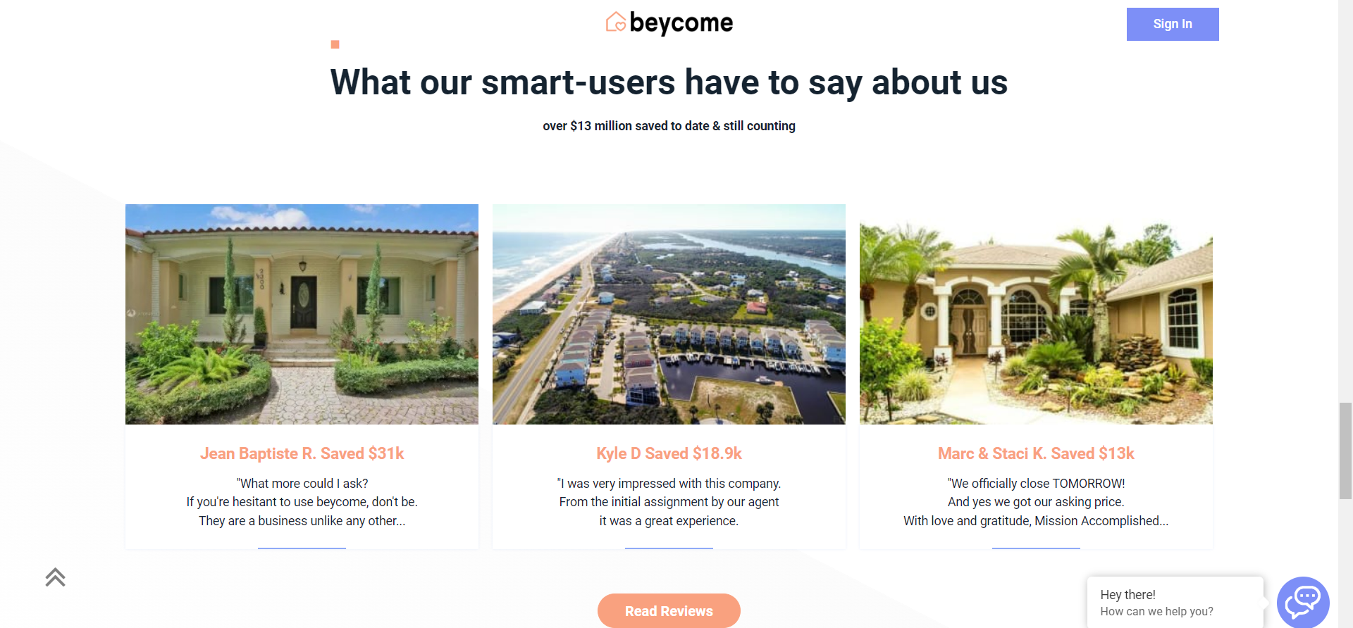
But there’s more. Further down the page, Beycome has provided more information, along with social proof and customer testimonials.
Evidently, the focus is on preventing confusion, and building trust – a sine qua non for success in real estate.
3. S&P Global
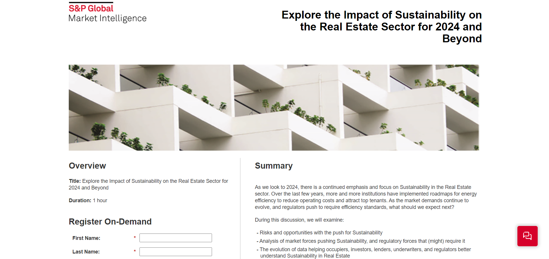
The first role of a proper landing page is to inform. S&P Global’s Summary informs the visitor what the page is about. Further down, the page lists the featured speakers, along with their headshots and designations. But the most important part of the landing page is the signup form. Here it is in full view.
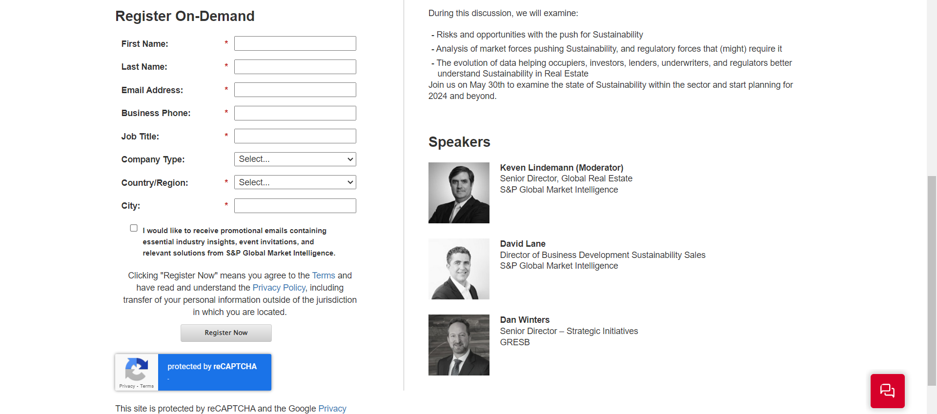
A landing page is used for capturing leads. The signup form will capture relevant information about leads, thereby activating the marketing funnel. Once prospects enter the funnel, S&P Global will send out emails in an effort to engage and potentially convert the webinar attendees.
Note the checkbox at the foot of the signup form. By sending promotional emails and emails containing real-estate highlights and event invites, S&P Global will try to lead the subscribers down the various stages of the funnel.
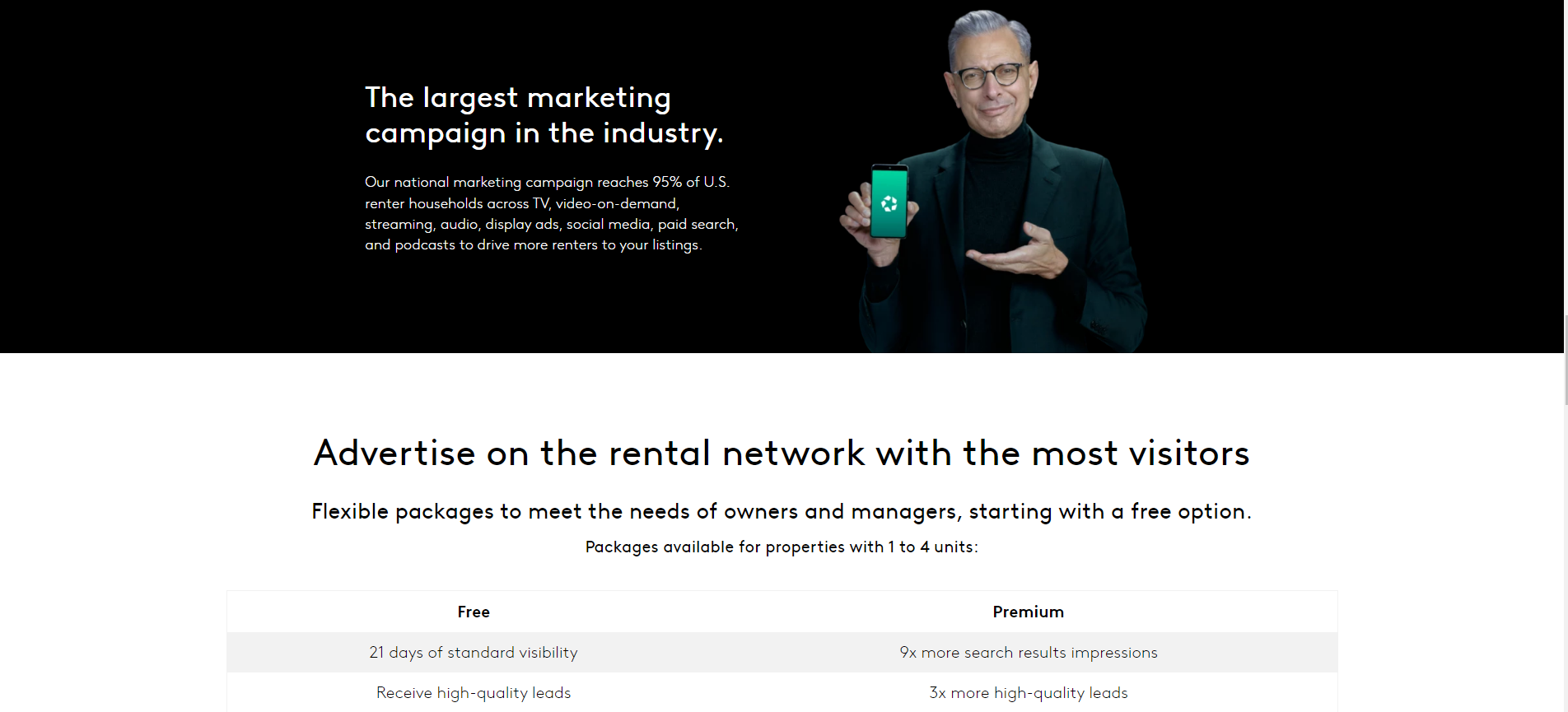
4. Apartments.com
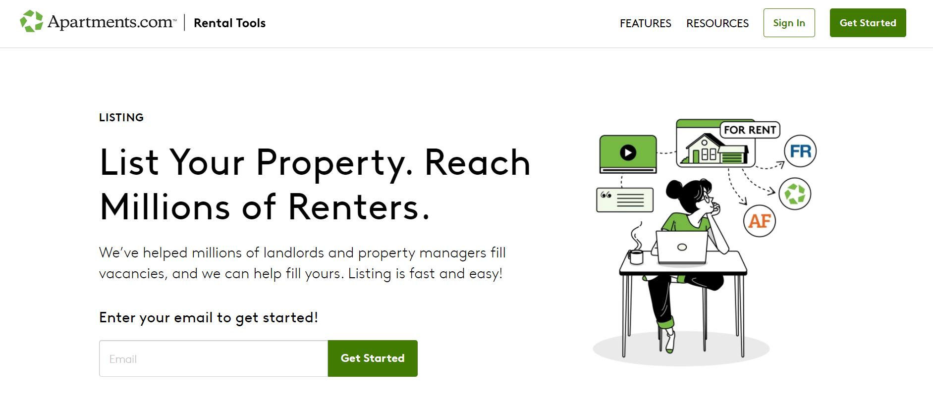
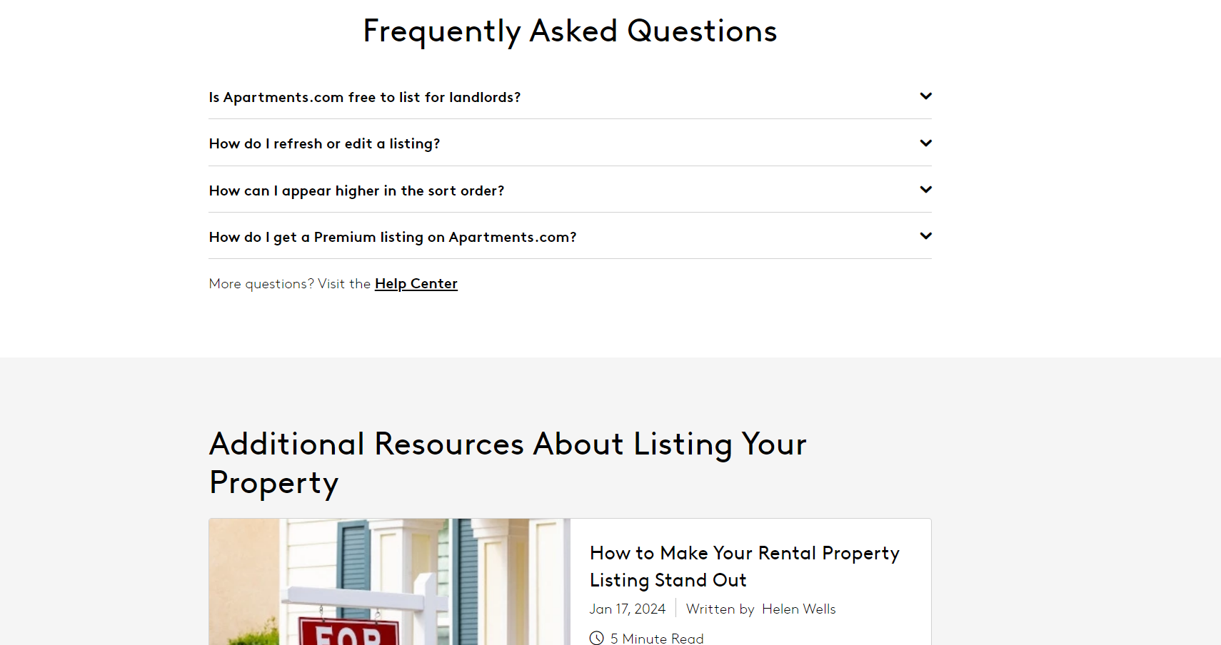
Apartments.com’s landing page for property listing is a banner for minimalism. The brand provides relevant information below the fold in the Z-pattern. The Z-pattern is how users scan web pages. So placing key information in the expected zones can improve readability and user experience.
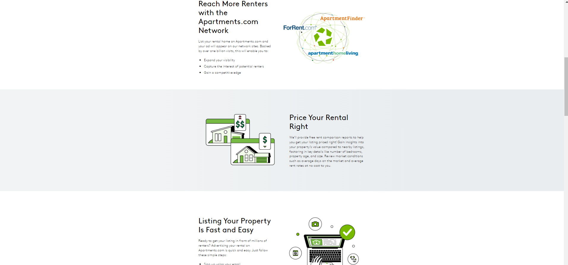
Like Beycome, Apartments.com offers social proof, followed by more information related to advertising properties on the rental network.
Further down, there’s a FAQ section, ending with additional resources. Once again, informing and educating prospects is the overarching goal of the landing page.
5. HotPads
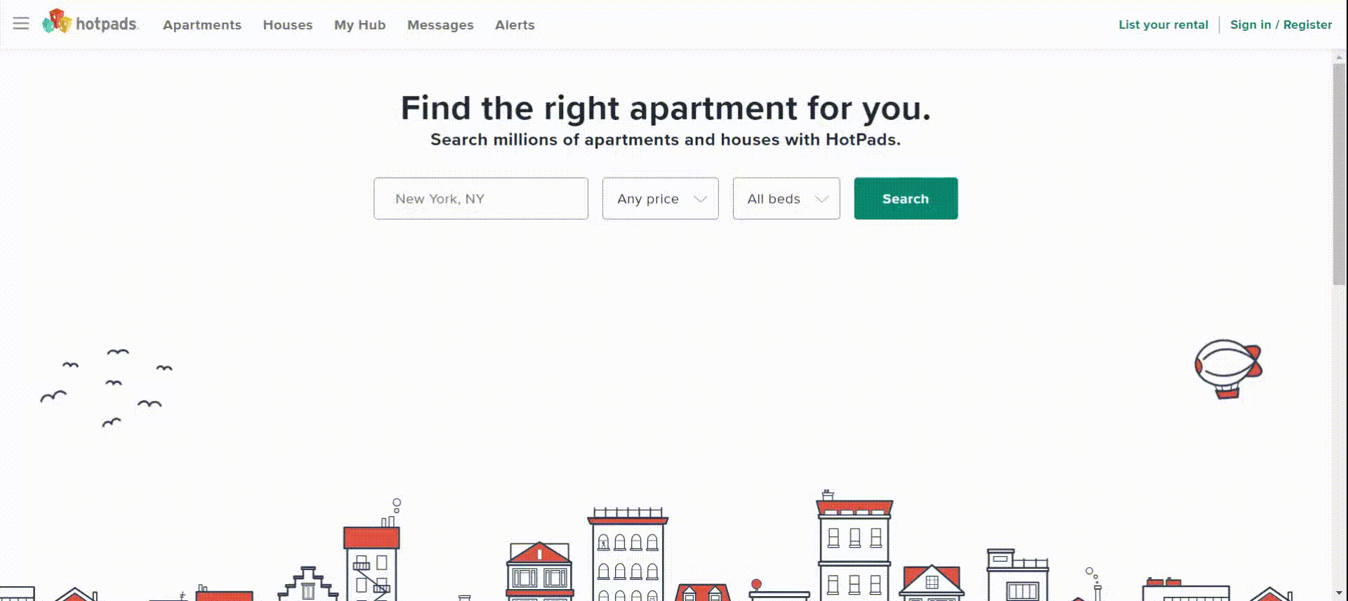
Our last example is a homepage that may double as a landing page.
HotPads uses a humble GIF to add to the viewing experience. Helpfully, the visitor can pause the GIF if they find it intrusive. Interestingly, unlike a typical homepage, HotPads’ homepage is neither hectic nor does it have trust signals.
This could be because HotPads is part of Zillow Group. The need for adding social proof and customer reviews may not have been essential.
Another reason might be that the homepage was intended to be a landing page. It’s short, and very search-query-focused. Apart from the search bars, there’s nothing by way of direct on-page information, prioritizing user intent over extensive gumph. The page is clean, minimalistic, and directed.
Real Estate Landing Page Design Best Practices
You can create your first landing page on a landing page builder. There are various LP builders out there, furnished with templates and code-free functionality.
That being said, it is helpful to have an idea of what goes into designing and developing landing pages from scratch. Besides, if your LP needs are complex, you may not find builders that answer to advanced requirements.
When designing a real estate landing page, keep the following in mind:
- Identify your target audience: The landing pages we explored so far were designed keeping the user in mind. With a similar approach, designing can be less hectic and more focused and compact.
- Compose a short, compelling headline: The primary and secondary headings should not be longer than a sentence. Your words should capture the user query.
- Use simple, engaging visuals: Because a landing page is primarily about informing and converting users, balance it with simple but engaging visuals.
- Ensure responsive design: Your design should be device-optimized. 58% of real estate website visits come from mobile.
- Strategic CTA placement: Place one relevant CTA button above the fold. Try to repeat the same CTA across the page since the latter serves a single purpose. This will also minimize scrolling.

Real Estate Landing Page Development Best Practices
Development is a different ball game altogether. A well-designed but poorly-developed landing page won’t convert visitors. So you better jot these down:
- Leverage effective schema markup: Implement relevant schema markup to your landing page code, enabling search engines to better understand your content.
- Minify landing page assets: Reduce file sizes of images, CSS, and JavaScript for faster loading times. Learn more: 10 Tips to Improve Landing Page Loading Speed
- Enable browser caching: This reduces server load and speeds up later visits by the same user. It’s faster to retrieve information from your hard drive than from a server.
- Enable lazy loading: For longer landing pages, prioritize lazy loading. Instead of loading the entire page at once, the browser loads the page progressively according to how the viewer scans the page.
- Utilize a CDN: Today, almost all websites rely on a Content Delivery Network to serve landing pages from geographically-distributed servers. Why? A CDN reduces delivery delay for users from different locations.
- Server-side rendering (SSR): If your landing page is complex with heavy client-side scripting, use SSR to help search engines properly crawl and index the content.
Create Responsive Landing Pages with Email Uplers!
Whether you want to turn your design into a custom landing page or start from scratch, feel free to get in touch with our custom landing page design experts. Just share your design brief, and we’ll turn it into a responsive, conversion-friendly landing page.
Susmit Panda
Latest posts by Susmit Panda (see all)
Top 8 Father’s Day Email Inspirations for 2024
Pro Guide: How to Do Mailchimp Audience Segmentation