
Seasonal campaigns can be tiring and nerve-wracking. Coming up with new ideas for the same holidays every year is exhausting. There’s added pressure since these occasions are when audience interest peaks the most.
Like every season, you want to design emails which make your subscribers sit up and look. You need them to stay with your email. Sure, you’ve the algorithm down pat, but what can you do more this year? How to create a scroll-stopping impact?
In this blog article, we’re sharing some of the classiest Father’s Day email examples, the design principles behind which should open up the creative vents. Over to the emails then!
- Letterfest
- Google
- The New York Times
- FitVine
- Brooks Running
- Brother Moto
- Bridge & Burn
- Animoto
- Father’s Day Email Marketing: Key Design Takeaways
Read more: 10 Mother’s Day Email Inspirations
1. Letterfest
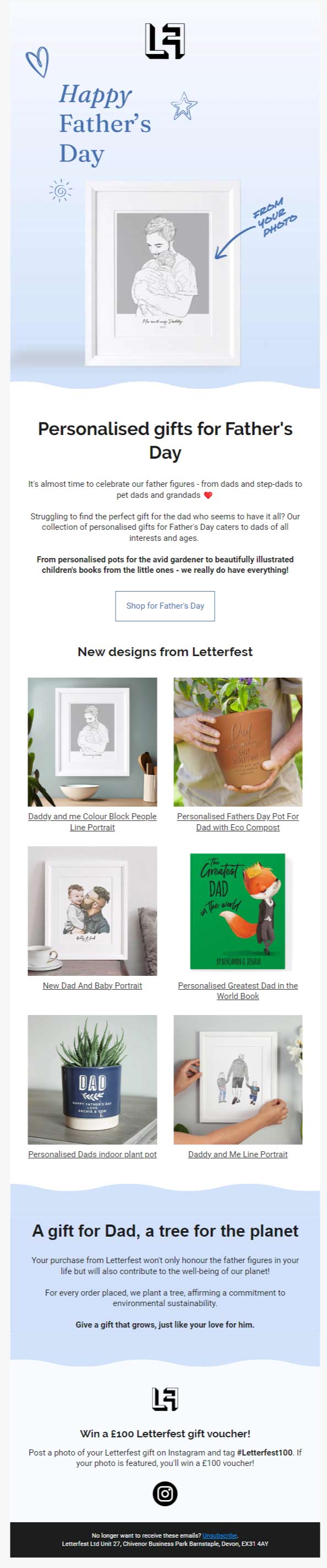
Letterfest’s Father’s Day email starts off with a scrapbook-esque hero image, which sets the (nostalgic) mood for the rest of the template. The hand-drawn signs seem to evoke a child’s pleasant association with their father. (The hero image actually features a product – a cool way to trigger fantasizing, paving the way for a surprise purchase option below the fold.)
Past the waveline which introduces the next section, the email is quite low-key in terms of design, perhaps to accentuate the products. The alternating color scheme improves readability, and maintains visual interest.
2. Google
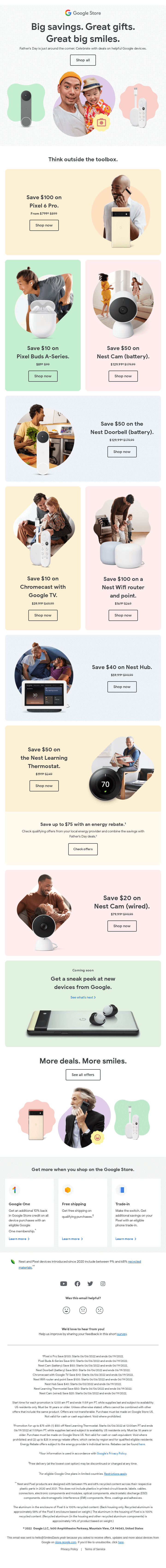
Google as you know has always prioritized simplicity in design. There isn’t much to play around with Google’s aesthetics. But in their Father’s Day email, Google has chosen to enhance the viewing experience notwithstanding their famed plainness.
There are nine different shapes, or pods, wherein Google embeds the marketing collateral via text and images. The human brain craves novel experiences. Viewing multiple shapes can be stimulating since there’s more information to process.
When there are multiple shapes, some products will stand out more than others, creating a visual hierarchy. This adds depth to the image. The viewer is more likely to really see the products. In addition, contrasting shapes will create tension, further enriching the viewing experience.
3. The New York Times
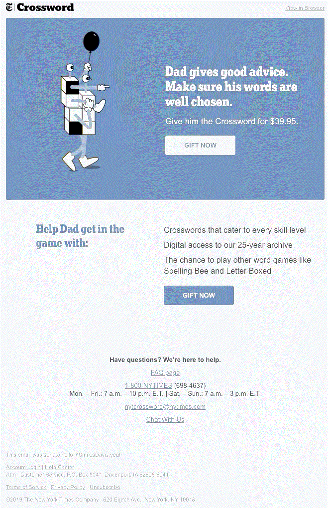
NYT’s Father’s Day email is short, cute, and unassuming. If you want to use GIFs in your email, this is one of the best ways to do it. NYT’s GIF integration is:
- Relevant: The walking crossword is relevant to NYT’s niche segment
- Rigorous: The GIF acts as a live CTA, pointing to the message of the email
- Restrained: It’s simple, and draws attention away from, not toward itself
Note the Z-pattern of the email as well, which is in line with how we scan content.
Read more: How to Use Animated GIFs in Email Marketing
4. FitVine
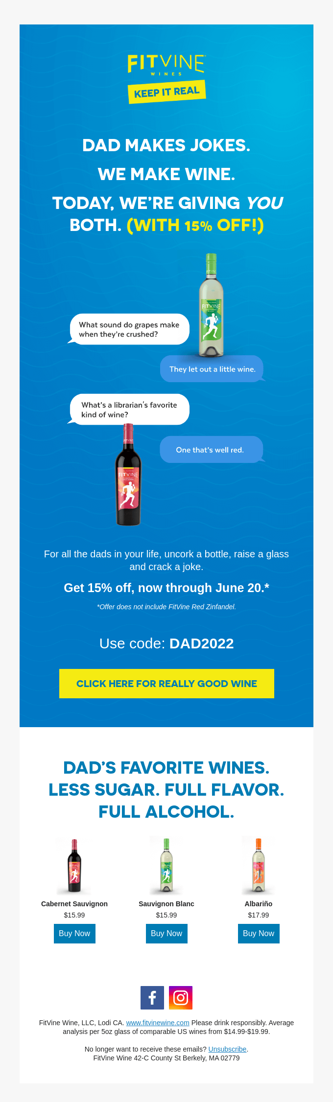
FitVine’s Father’s Day email is single-column, and majorly monochromatic. It seems that the email was designed keeping mobile viewers in mind.
The single-column layout eliminates the need for horizontal scrolling and pinching in on narrow columns to make out the content.
This makes for a more intuitive reading experience. A single column also gives you more space to use text and large CTA buttons. Plus, the flow is viewer-friendly since the visual hierarchy is uncomplicated. If you’re designing for your mobile audience, FitVine’s email should give you a head start.
5. Brooks Running Heartfelt Story
Source: Inbox
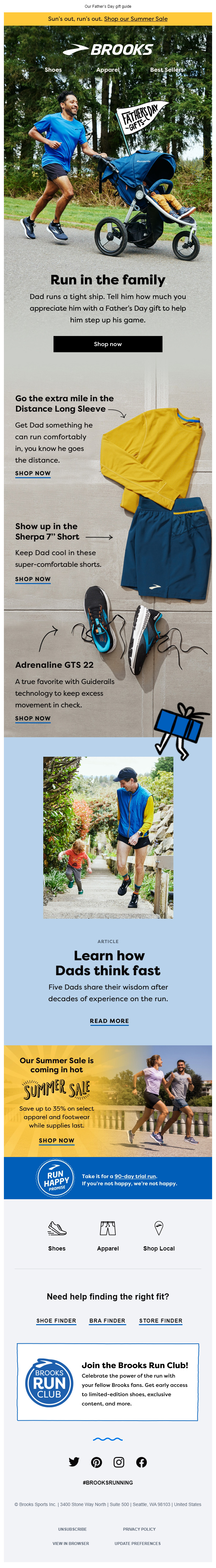
This Father’s Day email from Brooks Running is ingenuous in more ways than one.
The hero image is winning, both in terms of its photographic vigor and seamless blending with the succeeding portions of the email. The slant of the road is the first divider. The road leads on effortlessly to the light-gray concrete background. The products are casually arranged, with only the native slits in the concrete separating the one from the other.
The rest of the email uses on-screen dividers to separate the blocks. If you look at the email in full, you’ll see the blocks progressively decrease in size. This symbolizes the order of importance of each component of the email. Because it’s a gift guide, the most important block is the one at the top.
6. Brother Moto
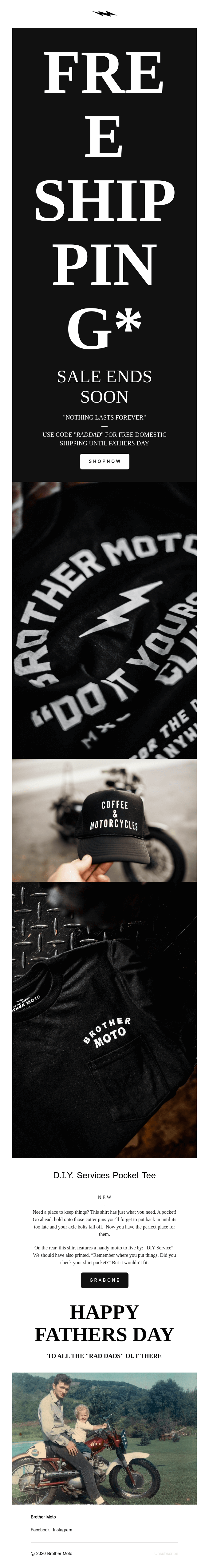
Brother Moto leverages ultra-detailed all-screen photography to create a lasting, immersive experience. The template is in line with the subject line, “For the rad dad.” The design is radical. The product images occupy more than half of the email.
An all-screen photo fills out your entire field of vision, immersing you in the finest details of the image. It’s a cool way of letting your product make an impact without going into too much textual description.
The extra-bold all-caps typography in the hero section (FREE SHIPPING* ) is in perfect harmony with the equally bold zoomed-in motto on the shirt. This makes for consistent, unified design.
7. Bridge & Burn
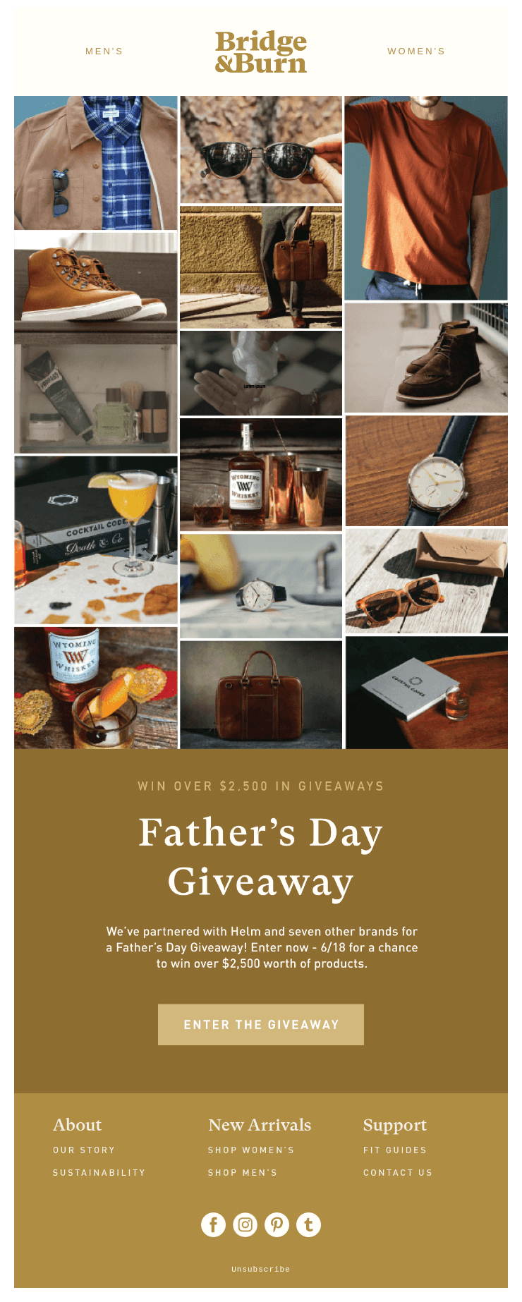
Bridge & Burn employs the quintessential collage in their Father’s Day email. This maintains visual interest, encouraging the recipient to pause and explore.
Next to an all-screen presentation, the collage is the best way to showcase your products. It minimizes scrolling. The viewer can take in a multiple range of products at a glance. Viewing and decision-making go hand in hand. One need not scroll up and down for comparative viewing. Now that’s quite user-friendly.
This Father’s Day email requires just one scroll to convert the recipient. There’s the product line above the fold, and there’s the CTA button below the fold. Neat!
8. Animoto
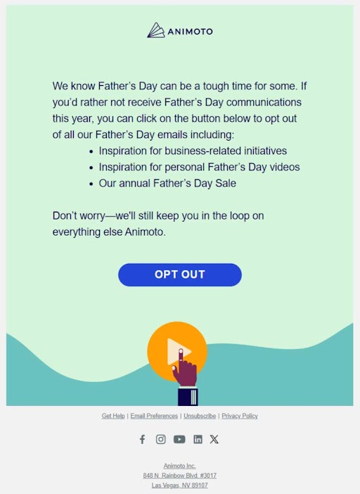
Source: Inbox
It is fairly simple to design an opt-out email on special occasions. Nearly all brands are consistently formulaic in their design approach. What’s the formula? Using up the brand palette!
That’s what Animoto’s opt-out Father’s Day email does. Cerulean and yellow are Animoto’s predominant colors. The email likewise uses three shades of cerulean, and a yellow passive CTA. No fuss.
Father’s Day Email Marketing: Key Design Takeaways
To summarize, put a pin in the following before designing your Father’s Day emails this year:
- Embrace design that captures the mood of Father’s Day
- Experiment with shapes to overcome the limitations of vanilla aesthetics
- Use simple, short, and content-aligned GIFs
- Leverage single-column layouts for intuitive mobile viewing
- Where possible, look beyond on-screen options to separate content blocks
- Explore all-screen photography
- Try the traditional collage for showcasing your product line
- Utilize the brand palette for all opt-out emails
Alternatively…
If you think all this is too much to take in, you can get in touch with our inhouse email design experts. From modular to custom to interactive emails, we design all kinds of templates for all sorts of clients for all occasions.
If you have a design file, share it with us. We’ll convert it into an HTML email in just 8 hours. In case you don’t, we can provide you with design and coding services, and your email will be good-to-go in just two days.
Susmit Panda
Latest posts by Susmit Panda (see all)
Expert Guide to Klaviyo-Salesforce Integration
5 Bounce-proof Real Estate Landing Pages Examples