
Besides the text and design elements, the color scheme is equally important if you want your emails to make an impact. Our brain can process visual information 60,000 times faster than text. To put this point in perspective, your mind instantly connects the green color with prosperity, wealth, and life. Similarly, the white color symbolizes pristineness. Not choosing the right color scheme can mess up with the purpose of the email and plummet the subscriber engagement.
Through this blog, we will try to understand the different types of color combinations you can use in your emails for best results.
Let’s start by understanding what the different colors signify.
1. Red
Love, romance, boldness, energy, hunger, excitement, and danger
2. Green
Health, nature, wealth, prosperity, and growth or abundance in any form
3. Blue
Calmness, trust, strength, and reliability
4. Orange
Friendliness, cheerfulness, confidence, and creativity
5. Yellow
Happiness, warmth, and optimism
6. Black
Strength, power, luxury, and sophistication
7. White
Purity, cleanliness, and ease of use
Note: The information shared above is a broader view of how colors are perceived by most people.
The colors can convey different feelings based on the cultural beliefs and ethnicity. As an instance: Black stands for mourning in the West, while in the East, white represents the same. In Brazil, purple is the color of mourning. On the other hand, Japan considers purple as the color of wealth. China considers red to be the color of good luck and happiness. However, it can also stand for war and unpleasant things in other cultures.
Various Color Schemes and Their Usage
The color schemes you decide will depend on their position in the color wheel.
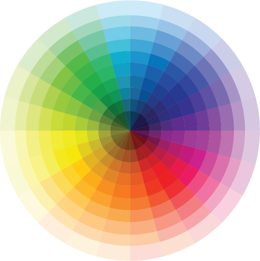
The different types of color schemes for emails include:
1. Warm colors
2. Cool colors
3. Achromatic
4. Monochromatic
5. Analogous
6. Triadic
Let’s discuss each of them in detail.
1. Warm colors
Warm colors include yellow, yellow-orange, orange, red-orange, red, and red-violet. They are warm hues and shades of bright red and yellow colors.
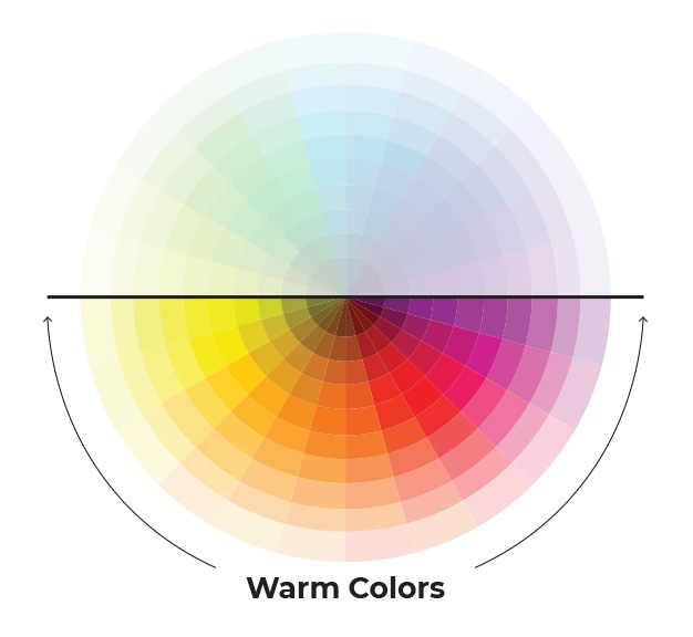
They are associated with heat, fire, and the sun. They feel more energetic and inviting.
We often come across a warm color palette in our day to day life in the form of a sunset or sunrise.

If you want your email to give an optimistic feel, orange, red, or yellow colors work the best. They are also used to represent urgency.
See how Ritual has used a warm color for their Valentine’s Day email to evoke the feeling of love, passion, and intimacy.

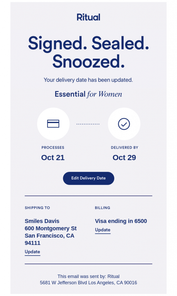
2. Cool colors
Cool colors are blue, green, violet, yellow-green, blue-green, and blue-violet. These colors include cold hues and tints. They stand for natural phenomena like fertility, sky, water bodies, and exude a touch of plenitude.
Remember your holiday at the beach? That’s how a cold color palette would typically look like.

These colors also depict serenity, trust and peace. Wellness brands and hospitals can use them to symbolize faith and assurance.
Take a look at this email by Ritual in which they have used a cold violet shade to build the reader’s confidence.
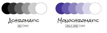
3. Achromatic
Emails with white, gray, and black colors without any hue are called achromatic emails. Plain text emails with black fonts over white background are achromatic. These emails depict professionalism and are easily accessible without any rendering issues.
If you have to promote a new gadget, you can use achromatic color combination to draw the reader’s attention to the product. It also gives a feeling of sophistication.
Check the email by Hourglass in which they have used shades of black, white, and gray to pique the subscriber’s curiosity.
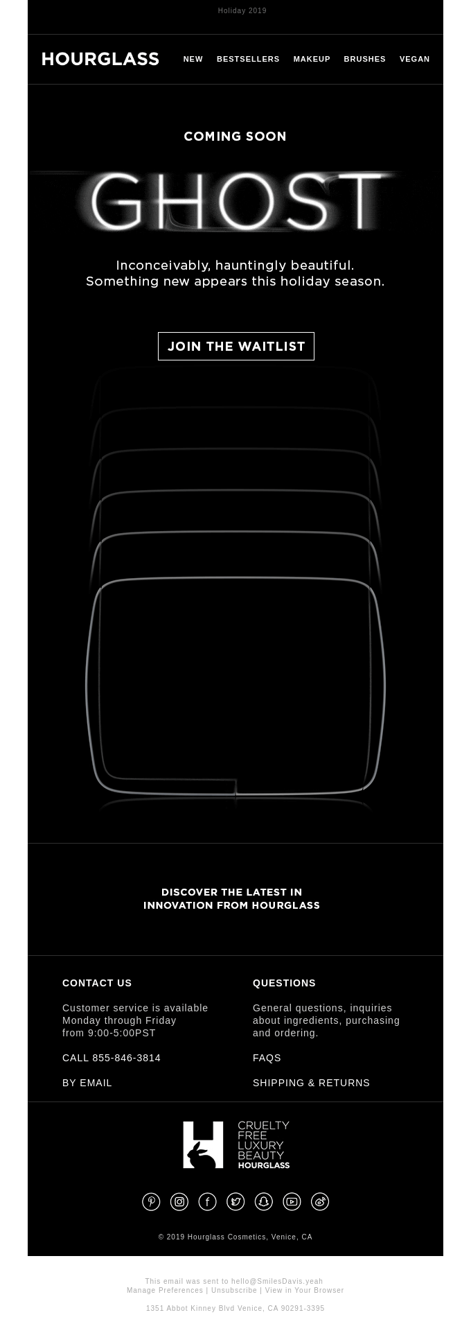
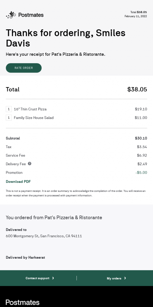
These color schemes also work well for transactional emails that intend to share important information with the readers. Here’s an email example demonstrating the same.
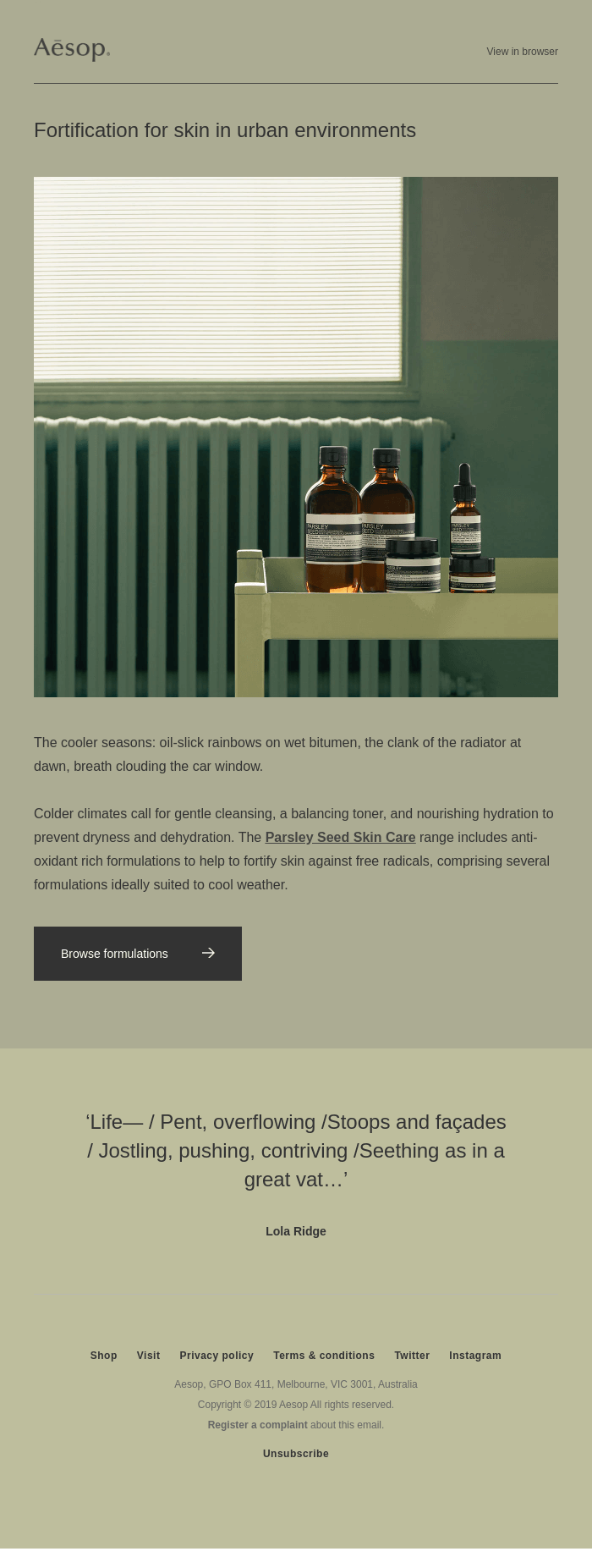
4. Monochromatic
The difference between achromatic and monochromatic is that achromatic combinations have neutral colors while monochromatic color schemes have multiple shades of a single color.
Monochromatic email designs create a harmonious configuration, thereby facilitating readability. Based on the color you choose, it can create depth in the email and make the visuals stand out. The minimalistic and simple look and feel enhance the email conversion rate. Monochrome layout with plenty of white space is free from any distractions. So, they can retain the subscriber’s attention better.
Here’s an email example by Aēsop, in which they have used green hues to impart uniformity to the email. It is a perfect choice of color as they are promoting natural formulations for skincare.
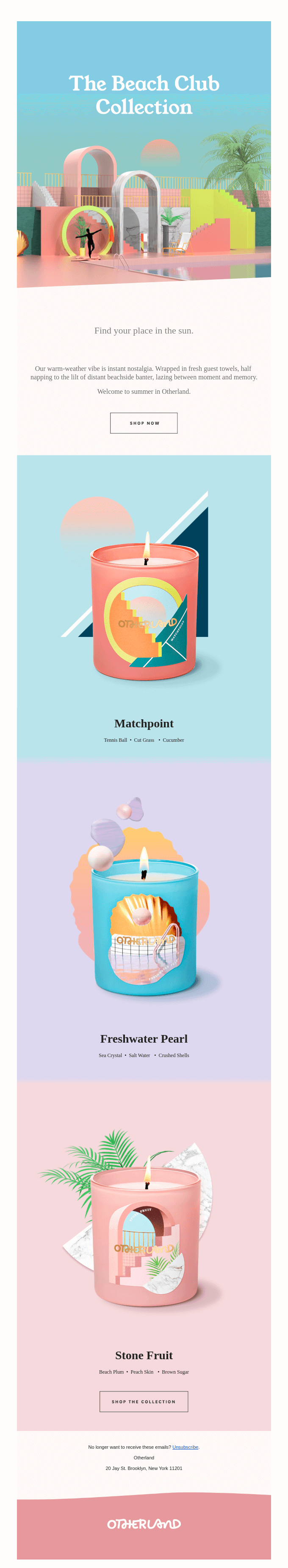
5. Analogous
An email consisting of three adjacent colors from the color wheel is said to have an analogous color combination. It creates a delightful design that enhances the overall aesthetic appeal of the email.
These color schemes work well when you want to show the change of seasons or natural phenomena.
For example: Take a look at this email by Otherland in which they have chosen analogous colors to promote their beach club collection.

6. Triadic
When emails have three colors placed at equal distance in the color wheel, it is known as a triadic color scheme. Generally, it uses colors that are almost opposite to each other in the color wheel. If you want to strike the perfect balance between warm and cool colors, this is the best choice for you. You can either use two warm colors with one cold color or two cold colors with a warm shade.
It reinforces the message to be conveyed by putting in focus the dominant color. The pro-tip is to use the dominant color wherever you want to bring the subscriber’s attention. It can be your headline, CTA buttons, or an offer you wish to highlight in the email.

Apart from these six types of color combinations, there are some additional points you must remember while laying out your email design.
1. Use different colors to organize the content
Most subscribers skim or scan through your emails rather than reading them line by line. Organizing the email content with small color tabs or labels can make the reader’s task simpler and convey the message faster. And you know the best part? You don’t need to design these sections separately. Just use an HTML background color to make the tabs and break down the content. You can also make the headers (and footers) more attractive with background colors. Rather than using an image, you can make these sections more prominent with the help of background colors. This technique works better as it does not create any rendering issues even if the images are blocked in the email client.
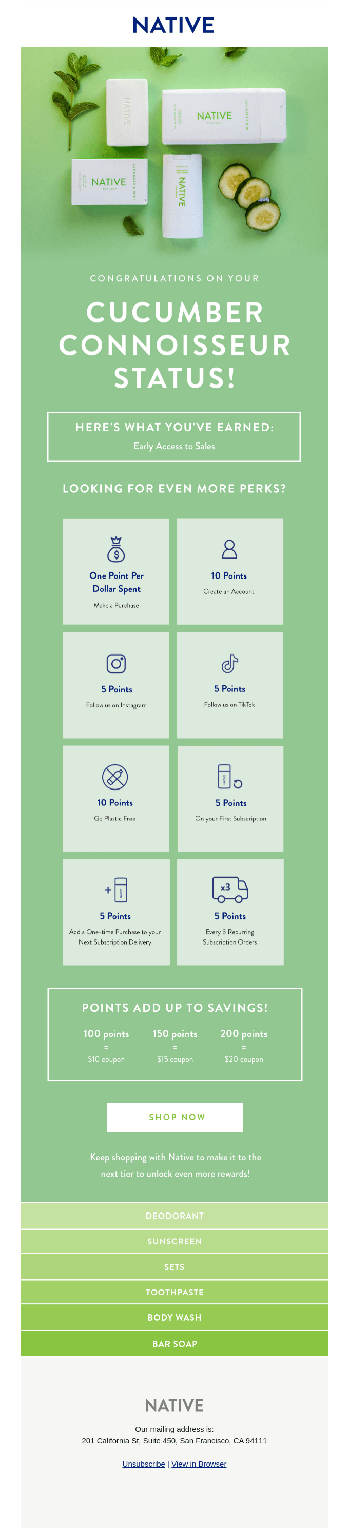
Take a look at this monochromatic email design with gradients by Native. They have created labels of different colors to show the huge range of their products. Also, see how they have separated the footer by designing it in gray color.
2. Enliven the white space
If your email has too much white space which makes the email look empty, splash some colors or vector images. It will make the emails look visually rich and get you some bonus points for readability. But make sure that you do not end up cluttering the otherwise neat email design.
3. Add some colors to the email text
Make the email links blue. Sounds so clichéd, right? Instead, you can make the links match your brand color or some other color that matches the overall look of the email. Apart from the links, you can even paint the text with different colors. Black text over white background is a best practice but you can always experiment with new ideas. For example: If you have a baby pink background, you can have a dark blue or navy blue color in the font face. You only need to make sure that the background color and the foreground contrast each other without hampering the accessibility criteria.
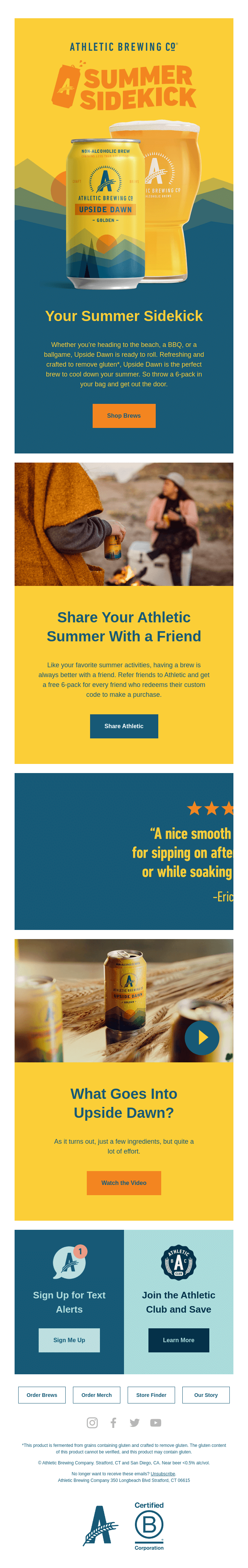
Take a look at this email by Athletic Brewing Company in which they have used a yellow font color in navy blue background.
4. Make the CTAs as easily noticeable as possible
Choose the right colors for the CTA as it will decide whether the user will click through or not. You might have to test different colors and see what works best for your brand. Red, green, yellow, blue, and black are some of the most commonly used colors for CTA buttons. While black might work for a travel company, yellow would work better for a SaaS company. It all depends on how your audience perceives these color combinations.
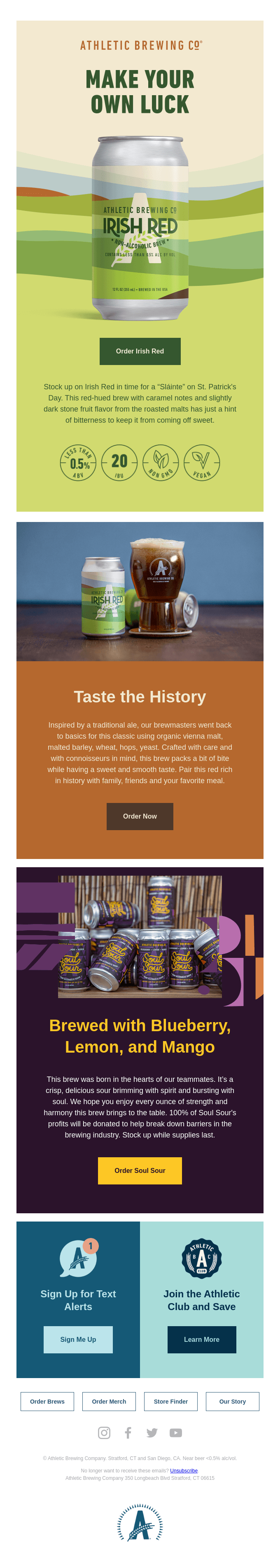
Have a look at this email by Athletic Brewing Company. It separates the different sections of the email with different colors. The CTA buttons are designed in the contrasting colors, accordingly.
Wrapping Up
The colors and visuals of your emails define the brand personality and strengthen the value proposition. Besides the ones shared here, you can always think of innovative ideas and unique color combinations that would enhance the subscriber experience. Run a trial and see what kind of colors resonate the most with your audience. Just make sure that they are in line with your business type and brand positioning.
Disha Bhatt (Dave)
Latest posts by Disha Bhatt (Dave) (see all)
A Quick Guide to CRM data mining and how best to use it for email personalization
How to Use Gmail to Send Mailchimp Email Templates?