If you’re an email marketer, by now you would have known that an email might not always turn out like how you expected. When it comes to sending emails, it could get very tempting to use images in place of text to overcome the coding hassles of emails.
However, with most email clients blocking your images by default, it becomes very important that you have a foolproof email design that can convey the message even without images. Gmail Data Analysis reveals almost 43% readers use email without turning images on.
Read on to know how you can optimize the images and make the most of them in your email design by just keeping a few things in mind.
How can images ruin your email?
The right image will help to increase the number of content views and email clicks and affect the conversion rate. A low-quality photo, obsolete vector, or ill-sorted image can take a toll on the user’s trust in the brand and on the email too. Remember these few points when you design an email with images.
Spam Triggers
It is a well-known fact that most spam mails contain heavy images and email clients have set their spam trigger criteria accordingly. Spammers are known for hiding their text with images, so to overcome this blind spot, most email clients treat heavy-image emails as spams.
Loading of images
If your subscribers have a slow internet connection or are connecting to data on-the-go, the images in your emails may load slower than normal. Even if someone has speedy internet, there is a risk that images may not load quick enough. The longer images take to load, the more likely your subscriber will be disengaged and delete your email—and if images are all your email has to offer, this can affect future engagement with your brand.
Avoid using one large image as your entire email, or too many images in general. Many email tools automatically compress images in emails, so they load faster.
Accessibility issues
Not including ALT text can harm your email’s accessibility. There has been a constant increase in the number of subscribers that use voice assistants to read their emails to them. Unlike screen readers, voice assistants do not seem to recognize ALT text and other HTML attributes, so even if you have set ALT text for your image-only email, it won’t matter for this subset of your audience: the email will be completely blank to them. So, when it comes to creating accessible emails, there’s no alternative to live text.
Moreover, when a subscriber wants to revisit your email or wants to search a keyword from your mail, it wouldn’t pop up in the search results within the email client, as the copy was part of the image.
Images disabled by reader
Many subscribers have a default email client setting or turn off the image visibility in emails by personal preference. This should be remembered while designing an email. Blocked images can result in emails that do not communicate anything and fail to make an impact—or even appear to be broken. It can be worse if you don’t have any ALT text set up for your imagery, because then the email simply appears blank.
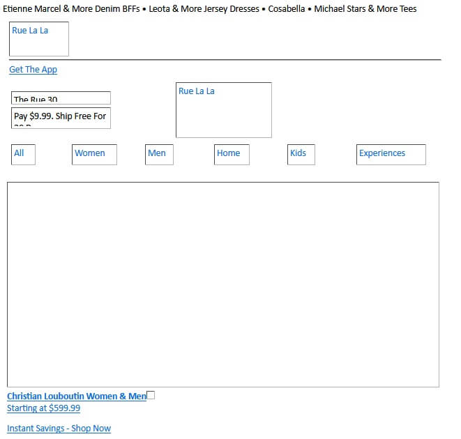
The below image is how an email from Rue la la looks when the images are disabled in an email client. This email has ALT text because of which the basic message is conveyed.
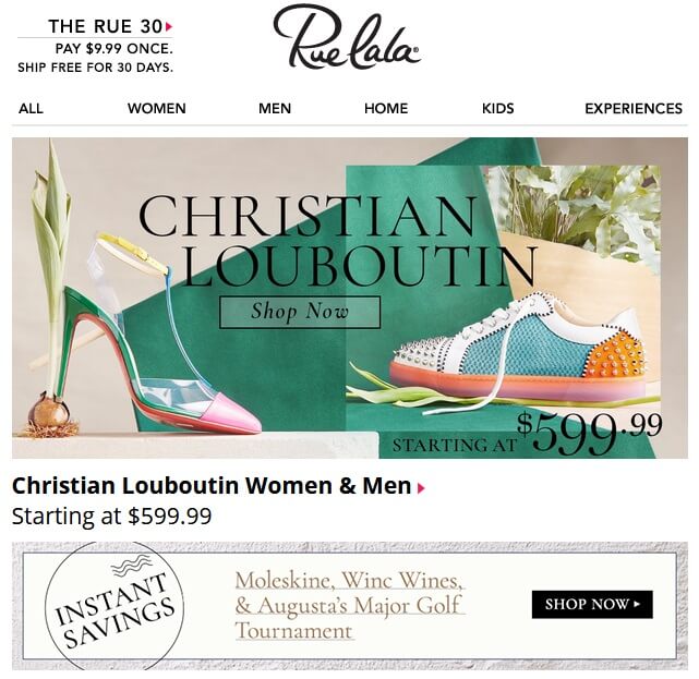
When the images are enabled, this is how the email looks.
Is there a right way to send images in email?
The only way to use images in emails is to do it in a way that does not raise any red flags. For instance, if a user opens the email only to confirm their registration, show them the link and don’t distract with excess content. There is no need to add an image just for the sake of it. An image should not duplicate the text but should help to set the mood or to literally show the subject of the message. Since there is little time available for an email to catch the user’s interest, any opportunity to convey meaning with an image or icon should be used. So, if you can show, don’t tell!
Best Practices in using image in email
Avoid Image only Emails
At the first glance, sending image-only emails might sound like a great idea, but those emails come with a poor subscriber experience—and can ultimately hurt your brand. A picture may say a thousand words, but sometimes you also need those words spelled out. If something goes wrong in an image only email, there might be a chance that the reader might not even know what the mail was about. Scary, right?
Optimize the image resolution
With the ever-growing trend towards higher pixel density monitors and mobile devices, using sharp, crisp images is more important than ever. A normal image displayed at its native size will appear blurry on high density displays due to the image covering roughly twice the number of pixels without any increase in its clarity. One technique is to save the image at twice the resolution needed and then hard code the height and width at the intended size.
Avoid Stock clichés
To connect with customers, you must go the extra mile to stand out and communicate effectively. Using stock images that a user might have seen repeatedly might not only lower your credibility, but it will also show that you don’t care enough and just selected a random image that you came cross.
Keep your images on brand and genuine. Take the time if you could create specific imagery for your email campaign!
Use GIFs over images
When there is a limitation in using visual components, GIFs are a blessing. Be it a short video or multiple images, GIFs are a great way to work around with emails. There are plenty of ways to get creative with GIFs to enhance your subscriber’s experience when they read your email.
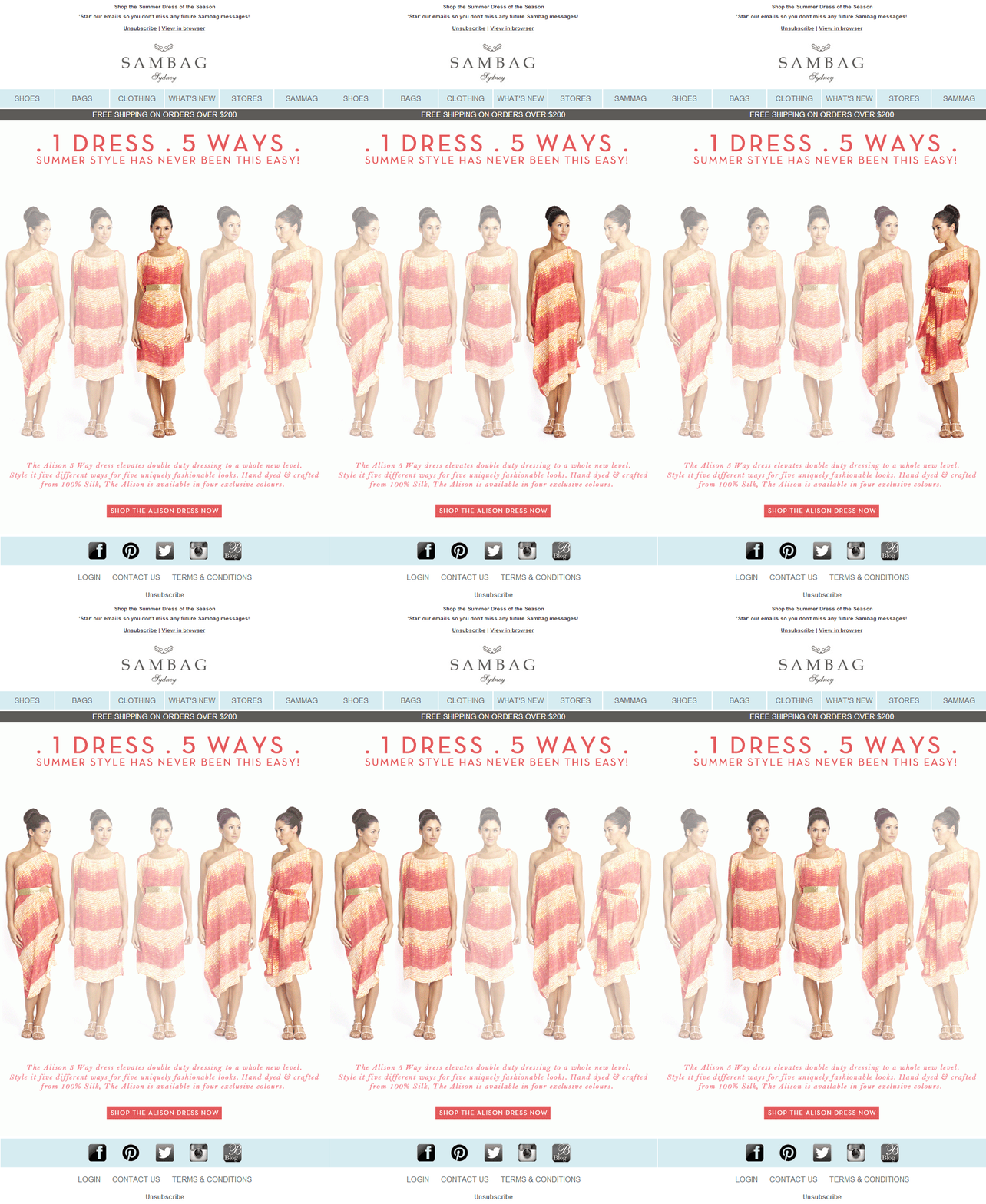
This email by Sambag has replaced 5 images with one GIF, which highlights all the elements that needed to be conveyed.
Maintain the ratio of image and text
It is important to keep in mind that you need to have 80:20 text to image ratio in emails, 80% text and 20% images. One reason is that an email without a balanced text and image will trigger red flags and it might end up in the spam folder. This is the safest ratio to maintain, keeping in mind that all email clients have different spam criteria.
Another reason is that, content from the images in the mail will not reflect in the search results in the email client. And that will hinder the process of possible engagement. Keep your copy consistent, conversational and to the point.
Check out these emails to see the difference between image-heavy messages and their cleaner, clearer cousins.
Image-heavy:
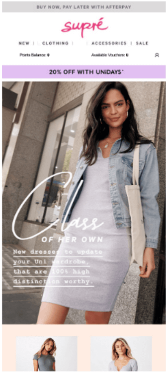
Better:

Avoid key copy in images
If your key copy or primary message of the mail is itself an image and due to some reason if the image is broken or blocked, you won’t be able to convey the basic information about your email.
Adapt a defensive design
One-third of your emails are likely to be opened with images disabled. ALT text in email is the text that displays if an image doesn’t show. When images don’t display—or when a subscriber relies on a screen reader to read your email—it’s the ALT text that makes your content accessible and provides your subscriber with the context they need to understand your message.
This mail has no ALT text, see how the mail looks when images are disabled or broken.
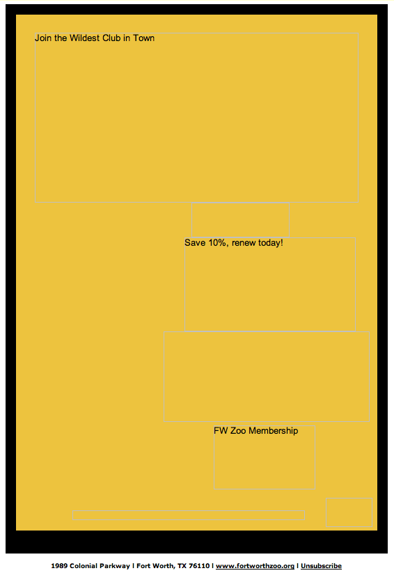
This mail is a nightmare for an email marketer. The same email when enabled with pictures, looks like this.

Using clear and appropriate ALT text on images. Ensure your email is readable and gets the point across, even without images. Styling your ALT text just gives you an opportunity to grab your reader’s attention, even if images are disabled.
This is an example of how a standard ALT text and styled ALT-text would look.


Use Bulletproof Buttons
The most important aspect of an email campaign is getting people to interact and here’s where the call-to-action, or CTA, is critical. Because of image-blocking in most email clients, image-based CTAs are not advised and aren’t used by most email marketers. If your CTAs are contained within images, there is a good chance that many subscribers are missing out on your message. Even worse, they aren’t interacting with your campaigns.
Bulletproof buttons allow you to build buttons with code instead of images. Using Vector Markup Language (VML), Padding or Border based buttons for calls-to-action is vastly superior to relying on images. Even in email clients that block images, bulletproof buttons ensure that your message will be clear to your audience, increasing the likelihood of your subscribers interacting with your emails.
Test your emails
While creating mails, one should always keep in mind the number of mobile users. While it may be time-consuming to test out your emails for all email clients, you’ll want to test them for the ones your audience uses the most. If your email marketing tool lets you, go ahead and preview what your email looks like in different email clients and devices that are popular with your audience.
You can also preview your email with images disabled, so that you can know what the recipient would be seeing if images are blocked or broken. Sending out a test version of your email before you send out the real deal to ensure it’s working properly is a smart way to ensure a successful email campaign.
Wrap Up
The lesson you take away from this should be that you don’t need to use only images to achieve consistent results with HTML email. Enhancing your subscriber’s or prospect’s email experience with deliverable images might require a bit more effort up front, but they will be more effective, and you’ll reap rewards in the long run.


Kevin George
Latest posts by Kevin George (see all)
Quintessential Mobile Landing Page Tips (that no one is going to tell you)
APNG in Emails: Taking Animations to a New Level