
A landing page works as an extension of your business personality. The better your landing pages, the higher your conversion rate will be. While an engaging copy sets the foundation of a high-converting landing page, the colors, backgrounds, and visual elements help create the right impact and encourage readers to take action. They reinforce the message and compel the visitors to convert into customers.
Given the competitive bottleneck and the zillions of landing pages floating on the web, you must ensure that your landing pages have something new to serve the visitors. While a lot has been said about the copy, there isn’t much information about the background images on the landing pages.
Hence, we thought to throw light on this less explored aspect of landing pages. (Read till the end because we have a “five-second-test” for you as the epilogue…)
Best Practices to Choose the Background Image for Landing Page
1. The image should capture the visitor’s attention
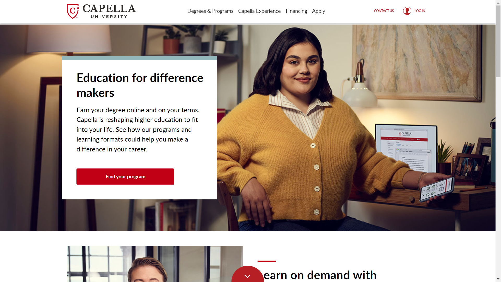
The first few seconds are enough to draw the reader’s attention and prompt them to take action. The image must capture the visitor’s eyeballs, entice them to stay glued to the page, and eventually take action.
Take a look at this Mother’s Day special landing page by Swarovski.
They have used aspirational images to inspire the visitors to take action. The headline “Let your love light shine” is in sync with their business vision.
2. The background should convey a message in itself
This point is more relevant for the eCommerce, travel, and SaaS sector, where visuals play a vital role.
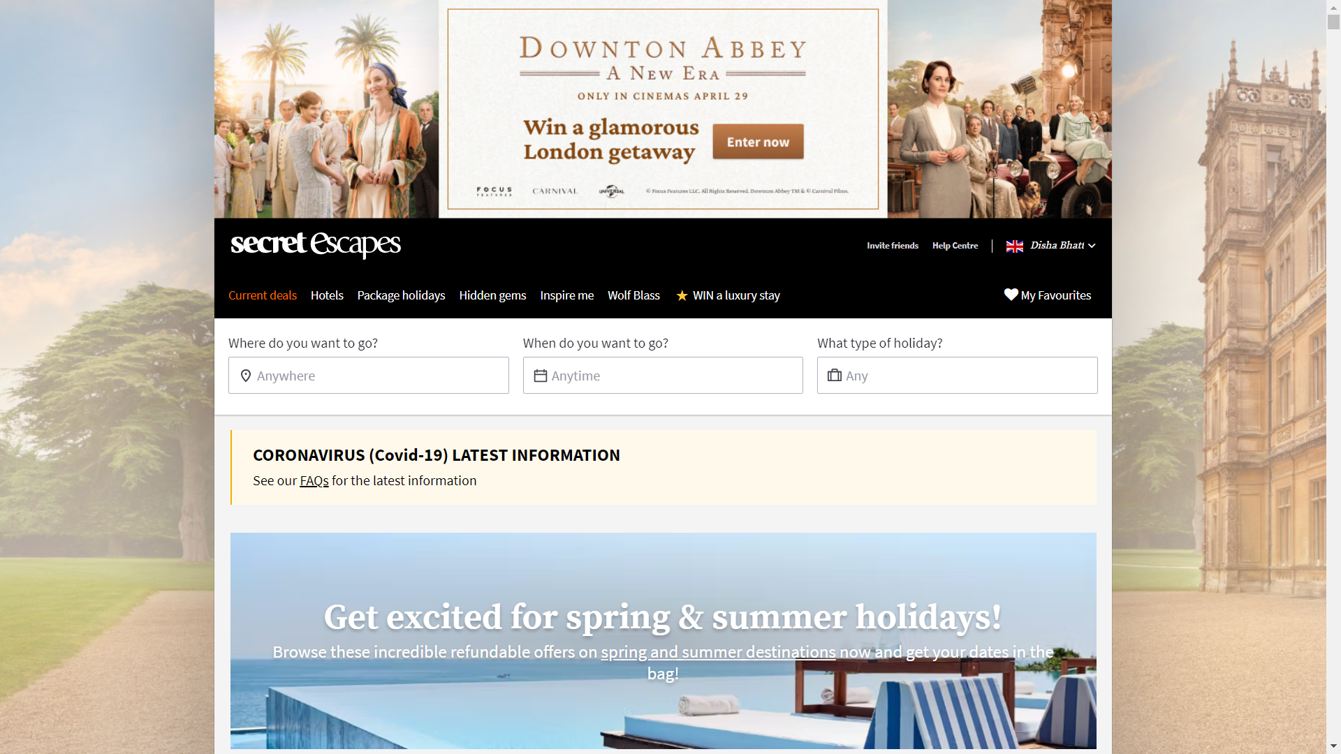
For instance: Secret Escapes has placed a picturesque background on its landing page to inspire the visitors to plan their next trip. The page is rich in visuals that are sure to convert the visitors.
The only concern is that the white text on the blue background is difficult to read. That’s why color contrast (discussed in the first point) is a critical aspect.
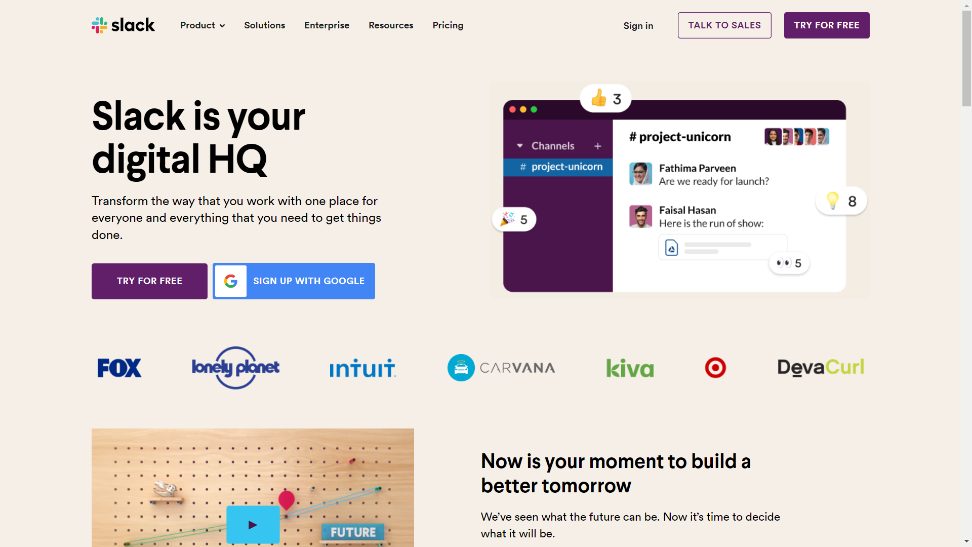
Slack presents another example of a winning landing page. The image and the headline “Slack is your digital HQ” instantly let the readers know what the software is all about.
You can even use video playing on a loop like HubSpot to reinforce your company proposition.
3. Add real people
Images of real people add a human touch to the landing page and help build trust with the visitors.
While choosing these images, avoid using any stock photos.
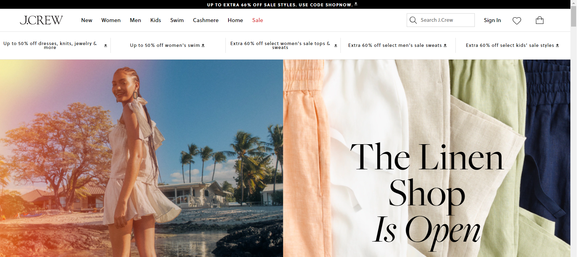
J.Crew has used pretty lifestyle images on their landing page that reflect their products’ aesthetic appeal and comfort. It would lure the visitors into making the purchase.
If you are struggling with images, check out the websites given below. (It is a mix of free and paid options.)
- Shutterstock, of course
- Big Stock Photo
- iStockphoto
- Fotolia
- Getty Images
- Pexels
- Unsplash
- IMCreator
- Gratisography
- Picjumbo
- Superfamous
- Death to the Stock Photo
- Little Visuals
- Getrefe
- The Pattern Library
4. Use visual cues to guide the user toward the CTA
Directional cues work as visual aids that direct the visitors toward the essential elements of the landing page and CTA. You can add arrows or set the eye gaze of the models to bring attention to the respective elements. These cues create signals or vibes for the reader and subsequently make them take action. Besides these explicit directional cues, some implicit cues also help engage the readers. These are white space, color contrast, and encapsulation.
Here’s a brilliant landing page example using different directional cues to win conversions.
5. Tell a story
Your landing page gives you a scaffold to tell a story and win over your visitors. Let them know the vision behind your products and services. Storytelling helps to boost user engagement by tapping on the reader’s emotional appeal. Pick images that target the reader’s pain or ambitions. That’s how the “Problem Agitation Solution” (PAS) formula works.
For instance: If you are in the fitness sector, you can consider placing the images of a model before and after using your services. It will intrigue the people who want to make a difference to their overall well-being.
Also, you can give an overview of your offerings like Dribbble has done. You place your product (Product Design Course in this case) as a solution ( in front of your user’s problems. As simple as that.
They have placed a video thumbnail and encouraged the visitors to watch the trailer. This will facilitate the decision making process and make conversions more likely.
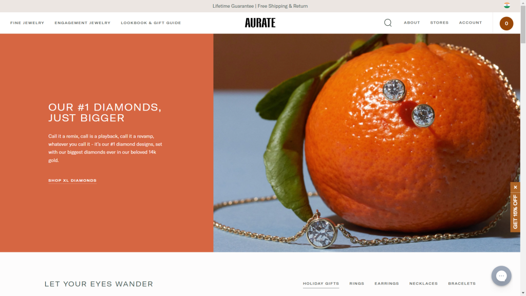
This tactic also works wonders when you want to launch a new product.
Aurate has launched their XL diamonds with attractive visuals and powerful copy describing the USPs of their products.
6. If you are using plain colors, make sure they match with the purpose of your landing page
Using the right colors on your landing page is a tricky affair. Kissmetrics has revealed that people emphasize visual appeal and color while shopping. 85% of customers state that color is the primary reason they purchase.
Choosing the right colors becomes all the more important from an accessibility and inclusivity point of view. Different cultures perceive colors differently.
For example: Black is the color of mourning in western countries, while white represents the same in India.
With that said, let’s go through the meanings of different colors.
- Blue
Blue is considered to be the universal color for all corporate websites. Several B2B websites and services use blue as the primary color. It conveys trust, integrity, and security. Besides, it imparts a calming effect to the eyes of the beholder. If “you can trust me” had a color, it would be blue.
- Orange
Orange has a feeling of warmth and optimism associated with it. It is a good option for your call-to-action buttons. Many eCommerce sites also bank on this color for their background and CTAs.
- Green
If you deal with outdoor activities and adventure sports like hiking and camping, green is the right choice. As it is the color of wealth and prosperity, you can also use it to promote businesses that drive faster ROI.
- Red
Red can mean love, energy, urgency, and hunger. Generally, restaurants use a combination of orange, red, and yellow on their landing pages. Remember KFC and Pizza Hut logos?
It is also the safest bet for CTA buttons as it drives maximum conversions.
- Yellow
McDonald’s uses the ultimate combination of red and yellow to get noticed. Yellow represents happiness, optimism, creativity and renders a “feel-good” factor to the readers. Like blue, yellow color also creates a calming effect on the customers. However, excessive use of yellow can be detrimental to the overall visual appeal of your landing page.
- Purple
Marketers dealing with fashion accessories and cosmetic products use shades of purple as it signifies royalty and calms the people. Many beauty brands use the purple color to endorse their anti-aging products. Just remember that too much purple can be hard on the eyes.
- Pink
Don’t blame me for stereotyping, but pink is considered a feminine color. For brands catering to a female audience exclusively, pink can be a safe color. If you have a male customer base, darker shades of pink will work as they stand for love and romance.
- White
Blue and white come off as a powerful duo for corporate websites. You can never go wrong with white as it conveys purity and clarity. It is not good for CTA buttons unless you have a black background on the landing page.
- Black
Black is obtained by combining all the colors of the spectrum. It is generally used for luxury products used by the affluent. For example: Apple sets the best example of such a product. It represents minimalism and simplicity along with sophistication.
7. Think out of the box
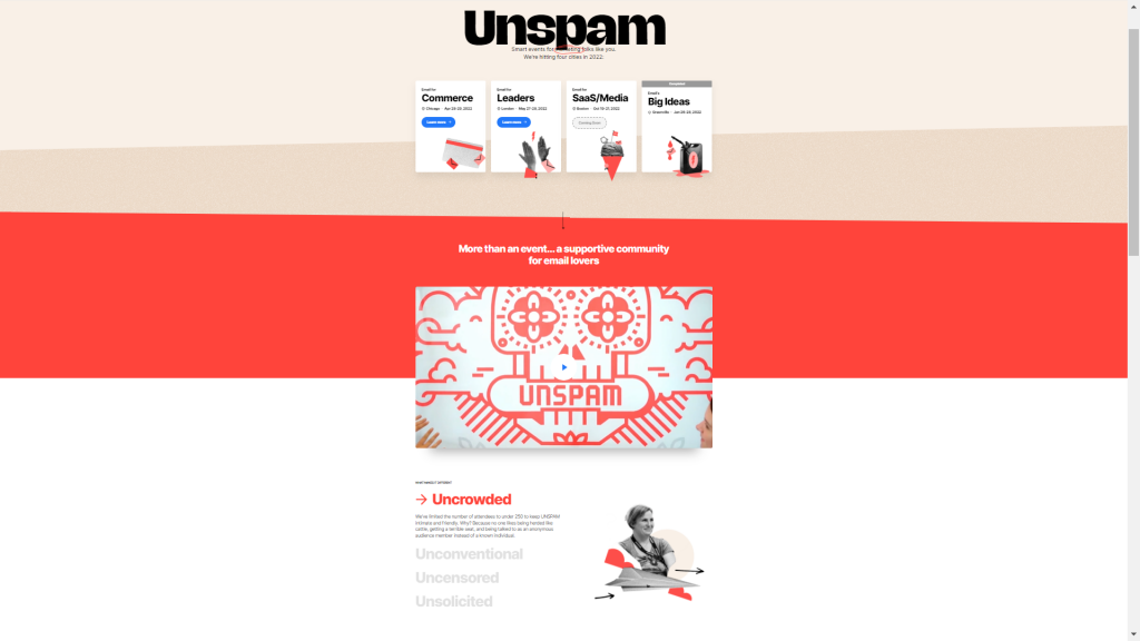
People are bored of reading the same old things on the Internet and seeing the stale images borrowed from Shutterstock. Therefore, you must go a step ahead and deliver something memorable through your landing page. Recently, I came across this event landing page by Really Good Emails that strikes the right chord in every way.
Unlike the traditional layout of event pages, this page presents freshness and creativity to the visitor. Even if you are not a marketer, you would be tempted to check out the event — that’s the power of a good landing page.
Furthermore, it is important to A/B test the visuals and monitor its results. Based on these insights, you must keep optimizing your landing pages for conversions.
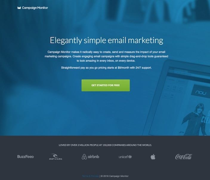
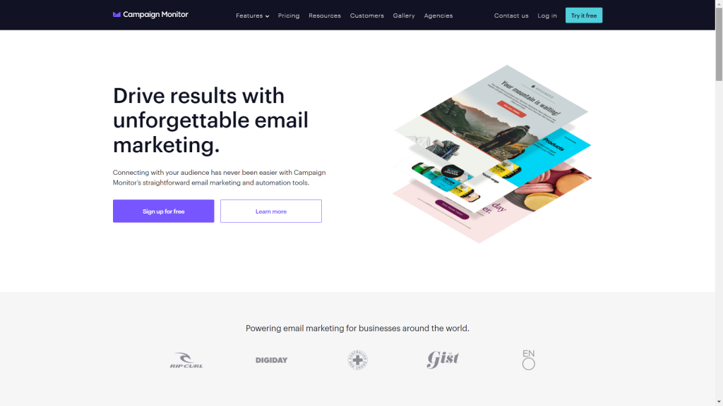
See how Campaign Monitor has revamped their landing page
from this:
to this:
Wrapping Up
You must apply the “5-second test” to determine whether your landing page, along with the background image, copy, and other visuals, can convey the most important message to the readers.
In this test, you must show someone your landing page for 5 seconds and then ask relevant questions about the page.
Ask the person about the company name, the offering displayed on the page, the salient features of the product or service, and the benefits.
Check out this landing page for 5 seconds and see if you can answer the questions above satisfactorily.
Let us know in the comments below whether this landing page appealed to you or not.
Also, share the link with us if you have come across any unique landing pages while browsing.
Disha Bhatt (Dave)
Latest posts by Disha Bhatt (Dave) (see all)
5 Tips on Improving Your Business Email Copy in 2022
EDM marketing: The 7-step guide to drive faster business growth