
“Signup anxiety”, a phrase not established industrially, is nevertheless a common experience people have both offline and online. Online, whenever the user is met with a signup form on a website, their mind spirals into a flurry of questions:
- Should I share my personal information with PetPeeves (a fictional online pet supplies store, duh!)?
- Should I trust the reviews and testimonials on the website?
- Isn’t there something off with the way the signup form looks?
- Why are there so many fields in this form? Is PetPeeves a scam?
- Why bother? After all, what’s in it for me?
- (SURPRISE QUESTION!)
Unsurprisingly then, the average email opt-in rate totters at a mere 1.95%. Just to be clear, “signup anxiety” is just a handy phrase. We’re not talking about something that is l-i-t-e-r-a-l-l-y sweat-inducing.🙂
But you see the problem. Apparently, unless you are the Wall Street Journal, the New Yorker, or the BBC, getting visitors to confidently fill in the email signup form on your website is next to impossible.
Except that it’s not. Let’s try and unwrap this using the questions listed above.
Signup Forms: From The Visitor’s Perspective
Should I share my personal information with PetPeeves?
Users are increasingly concerned about data privacy and security, especially when it comes to email addresses.
Every time a visitor enters their email address, it is saved in a database. Each time the email is used, it’s a step toward building a detailed profile of the user that may include information such as their geographic location, employment status, hobbies, friends, search history, social media handles, banking products, and so forth.
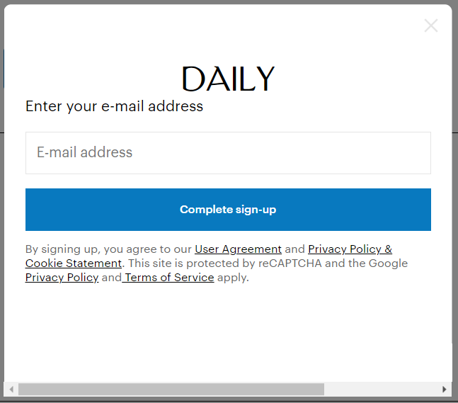
Visitors are justifiably concerned. Which is why the best email signup forms display trust signals in the form of security badges, privacy policies, and clear statements on their objectives behind collecting visitors’ email addresses. It is equally important to ensure compliance with data privacy laws such as GDPR, CCPA, etc.
Here’s how the New Yorker does it. Note the underscored phrases.
Should I trust the reviews and testimonials on the website?
‘I’ll have what she’s having’ describes perfectly the human disposition toward social validation of some kind. Visitors to your website will be more likely to sign up if they are convinced that many others have already done so.
That’s the power of social proof. Email signup forms that quantify the popularity of the brand will net more subscribers than those that don’t. You may also include one customer testimonial alongside your form. Here’s how the Content Marketing Institute utilizes social proof in their signup form.

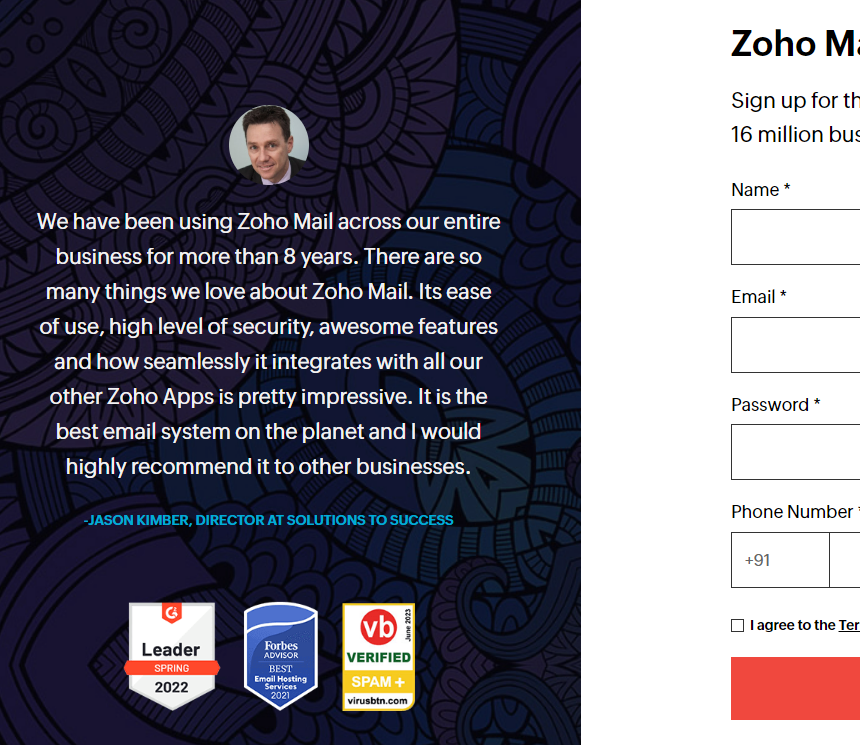
Zoho Mail has included an elaborate client testimonial alongside their signup form.
Isn’t there something off with the way the signup form looks?
Design directly affects user experience since it is tied to navigability. If your signup form is poorly designed, it is, oddly enough, more noticeable and proportionately off-putting.
- Ensure that the signup form is user-friendly and has a clear layout.
- Reduce visual distractions.
- Decide the placement of the form (header, footer, sidebar, within the content, etc.).
- Include a prominent CTA.
- Make sure that the font size is legible.
- Choose a brand-consistent color scheme.
- Lastly, minimize the number of fields (hashed out in more detail below.)
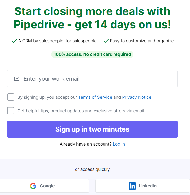
Check out Pipedrive’s signup form below. It checks all the boxes.
Why are there so many fields in a popup form? Is PetPeeves a scam?
It is universally agreed that the best email signup forms are short. Visitors are not expected to fill in a federal form, are they?
As per Ominsend’s research, including just three fields in a signup form triggers maximum conversion. According to the same research, the majority of websites ask the visitor’s first name and their email address. However, email plus phone number enjoys maximum signups.
Those are some interesting finds. Overall, the point remains: the lesser the number of fields in your signup form, the better. Consider Jasper’s email signup form template below, which has just three fields.

Why bother? After all, what’s in it for me?
General indifference is a problem. In spite of the dumbfounding advances in marketing, people are still instinctively averse to being sold to. Lack of incentives only reinforces it.
We’re considering our fictional brand, PetPeeves. Not all visitors to PetPeeves’s website are looking to buy something. They may just be looking for resources. Or they may have been directed to a blog post that might answer some of their questions. In short, user intent is as varied as the users themselves.
But, you want to deliver global value by transcending these local opportunities, potentially triggering longer, more substantial interfacing with the visitors. Which is why incentivizing signup forms by offering access to exclusive content, newsletters, discounts, etc. is crucial.
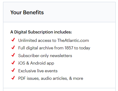
The Atlantic, for instance, lists how the viewer stands to benefit from subscribing to their newsletter.
(Surprise question) But I don’t speak English!
If your signup form is not accessible, what’s the point? So, if you cater to an international audience, make sure that the signup form is available in multiple languages.
Don’t overlook localized content. Allow the visitors to choose their preferred language or region, and customize all email communications accordingly. This will significantly enhance user engagement.
Types of Signup Forms
In this post, we will consider the three principal types of email signup forms, namely popup form, landing page form, and inline form.
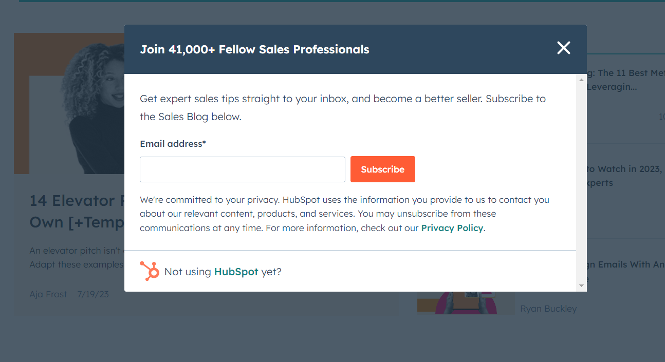
1. Popup Form: Suppose you’re reading an article about a scratch pad on PetPeeves, and suddenly a window seemingly from nowhere “pops up” in the middle of the content. That’s known as the popup form. For instance, here’s a popup on HubSpot’s sales blog.
| Pros | Cons |
| Attention-grabbing | Intrusive |
| Effective at converting visitors when paired with compelling incentives | Aggressive popups can lead to higher bounce rates |
| You can control the timing of popups | Difficult to optimize for mobile |
| Easy to A/B-test | Negative brand perception |
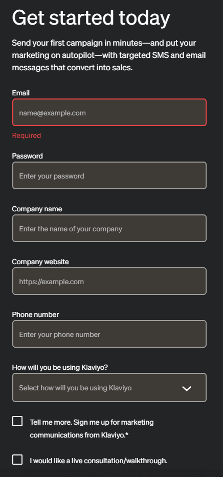
2. Landing Page Form: Placed prominently below or alongside PetPeeves’s hero image on the landing page, this signup form may be slightly more detailed than popups. It is more formally-designed and comprises fields like first name, last name, email address, company name, phone number, etc. Here’s a nice signup form example from Klaviyo.
| Pros | Cons |
| Contextually relevant, less in-the-face | Lower visibility, unlike popups |
| Highly effective for information gathering | Potentially less effective at converting |
| Good at trust-building | — |
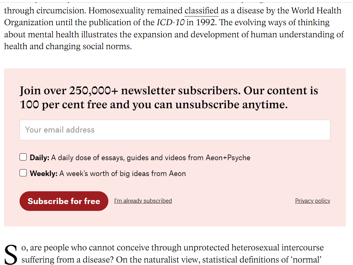
3. Inline Form: The inline signup form is embedded within the blog post you might be reading on PetPeeves. Unlike popups and landing pages, the inline form is seamlessly integrated into the content, and blends with the surroundings without disrupting your reading experience. Like this newsletter sign up form from Aeon.
| Pros | Cons |
| Seamless integration | Lower visibility |
| Non-intrusive | Limited screen space |
| Contextually relevant | Lower conversion rates |
In Lieu of Signing Off: Some Best Practices
Instead of a general wrap-up, we leave you with some expert-vetted email signup form best practices:
a. Make sure that your signup form is accessible to ALL users, including differently-abled visitors. Include clear labels, provide alternative texts for images, and test compatibility with the help of screen readers.
b. Triple-check privacy compliance. Ensure your form complies with local as well as national/global data protection laws. Clearly state your privacy policy. Always obtain consent from visitors.
c. Optimize your signup form for mobile and other handheld devices, particularly in the case of popup forms.
d. Gradually profile website visitors instead of asking too many details at once. Start with collecting basic information and progressively gather more data in proportion to user engagement.
e. Simplify the signup process by inviting visitors to sign up using their social media accounts.
f. Send a confirmation email and wrap up the verification process. This is important because you don’t want fake or incorrect addresses in your email list.
g. Beef up the verification process by implementing a double opt-in process.
h. You may consider implementing spam mechanisms like CAPTCHA to minimize the risk of bots and bogus signups slipping into your email list.
i. Continuously A/B-test your email signup form template, from design to placement to text.
j. Lastly, use analytics tools to track user behavior and monitor relevant metrics such as bounce rate, conversion rates, abandonment rates, etc.
Susmit Panda
Latest posts by Susmit Panda (see all)
How to Send Push Messages with Salesforce Marketing Mobile Studio
Unraveled: Einstein Engagement Frequency in Salesforce Marketing Cloud