Using illustrations in your emails is more than just about adding an element of lightheartedness or making your content more visually appealing. When used the correct way, these can become an effective storytelling tool unto themselves. That’s why illustrations rank among the hottest digital trends being leveraged by email marketers around the world.
The fact that custom-made illustrations were voted the design trend of the year 2019 by Behance speaks to the effectiveness of this visual element. By extension, it’s growing popularity in the domain of marketing design. Another survey from 2018 also goes on to show that illustrations and infographics have been outperforming other visual elements in driving engagement.
These insights, coupled with rampant use of customized illustrations across marketing content – be it banners, print designs, packaging, besides digital promotions – point to a singular takeaway: every email marketer must embrace these to optimize engagement with their content.
If you haven’t hopped on the illustrations bandwagon yet, we are here to show you how to get started with some creative examples.
7 Creative Ways to Add Illustrations in Your Emails
Images and visual elements are known to capture and retain a reader’s attention longer. According to eye-tracking studies, people are more likely to spend time on images that are relevant to them than generic ones. This is one of the first advantages of using custom illustrations in your email messaging.
Besides, when you work with stock photos instead, the risk of a competitor also using the same, or similar, images cannot be ruled out. This eats into the uniqueness and customized nature of your emails. Thus, denting its appeal to your subscribers.
Lastly, when illustrations are used to drive home a point, your recipients may well be able to see themselves in the story you’ve created to drive home a message. This means your marketing content delivers on the crucial yardstick of personalization and has a better chance to drive engagement.
With these criteria in mind, let’s explore some creative ways in which you can incorporate illustrations in your emails:
1. Quirky yet meaningful

The UK-based energy company, Bulb, rolled out its green energy policy with the millennials as its target audience. Since grabbing and retaining the attention of these digital natives is no mean feat, they used a smart approach of using quirky illustrations to convey a serious message. This email celebrates milestones, and the use of fun, vibrant colors is just on point and in tune with the content.
2. How-to Guides
Put yourself in the shoes of a consumer. You’re receiving an email from a brand telling you about a new range of products, complete with a guide on how to use them. Would you really bother to pinch in and out of the screen and read through the entire content?
No, right? Beauty and personal care brand Harry’s has found a smart way around this perennial conundrum – using illustrations to create a storyboard. By simply browsing through, a reader can fully comprehend what’s being said.
They have also carefully placed the CTA button right below the illustration to optimize the CTR.
3. Mixing it Up
Illustrations don’t just work well as a stand-alone visual element but can also be used effectively with images. Austin Eastciders, for instance, has optimally tapped into this versatility of illustration to display the contents of its new Sangria Cider. The fresh vibrant fruits appear visually appealing and also make the consumer feel that they’d be making a healthy choice by buying this product.

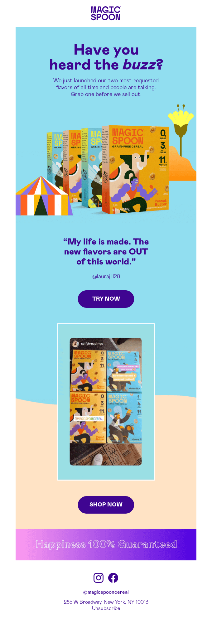
Similarly, Magic Spoon Cereal has used illustrations to make their cereal boxes seem more irresistible to a potential buyer. Truly tapping into the ‘eat with your eyes’ adage.
4. Animation in Illustration
Why use a simple illustration when you can blend it with another proven effective visual element – animation! That’s exactly what the New York Times has done in this Father’s Day emailer. A cute father-child figure made of crossword blocks, and animated to incorporate an element of mobility is downright endearing. With such an attention-grabbing header, you can be sure that the recipient will scroll through and read what you have to say.
If the rest of the message resonates with them equally well, they may as well act on your CTA.
5. Seasonal messaging
The holiday season presents the perfect opportunity to create some fabulous illustrations. From Halloween to Christmas, every prominent holiday or festival comes with its own vivid imagery that already has a great recall value for people across the board.
Using these themes to create illustrations for announcing sales, promotions, discounts, new launches, etc can be a smart way to grab your readers’ attention. Just the way it has been done in the above holiday discount email from Rifle Paper Co inviting its subscribers to avail of the 30% off on a range of products.
This DesignModo emailer, also announcing a 30% off on Halloween, follows the same strategy. And pretty much nails it.
6. A Warm Welcome
Illustrations can also be a great way to engage with new subscribers on your list and make a lasting impression on them. Using fun, quirky designs to appeal to your subscribers’ sense of levity can help you create a favorable first impression. This can go a long way in ensuring that they continue to engage with your subsequent emails as well, and not consign them to the trash bin unopened.
These welcome emails by Casper and Headspace are both fine examples of how illustration can – and should be – used in welcome emails.
The quirky figure of a man enjoying a good night’s sleep against a soothing purple backdrop depicting the night, for instance, conveys the brand messaging without needing any words. Similarly, the cutesy orange mascot used by Headspace is egging you on to start meditating to imbibe its Zen-like energy.
7. Telling a Story
Creating a storyboard using illustrations is a simple, classic approach that remains effective no matter what the medium. So, it makes sense to incorporate it in your emails to craft a captivating message with minimal effort.
In this email, for instance, David’s Tea – a specialty tea and tea accessory brand – is using illustrations to tell a story about a customer’s journey with them. It also nails the personalization element to a T by making the entire messaging about the recipient, even though the email is about the brand’s 10th anniversary.
The Takeaway
Illustrations are an effective tool for enhancing the appeal of your emails to your readers as well as creating a positive brand image. To truly tap into their full potential, it’s important to mix things up a little and use illustrations in conjunction with other elements. For instance, subtle touches like using animated illustrations or blending them with GIFs and images can make them more eye-catching and appealing. These are also a great tool to bring abstract concepts to life.


Kevin George
Latest posts by Kevin George (see all)
Email Automation, Artificial Intelligence, and Personalization: The Perfect Trifecta To Deliver More Relevant Campaigns
5 Easy Strategies to Boost Customer Loyalty and Enhance Customer Retention Marketing in SFMC