
Your target audience doesn’t care what you’re offering. They’re only interested in whether or not you’re giving them what they want in the way they want it.
You’re blasting out 2-3 promotional emails every week to all your segments. You might be generating opens too. But after that, there’s a prolonged, unexplained hush…
Many things could be getting in the way of your subscribers.
But if this is the general pattern of their interest in you, ten to one, you’re not giving them what they want in the way they want it.
Someone habitually checks their emails on their Samsung tablet. Another is hooked to their mobile phone; yet another won’t even check emails unless their Apple Watch alerts them with a notification.
And these three people may be on your contact list. Or it could be just one person viewing your emails on different devices at different times in different circumstances.
This is where responsive design comes in. Designing for devices. Designing for people. Email marketing and responsive design are intrinsically linked.
We’re an old hand at this, designing responsive emails for ten years now. By the end of this post, you’ll learn everything about responsive email design. Let’s get started.
- What Is Responsive Email?
- How to Create A Responsive Email?
- Types of Responsive Email Designs
- Advantages of Responsive Email Design
- Get A Head Start!

What Is Responsive Email?
A responsive email is an email that is optimized for a variety of devices and screen resolutions, such as desktop, mobile, and wearables.
Back in the day, when email marketers sent fixed-width emails, mobile users had to swipe right and left to read the content.
Responsive design solves this problem by allowing users to view emails as and how they want it. Below is a responsive email in action.
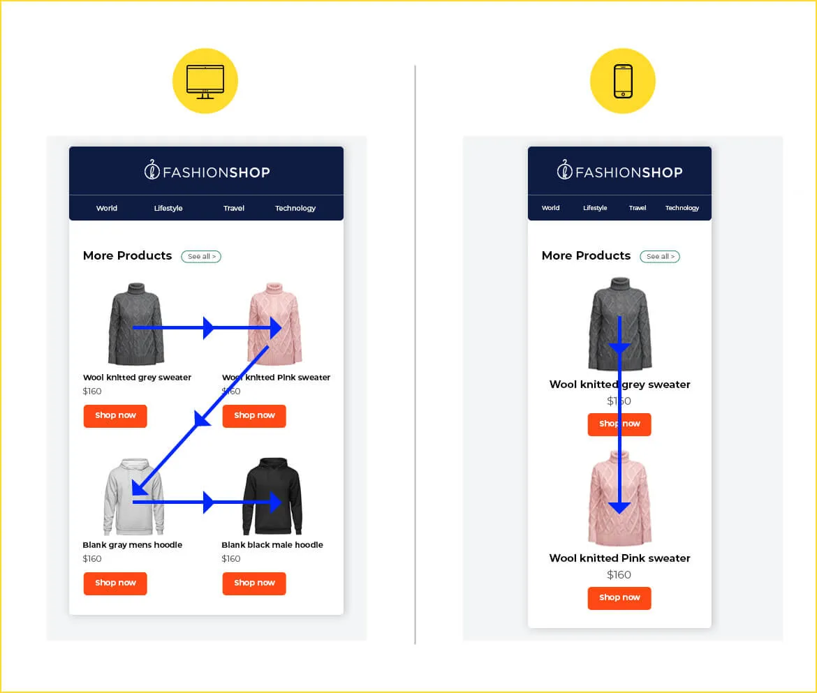
In the above example, the two-column layout on desktop resolves into a single column on mobile, leading to better subscriber experience and strong brand impression.
Responsive design is a necessity, but it becomes more critical during one-off events and certain times of the year. Take the case of limited sale campaigns.
Limited offers, countdowns, back-in-stock emails, etc. require users to act fast. If these emails are only viewable on a desktop, what happens to those who receive them while on the subway, in a restaurant, or elsewhere?
Remember, two-thirds of your list likely includes these individuals.
During the holiday season, when people are mostly traveling, mobile and wearables are their sole entry points to the online world. If your emails are not optimized for these devices, you’re not just preventing revenue generation, but potentially ousting people from your list.
How to Create A Responsive Email?
To create responsive email designs, developers use fluid tables, images, and CSS media queries to ensure the content adjusts seamlessly across different screen sizes.
Media queries transform fixed-width tables and images on desktops into fluid elements that display properly on smaller screens.
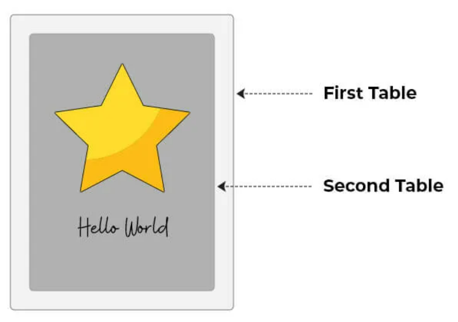
Email layouts are created using tables within the email body. To achieve the desired design, tables are nested inside outer tables.
For example, consider the following code snippet.
<table border="0" cellpadding="0" cellspacing="0" width="600">
    <tr>
    <td>
    <table>
           <tr>
               <td>
               <img src="images/xyz.jpg" width="280" alt="" />
               </td>
           </tr>
           <tr>
               <td>
                   Hello World
               </td>
           </tr>
    </table>
    </td>
    </tr>
</table>
The above code will create a table containing an image and a text, nested within a larger table (600px wide), as shown below.
To make the table flexible, you need to add the class='wrapper' tag to the outer table:
<table border="0" cellpadding="0" cellspacing="0" width="500" class="wrapper">
The class="wrapper" is defined by the media query. Media queries use specified breakpoints to rearrange the layout based on the device’s screen size.
In the example above, the media query applies to devices with a screen width below 600px. The class=”wrapper” ensures that the table aligns to 50% width for these devices. The final code will look something like this:
@media screen and (max-width: 599px) {
              wrapper {
width: 100% !important;
}

           }

           .
           .
           . (Here come remaining CSS code for defining other
           . styles and header of your emails)
           .
           .
           .

<table border="0" cellpadding="0" cellspacing="0" width="550">
    <tr>
       <td>
          <table>
                <tr>
                   <td>
                          <img src="images/xyz.jpg" width="280" alt="" />
                     </td>
                </tr>
                <tr>
                     <td>
                           Hello World
                     </td>
                </tr>
         </table>
      </td>
   </tr>

</table>
The use of !important is crucial because inline styles typically override styles defined in media queries. By applying !important, the styles within the media query can take precedence over inline styles.
Types of Responsive Email Designs
We can broadly categorize responsive email design into the following subsets:
- Scalable or mobile-first design
- Liquid or fluid design
- Spongy or hybrid design
- Adaptive design, and
- Responsive-aware design
Mobile-first or Scalable Design
In scalable email designs, the layout adapts seamlessly to various screen sizes, ensuring compatibility across different devices. They are also called mobile-aware designs.
Note that in scalable design, everything scales proportionally to the screen size, but the layout itself remains unchanged.
Liquid or Fluid Design
Fluid email designs utilize percentage-based sizing, allowing the width of tables and images to automatically adjust according to the screen size of the device.
Notably, fluid email designs are better suited for text-heavy emails. They don’t rely on media queries, and are not particularly suitable for complex layouts.
Spongy or Hybrid Design
Hybrid design uses percentage widths and media queries, aiming for wider support across email clients.
Hybrid design is not easy to implement as it requires extensive coding skills.

Adaptive Design
Adaptive design uses media queries to set specific breakpoints at certain screen widths. At these breakpoints, the email content is reformatted or rearranged to optimize for the screen size.
Responsive-aware Design
Responsive-aware design uses responsive design only for the header, navigation bar, footer, and the recovery module while the rest of the email is mobile-aware.
Responsive Email Design Best Practices
To implement responsive design correctly, consider the following responsive email campaign best practices:
- Use a single-column layout within the range of 600 to 640 pixels to ensure readability on small mobile screens
- Design your emails in portrait mode rather than landscape, as not all desktop users view emails in a full-screen window
- Follow Apple’s guidelines by keeping links and buttons at a minimum size of 44 x 44 pixels
- For iPhones, maintain a minimum font size of 13 pixels to prevent automatic upscaling that can disrupt the layout
- Keep the email copy short and concise, placing important visuals above the fold. Ensure ample white space to provide a comfortable reading experience
- Use the code mobilehide{ display: none !important;} to hide certain content on mobile devices
- Include small, responsive images with appropriate alt tags. For retina screens, use images at 2x resolution. Apply attributes like width:100%; and max-width:x;
- Always test your emails across various email clients and devices to ensure proper rendering. Use web-safe fonts for correct text display on various email clients
- Follow a logical visual hierarchy for mobile-friendly email design
- While creating a responsive HTML email, don’t forget to provide a plain-text version of your email as many clients don’t support HTML
- Make sure to optimize your emails for Dark Mode compatibility. You can learn how to do that by reading our post on Dark Mode in emails

Advantages of Responsive Email Design
The following are some of the main advantages of responsive design in email:
- Responsive design enhances subscriber experience by increasing the scope of interactivity
- Responsive emails lead to better engagement, potentially reducing the number of unsubscribes
- Next to consistent design, responsive emails maintain brand consistency, eliminating UX disruptions across devices
- Emails that are responsive have a higher chance of generating conversions than those that are not
Need A Head Start?
Designing responsive emails is hard. Email rendering is complex because you need to get your email pass functionally more or less unaltered through your ESP, email clients, different operating systems, web browsers, and devices/screen sizes.
In fact, there are potentially 300,000 renderings for every email you send, go figure!
So, by the time an email reaches the intended inbox, it has gone through several conflicting environments, rendering layers, and platform turbulences. Yes, Gmail and other clients are slowly starting to support renderability, but the fact remains that email is an open platform with no universally accepted coding standards.
We couldn’t go beyond the basics of responsive email in this blog post. But if you want to understand it in depth, head to our series on responsive design.
Susmit Panda
Latest posts by Susmit Panda (see all)
The Ultimate Guide to Images in HTML Email
E-commerce Landing Page & Email Templates: 5 Common Mistakes & How to Avoid Them