Even though the past decade or so has witnessed the emergence of various new channels of communication, brands continue to be as loyal as ever to email. And why shouldn’t they be? Email marketing offers them a range of benefits so vast that other channels would have a hard time replicating; implementing personalization at scale, promoting brand awareness, boosting sales, collecting feedback, owing contact lists, generating greater leads, and effectively monitoring campaign performance- these are but only a few of the merits that email marketing brings to the table.
However, before you start pouring your time and resources into stunning, impactful email campaigns, there’s one basic requirement you need to take care of- collecting email addresses. This is where email capture landing pages come into the picture. Curating a landing page that can compel visitors to share their email addresses is a precise art and can take a fairly long time to master. But, fret not! We aim to fast-track the process for you; in today’s blog post, we share a handful of techniques that will help you design a high-converting email capture landing page with ease. Can’t wait to discover what we have in store? We don’t wish to keep you waiting either; let’s go!
Emphasize Your Value Proposition
Why must someone choose your brand over your competitors? Pondering long and hard over this question will help you obtain clarity regarding your unique selling proposition which you can then subsequently leverage in your email capture landing page, thereby increasing your conversion probability. Spare no measure in elucidating attributes of your product or service that make your business a notch above the rest; tell your visitors what they stand to gain by opting into your offerings (or stand to lose by not; if you want to play that game!).
Essentially, the “why” is the foremost question your email capture landing page must answer to have a realistic shot at capturing the email addresses of your visitors. Once this aspect is taken care of, focus on stating, as clearly as possible, the next steps they would have to follow to hop onto your business’ bandwagon and, of course, avail of the value you promised them.
Supergoop’s email capture landing page is an ideal illustration of the points we just discussed.
Leverage Personalization to Grab their Attention
Different visitors land on your website through different channels, right? So, instead of flashing the same email capture message to them all, how would it be if you wrote a custom message for each channel? Rather impactful, you’d agree! In 2024, personalization is the name of the game. Gestures, big or small, don’t matter; so long they’re genuine and aimed at catering to the unique needs and interests of your visitors, they’ll definitely get noticed. Creating personalized landing pages for visitors from different traffic sources is sure to do your conversion rate a whole world of good.
Keep the Form Simple
What do you need from a visitor to send them an email? Their name and email address, correct? Well then, ideally, these are the only two fields that should be present on your email collection landing page form. Of course, we do understand that this is the age of omnichannel marketing, and hence, can’t really fault you for requesting visitors’ social media handles and contact numbers as well in your form- the bottom line is don’t include anything in your form that can be deemed non-essential. Why? For, then, you stand to arouse the visitor’s suspicion; don’t forget that they are, after all, sharing personal information with you. Suspicions aside, expecting visitors to invest a considerable period of time in filling out a long form on your website isn’t practical in the first place.
Therefore, if you want to have a realistic shot at collecting email addresses, keep your forms short and sweet. And no, don’t take our word for it. Create two versions of your form- one with few fields, and one with many- and run an A/B test to gauge the best-performing variant yourself.
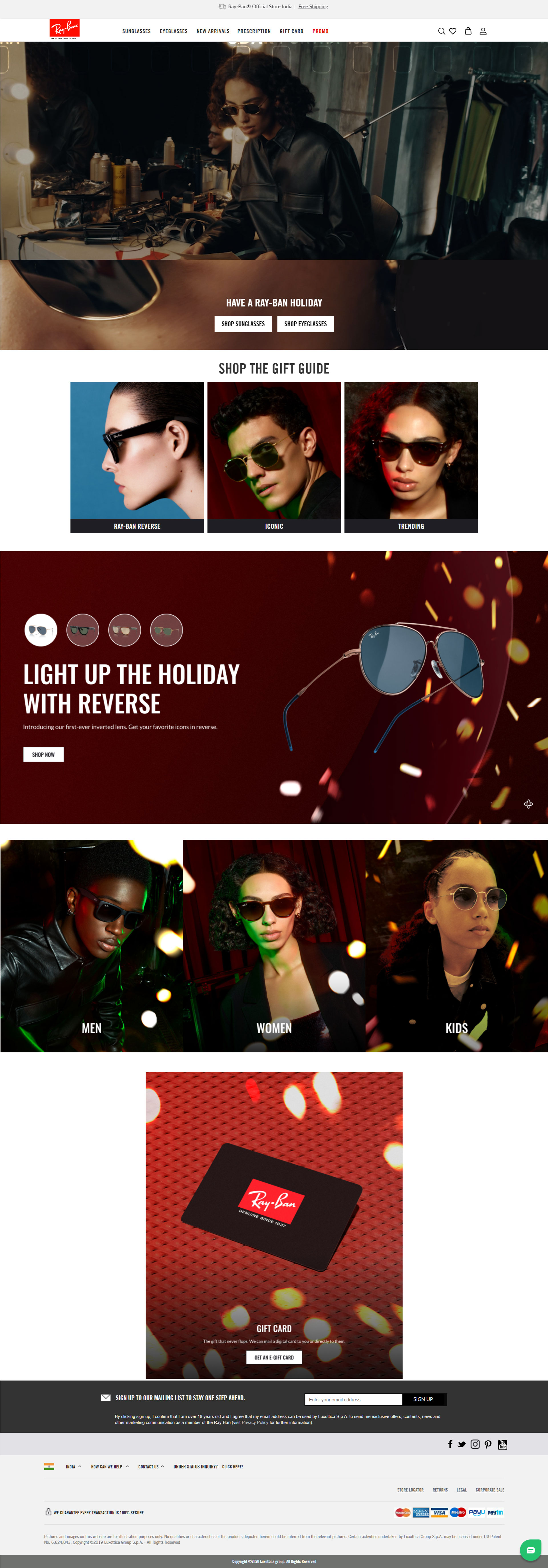
The form below on Ray-Ban’s landing page is the kind you should be looking to emulate.
Include a Lead Magnet
Remember how a little while earlier we talked about the importance of clearly mentioning the “why” in your email capture landing page? Well, this is sort of going to be an extension of that school of thought. You see, sometimes, your value proposition won’t be enough of a reason for visitors to choose you over your competitors; the modern-day customer is extremely spoiled for choice. And so, you need to do a little something extra to captivate their imagination. Say, something like, you guessed it- including a lead magnet! In exchange for visitors sharing their email address with you, offer them something valuable.
Now, this could be anything: ebooks, case studies, whitepapers, product samples etc. Just ask yourself if it is a good enough incentive for visitors to drop their email addresses. Other than acting as incentives, lead magnets also double up as tangible expressions of gratitude from your end, which is why they are so effective and widely deployed by all kinds of businesses out there.
Choose the Right Media to Showcase Your Product/Service
The underlying objective behind collecting email addresses is to sell your products or services to more and more people, right? Now, in order to do this effectively, you need to cast a good first impression in your email capture landing page; the kind of media you choose to advertise your product/service can go a long way toward determining this.
You have many modes of representation at your disposal: static photos, video, GIFs, and animated illustrations, to name some. What’s important is that you pick the mode that aligns best with the nature of your product/service as well as your brand personality.
See how Graza have gone about displaying their products in their email capture landing page.
Remember, Social Proof is Your Best Friend
The best salesperson in your team is…actually no one from your sales department but a glowing testimonial from a customer. No matter how persuasive and suave your ads are, they won’t be able to persuade new visitors with the same vigour with which a review from a satisfied customer will. And that’s exactly why you should always look to include social proof in your email capture landing page.
To drive home the authenticity of the testimonial/review you’re adding, make sure to add the customer’s name, image, and even their social media handle, if possible. Sometimes, businesses look to bait in visitors with the help of counterfeit testimonials, but such acts can be easily found out, and when they are, the reputation of the business goes for a toss. Apart from customer reviews, if you have any well-recognized publications vouching for your offerings, you can very well add that to your landing page, too. There are few better ways of establishing your business’ credibility in the minds of new visitors than social proof so leverage them as best you can!
Take a look at how deftly Magic Spoon have used social proof in their email capture landing page.
Get Your CTA Right
Should your landing page not have a powerful CTA, its overall appeal can get dampened to a significant extent. A good CTA need not be witty or clever but rather successful in its attempt to invoke a sense of urgency in the visitor’s mind and eventually nudge them towards the action you desire them to. Most importantly, your CTA phrase should be able to give your visitors a clear idea of where they’ll be led to upon clicking on it.
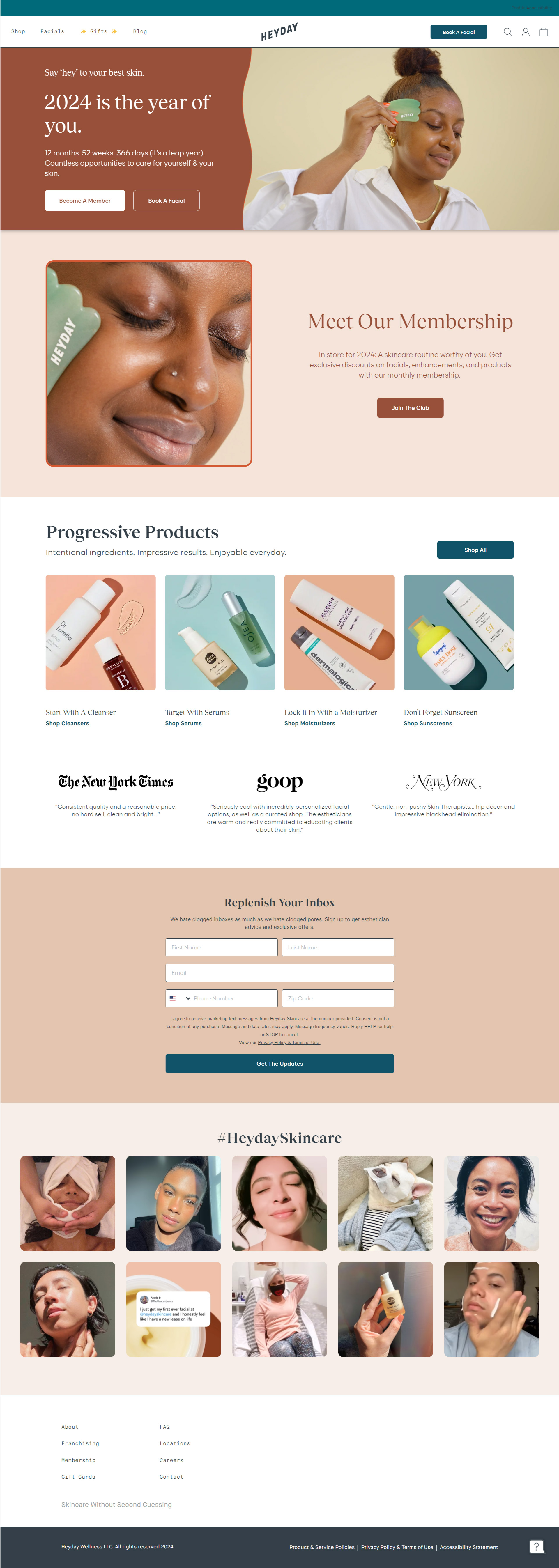
Heyday’s CTA game is on point in their email capture landing page.
Wrapping It Up
We hope the insights and examples shared above have been able to give you a satisfactory idea of what goes into designing a winning email capture landing page. All that remains for you now is to put these learnings into action. What’s stopping you then? Off you go, on your merry way, collecting as many email addresses as you please!


Kevin George
Latest posts by Kevin George (see all)
Craft Impactful Email Campaigns With These 8 Truly Empowering Women's Day Email Inspirations!
11 Proven Ways to Ensure Bulletproof Security for Salesforce Marketing Cloud