As parents and children gear up to wash themselves excited with the thrills and frills of the back to school season, marketers prepare to tap into the generous consumer spending that is characteristic of the season. With one in four already claiming to have spent more on school supplies in 2022 than in 2021, this back to school season is all set to be competitive like never before for businesses out there. To cut through the noise, you would need to enchant your audience with pixel-perfect and impactful campaigns. Wondering how you can go about it? Why, by picking up a trick or two from the stunning email inspirations we are going to showcase in this article, of course!
Smockingbird Kids
Subject line: Last Chance Order New Back to School Today

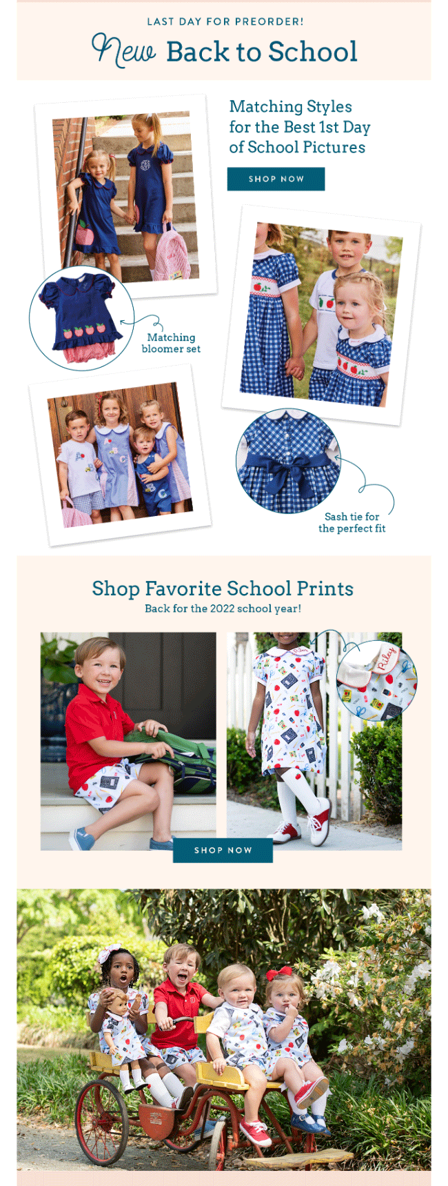
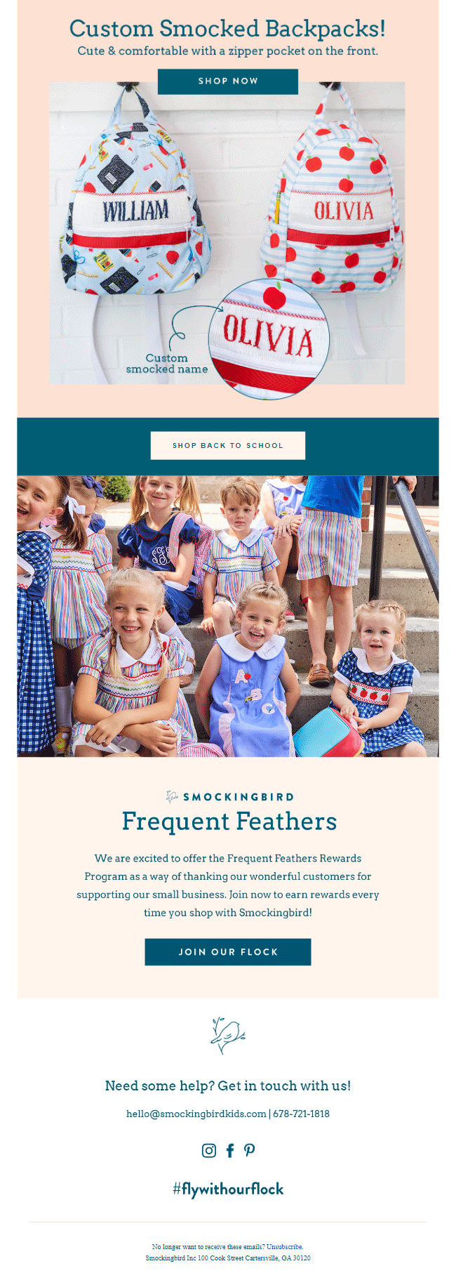
Using GIFs in your email’s hero section is an excellent ploy to attract your subscribers’ attention. No, you don’t have to take our word for it. All you need to do is direct a single glance towards Smockingbird Kids’ delightful back to school email over here.
What we particularly love about this email design is the manner in which they have showcased their products. Besides including high-quality pictures of their dresses, they have also highlighted the unique features of each. Taking the help of illustrated arrows to call the reader’s attention to it is a brilliant touch too.
The email has been crafted in a single-column layout which makes it accessible and mobile-friendly. Not to mention the smooth navigation it facilitates. Every content segment has its own CTA (call-to-action) button, which makes matters quite convenient for the subscribers. The buttons are prominent, for they contrast sharply against the email background and are quite enticing, thanks to the smart CTA phrases they have been provided with.
Shein NL
Subject line: Don’t Miss the School Bell! BACK TO SCHOOL is back!

Shein’s hero image perfectly encapsulates the spirit of the back to school season. To spark their reader’s interest, they have highlighted their special offers using bold typography. The email is heavy on images which renders it a high visual appeal. And the best part is that the visual elements aren’t present to just serve as eye candy but to make the overall content more comprehensible for the audience. For instance, one can instantly identify the different product categories in the email even without reading the text. Simply looking at the images that accompany them provides you with more than enough context.
Kidbox
Subject line: The BACK-TO-SCHOOL List Is Here!

If you have different products and want to learn how you can cleverly segment them in your email using design, look no further than this email by Kidbox. Apart from placing their blocks in three different blocks, they have also used separate background colors for each to make the sections visually distinctive to a fault.
The email doesn’t tire the readers by overusing a single element- while it uses images for tees, denim, and backpacks, it employs illustrations to denote the “mystery grab bag,” essentials, and free shipping. Mixing up visual elements in this manner is a good tactic to keep audiences glued to your email.
Tiny Cottons
Subject line: Back to School
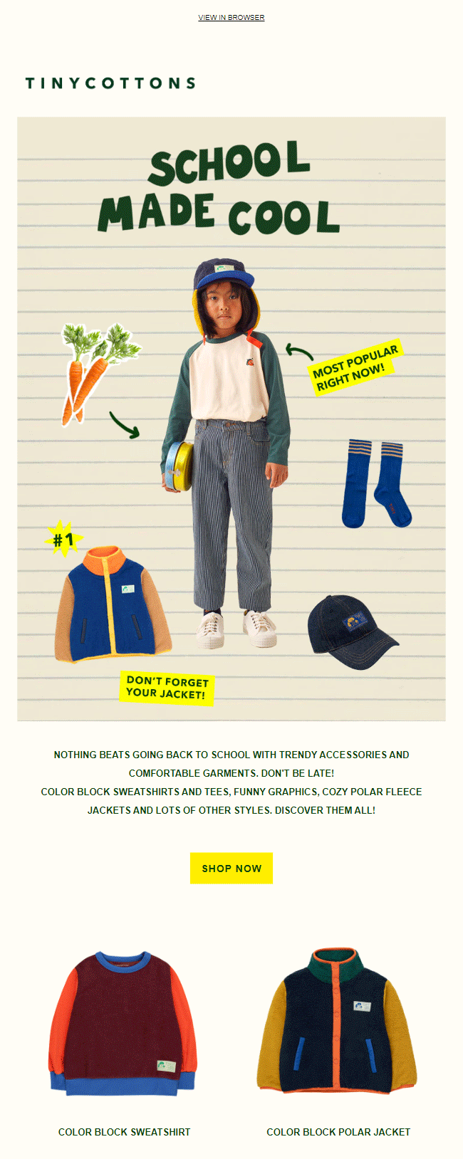

Nothing screams back to school more than using a notebook-themed background for your images, isn’t it? Our favorite thing about this email is that it has the visual aesthetic of a page taken from a student’s scrapbook. The email copy is crisp, to the point, and has a friendly tone which makes you want to take action against the CTA that follows it.
Sparkle In Pink
Subject line: Guess what’s back?

Sparkle In Pink’s back to school email is a masterclass in how businesses can make use of bold typography to make their emails visually breathtaking. In most cases, the absence of a variety of visual elements tends to make the email monotonous, but here, just the usage of bold typography holds up well simply because the email is extremely brief, to begin with.
To highlight their discount, they have used a combination of different typographies, making the resultant output highly pleasing to the eyes. Here, Sparkle In Pink utilizes icons to provide additional context for their intangible offerings to their readers.
The TouchPoint Solution
Subject line: Your July 2021 Update
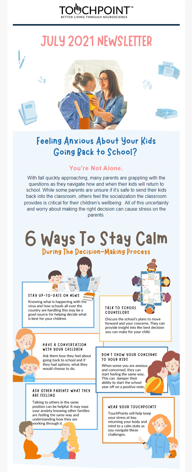

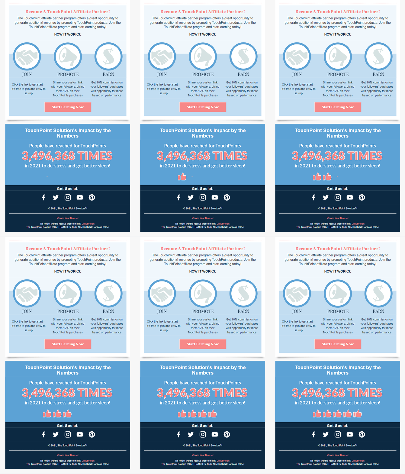
From a consumer’s perspective, the back to school season isn’t just about spending money on school supplies. It is also about dealing with a host of emotional and psychological factors that are associated with sending their children back to school after a long break. The TouchPoint Solution addresses precisely this topic in their email. Given the sensitivity of the subject at hand, they have made skilled use of illustrations to keep it from appearing overwhelming.
Even though the email is text-intensive, it has been laid out in such a manner that it appears uncluttered.
Munchkin
Subject line: Let’s Get Personal for Back to School
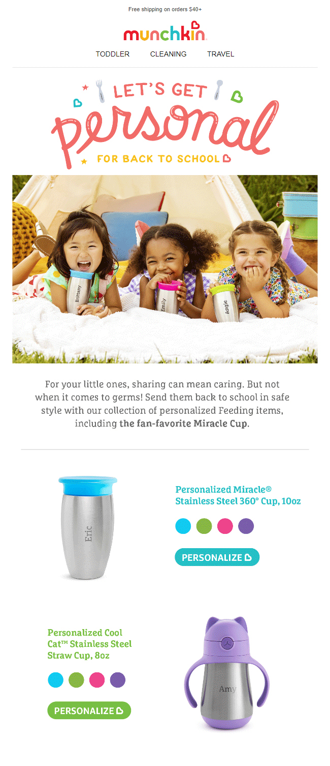
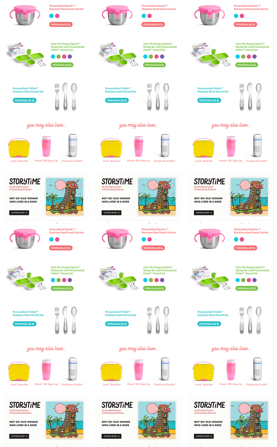
Now, isn’t this hero image among the cutest you have ever seen? What we really appreciate about this email is its choice of typography. Often, brands make the mistake of using an overly formal typography in combination with playful text. As a result, the overall tone of the email becomes rather confusing.
Here, Munchkin have perfectly synced the wavelengths of their typography and visual elements. The images of the products have been accorded ample white space, which makes that complete section appear neat and quite pleasing to engage with.
The Happy Planner
Subject line: 6 Tips to Prepare for Back to School!

Designing your email with motifs that unambiguously represent the occasion you are talking about is a great way of generating interest in your readers’ minds. This email from The Happy Planner drives our point home perfectly. Pencils, pencil shavings, scissors, sharpeners, markers, erasers, and rulers- when you spot all these elements in an email’s hero image, you will instinctively understand that this is a back to school email. Once the theme of your email is established, pitching your offers becomes that much more easy.
Cozy Earth
Subject line: Back to school tiring you out?

We’ve said this before, and we’ll say it again- we are a huge fan of brands that somehow manage to make their offerings relevant to the occasion at hand. Case in point here is this email by Cozy Earth. While businesses dealing with school uniforms, stationery, and tiffin packs are expected to steal the show during the back to school season, if you are as innovative as the folks at Cozy Earth, you will always stay ahead of the curve.
The design of the template is unfussy, laced with high-quality images, stylish typography, and witty copy. (Just us or you would also want to keep staring at that delightful background color all day?)
Marshalls
Subject line: The back-to-school excitement is real
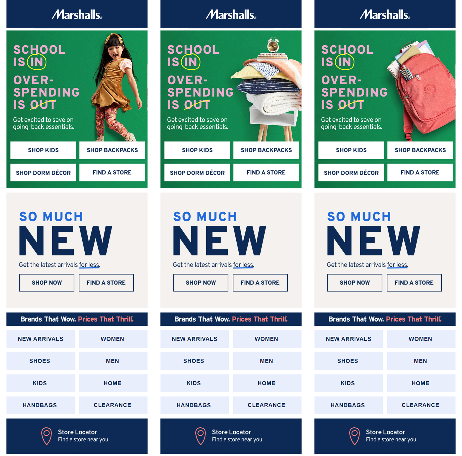
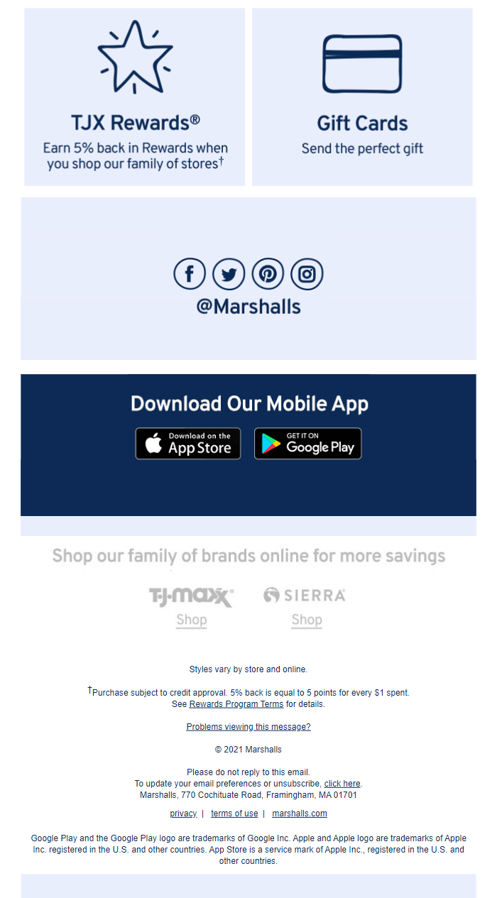
This back to school email from Marshalls is bound to grab its reader’s attention the minute they open it. An attractive GIF with a clever copy- you can’t do much wrong with that combo, can you? If you observe closely, you will notice that apart from the hero section, the rest of the email is quite minimal. Pretty smart, if you ask us. GIFs are visually rich elements. Introducing other design elements along with it can cause your templates to look cluttered.
SmartyPants Vitamins
Subject line: Our #1 back to school recipe
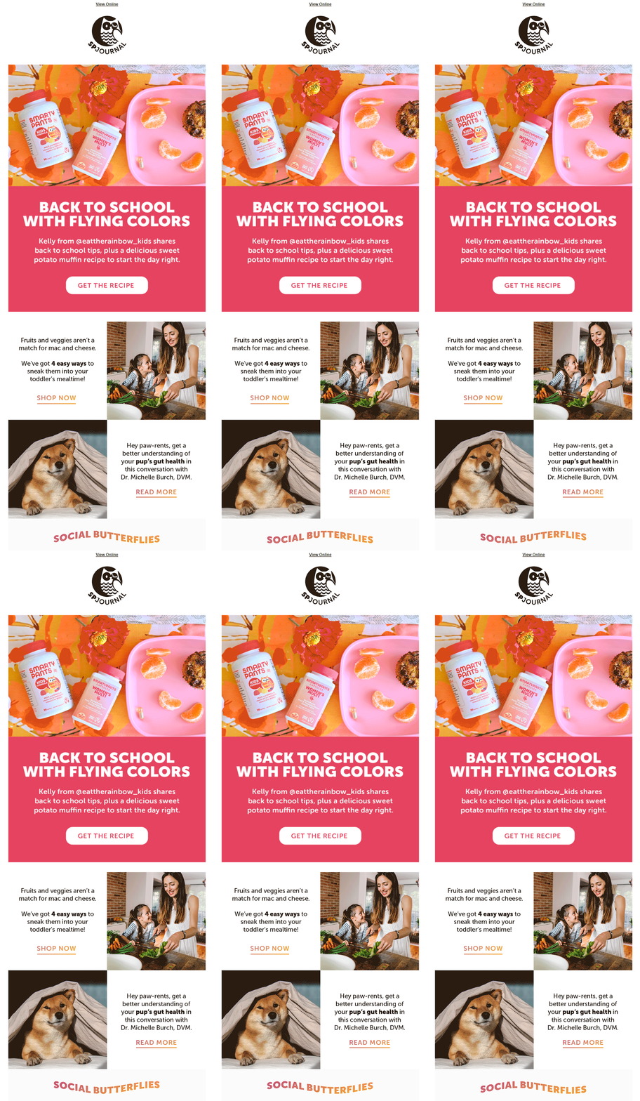
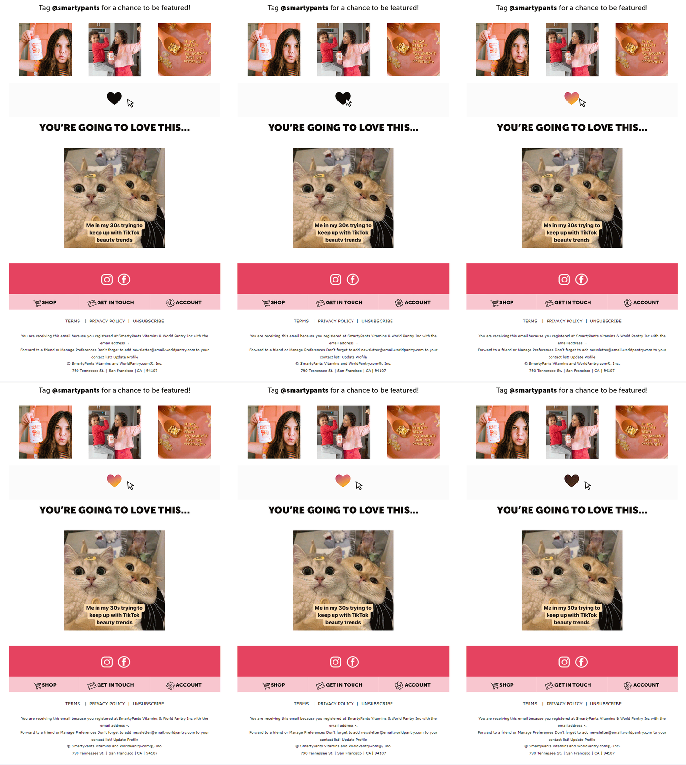
Who would bounce from a back to school email whose hero image is as vibrant as that of SmartyPants Vitamins over here? The email is punctuated with extremely simple animated elements at regular elements to make certain that readers don’t lose interest and scroll right to the end. Another thing that stands out in this email is its humor. Such an email never fails to charm its audience.
Surf Dive’ n Ski
Subject line: Head Back to School In Style
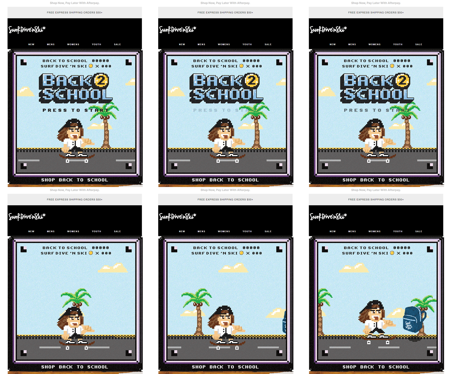
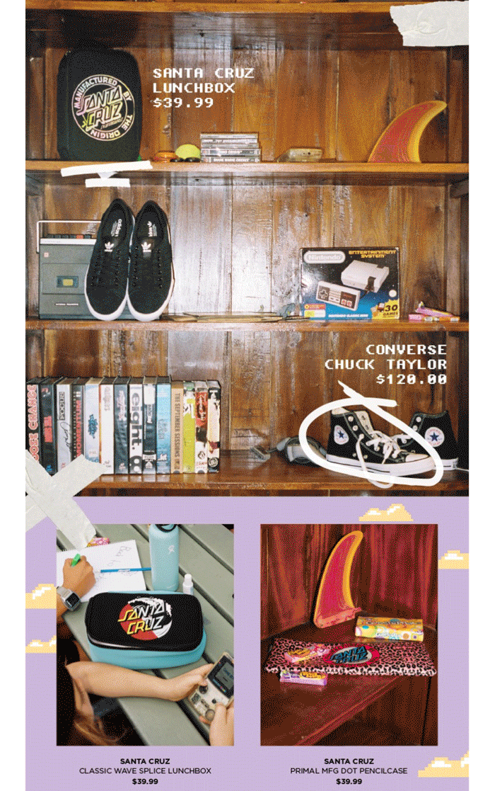
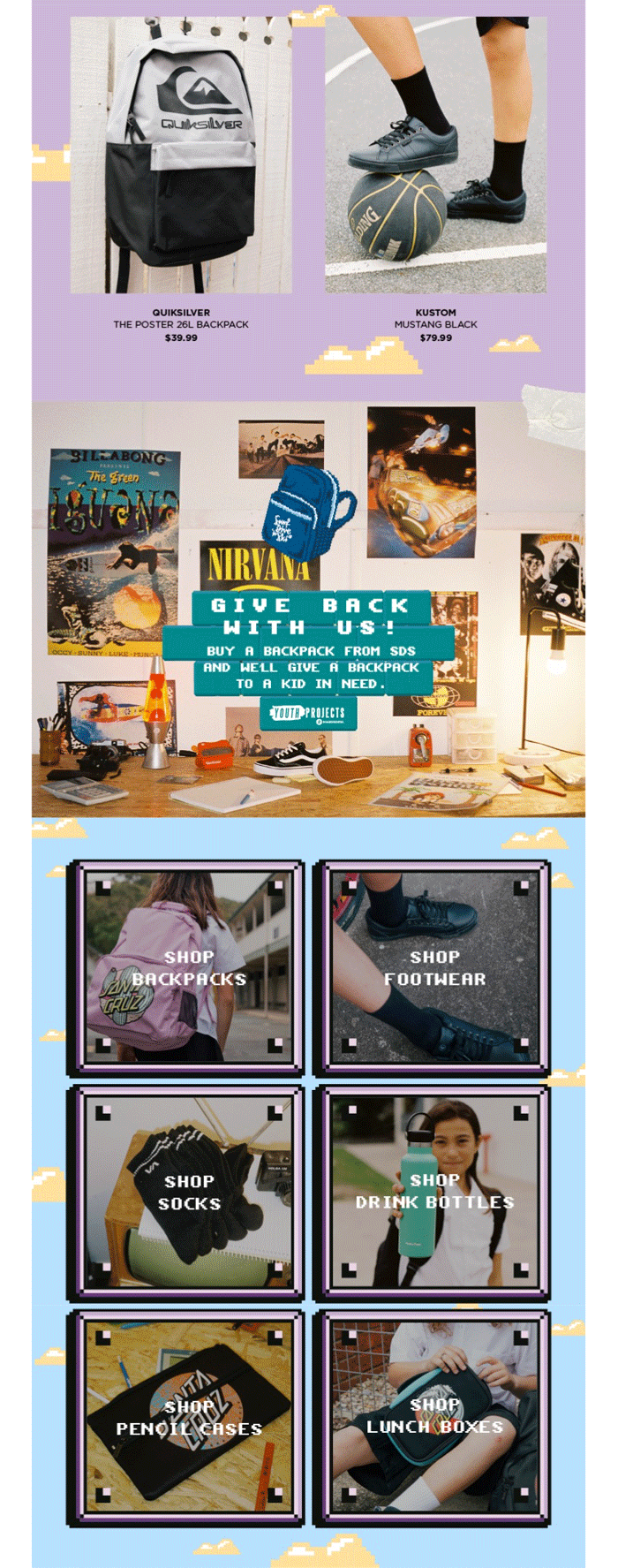
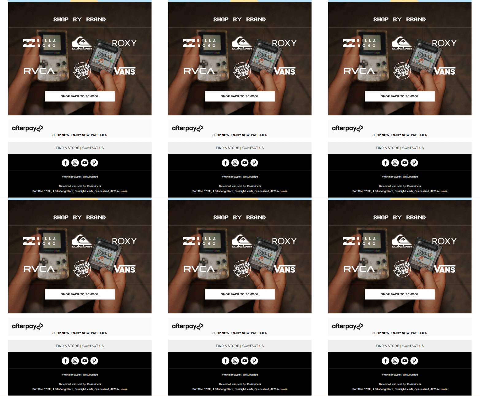
There are many things to love about this back to school email from Surf Dive’ n Ski, but we will start by addressing the most obvious bit- the back to school-themed video game animation. The GIF cleverly addresses the products that consumers should be aiming to add to their cart during this season. To maintain consistency, the GIF’s font has been extended to other aspects of the email as well. The prices of the products are mentioned in the email itself to fast-track the customer’s decision-making process.
Wrapping It Up
Now that you know how the best in the business go about their back to school emails, we hope you have gained enough insight to launch winning campaigns for your brand. We can’t wait to see what you come up with!
Need help with creating back to school emails for your brand? We got your back.


Rohan Kar
Latest posts by Rohan Kar (see all)
Using AI to Write Email Copy- Navigating the Pros and Cons
A detailed guide to help you ace your Email Template Design