Building a landing page involves a diverse range of “points to remember” in order to generate conversions. Some of them include page design, development, customer psychology, copywriting of course, user-friendliness, and other science-and-art combinations. Besides all these, the typography on the landing page also plays a vital role in engaging the reader.
Your words and the way they are presented both make a huge impact on the reader’s mind and ultimately hinder or facilitate their decision making. That’s because people treat fonts like humans and assign a unique personality to each. For instance: Some professionals do not find Comic Sans font appropriate for a resume or business proposal. Arial is a suitable font for such documents.
Before diving deeper into the concept of landing page typography, let’s brush up the fundamentals.
1. Types of Fonts
- Sans-serif
Fonts like Arial and Verdana that do not have any divots or embellishments at the ends of the letters fall in this category.
- Serif
Serif fonts have divots or flourishes at the ends of each letter. For example, Times New Roman.
- Script
Lobster and Sacramento are some examples of handwritten font faces. These look like cursive handwriting and are curvy with connecting strokes.
- Slab
These are extra thick font faces that have separate letter strokes with or without serifs. For example, Rammetto One and Slabo
Landing pages generally have sans-serif and serif fonts. Certain businesses prefer using slab or script font in the headline, but it is not advisable for body copy. Sometimes, you might have to use decorative fonts to promote a special offer, but it is not recommended otherwise.
2. Kerning and Leading
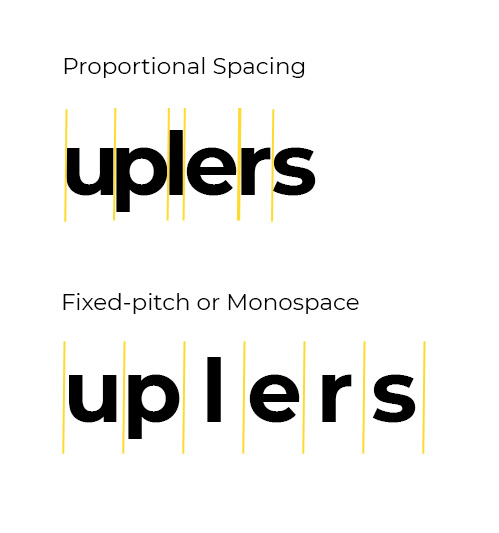
Kerning is the spacing between two letters while leading is the spacing between lines of text. These two parameters are as important as the typeface chosen.
When it comes to kerning, it can either be proportional or monospaced.
As far as leading is concerned, take a look at this image to understand it better.
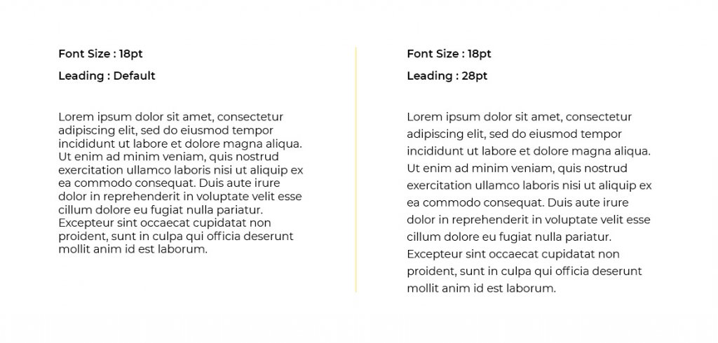
The text in the second version is easy to read and consume just because of the spacing. Also, remember that kerning and leading of a landing page (website) will render differently on desktop and mobile devices. Therefore, you must test the landing page before publishing or making it live.
You might as well seek expert advice and help from landing page experts at Email Uplers.
3. Size
Since computers and websites came into existence, it is a given that larger fonts represent important text and headings while smaller fonts are used for the body copy that is less important. The same principle applies to your landing page too.
From a usability and accessibility point of view, you must have a body font as 12pt for young readers and 14pt for older readers. You must go for an even larger size for the mobile layout of the landing page.
4. Color
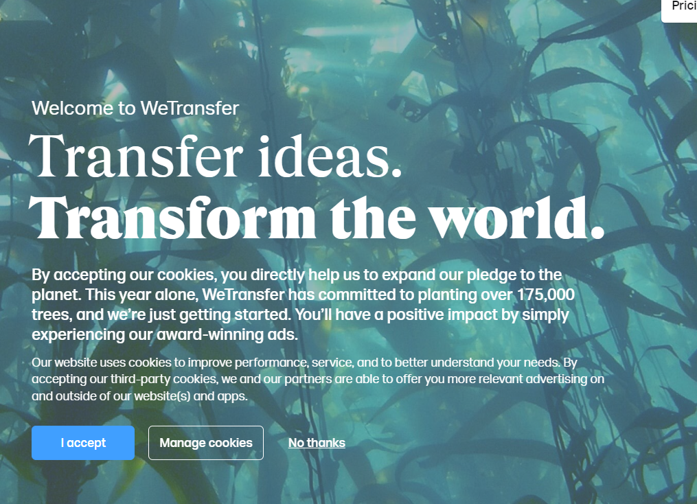
The font color will have a direct impact on the legibility of your page and the psychological impact on the customers. Therefore, you must ensure your font color is in sync with the emotional appeal you want to impart and the overall design of the page.
For instance: Check out this landing page that is not so easily readable.
(Discussed in detail in the next section)
5. Pairings
Rather than using uniform typography throughout the landing page, some marketers prefer using different typefaces. If you are one of them, you must pair up the fonts from different categories. For example: Montserrat and Courier New, Pacifico and Quicksand, Oswald and Lato are some of the pairings that bring out the best of a landing page.
Now, after having brushed up the basics, we shall understand the correct usage of typography in landing pages.
How to Pick the Right Typography for Effective Landing Pages?
An attractive offer and engaging copy will mean nothing if the users do not read it. With that in mind, we are here with top tips that can help you zero in on the most powerful typefaces.
1. Consider the target audience while selecting the typography
When you design a landing page, reflect on the target audience you wish to appeal to.
Let me share an interesting report with you.
Errol Morris carried out an experiment to figure out how typography can influence people’s perception.
He placed a paragraph claiming that we live in an era of unprecedented safety and added two questions.
1. Is the claim true? (Answer in yes or no)
2. How confident are you with the answer? (slightly, moderately, very)
If truth be revealed, Morris just wanted to determine whether fonts had an impact on people’s opinions. The participants saw the passage in different typefaces, namely Baskerville, Computer Modern, Georgia, Trebuchet, Helvetica, and Comic Sans.
Results:
The graph below shows the number of people who agreed to the first question.
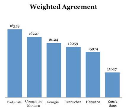
In the second graph below, you will get an idea about the weighted disagreement of the people.
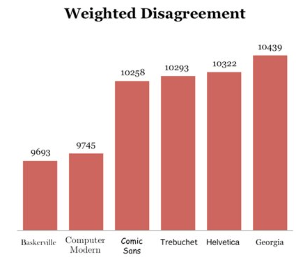
Comparing the two graphs, it is evident that the Baskerville font ranked highest for weighted agreement and lowest for weighted disagreement. Contrarily, Comic Sans had the lowest score for weighted agreement. It is kinda obvious because Comic Sans (as the name suggests) is more of a fun font.
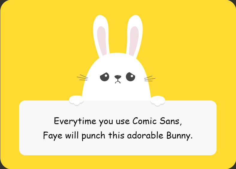
These results make it quite clear that the credibility of your landing page lies in the hands of the typography you choose.
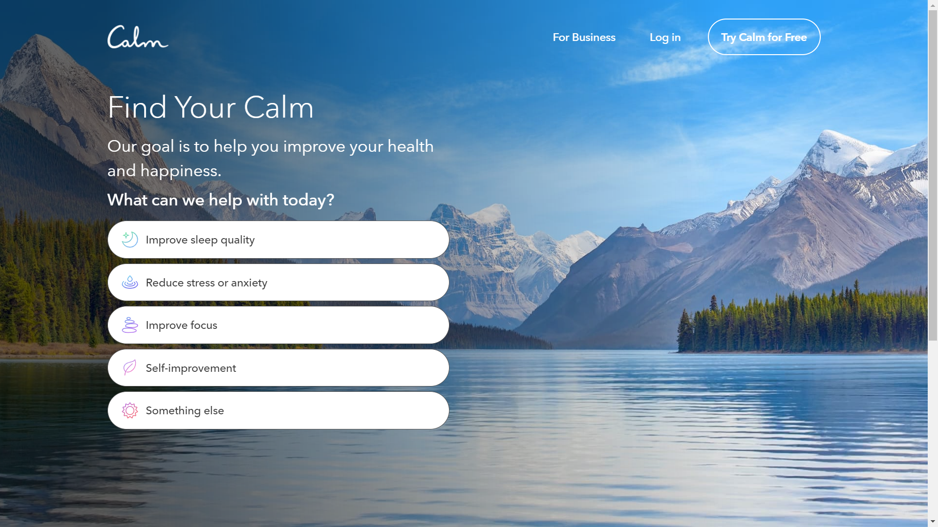
I cannot emphasize this enough that the typography should instantly communicate the purpose of your product or service. Take a look at this landing page by Calm. The colors, font faces, and CTA button are chosen in such a way that they comfort the reader and encourage them to take action.
Now, imagine the same landing page written in a bold and slab kind of typography.
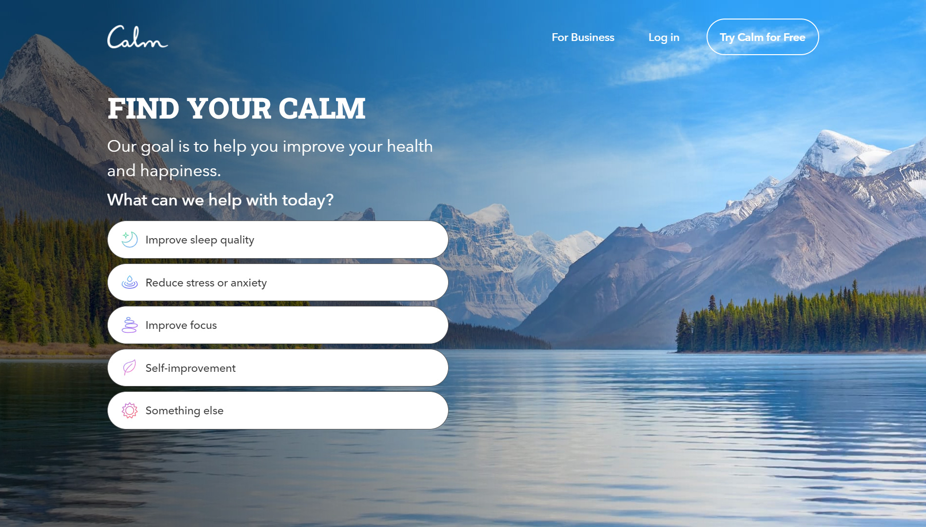
Which one has a better impact on the reader, according to you? The former, right? That’s exactly why fonts play such an important role in landing page designs.
2. Set a visual hierarchy with your typography
Take a look at this event landing page by Validity.
Notice how they have used different font sizes to manifest the visual hierarchy?
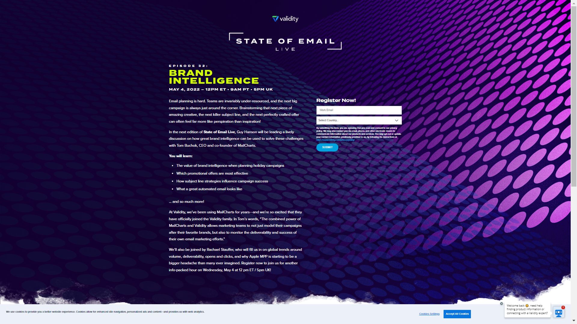
And you know the best part? They have done this with the help of a single font face – Arial.
Doesn’t it look professional and appealing at the same time?
This design nails two more aspects besides the font size – usage of the right color and avoiding too many font faces. (discussed in the following points)
3. Use the right colors to draw the reader’s attention
Just like the choice of the typeface matters, so do the colors you choose for the fonts. They should be in contrast with the background for easy readability. Your prospects will not take action, unless they are able to read what you have got to say.
Take a look at the landing page shown below where copywriting, typography, and choice of colors are all on point.
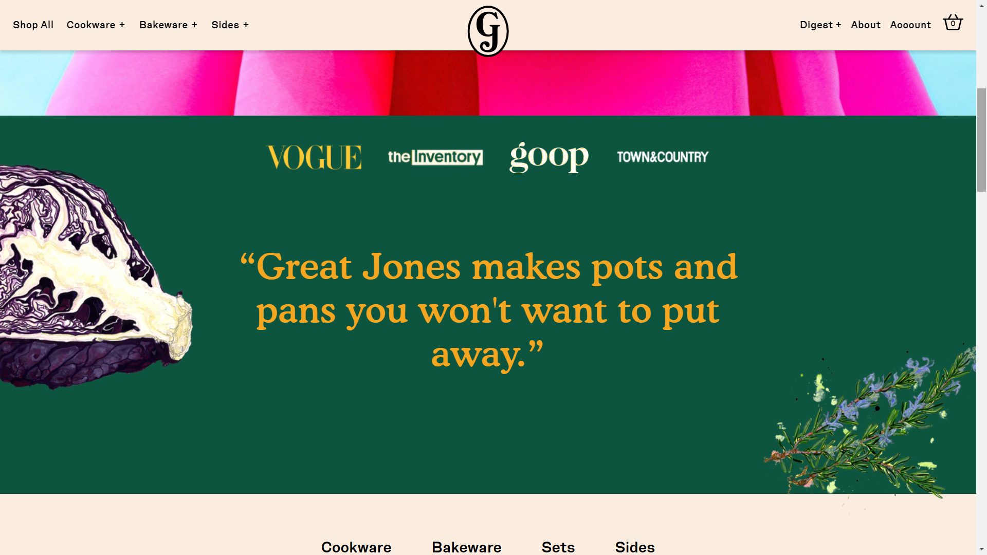
Apart from readability, colors are also used for emphasis. They should also express the brand’s personality and business type. Some brands use different colors for headlines, hyperlinks, and important points for the reader. The bottom line is that colors should guide the visitor’s eye and encourage them to read till the end.
4. Refrain from using too many font faces
Using too many font faces is not advisable as it will overwhelm the readers and screw up their experience. As a best practice, you can use two font faces – one for the header text and another for the body copy.
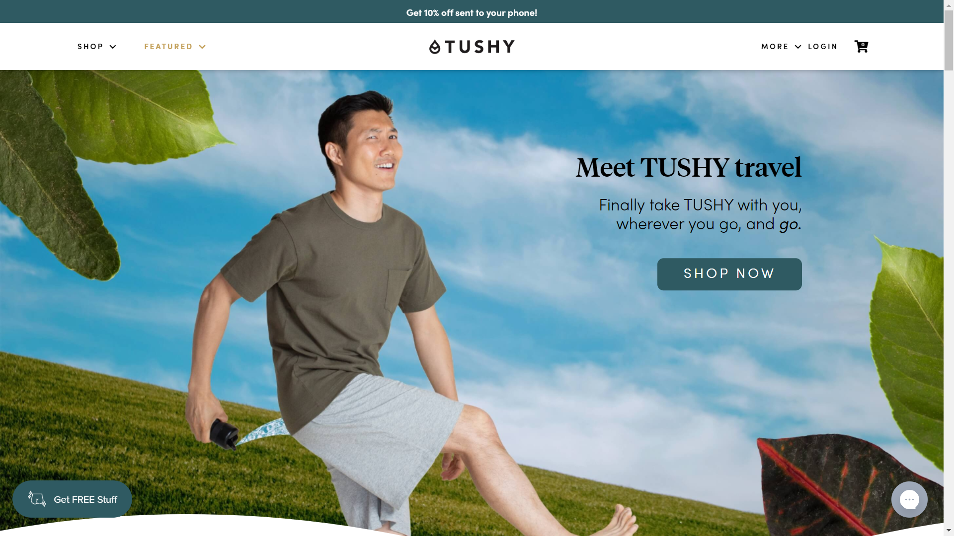
Here’s a product landing page example by Tushy in which they have used two fonts for the headline and subheadline.
5. Take the help of fancy fonts, but only when necessary
It might sound contradictory, but fancy fonts can affect the readability of your landing page. They can also affect the loading speed if they take too long to download. This does not mean that you should break off with custom fonts. It just means that you must take care of the loading speed while choosing such fonts. Readers should not leave your page because of slow loading speed.
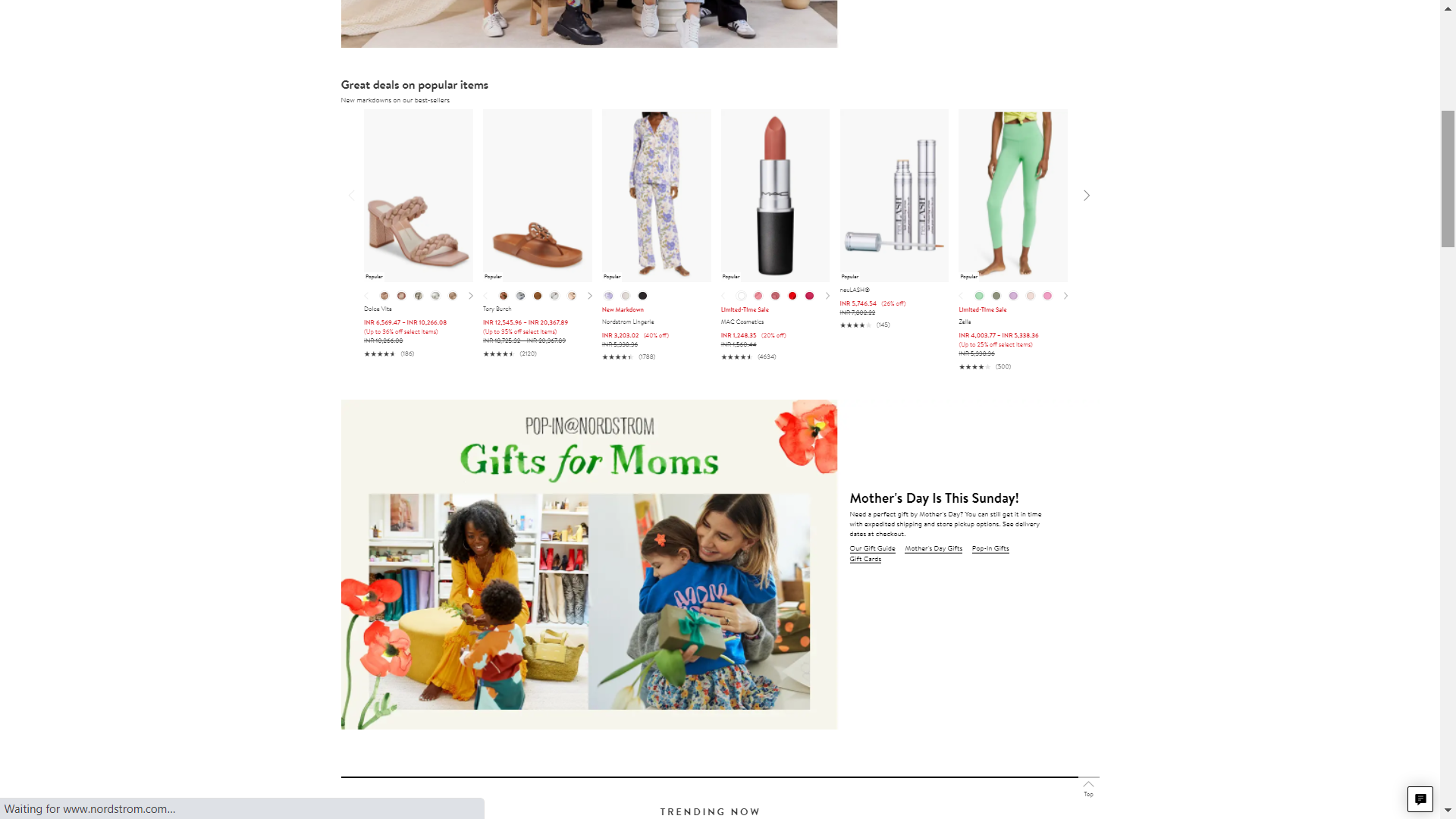
In my opinion, it is good to use fancy fonts once in a while, during special occasions.
Nordstrom has used an attractive font to emphasize the Mother’s Day offer and promote “Gifts for Moms”.
6. Use a different font for the call-to-action button
To design an impactful call-to-action button, you must carry out the 10 foot test. Here’s what you must do:
Open your landing page and go 10 steps away.
Check whether your call-to-action button stands out. If not, you must rework on it and make sure that it is clearly visible and brings the reader’s attention.
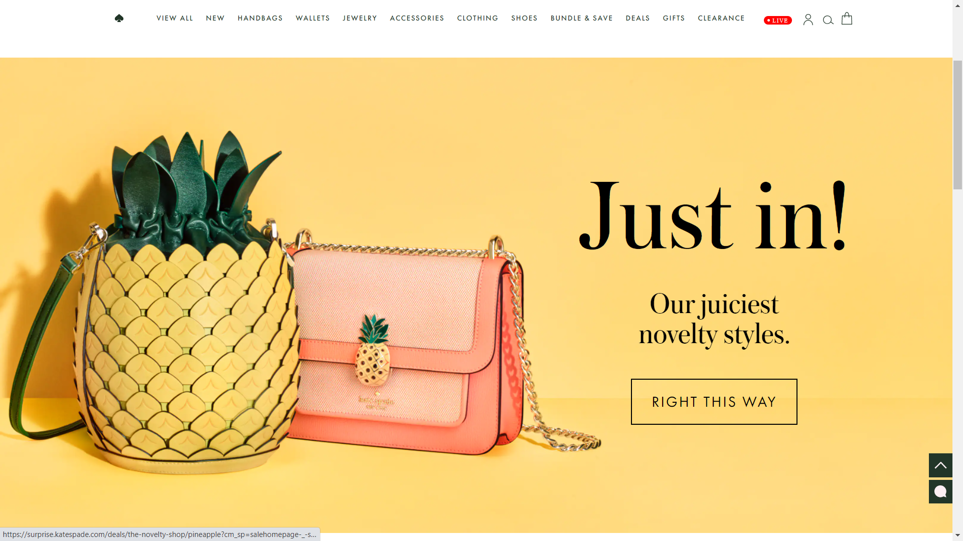
As you can see, Kate Spade uses a different font for the CTA that complements the headline typography.
7. A/B test your landing pages
I am sure that with all these tips and the huge ocean of fonts to choose from, it is easy to get overwhelmed and confused. That’s where A/B testing comes into play. It will help you determine what kind of designs and typography work the best for your target audience. Monitor the landing page analytics like visits and conversions. See whether you are able to achieve the objectives of your landing page. Accordingly, you must keep iterating and optimizing the design.
Wrapping Up
Your landing page brings all the conversions. So, you must make sure that they strike the right chord with the readers. Landing page builders have certainly made designing landing pages a breeze for people as it does not require any technical knowhow. However, despite these DIY tools, there are some design aspects that you must know and typography is one of the most important among them all.
Related Reading
8 Tips To Generate Maximum Traffic For Your Landing Page



Disha Bhatt (Dave)
Latest posts by Disha Bhatt (Dave) (see all)
3 Ways to Leverage Salesforce Marketing Cloud to Impress Customers in a New Age of Travel and Leisure
Email Testing Tools: Making the Lives of Email Professionals a Breeze