
In 2023, retail sales in the US on Black Friday shot up by 2.5% year-over-year throughout in-store and online channels. In fact, 200.4 million US customers shopped in-stores and online during the BFCM weekend. “The five-day period between Thanksgiving and Cyber Monday represents some of the busiest shopping days of the year,” said NRF President and CEO Matthew Shay last year.
Altogether, BFCM in 2023 generated a whopping $9.8 billion in sales. According to Tamara Niesen, CMO at Woo, BFCM is set to be even bigger in 2024.
If you’re in e-commerce, you should aggressively use omnichannel marketing, make the most of the BFCM window, and leverage voluntary buy-in.
As you must know, email is the color purple in the omnichannel palette. But it’s not always easy to flex your creative limbs, not at the clock’s bidding, it’s not!
Wondering how to pull it off this BFCM? Take a cue from our 11 favorite Cyber Monday and Black Friday email template examples for 2024. Also swipe tips and expert insights along the way!
11 Black Friday/Cyber Monday Email Templates
1. Lille Baby
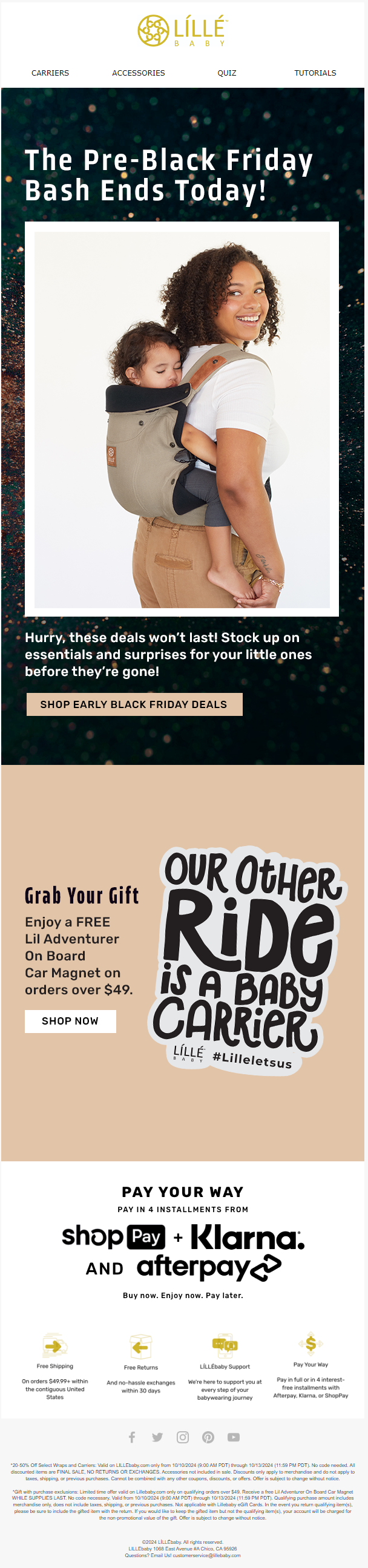
The countdown to the BFCM weekend may start as early as September. Brands start priming their audience early, so that they can stay top-of-mind during the busy weekend when people are in a hurry and spoilt for choice.
This is also when brands can still invest time and effort into long, beautiful emails. As the weekend gets closer, short, urgent emails take the front seat.
Our first BFCM email template is a pre-Black Friday message from Lille Baby. We love the optimized CTAs, the hero image, and the bold text right away.
The prominently displayed payment options strengthen the pitch. And good use of white space is always a plus in our book.
BFCM Tip 💡: Customize your cart abandonment flows for the event. Send timely reminders highlighting BFCM special offers on abandoned items. In terms of design, leverage show/hide blocks and send dynamic gift guides.
2. Jot
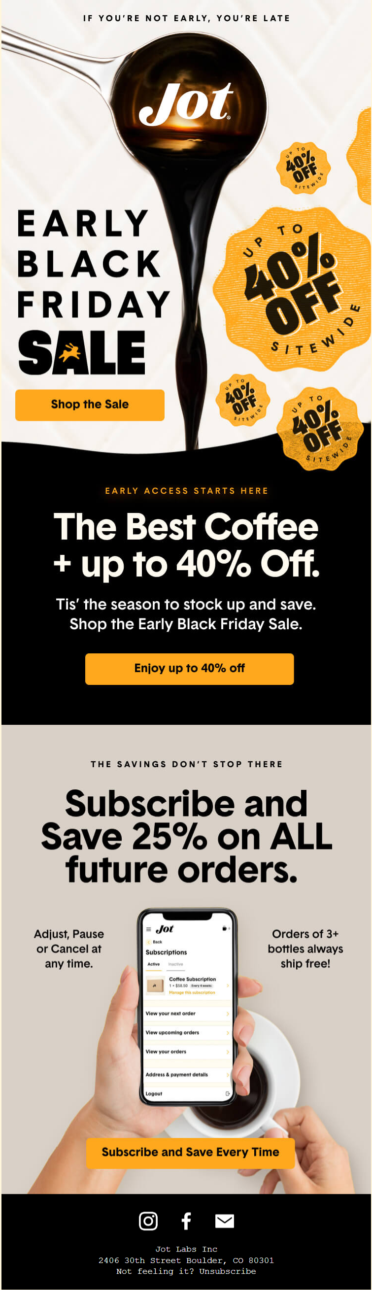
Here’s another early-bird Black Friday email example, this time from Jot. Loving the terse header, which leverages the false dichotomy fallacy very skillfully. The hero image with its dark shades, bold text, and addictive graphics is a tour de force.
The bold, rounded CTA buttons are eye-catching and sales-focused. Full points to the CTA copy as well. We’re saving this!
BFCM Tip 💡: Offer discounts throughout the week leading up to Cyber Monday. Set up a dedicated day-by-day reveal campaign to stay top-of-mind.
“Make sure you have suppressions for your regular campaign flows. Or adjust them to fit around BFCM promos.“
— Simon Harper, eCommerce & WordPress Website Designer at SRH Designs
3. Kurk
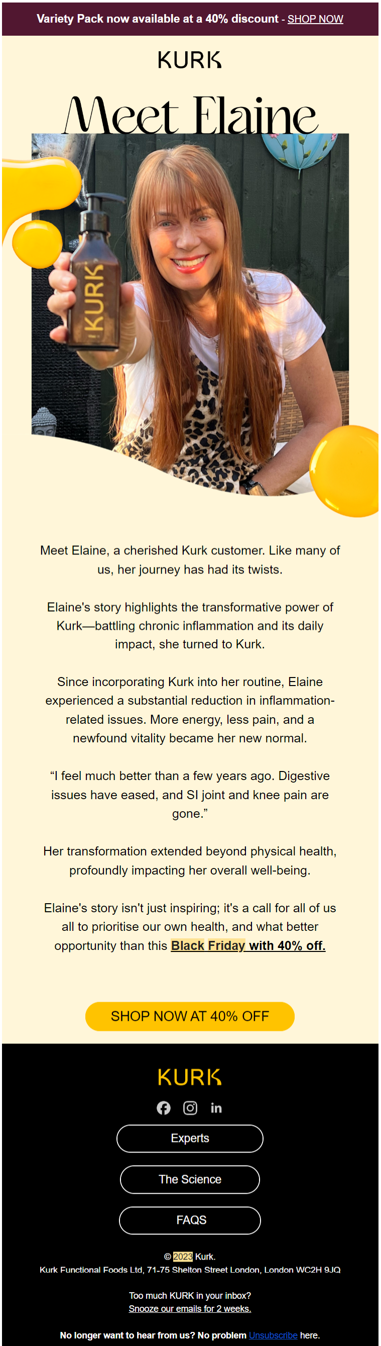
Image source: Inbox
As the BFCM weekend gets closer, you should be optimizing your holiday email templates for gradually shrinking attention spans.
Kurk gets that, so instead of customer testimonials, they’ve built this Black Friday email around just one loyal customer. Unlike viral growth on social media, word-of-mouth scales linearly, making email just the right, off-pressure platform to market during in-your-face holiday events. To that end, Kurk’s email is straightforward, lightweight, and feel-good. All the CTAs are perfectly optimized for the event. The inverted pyramid is also in action, reinforcing the text pitch.
BFCM Tip 💡: Work on your subject lines. Take help from AI, but go beyond. Stand out from the crowd. Check out this emoji-only subject line from Huckberry.
4. Spanx
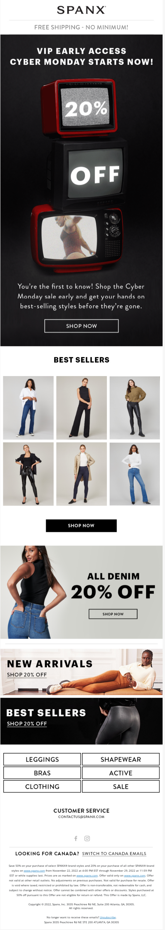
Continuing with pre-holiday emails, this Cyber Monday dandy from Spanx is surely a winner right from its two-color gradient hero image.
What a creative way to announce their % off! Love the order of the TV screens. The three-column layout nicely etches out the product grid. The content blocks get progressively shorter as the amount of information increases, that’s being strategic!
Not one pixel of this Cyber Monday email template is wasted.
BFCM Tip 💡: Generally speaking, avoid animated/fancy emails closer to the event. People are in a hurry, they’re not looking for entertaining emails. Simplify your design, reduce layout complexity, and shorten your emails. Give it to them straight. Stick to the traditional graphic-text-button flow.
5. Threadless
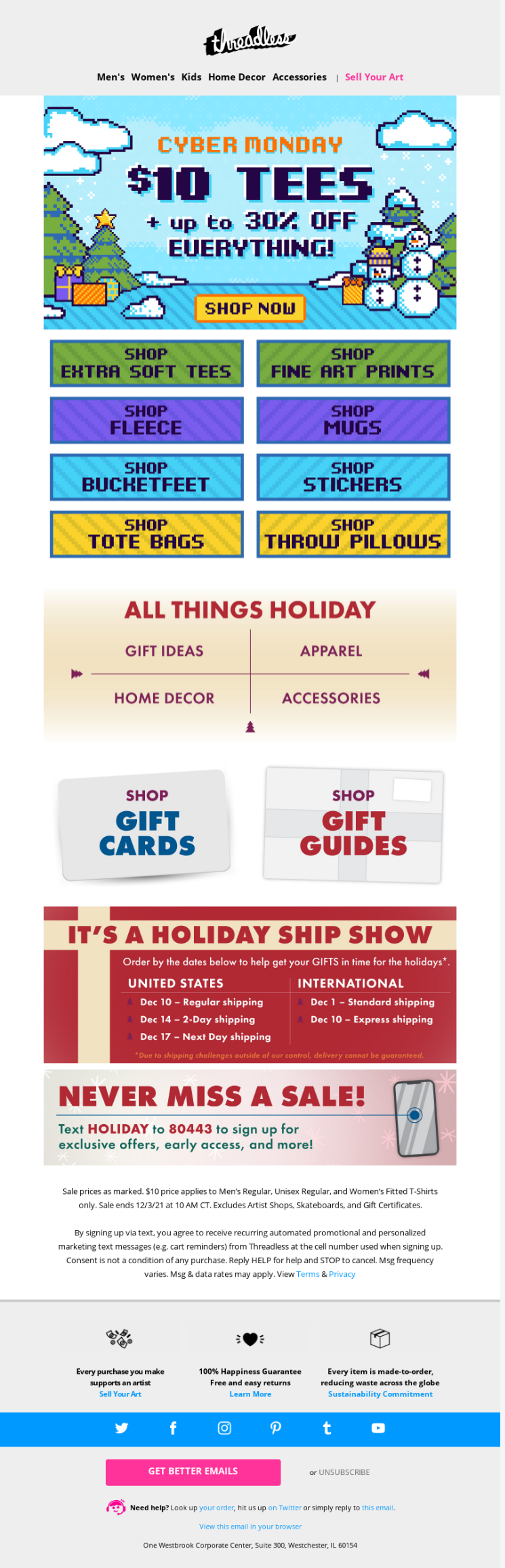
You must have guessed from the previous emails that hero graphics become a very important part of getting your message across during holidays.
Because people are increasingly skimming for deals, you need to shoot from the start, make the above-the-fold content the carrot of your emails. Give your subscribers the opportunity to convert from the get-go, the way Threadless does it. We’re loving their use of 90s-era pixel art; it’s nostalgic, compelling the viewer to pause. It was smart to extend the pixel art to the recovery module too.
In terms of sales, the hero space does more than half the job. The rest of the email is info-rich and full of click opportunities.
BFCM Tip 💡: Segment your list by customer lifetime value. Send targeted emails to VIP members (unengaged as well as engaged), frequent buyers, high rollers.
“Always have an email in your back pocket which extends your Black Friday sale if needed!”
— Chris Behrens, founder, BearMail
6. Fussy
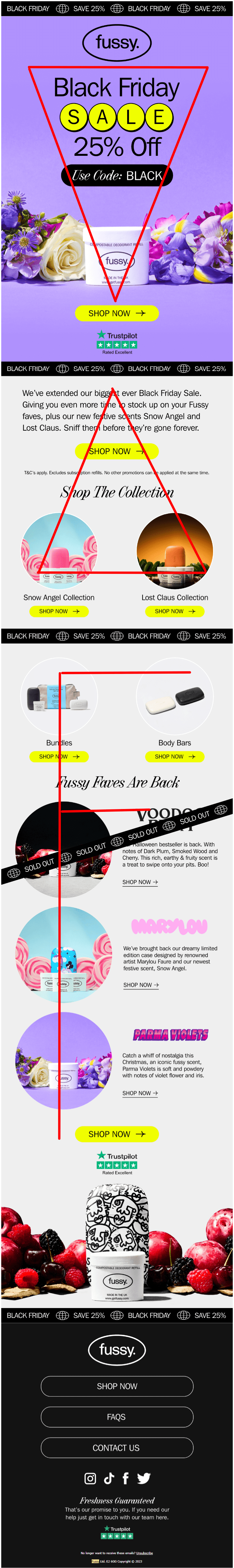
Image source: Inbox
This Black Friday email example from Fussy is a nice example of diverse layouts: It starts with an inverted pyramid, which is flipped in the second block, followed by the F-shaped pattern. Because the email is long, the layouts keep the viewer engaged.
Typically, offer extension emails tend to be long for obvious reasons. There are more products to show, more information related to eligibility criteria, expiration dates, and so on. Fussy’s Black Friday email template pulls it off neatly, keeping an optimal image-text ratio, drawing off of a single CTA, and leveraging negative space.
BFCM Tip 💡: Use plain-text emails for better deliverability. Besides, a note from the CEO/co-founder/product manager, furnished with the right links, pulse-point copy, and a warm send-off has nailed it for many brands. Don’t rely on AI for this, pen it for real’s sake.
7. Urban Outfitters
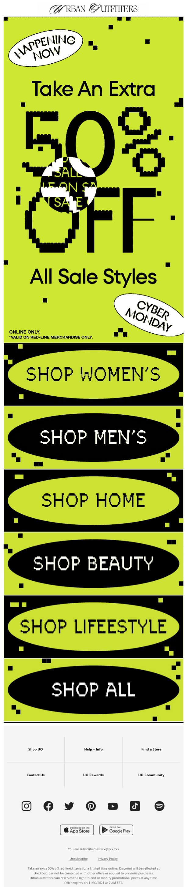
Urban Outfitters went the whole hog with pixel art in their Cyber Monday email template. This had to be part of our curation because it’s the best example of economical design.The layout is evenly divided between the announcement and categorization, while the footer is kept intact, lending balance to the pixel wash.
It can’t get more efficient around Black Friday/Cyber Monday.
BFCM Tip 💡: Send teasers, reminders, and last-chance emails to your subscribers as your campaign deepens.
“Tell an original story in your email. Stand out from the dozens [of] ‘Don’t miss this deal’ mails. Hire a copywriter.”
— Taco de Koning, Freelance CRM and e-mail marketing specialist
8. Threadheads
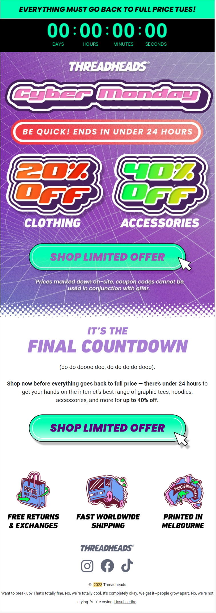
Image source: Inbox
The BFCM weekend is now at the door. People are scouting and clinching deals at warp speed. You should be keeping up with your customers, too.
Take a cue from Threadheads. Short, bold, and fortified with a countdown timer, this Cyber Monday email defines urgency messaging. Right from the header, Threadheads pedals to the metal with a pointed copy. The timer is suitably situated within the pre-scroll space. The prominent CTA buttons, inset with a click icon, anticipates instant action on the user’s part. You heard it – this email’s a scream!
BFCM Tip 💡: Feel free to reskin previous BFCM emails if and when appropriate, unless you’re bubbling with new ideas. Don’t necessarily linger for inspiration.
9. Apex Gaming
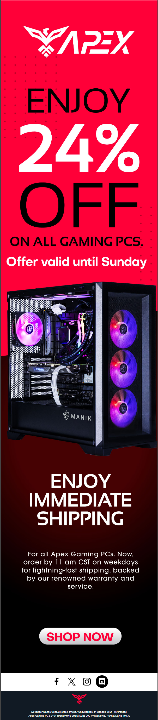
Here’s another example of urgency messaging around BFCM. This Black Friday email example kicks off with a stand-out offer, coupled with ambitious graphics and a bold, 3D-esque CTA button. The image smack-dab in the middle of the flow is nicely shot, detailed, and attention-grabbing. Great use of color gradient, minimum text, and brand-consistent color scheme make this email a stunner.
BFCM Tip 💡: Plan for retention post-BFCM. Thanks to voluntary buy-in, you’ll be acquiring new customers during the weekend; don’t lose them.
10. Traf
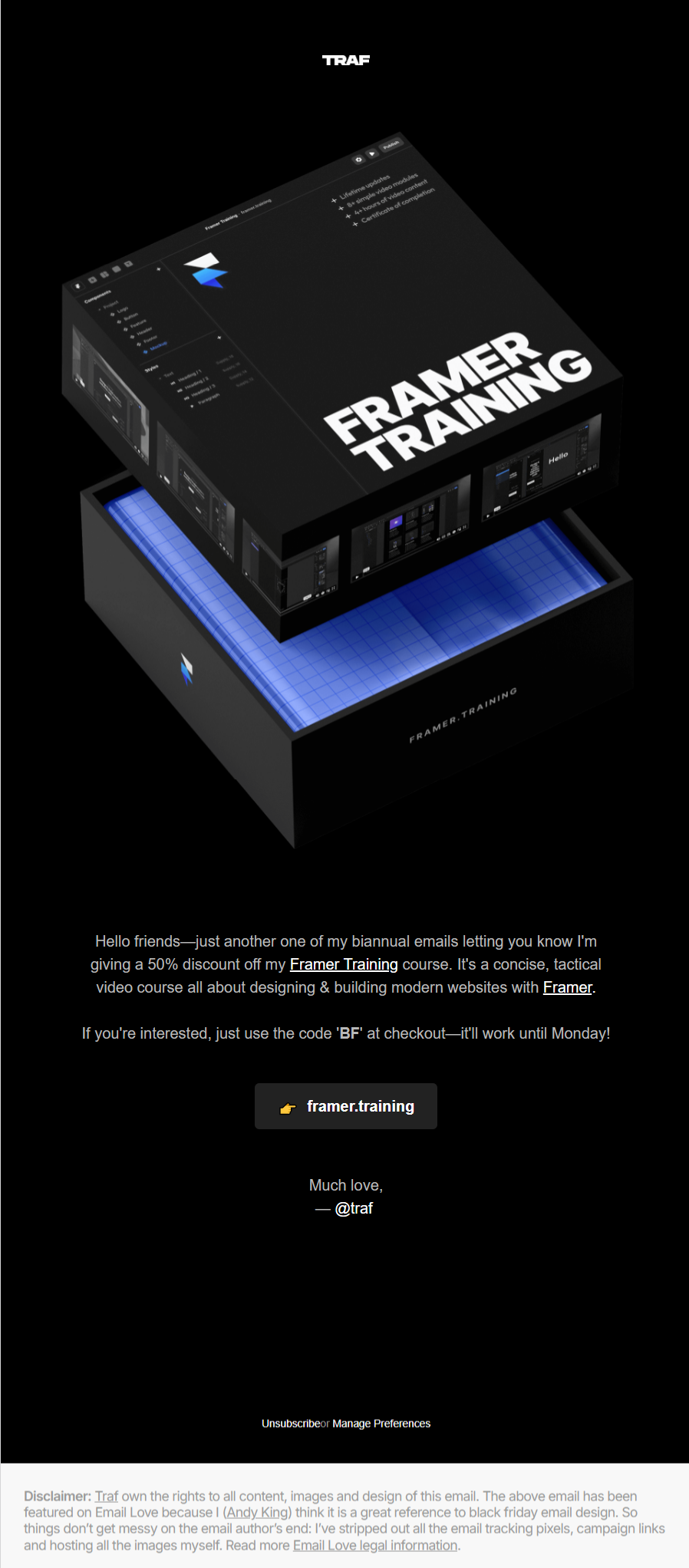
Not just B2C, it’s BFCM for B2B as well. Traf’s BFCM email is short, urgent, and optimized for quick subscriber action. We love how the image showcasing unboxing has this nice B2C vibe. Very smart! You don’t get to see such B2C-esque emails from B2B vendors. The flow culminates with the CTA button. The unsubscribe link, set pixels apart from the pyramid content, is tight and prominent.
Needless to point out, it’s such a great use of negative space!
BFCM Tip 💡: Optimize for mobile. Make sure your CTA buttons are well-padded. Design single-column layouts. A/B test for all sorts of mobile devices.
“Use the month of October to reactivate customers before the core holiday push. Go through your unengaged list 2 to 3 times to get customers to start opening messages again.”
— Dela Quist, Strategic Advisor, Kombai
11. Copper Cow Coffee
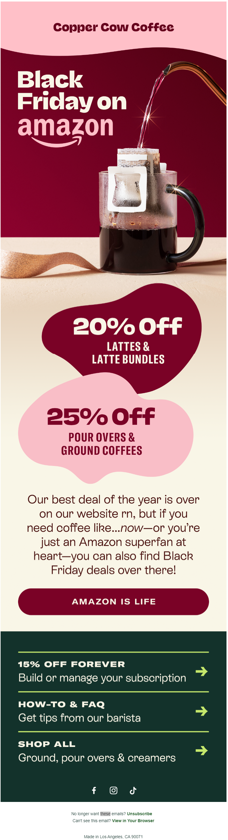
Image source: Inbox
This post-BFCM burgundy email from Copper Cow Coffee is elegant, pleasing to look at, and leverages color ramp to a T. We’re loving the bold typography, the single image, the offer blobs, and of course, the affiliate-optimized CTA button. The mix of burgundy and sea-green is attractive, spotlighting the brew code.
It’s one of the finest uses of the single-column layout, too. Have you saved it yet?
BFCM Tip 💡: Because multiple first-time buys happen during BFCM, it’s critical you set up your welcome flows accordingly. This ties in with your retention strategy.
Jack up Your Email Marketing This Holiday Season!
The holiday window is flung open for real. You don’t want to drop the ball. Check out some steal-worthy holiday insights from these 10 email marketing experts.
If you want insights into BFCM in particular, here’s a great resource for you.
And if you want to get high-converting BFCM email templates, get in touch with our experts. We’re offering 10% off on all template orders. Claim it now!
Susmit Panda
Latest posts by Susmit Panda (see all)
Expert Interview Series: Part 13
10 “Gobblesome” Thanksgiving Email Inspirations You’ll Thank Us For