
Building your email list is a key aspect of growing your business. But, as you would have guessed already, it isn’t a simple endeavor in the slightest. You have to identify your target audience, work towards making your brand visible to them, and, lastly, get them on deck by grabbing their attention with targeted messages. This is where email popups come into the picture.
A vital component of your list-building strategy, email popups are hailed by many to be the most effective form of signup forms out there. Since they appear on your visitor’s screen during their browsing, popups spare them from having to search and scan the website to locate your signup form. New to this popup game? Worry not! You’re just at the right place. Here, we’ll be walking you through a slew of best practices and stunning email popup examples that will tell you everything you need to know. Let’s dive in!
Why Should You Use Email Popups?
- When your signup form is implemented as a popup, its visibility improves significantly. This ultimately leads to you capturing more leads than usual.
- Email popups offer you various segmentation options, allowing you to greet your visitors with targeted messages.
- Unlike other variants of email signup forms, popups aren’t embedded within your page. Subsequently, you get to exercise a greater degree of creativity while designing them. Goes without saying, the more visually appealing your email popup, the greater will be the number of leads you attract.
- You don’t need to learn any complicated coding skills to add an email popup to your page. Most leading marketing automation platforms such as Mailchimp, Klaviyo, and Active Campaign contain vast libraries of diverse popup templates. You are free to choose any and implement it.
Things To Keep In Mind While Designing An Email Popup
While popups generate extraordinary results for businesses, I’m sure you would have come across many who find them rather annoying. Now, why is that? Because many lose the plot when it comes to designing and executing them properly. But, all that stops here. Take stock of the tips and tricks discussed below to create stunning popups and fetch rich dividends for your business.
Let Your Headlines Standout
If you are interrupting a visitor’s browsing with a popup form, you have to ensure that it is able to capture their imagination right from the get-go. How do you ensure that? By writing compelling headlines. An impactful headline is what will ensure that they remain glued to your popup and pay attention to the message on it. Here are some pointers you could keep handy while writing your headlines:
- Keep them crisp and to the point.
- Try to work in a sense of emergency into your headline; it is a surefire technique of spurring your visitors into action.
- Make sure your headline is easy to understand. Often in the quest of appearing witty and quirky, brands end up trying too hard with their popup headlines which eventually put off their visitors.
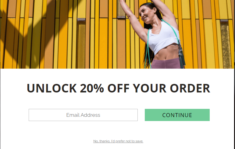
This popup form by Crossrope couldn’t possibly be any clearer with their headline.
Win Over Visitors With Your Design
Your headline and copy might tower head and shoulder above your competitors, but you will still fail to garner your visitor’s attention if your popup design isn’t visually appealing. Remember, when a popup appears on the screen, all the other elements on your webpage get faded, making it the focal point. That’s why the design of your email popup carries a lot of gravity. A captivating design has the power to inspire engagement from your visitors, while a shabby effort can push them to bounce from your page.
Take a look at this popup by Gingiber, for instance.
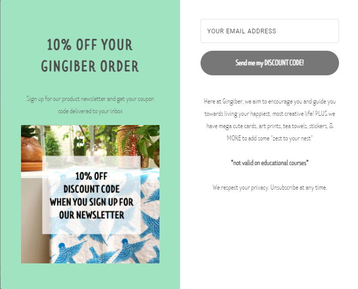
Neatly divided into two columns, each half of this popup has been made distinct for the visitor. Human eyes tend to read from left to right, which is why the important part of this popup, the one announcing the incentive, has been placed on the left. The font size is optimal, and ample spacing between the lines prevents the layout from appearing visually uncluttered. Additionally, the color of the CTA (call-to-action) button is such that it contrasts nicely against the background, making it extremely prominent.
Gaiam’s popup is quite striking too.
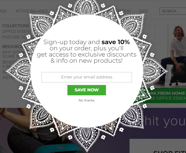
The unconventional shape of this popup will surely grab some eyeballs, won’t it? Extra points for making the CTA pretty conspicuous too.

Nail Your CTAs
Talking about CTAs, they being prominent from a design perspective isn’t enough; it deserves a section of its own. Come to think of it, isn’t the CTA button the most vital part of your popup? The headline, the copy, the design- their collective objective is to lead your visitors towards…you guessed it, the CTA button. Hence, making your CTA button impactful is absolutely non-negotiable. So, what goes into crafting a winning CTA? Let’s take a look:
- Don’t confuse your visitors with multiple CTAs. As it is, you get to work with a limited area with popups, so there’s no point in crowding it. Place one clear CTA button and let it work its magic.
- Avoid vague phrases like “Click Now” and “Find Out More” like the plague. Use power words such as “Submit”, “Explore”, “Upgrade”, “Create”, and the like to coax a psychological and emotional response from your visitors. Doing so, will do a world of good to your conversion rates.
- I’ve stated this earlier but will just mention it again to re-emphasize its importance- the color of the CTA button must not just contrast sharply against the background but should also be distinct from the remaining visual elements on the popup. The objective is to make the CTA the most noticeable aspect of your CTA button.
- To establish a personal connect with your visitors, it is best to write your CTA copies in the first person.
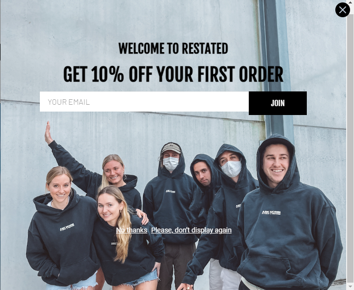
Restated sets a good example with its CTA.
Cosmetic Packaging Now’s CTA ticks all the right boxes as well.
Personalize Your Messages
Personalizing your popup is a great way of registering yourself on your visitors’ radars.
I know what you are thinking- “I don’t have any personal information about these visitors; how can I personalize my messages?”
Well, the interests and preferences of your visitors aren’t the only factors based on which you can implement personalization; there are many others. For starters, there’s geographic location- visitors accessing your website from different parts of the world can be shown location-specific messages based on your activities in those regions. Another excellent parameter is the referral source. Figuring out where (which domains) your visitors are coming from will allow you to write customized messages for them. For example, if you know that the major chunk of your traffic is coming from Instagram, you can create an email popup targeting them exclusively.
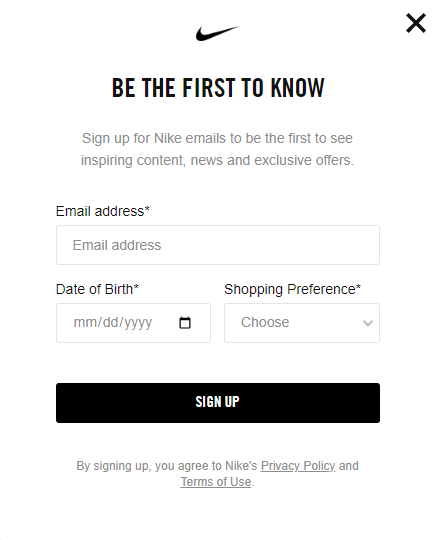
Stick To As Few Input Fields As Possible
Ask yourself this- “What do I really need from a new lead to add them to my contact list?”
Your head will pop up (yes, that was on purpose) two or three responses at the most- name, email address, and contact number. For email lists, the first two are enough. However, with SMS marketing starting to turn heads, marketers can’t be faulted for expressing their interest in the third as well. After all, we live in the age of cross-channel marketing, where delivering seamless customer experiences has become exceedingly vital. Adding more fields than these will throw off your visitors and invite their suspicion.
In some cases, as Nike has done over here, brands also include a “Preferences” field with the aim of delivering personalized content to their new subscribers.
Offer Incentives
Imagine you are browsing a new website. No sooner have you scrolled down a little bit than a popup window appears on your screen. You are disrupted, so you’re a touch annoyed; understandably so. Just then, you see the words “Free membership for life, if you sign up now” writ large across the popup. The facial muscles responsible for your frown have now flipped over gracefully.
Of course, that’s a hypothetical situation, but you get my point- incentives are amazing. Not only do they make visitors take instant note of their popup, but they also give them that much-needed nudge to complete signing up. Now, your incentive need not be anything extravagant; it could be anything you deem fit- a promo code, a discount coupon, or even free shipping.
Be Conscious Of Your Timing
Half of the reason people get miffed by popups is that they are almost always mistimed. No one wants to see a popup within a quarter of a second of opening the website, do they? Therefore, optimizing the timing of your email popup is critical to determining its success. As per a report by Nielsen Norman Group, after landing on your page, the average visitor takes 10 seconds to decide whether they want to remain or bounce off. Thus, the best course of action is to wait out this period. At the end of the day, the goal of your email popup is to build a high-quality email list. And adding a customer who couldn’t invest even a few seconds to browse your page isn’t really a smart move, is it?
Wrapping It Up
Email popups, if executed properly, will not just skyrocket your subscription numbers but also enhance your average order value. We hope the email popup ideas shared above have given you enough fodder to chalk out your own plan and galvanize your campaigns!
Rohan Kar
Latest posts by Rohan Kar (see all)
5 Reasons You Should Opt For A Managed Marketo Service In 2022
5 Tips on Improving Your Business Email Copy in 2022