Can you feel the holiday vibes in the air already?
Marketers sure can, and they’re busy giving their best shot to all their marketing efforts, including social media, emails, and in-app promotions. However, many of them neglect the effectiveness of banner ads when it comes to marketing for the Holiday season. Whether it is for retargeting or for promotions on different websites, banners have a special role to play in the world of marketing.
While designing banners for the Holidays might seem to be an easy task at first thought, it is difficult to create ones that stand out and leave an impact that drives a click-through during this busy season. According to a report, we see around 5000 ads per day. Despite this huge number, banner ads are perceived to be dull and boring, mostly because they normally are…
Therefore, to help you create impressive banners, we are here with top actionable tips to create click-worthy holiday sale banners.
1. Design the banners in the most appropriate size
Google Adsense has revealed that the most successful banner sizes are as mentioned below:
- 728x90px: Leaderboard
- 300x600px: Half page
- 300x250px: Medium rectangle
- 336x280px: Large rectangle
So, take the hint and create your seasonal holiday banners accordingly. Also, make sure that you have purchased the ad space in such a way that your banner gets featured above the fold and along with the page content. This is all the more important during the Holiday season if you want to beat your competition.
2. Use visuals that match the festive mood
Whenever you are designing a banner for the Holiday season, you must include visuals that reflect festive cheer and celebrations. Use bright colors such as red, green, and blue along with elements like pumpkin, turkey, reindeer, Santa Claus, and Christmas tree. It would instantly let the subscribers know that the advertisement is related to a Holiday offer.
Here’s a banner that clearly promotes a Black Friday sale to the viewers.
3. Let your ads revolve around a particular occasion
The Holiday season is not just about “Christmas”.
It is also about Halloween, Thanksgiving Day, Black Friday, Cyber Monday, and of course the New Year. Besides, there are some non-commercial holidays like Small Business Saturday and Columbus Day. Just like these days are spread over a period of three months, you can have your display advertising campaigns running over this time. Your subscribers are expecting different offers for every occasion. To cater to this expectation, you can design distinct banners for each Holiday.
For instance, you can have a spooky banner with pumpkins, spiders, and ghosts to trick and treat the viewers on Halloween. Here’s an example of a Halloween banner by Sharpie.
Check out this Christmas holiday sale banner.
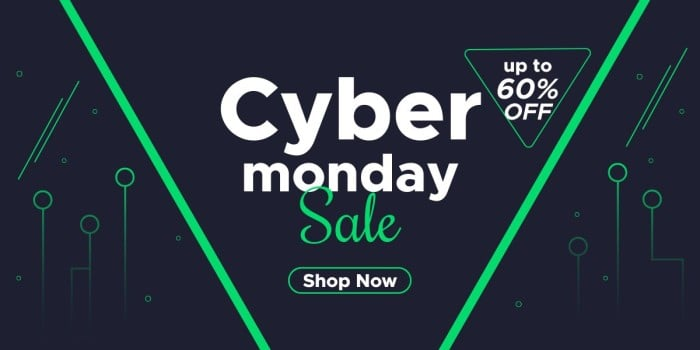
Here’s another holiday banner promoting a Cyber Monday sale.
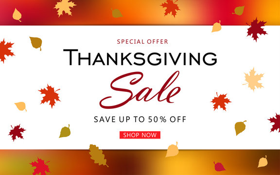
Here’s a Thanksgiving holiday sale banner.
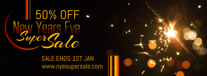
Finally, a New Year sale banner.
4. Personalize the customer’s experience
With HTML5 banners, you can design advertisements that target the customers with products and offers they are interested in. You can use feeds and dynamic banners to create product lists with real-time availability of the items. Seeing relevant offers and products would entice the reader to make the purchase and add to your Holiday sales profits.
5. Make your banners interactive
How about making your Holiday banner ads more attractive by using interactive animations? You can include a GIF displaying some of the best-selling products on sale, along with an offer that the reader cannot refuse.
Take a look at this animated seasonal holiday banner that is sure to pique the reader’s interest and get them to convert.
According to the positioning of your brand in the market and your industry, you can even have a short video in your banner that does not hamper the loading speed of the web page.
Sendspark has used a video thumbnail with a play button to generate click-throughs.
6. Instill FOMO with your banners
As humans, we are always scared of losing something rather than being thankful for what we have. Tap on this consumer instinct by creating a sense of urgency through your banners and inculcating fear of missing out (FOMO). You can combine words like “HURRY”, “OFFER EXPIRING SOON”, and “LIMITED STOCK” along with a countdown timer to get people to make instant purchases.’
7. Do not forget your branding guidelines
Many marketers create the most visually impressive banners but forget about their branding elements. Of course, your banner has to include the holiday elements to reflect the Christmassy mood, but do not leave your brand guidelines behind in the quest of doing so. The user must be able to instantly recollect the brand name on seeing your banner.
Cordial sets the perfect example of a banner that follows the branding guidelines and is far from boring.
8. Make your ad mobile ready
Most of your subscribers might be checking a website on their mobile devices. Therefore, if your banner ad fails to render well on small screens, it would tarnish your brand reputation. If you are planning an interactive banner, bear in mind that mobile interactivity will be more of tapping, scrolling, and swiping rather than clicking or hovering the mouse cursor on desktops or laptops.
9. Monitor the analytics and optimize your banner ads
Generating conversions through banners does not stop at making the banner ads live. You must constantly monitor the analytics and see how your customers are responding to it. Check the click-through rate and conversion rate at regular intervals. In case you notice a dip in the click-through rate, you must work on the copy or design and optimize the ad.
10. Let your banners be creative to overcome banner blindness
Lastly, I would like to talk about the most common web user behavior of ignoring page elements that look like ads. Ensure that your banners are placed and designed in such a way that they draw the reader’s attention, enough to be acted upon. Failing to do so will lead to your ad getting ignored and all your efforts going down the drain. Experiment with different types of seasonal holiday banners and see what works the best for your business.
A Word on Flash Sale Banners
As per Wix’s report, online stores running flash sales have seen their monthly gross merchandise value go up by 64,000%. Goes without saying, flash sales ought to be on your mind during the holiday season. And you can promote flash sales using banners.
For example, check out this holiday flash sale banner on Walmart.

Here’s another flash sale banner, this time by Americana-Depot on eBay.

This flash sale banner is up on Wayfair right now.

And here’s the last example, this time on Sierra.

Let’s look at a few best practices when designing flash sale banners:
- Create short, winning copy: More than fancy graphics, it’s important that your flash sale banners are written well. Banner copy should be simple, moving, and clear. Use action words, highlight expiration dates, keep it taut.
- Leverage FOMO: That’s the whole point of a flash sale. Use negative phrases to bring home the idea of missing out.
- Feature a well-written CTA button: Your CTA too should be well-written. It should clearly convey the post-click event. Make it prominent. You can animate it to make it stand out.
- Make it on-brand: Distinguish, but don’t separate. You want to make the banner stand out, but not by being completely off-brand. In other words, don’t depart entirely from your brand aesthetics.
Wrapping Up
If you are struggling to get your banners noticed, just follow these tips and we’re sure they’ll work. In case you need help with creating a high-converting banner, our experts at Email Uplers would love to help you out. While we create all types of banners, you’ll fall in love with our HTML5 banners with visuals and animations added according to your need.


Disha Bhatt (Dave)
Latest posts by Disha Bhatt (Dave) (see all)
Salesforce Marketing Cloud Oct 2020 Release: Your guide to all the important features - Part 2
3 Crucial Ways SFMC Email Marketing Strategies Are Evolving Due to COVID-19