
So you’re into designing emails. To start with, take a look at these stats:
- 73% of brands prioritize mobile optimization for email campaigns.
- 3 in 5 people check their emails on their mobile phones.
- 43.2% of people delete emails not optimized for mobile.
- iPhone enjoys the highest percentage of email opens at 28.4%.
The point? You should design emails for mobile first, and then for desktop.
“Smartphones and tablets can no longer be ignored by email marketers. They represent a massive part of all email interactions and revenue,” writes Jordie van Rijn, email marketing pro and founder of Email Monday.
But how do you design emails specifically for mobile? That’s what you’ll be learning in this comprehensive guide to responsive email templates.
Yes, it can be challenging to adapt emails to various screens. Besides, email clients can be very taxing. But don’t you worry! Because we will guide you from the other side of 3000+ templates/ month across 50+ ESPs, go figure!
So, we’ll get started in the following order:
- What Is A Responsive Email Template? The Definition
- Core Principles of Responsive Email Design
- Benefits of Using Responsive Email Templates
- Step-by-Step Guide to Creating a Responsive Email Template
- Best Practices for Responsive Email Templates
- Common Challenges in Responsive Email Templates
- Responsive Email Templates by Email Uplers
What Is A Responsive Email Template?
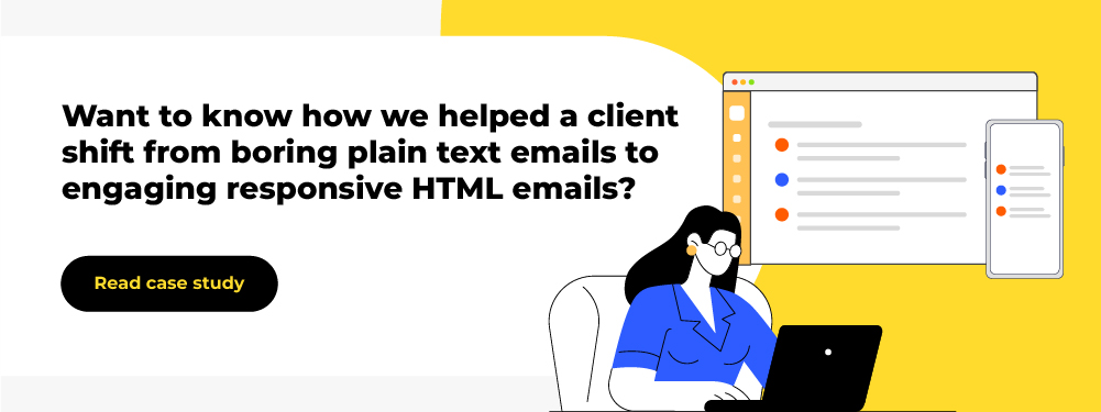
A responsive email template is a pre-built or customized template that seamlessly adjusts to various devices/screen sizes without losing its quality. For example, here is a pre-live template we designed for Maven that looks equally good on desktop and mobile.
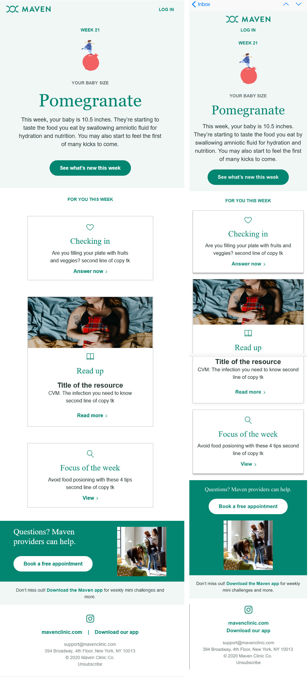
The mobile version of an email stacks the elements vertically. You can observe this in the email above. For example, the final call-to-action button is displayed above, rather than alongside, the image. Similarly, the website and the app download links also stack up on the smaller screen.
“Mobile devices give a very limited viewing screen, and the ideal design for mobile devices is one column,” says Carin Slater, Email and Content Growth Marketing Manager at Litmus. “But we don’t want to limit ourselves to single-column designs on desktop where we have loads of space. Enter media queries to let you stack content on mobile to make sure your content is optimized for the smaller screen.”
Later in this post, you’ll learn how to stack columns for mobile viewing as it is one of the most important aspects of responsive email templates.
“Responsive design offers us a way forward, finally allowing us to design for the ebb and flow of things.”
– Ethan Marcotte, inventor of the term responsive design
It is critical to appreciate that unlike responsive web design, support for HTML and CSS standards is not uniform across email clients. As a result, the reputation of email as a technology, moderate as far as technology goes, seems greater than great in light of the reputation of email clients.
For example, here’s how things can go wrong: This email appears flawless on desktop, but goes south on mobile.
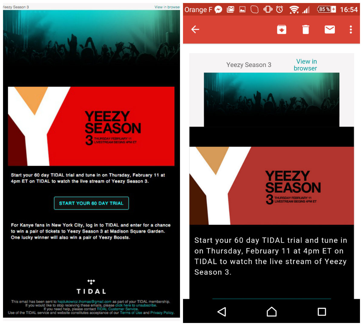
“Goated” content?
So, when it comes to creating responsive emails, forewarned is forearmed.
Core Principles of Responsive Email Design
Below are five core principles of responsive email design:
- Fluid layouts: An email should dynamically adjust to multiple screens and devices. A fluid or percentage-based layout makes this possible.
- Mobile-first approach: Because the majority of email opens occur on mobile devices, a mobile-first approach is key.
- Minimal design: A responsive email is clean, clutter-free, and focused on presenting urgent information in bite-sized form.
- Testing: The pre-live email is made to pass through multiple checks with the help of email testing tools. It is tested on various devices, including smartphones, tablets, and desktops.
- Client optimization: The email is optimized for various email clients, such as Apple Mail, Gmail, Yahoo, and Outlook.
Benefits of Using Responsive Email Templates
Imagine a scenario where one of your subscribers wants to open and look at a promotional email you just sent. The subscriber is on a crowded bus and they can’t open their laptop to check your email. So, they try the phone.
But your email doesn’t render well on the small screen. The user is having to scroll horizontally to read the content; the images are cut off, and in some places, they’re overlapping the text; but the text, too, is ant-sized.
The consequence? Your subscriber is frustrated and quits.
By the time they get home, they may no longer remember checking your email on the desktop. To sum it up, this is a horrible though preventable UX. Good UX is the number one benefit of a responsive email template.
But here are four more benefits as a direct result of good UX:
- Increased accessibility: The more your email is accessible across devices and environments, the greater the scope of engagement.
- Higher open rates: If you’ve convinced subscribers that your emails are responsive, it will lead to more opens across devices than when opened on one device only.
- Higher scope of conversions: Urgent/time-limited campaigns will benefit from mobile-optimized emails by enabling users to convert on the spot, no matter where they may be.
- Better sales: The point of email marketing, just like any other channel, is more sales. Responsive emails guarantee seamless UX, automatically resulting in more sales.
How to Create A Responsive Email Template? A Step-by-Step Guide
Let’s learn how to create a responsive email template.
After you’ve defined the goal of your email, planned the layout, and chosen a responsive framework (MJML or CSS), create the HTML structure.
Note: Although most modern email templates are created using div-based layouts, the responsive email we’re going to develop in this blog post is built using tables. Our process just shows the coding framework of a basic responsive email template. Practically, coding for responsive emails will vary depending on project specifications, compatibility constraints, and desired layout behavior.
1. Create The Basic HTML Structure
Start the basic HTML document. Because most email clients render tables more consistently, use tables for layout instead of divs.
So, here’s the basic HTML structure to begin with.
<!DOCTYPE html>
<html lang="en">
<head>
    <meta charset="UTF-8">
    <meta name="viewport" content="width=device-width, initial-scale=1.0">
    <title>Responsive Email Template</title>
</head>
<body>
    <!-- Content will go here -->
</body>
</html>
2. Create The Scaffold
In HTML email design, the scaffold is the foundational structure of the email. Think of it as the skeleton on which your email is going to be built.
So, in our next step, we’ll be adding the outer scaffold to the email as shown in the following code.
<!DOCTYPE html>
<html lang="en">
<head>
    <meta charset="UTF-8">
    <meta name="viewport" content="width=device-width, initial-scale=1.0">
    <title>Responsive Email Template</title>
    <style>
        body {
            margin: 0;
            padding: 0;
            background-color: #f4f4f4;
        }
    </style>
</head>
<body>
    <table role="presentation" width="100%" cellspacing="0" cellpadding="0" border="0">
        <tr>
            <td align="center">
                <table class="container" role="presentation" width="100%" cellspacing="0" cellpadding="0" border="0">
                    <!-- Main content will go here -->
                </table>
            </td>
        </tr>
    </table>
</body>
</html>
3. Add A Ghost Table
The term “ghost” table is used because it is specifically designed to only appear on certain problematic email clients, like Outlook. In these cases, the ghost application responds to conditional comments only. This ensures that it does not affect the email layout in other email clients.
So this is part of how to create a responsive email template in Outlook. In this code, the style=”display: none;” hides the table.
<!-- Inside the scaffold table -->
<table width="100%" cellspacing="0" cellpadding="0" border="0" style="display: none;">
    <tr>
        <td style="font-size: 0; line-height: 0;"> </td>
    </tr>
</table>
4. Add The Main Content Container
In this step, we add the main content container. The code creates a row in a table that contains a nested table; there is no spacing or borders, and the main content, represented in the form of a placeholder, is not yet defined.
<!-- Inside the main container table -->
<tr>
    <td>
        <table role="presentation" width="100%" cellspacing="0" cellpadding="0" border="0">
            <!-- Main content will go here -->
        </table>
    </td>
</tr>
5. Create The Heading
The following code creates a table row with a single cell that is centered and padded.
The H1 inside the cell welcomes the subscriber to the newsletter.
<tr>
    <td align="center" style="padding: 20px;">
        <h1 style="font-size: 24px; color: #333333; margin: 0;">Welcome to Our Newsletter!</h1>
    </td>
</tr>
6. Add A Full-width Image
In the following code, there’s a table row containing a single cell.
The image is centered within the cell. The placeholder scales to fit the width of the cell while maintaining a width of 600 px.
<tr>
    <td align="center">
        <img src="https://via.placeholder.com/600x300" alt="Full Width Image" style="display: block; width: 100%; max-width: 600px;">
    </td>
</tr>
7. Optimize for Responsive Stacking
If you’re using two columns in your email, it’s critical to ensure what is known as responsive stacking.
Accordingly, in this step, we’re adding two equal-width columns. Each column has a specific heading and a paragraph of text. In the following code, the two columns will display side by side on desktop screens due to the 50% width assignment. But on smaller screens, the columns will line up vertically.
<tr>
    <td>
        <table role="presentation" width="100%" cellspacing="0" cellpadding="0" border="0">
            <tr>
                <td class="column" style="padding: 10px;" width="50%">
                    <h2 style="font-size: 18px; color: #333333;">Column 1</h2>
                    <p style="font-size: 14px; color: #666666;">This is some text for the first column.</p>
                </td>
                <td class="column" style="padding: 10px;" width="50%">
                    <h2 style="font-size: 18px; color: #333333;">Column 2</h2>
                    <p style="font-size: 14px; color: #666666;">This is some text for the second column.</p>
                </td>
            </tr>
        </table>
    </td>
</tr>
Note that role=”presentation” suggests that the table is not meant to display tabular data, but is rather a visual layout.
You might also use the following CSS to enable responsive stacking. We use media queries here, which allows us to apply styles based on the viewport size.
/* Base styles for the columns */
.column {
    padding: 10px; /* Padding around the content */
    box-sizing: border-box; /* Ensures padding is included in the width calculation */
}

/* Media query for responsive behavior */
@media (max-width: 600px) {
    .column {
        width: 100%; /* Each column takes full width on small screens */
        display: block; /* Ensures they stack vertically */
    }
}
Note: Don’t stack every design element for mobile viewing. Be strategic. Responsive design is essentially about making use of available space; where space is not an issue, you don’t need to stack content.
8. Add Font Styling
Now we create a paragraph element that displays a thank-you message. The paragraph is styled with a font size of 16 px and a dark, gray color.
<p style="font-size: 16px; color: #333333;">Thank you for subscribing to our newsletter!</p>
9. Add Full-width, Padded Image & Text
Once again, we add a table row with a single cell that centers an image and a paragraph of text. The image scales to fit the width of the cell while maintaining a maximum width of 600 px. Just below the image, there’s a paragraph with additional text styled with specific font size, color, and is well-padded.
<tr>
    <td align="center">
        <img src="https://via.placeholder.com/600x200" alt="Full Width Image with Text" style="display: block; width: 100%; max-width: 600px;">
        <p style="font-size: 14px; color: #666666; padding: 10px;">This is some additional information.</p>
    </td>
</tr>
10. Create The Footer
For the footer, we create a table row that contains the footer section.
In the following example, the footer section includes a copyright notice for 2024 and an unsubscribe link, which is styled in blue but not underlined.
<tr>
    <td class="footer" style="font-size: 12px; color: #888888; text-align: center; padding: 20px;">
        <p>© 2024 Your Company. All rights reserved.</p>
        <p><a href="#" style="color: #007BFF; text-decoration: none;">Unsubscribe</a></p>
    </td>
</tr>
11. The Final Code
Now, here’s the final code for our responsive email template.
<!DOCTYPE html>
<html lang="en">
<head>
    <meta charset="UTF-8">
    <meta name="viewport" content="width=device-width, initial-scale=1.0">
    <title>Responsive Email Template</title>
    <style>
        body {
            margin: 0;
            padding: 0;
            background-color: #f4f4f4;
            font-family: Arial, sans-serif;
        }
        img {
            max-width: 100%;
            height: auto;
        }
        .container {
            width: 100%;
            max-width: 600px;
            margin: 0 auto;
            background-color: #ffffff;
        }
        .column {
            width: 50%;
            display: inline-block;
            vertical-align: top;
        }
        @media screen and (max-width: 600px) {
            .column {
                width: 100%;
                display: block;
            }
        }
        .button {
            background-color: #007BFF;
            color: white;
            padding: 10px 20px;
            text-decoration: none;
            border-radius: 5px;
            display: inline-block;
        }
        .footer {
            font-size: 12px;
            color: #888888;
            text-align: center;
            padding: 20px;
        }
    </style>
</head>
<body>

    <table role="presentation" width="100%" cellspacing="0" cellpadding="0" border="0">
        <tr>
            <td align="center">
                <table class="container" role="presentation" width="100%" cellspacing="0" cellpadding="0" border="0">
                    <tr>
                        <td>
                            <table width="100%" cellspacing="0" cellpadding="0" border="0" style="display: none;">
                                <tr>
                                    <td style="font-size: 0; line-height: 0;"> </td>
                                </tr>
                            </table>
                            <table role="presentation" width="100%" cellspacing="0" cellpadding="0" border="0">
                                <tr>
                                    <td align="center" style="padding: 20px;">
                                        <h1 style="font-size: 24px; color: #333333; margin: 0;">Welcome to Our Newsletter!</h1>
                                    </td>
                                </tr>
                                <tr>
                                    <td align="center">
                                        <img src="https://via.placeholder.com/600x300" alt="Full Width Image" style="display: block; width: 100%; max-width: 600px;">
                                    </td>
                                </tr>
                                <tr>
                                    <td>
                                        <table role="presentation" width="100%" cellspacing="0" cellpadding="0" border="0">
                                            <tr>
                                                <td class="column" style="padding: 10px;">
                                                    <h2 style="font-size: 18px; color: #333333;">Column 1</h2>
                                                    <p style="font-size: 14px; color: #666666;">This is some text for the first column.</p>
                                                </td>
                                                <td class="column" style="padding: 10px;">
                                                    <h2 style="font-size: 18px; color: #333333;">Column 2</h2>
                                                    <p style="font-size: 14px; color: #666666;">This is some text for the second column.</p>
                                                </td>
                                            </tr>
                                        </table>
                                    </td>
                                </tr>
                                <tr>
                                    <td align="center" style="padding: 20px;">
                                        <p style="font-size: 16px; color: #333333;">Thank you for subscribing to our newsletter!</p>
                                        <a href="#" class="button">Learn More</a>
                                    </td>
                                </tr>
                                <tr>
                                    <td align="center">
                                        <img src="https://via.placeholder.com/600x200" alt="Full Width Image with Text" style="display: block; width: 100%; max-width: 600px;">
                                        <p style="font-size: 14px; color: #666666; padding: 10px;">This is some additional information.</p>
                                    </td>
                                </tr>
                            </table>
                            <table role="presentation" width="100%" cellspacing="0" cellpadding="0" border="0">
                                <tr>
                                    <td class="footer">
                                        <p>© 2024 Your Company. All rights reserved.</p>
                                        <p><a href="#" style="color: #007BFF; text-decoration: none;">Unsubscribe</a></p>
                                    </td>
                                </tr>
                            </table>
                        </td>
                    </tr>
                </table>
            </td>
        </tr>
    </table>

</body>
</html>
Best Practices for Responsive HTML Email Templates
To implement responsive design, consider the following responsive email campaign best practices:
- Use a single-column layout within the range of 600 to 640 pixels to ensure readability on small mobile screens
- Design your emails in portrait mode rather than landscape, as not all desktop users view emails in a full-screen window
- Follow Apple’s guidelines by keeping links and buttons at a minimum size of 44 x 44 pixels
- For iPhones, maintain a minimum font size of 13 pixels to prevent automatic upscaling that can disrupt the layout
- Keep the email copy short and concise, placing important visuals above the fold. Ensure ample white space to provide a comfortable reading experience
- Use the code mobilehide{display: none !important;} to hide certain content on mobile devices
- Include small, responsive images with appropriate alt tags. For retina screens, use images at 2x resolution. Apply attributes like width:100%; and max-width:x;
- Always test your emails across various email clients and devices to ensure proper rendering. Use web-safe fonts for correct text display on various email clients
- Follow a logical visual hierarchy for mobile-friendly email design
- While creating a responsive HTML email, don’t forget to provide a plain-text version of your email as many clients don’t support HTML
- Make sure to optimize your emails for Dark Mode compatibility. You can learn how to do that by reading our post on Dark Mode in emails.
Common Challenges in Responsive Email Templates
Here are five common challenges HTML developers face while creating a responsive email template.
1. Inconsistent Rendering across Email Clients
Different email clients tend to render HTML and CSS differently. This results in inconsistencies in how your emails look. Here are couple of best practices to overcome inconsistent rendering:
- Use table layouts rather than CSS-based layouts.
- Stick to inline CSS for style since many email clients strip out the <style> tag in the head.
2. Media Queries Not Supported by All Email Clients
Responsive email design depends on media queries. However, some email clients, such as older versions of Outlook (who else?! 🙄), do not support media queries. Here are a couple of workarounds:
- Take the mobile-first approach. First, design the default styles for mobile devices, then use media queries to adjust for larger screens.
Consider hybrid coding techniques, such as “mso-hide” to hide certain elements in Outlook while displaying them to other clients. For example, take a look at the following code where mso-hide is conditioned for when the email is opened on non-Outlook clients.
<!DOCTYPE html>
<html>
<head>
    <style>
        /* General styles for all email clients */
        .hidden-in-outlook {
            display: none; /* Hide by default */
        }
        /* Specific styles for Outlook */
        <!--[if !mso]><!-->
        .hidden-in-outlook {
            display: block; /* Show in non-Outlook clients */
        }
        <!--<![endif]-->
    </style>
</head>
<body>
    <div>
        <p>This text is visible in all email clients.</p>
        <div class="hidden-in-outlook">
            <p>This text is hidden in Outlook but visible in other clients.</p>
        </div>
    </div>
</body>
</html>
3. Images Not Scaling
Images may sometimes appear large on small screens. You can:
- Use the max-width: 100%; property so that the images scale down proportionally in their container
- Set the height of images to auto so that the aspect ratio is preserved.
- Use srcset so that images scale according to different resolutions.
4. Limited CSS Support
Not all email clients support flexbox and grid. So it’s best to:
- Go with basic CSS properties like padding, margin, and font styles.
- Avoid advanced layouts and use fallback styles for unsupported properties.
5. Font Not Rendering Properly
Be careful with custom fonts that do not render properly on certain email clients. We’d recommend that you:
- Use web-safe fonts, such as Times New Roman, Arial, etc.
- Utilize the @font-face rule if you must have custom fonts.
“If you take email strategy and design seriously, it doesn’t take much to elevate you above everyone else, especially your competitors.”
– Jason Rodriguez, author of Professional Email Design
Examples of Successful Responsive Email Templates by Email Uplers
Here are four responsive email templates, straight from the house of Email Uplers.
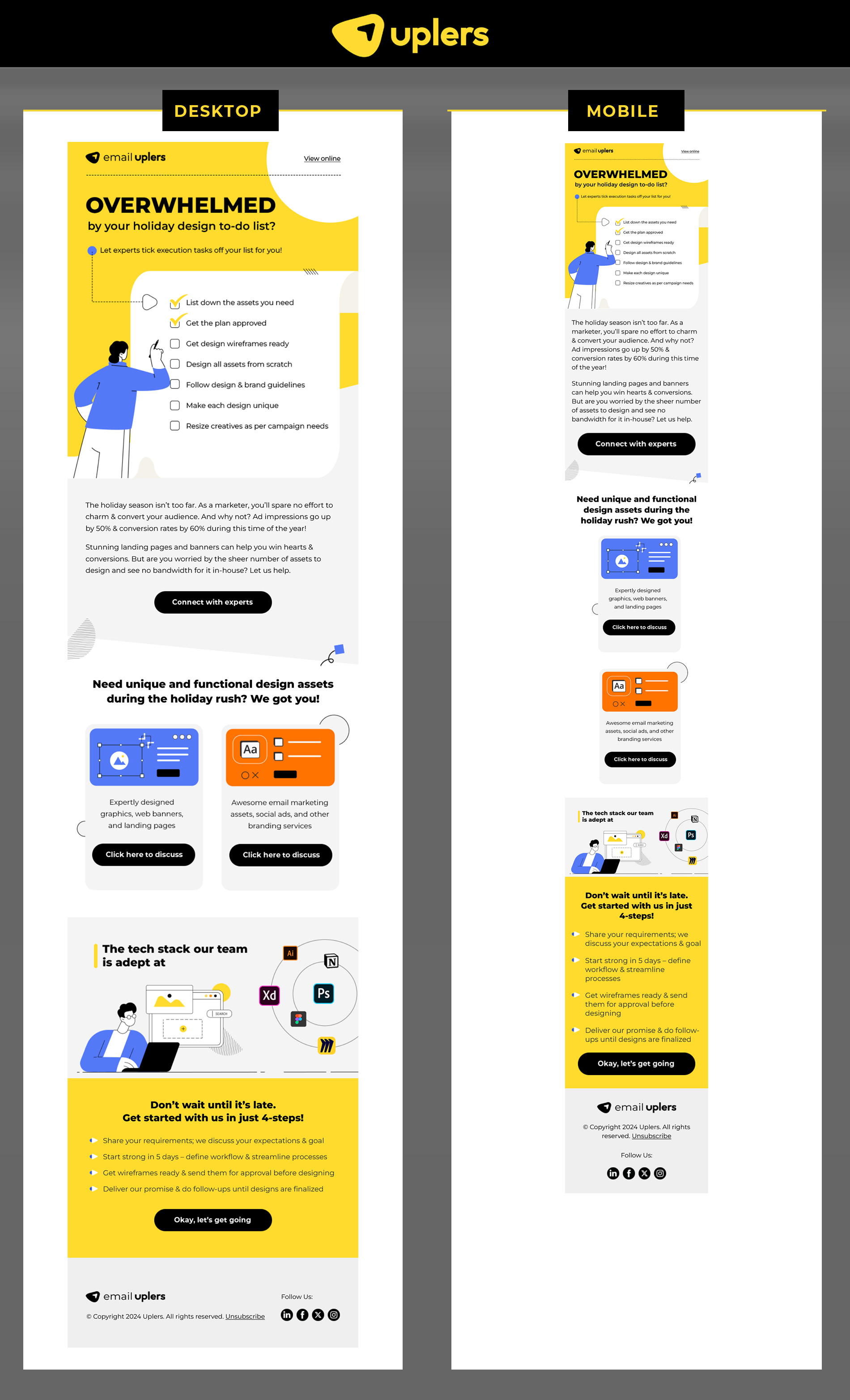
1. Holiday Design Campaign
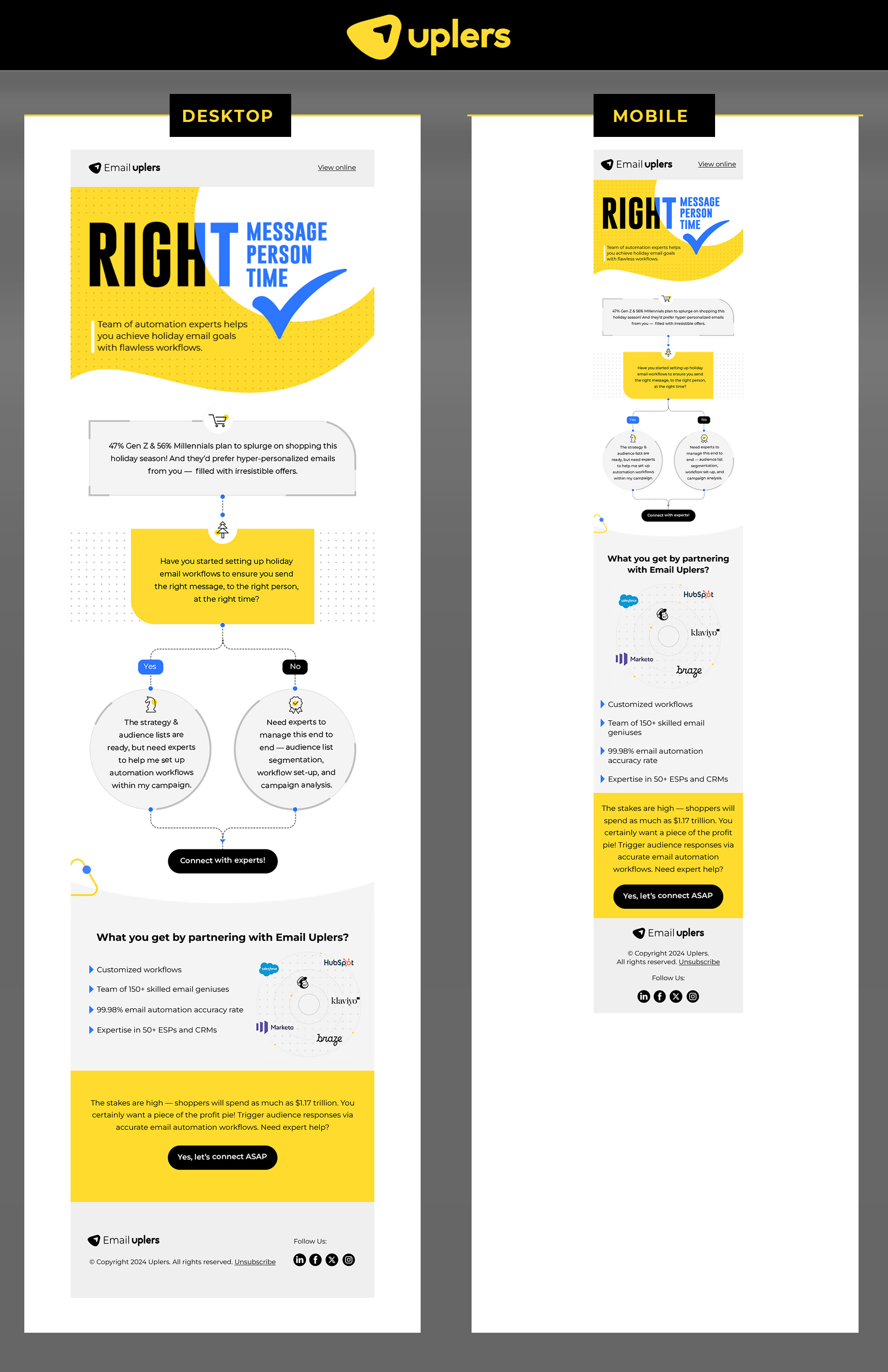
2. Email Automation Campaign
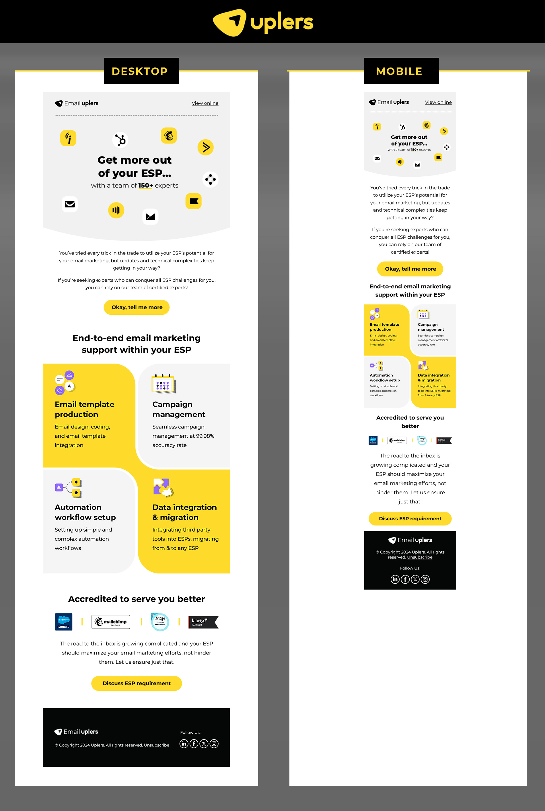
3. ESP Campaign
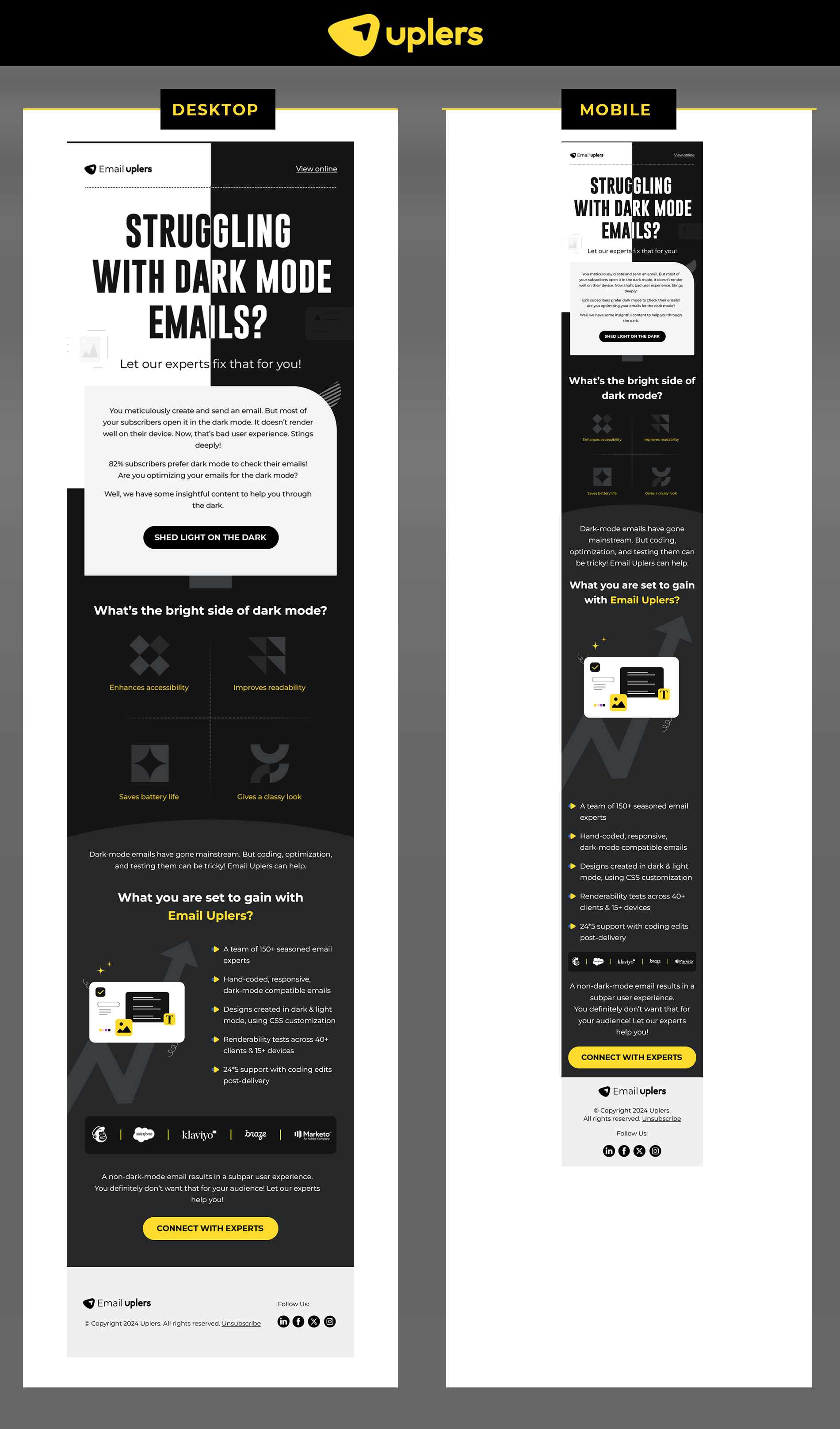
4. Dark Mode Campaign
In Closing: Not Just Our Emails, We’re Responsive Too
If you need help designing responsive email templates, get in touch with our template production team. All pre-live email templates are:
- Litmus-tested across 40+ email clients
- Checked for compatibility with your ESP
- Checked on multiple devices and browsers
- Fortified with appropriate fallbacks
Get more information on all things responsive on our dedicated blog.
Susmit Panda
Latest posts by Susmit Panda (see all)
How to Upload Emails to Your HubSpot Account: A Step-by-Step Guide
Understanding User Experience in Email Marketing — A Guide Like No Other