As you must know, a modular email template is a flexible and reusable design framework used in email marketing to streamline the creation of email campaigns.
So, instead of building each email from scratch, a modular template is divided into individual “modules” or “blocks” such as headers, footers, image sections, text blocks, buttons, and other components that make up a professional email template.
Modular email templates is one of our core services as an email marketing agency. Our 150+-strong team of designers and developers delivers over 3000 templates each month. So far, we’ve already designed and hand-coded over 60,000 newsletters.
In this blog post, we’re going to share best practices and “insider” tips on how to leverage modular templates more intelligently.
These insider tips are crazy in-house, and you’ll want to apply these tips as well as best practices in your projects. Let’s get started!
- Brushing up on the Basics…
- Modular Email Creation: General Guidelines
- Design Tips & Best Practices
- Coding Tips & Best Practices
- Limitations of Modular Templates
Brushing Up on The Basics…
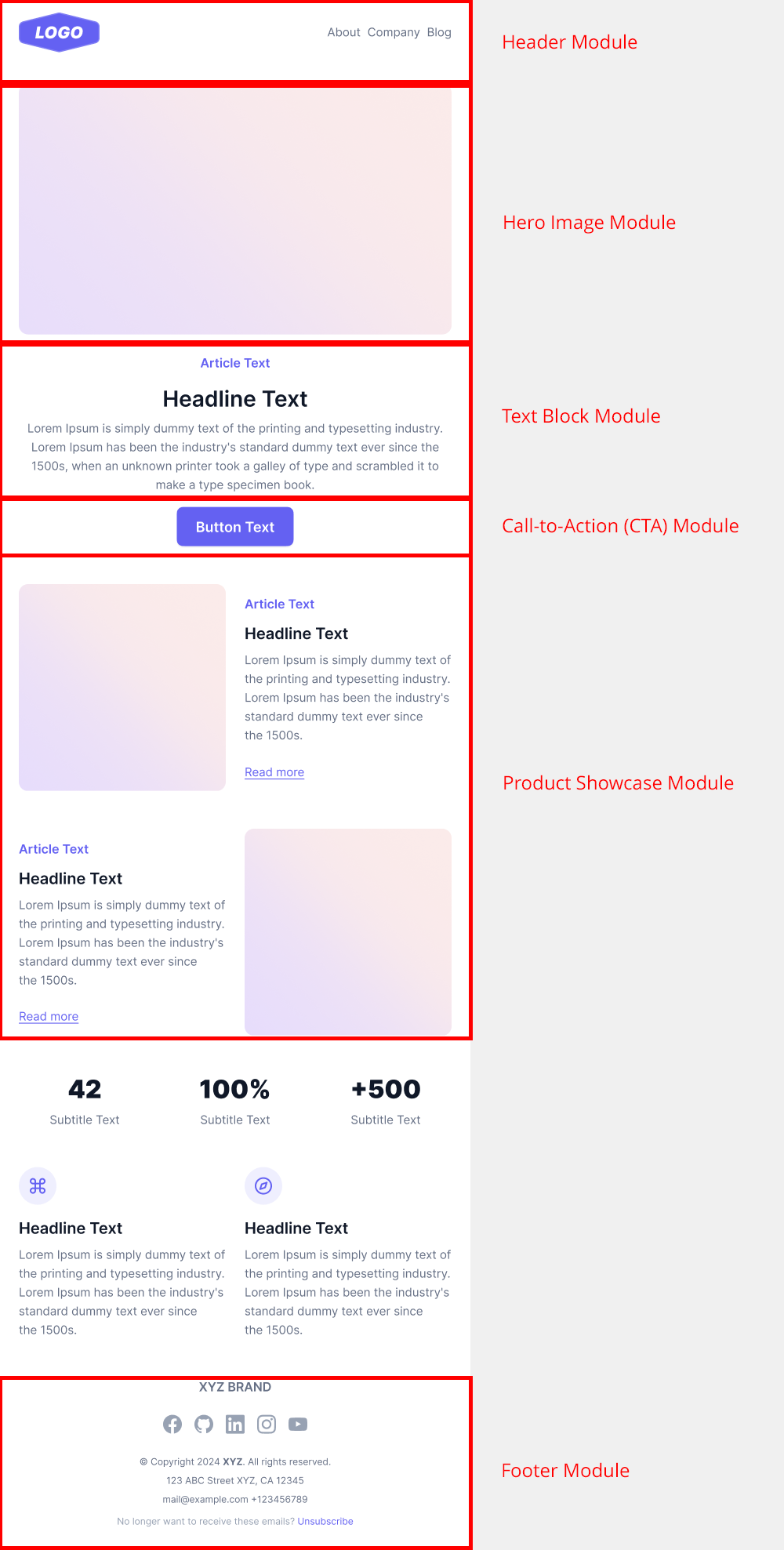
The standard modular email template consists of the following “modules”:
- Header Module: The header typically includes the logo, navigation, and a headline, along with the preheader, a short summary text that appears before the header and provides additional context or highlights key messages.
- Hero Image Module: The hero image is a large, eye-catching image that usually goes at the top of the email.
- Text Block Module: Sections for text content, such as articles, descriptions, or promotional copy.
- Call-to-Action (CTA) Module: Buttons or links that encourage readers to take action, like “Shop Now” or “Learn More.”
- Product Showcase Module: Displays products with images, descriptions, and pricing.
- Footer Module: Contains brand information, social media links, and unsubscribe options.
Here is how a modular email template looks like:

The advantages of modular email templates include the following:
- Efficiency: Speeds up the email creation process by using pre-designed and pre-coded modules.
- Consistency: Ensures a uniform look and feel across different emails and campaigns.
- Flexibility: Allows easy customization and rearrangement of content blocks to fit different purposes.
- Scalability: Facilitates the addition of new content or modules without needing to redesign the entire email.
Finally, here are a few use cases of modular templates:
- Newsletters: Perfect for creating newsletters with recurring sections that can be easily updated.
For instance, here’s one of our own newsletters that we created for Bleacher Report. The entire email is based on the modular framework.

- Promotional Emails: These emails are ideal for marketing campaigns where different products or offers need to be highlighted.
Catch this promotional email we designed for My Muscle Chef.

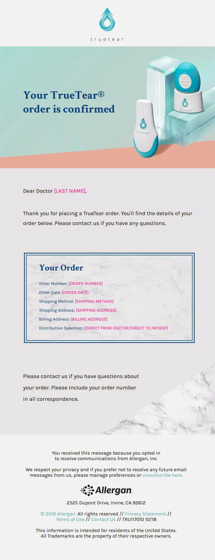
- Transactional Emails: Useful for creating standardized yet customizable order confirmations, shipping notifications, etc.
Here’s a transactional email template based on the modular framework that we designed for Allergan.

- Event Invitations: Great for event announcements and follow-ups where modular blocks can highlight different details like speakers, schedules, and registration links. Here’s one such email template we built for one of our clients — again, based on the modular framework.

Modular Email Creation: General Guidelines
Consider these general guidelines or starting points before diving into modular emails:
- Explore your existing email templates to identify patterns. Identify recurring components that may be legitimately saved out as reusable modules.
- Once you’ve documented the possible modules, the next step is to identify which email sections you’d like to modularize.
- Create a boilerplate HTML to include your preferred modules across all future emails.
Modular Email Templates: Design Tips & Best Practices
Generally speaking, an email template should be 600-700px wide and 1500-3000 px long.
But in the case of modular email templates, we can ignore the standard height because we need to create reusable components. To begin with, here are some basic styling rules you should follow:
- Design must look and feel consistent to all modules
- Use a cohesive color scheme, typography, and imagery as per the brand guidelines
- Use headings, subheadings, and varying font sizes to create distinctions between different types of content.
- Design modules that can be easily rearranged to create different layouts.
- Include versatile content blocks like headers, footers, text blocks, image blocks, and call-to-action buttons.
- Use a grid system to ensure alignment and spacing are maintained when new modules are added.
- Use responsive design techniques to ensure modules look great on all devices.
- Design with scalability in mind to accommodate future updates or additional modules.
Modular Email Templates: Coding Tips & Best Practices
- Use of Tables: Tables are used in email coding because they ensure consistent and reliable rendering across different email clients.
Unlike modern CSS techniques, which may not be fully supported, tables provide a predictable structure that works well in both old and new email clients, ensuring layouts appear correctly. They also help manage complex layouts and allow for in-line styling, which is crucial since many email clients strip external CSS. - Inline CSS: Inline CSS is used in email coding because many email clients ignore external and embedded CSS. By applying styles directly within the HTML elements, inline CSS ensures that the email’s design and formatting are preserved, leading to more consistent and predictable rendering across various email clients. This approach is particularly important for maintaining the visual integrity of emails across platforms.
- Responsive Design: Use responsive design techniques like media queries to adjust email layouts based on screen size, ensuring they look good on all devices. This helps improve readability and engagement across desktops, tablets, wearables, and smartphones.
- Avoid Complex CSS: Stick to simple styles and basic formatting to enhance compatibility across different email clients. Complex CSS properties (like Flexbox or Grid) may not be supported everywhere, leading to layout issues. Instead, focus on using inline styles, tables for structure, and straightforward designs to ensure consistent rendering and a better user experience.
- Testing: Testing in email involves checking how your email renders across different devices and email clients to ensure consistent formatting and functionality. This includes verifying design, links, images, and overall layout to identify any issues before sending. Using code review tools alongside testing can further improve the quality of your modular templates by catching coding errors, enforcing best practices, and ensuring clean, maintainable HTML and CSS.
Effective testing helps improve user experience and engagement by ensuring that emails look good and work properly for all recipients. There are several email testing tools like Litmus, Email on Acid, Email Preview Service, etc. - Fallbacks: Fallbacks for custom fonts and background images are added to ensure a consistent look and user experience when these elements are not supported by certain email clients or browsers. If a custom font or background image fails to load, fallbacks provide an alternative that maintains the design’s integrity and readability. This prevents emails from appearing broken or unattractive, ensuring that all recipients have a similar experience regardless of their email client capabilities.
Limitations of Modular Templates
Notwithstanding the advantages and use cases of modular templates, it has a few limitations that might force you to consider better alternatives:
- Limited Design Flexibility: While modular templates offer flexibility, they can also limit design creativity due to predefined structures.
- Code Complexity: Maintaining and updating modular templates can become complex, especially with multiple versions and variations.
- Client-Specific Limitations: Some email clients have limited support for advanced CSS and HTML features, affecting the functionality and appearance of modules.
Need A Leg Up on Your Email Design Ideas?
Do you want our email template experts to breathe life into your ideas? We’re not just about modular templates. From custom to interactive, we do it all. If you need, catch our “infotaining” infographic on interactive emails.
At Email Uplers, we’re a template juggernaut. Feel free to drop us a line!


Yagnik Bhalodia
A results-driven email development professional with over 8 years of experience, Yagnik Bhalodia has excelled in roles at Email Uplers. His expertise includes team leadership, project management, and advanced email coding. Passionate about innovation, he specializes in automation and dynamic content. He enjoys reading and staying updated on new tech trends to continuously enhance his skills.
Susmit Panda
A realist at heart and an idealist at head, Susmit is a content writer at Email Uplers. He has been in the digital marketing industry for half a decade. When not writing, he can be seen squinting at his Kindle, awestruck.
An Inside Look at The Email Design & Development Process at Email Uplers
How to Use Margins and Padding More Effectively in HTML Emails