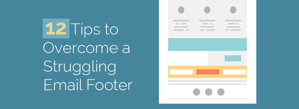
Your email represents you, and the footer of your email acts as your business card containing all your communication particulars. As a matter of fact, the footer has more to it than just the contact information which can prove vital for a successful email campaign. So, how do you optimize the footer of your email to fashion it effectively?
Well, let’s head to the Cloister of Uplers to experience the godly tips to consider while creating the footer for your emails.
12 Tips to overcome a struggling email footer:
- Visually distinct looking footer – As the name suggests, the footer is at the bottom of an email. So, when a reader scans through the body your email, a visually attractive and distinct footer will grab their attention.You can play with the colors and fonts in the footer. Consider keeping the color of the footer in contrast with the colors used in the email body. This can make your email look visually appealing.
- Theme it up with your email’s theme – In the previous point we spoke about the use of contrasting colors in the footer. But, this doesn’t give you the license to use fancy colors or fonts in the footer, going away from the theme of your email. Maintain the font consistency across the email. Also, striking typography in footer is as important as it is in the rest of the email.
- Optimize with social sharing buttons – Social sharing buttons in the footer gives you an opportunity to engage with your customers and make them feel special. You can track footer social sharing to monitor the increase in engagement, followers, click, etc.
- Provide mailable address and link to unsubscribe – Often we get complacent and tend to ignore small things which could prove fatal. Well, footers are meant to contain your contact details, so consider adding postal Service address of your company. This will make your brand look credible and also CAN-SPAM compliant.
Talking about being CAN-SPAM compliant, an unsubscribe link in the email is a must. Give your readers an option to unsubscribe, they wouldn’t be interested anyways. - Possibly, add company logo in footer–It’s actually ok to add the company logo in the footer of your email. If space permits, try adding your company logo.
- Favor the use of table tags for html footers–Consider using table tags in your footer as most of the email clients support them. Also, table tags make your email layout look smooth as compared to div that sometimes make your email look sloppy.
- Responsive footer design – Responsive email design isn’t limited to the main body of the email. A Responsive footer design is equally vital for the email to render smoothly on mobile devices. Remember to test your emails across all devices before shooting your email campaigns.
- Fasten the alt text components in footer – Adding alt texts in an email is one of the best practices while designing an html email. Don’t forget to add them in your footer too. Your social media logos as well as your company logo (if added) might not load at geographical areas where internet connectivity is low. Alt text does wonders in situations like these.
- Plain text version for wearable and connected devices – Wearable devices like smart watches do not render the html emails, they convert them into plain text instead. Consider using multi-part MIME emails which is a blend of html and plain text. Devices that do not support the html part of an email can still render the plain text versions magnificently.
- Say yes to A/b test – A/b test is not only important to observe which subject line or copy is intuitive, but it can be valuable to spot the right footer that can reap benefits to you.
- Restrict stuffing a lot to your footer – Keep it simple. Don’t try to make your footer too fancy to grab the attention. It might back fire and not pass the right message to your audience.
- Color code your URL links – URL links once clicked, changes the color and spoils the look and feel of your email. Try adding color code to your URL links, they work wonderfully well.
Take Away
- Let your footer look vividly unique from the rest of the parts.
- Be CAN-SPAM compliant.
- Social sharing buttons is the key.
- Use forward to a friend option
- Keep it tidy but informative


Kevin George
Latest posts by Kevin George (see all)
Got no subscribers on your email list? Fourfold your email list with these tricks!
Urgency in Emails - Countdown Inspirations