
Let me take you back to the college days!
Remember those PowerPoint Presentations you spent hours designing and redesigning?
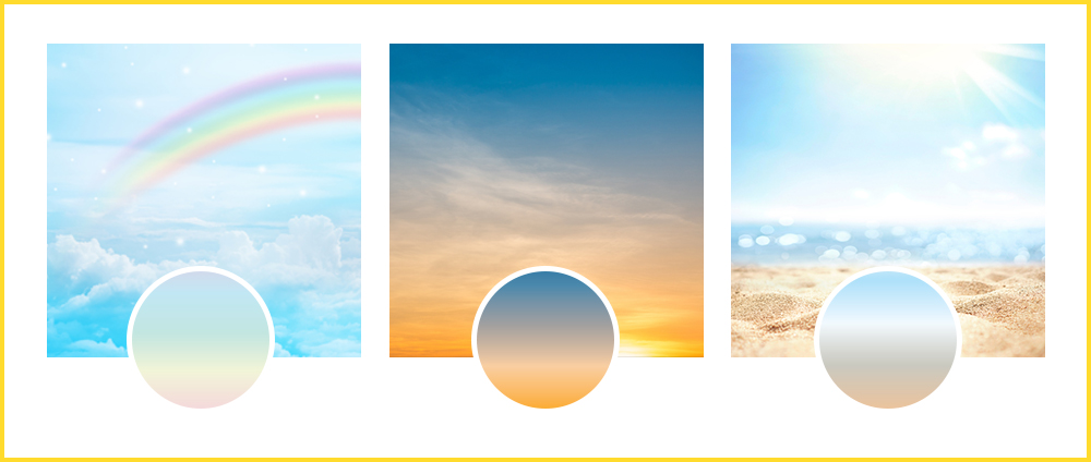
If yes, this screenshot will look pretty familiar…
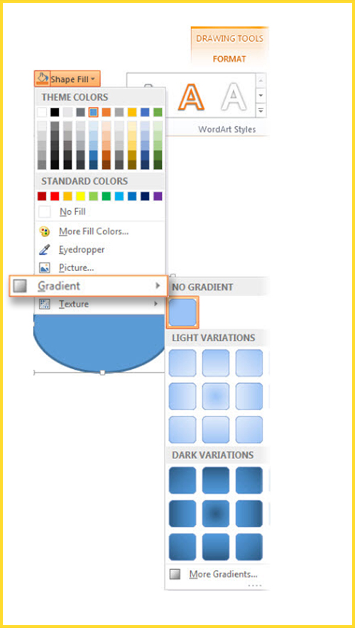
I am not sure about you, but I used gradients in the background for all my presentations. I just loved gradients.
I was really good at choosing the most visually aesthetic gradient without getting too loud with the designs.
Now, I will share another interesting thing with you.
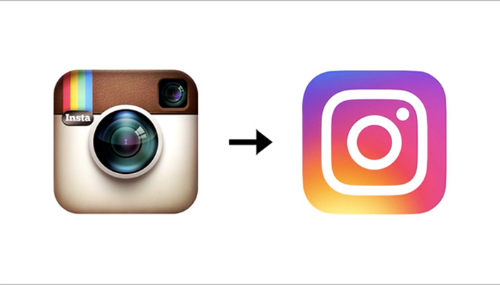
Does this image ring a bell? Well, yes! I am talking about the most loved photo and video sharing social media app – Instagram.
On 11th May 2016, they redesigned their logo and added a rainbow gradient color scheme to it.
It instantly took me back to the good old college days and that rainbow gradient of Microsoft PowerPoint (AGAIN).
Obviously, design geeks took some time to reignite their love for gradients but in 2018, people started using it and expressing their love for this wonderful design trend.
Designers started using gradients to add more visual appeal to the flat designs. You can also add a color overlay to photos or textures to the background with the help of gradients.
Even email marketers are not behind when it comes to incorporating this trend in their email campaigns.
In addition to interactivity, AMP emails, monochromatic layout, and minimalistic designs with pastel colors, gradients will emerge as one of the most promising email design trends for 2021 and the years to come. Brands have already started using this element in their emails and it has resonated quite well with the email subscribers.
Before we check out some wonderful examples of gradients in email designs, we shall sort out the basics.
So, what do gradients look like?
Gradients or color transitions refer to the smooth blending of one color into another. If you like vibrancy, you can have a transition of multiple colors too. According to your brand personality, you can use subtle gradients or bold ones.
You can either have gradients of similar colors like different shades of red or totally different or contrasting colors like yellow and purple. Rainbows, sunsets, and the sea (along with the sand) are classic examples of the most picturesque gradients we have witnessed in real life.
Advantages of Gradients in Email
If someone asks me my favorite design trend in email, my vote will go to gradients without any second thought.
You can reinvent new possibilities with attractive color transitions of gradients. It gives a more sophisticated feel and a fresh look to the emails.
Gradients not only impart a “retro” look to the designs but cut through the noise created by ordinary graphics.
It will create a memorable design and help to create a strong connection with your subscriber.
Some designers use gradients in such a way that it looks like a new color in itself.
Users will start relating the gradient you use with your brand, just like people relate the rainbow gradient with Instagram.
Our minds are programmed in such a way that we always move our eyes from a lighter to a darker area of the gradient. Gradients help to reinforce the visual hierarchy by guiding the eye movement.
Gradient designs that have a halo type area will draw the user’s attention to the main message to be conveyed.
You can even use gradients in the typography to make the copy more readable and highlight the important words.
I guess by now, you must be quite convinced about the usefulness of gradients in email.
Let’s see how brands are adding gradients to email designs and making them more appealing to the subscriber.
Take a look at these fine examples.
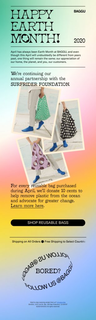
1. BAGGU
Such a soothing email!
BAGGU has sent out a gradient in email with four different color shades – green, pink, yellow, and blue.
What catches the eyeballs is the way they have used gradients in the background and tried to give a similar feel through the three images that they have added.
Overall, it is a minimalistic and subtle email that is sure to impress the email recipient.
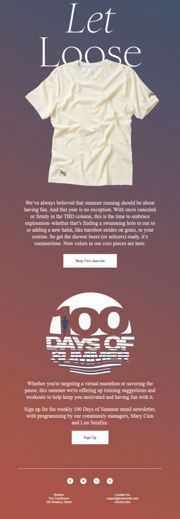
2. Tracksmith
Like we mentioned in our infographic on Email Design Trends 2021, email geeks will combine two or more graphic trends to stand out from the crowd. Tracksmith has done exactly that.
They have combined the power of gradients and animations to highlight their Summer arrivals. This email perfectly demonstrates how gradients can reinforce the eye movement and prompt the user to scroll further.
3. Instagram
I know I have mentioned Instagram too many times in this article, but I just could not help it.
Take a look at this email and you will understand why…

See that gradient effect added to the CTA? It is in sync with their brand logo and other design elements you see in their mobile App. Now, that’s a clever way to increase brand recall and (almost) establish ownership of that gradient.
4. 1973 Ltd.
Monochrome gradient – If you like that paradoxical design element, you will love this email by 1973 Ltd.
Whether it is the animated hero image or the gradient background, more power to the entire team who was involved in the creation of this email.
I guess they live by the quote: Simplicity is the ultimate sophistication!
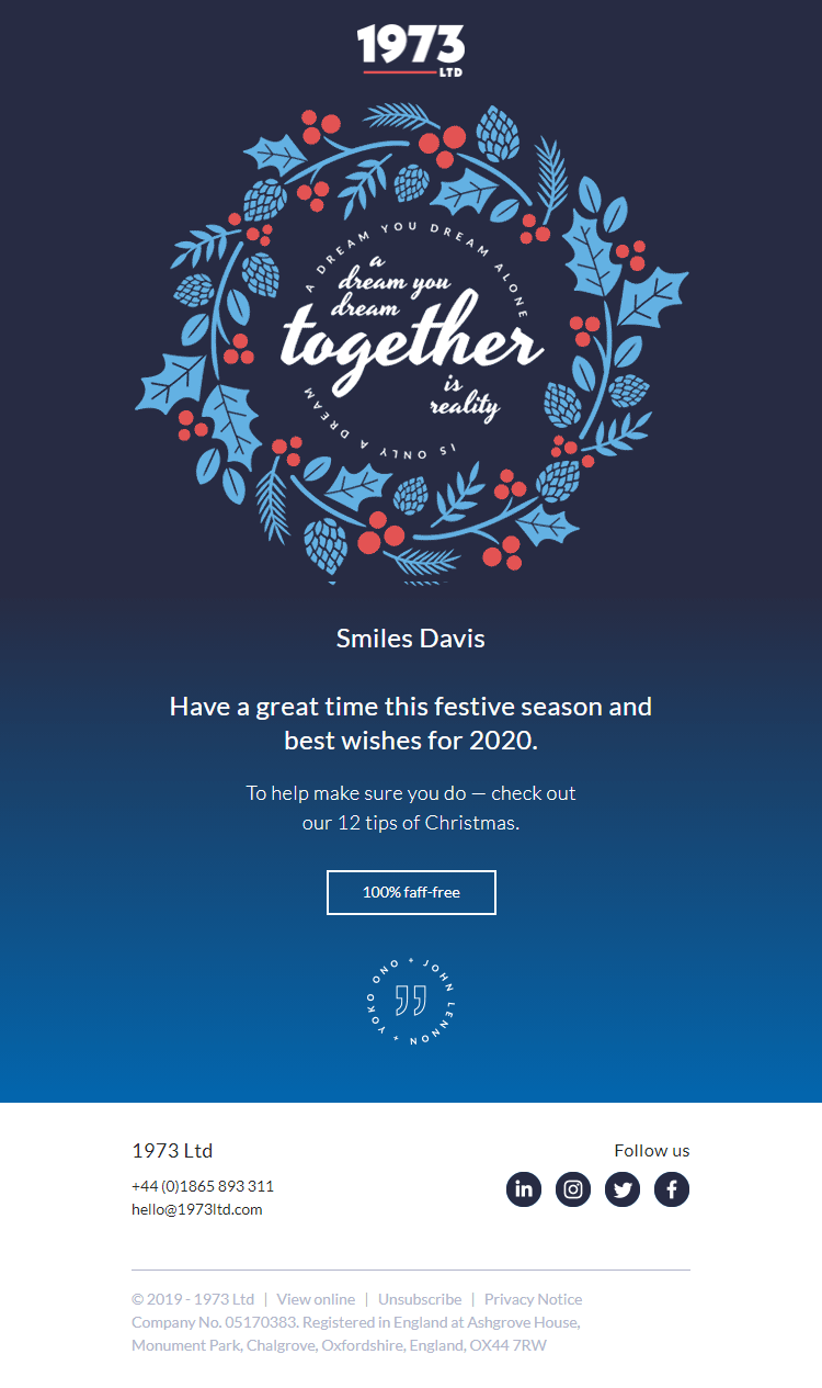
Here again, I would like to mention about the consistency that 1973 Ltd. follows in all their emails.
Take a look at another email from them.
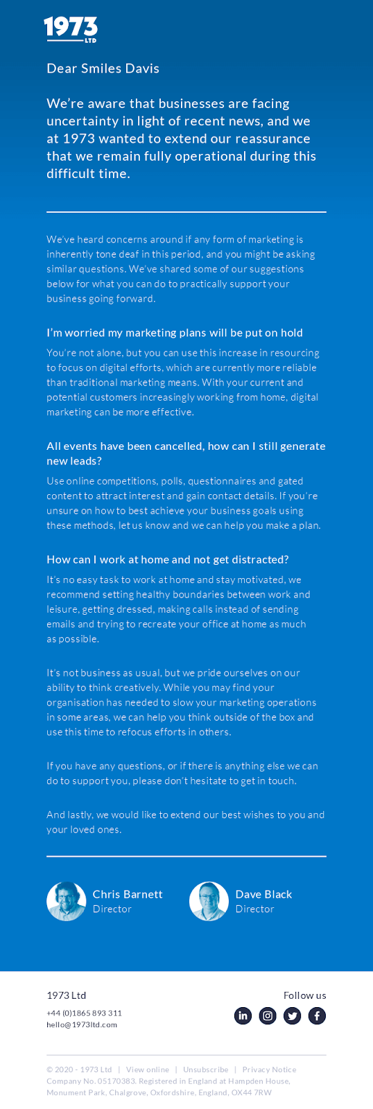
What’s commendable is that even their website follows the same approach.
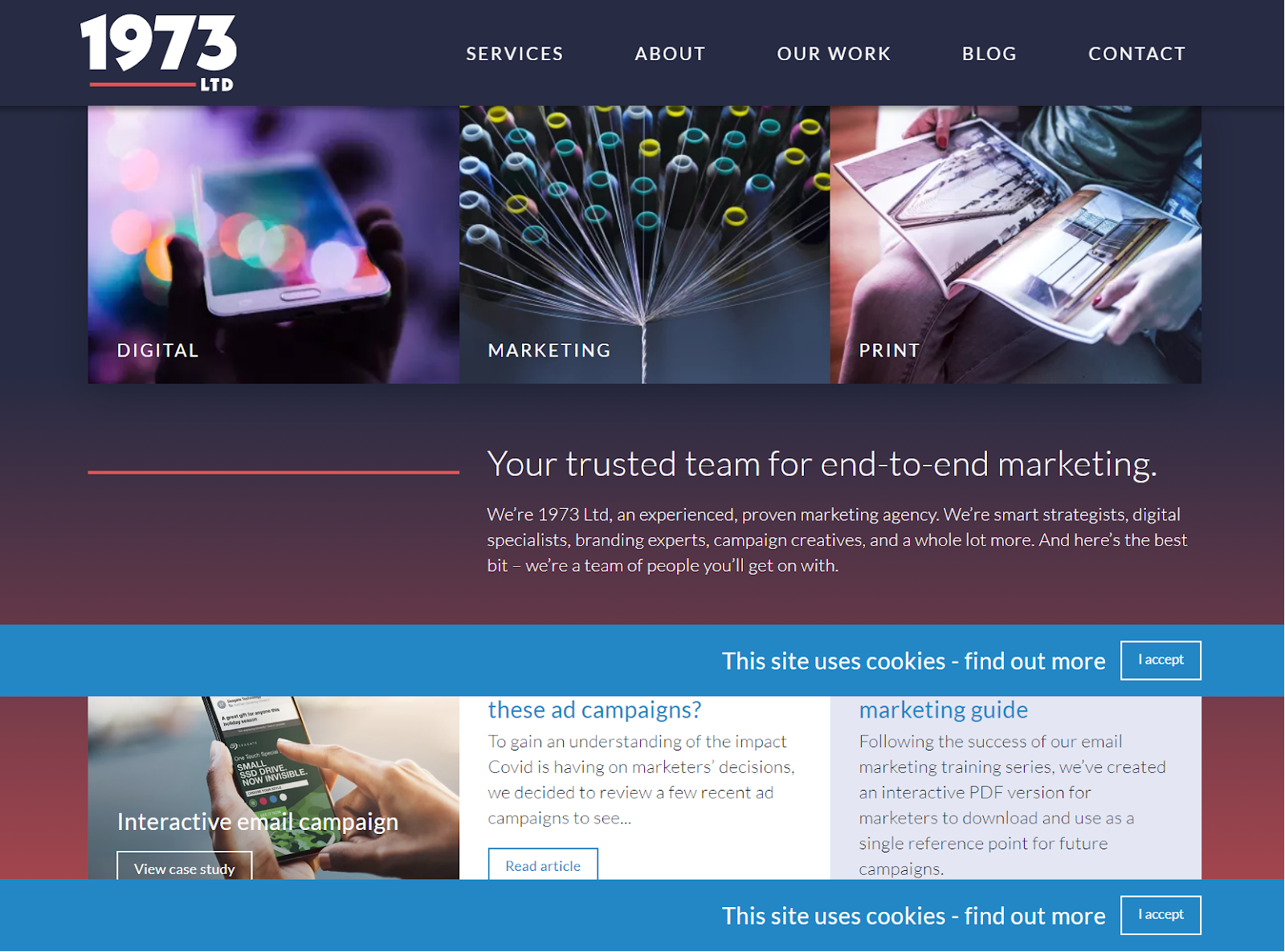
5. allset
Rather than adding a gradient in the entire background of the email, allset has added it in the first fold to promote their new app and website. Also, check the CTA that is perfectly contrasting with the background.
In the next fold, they have included the new features to get people to check out the new look and experience.
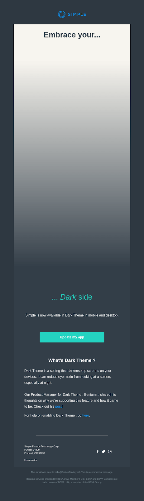
6. Simple
I loved this concept.
Simple has informed the subscribers that their app is now available in Dark Theme in mobile as well as desktop.
They have used white-to-black gradient to convey their message and get people to EMBRACE THEIR DARK SIDE.
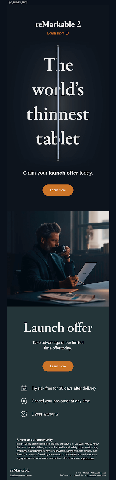
7. reMarkable 2
reMarkable 2 has used a basic gradient theme with a white halo to advertise the world’s thinnest tablet.
The rest of the email has a simple layout but it conveys the purpose of sending it. That’s all that matters, right?
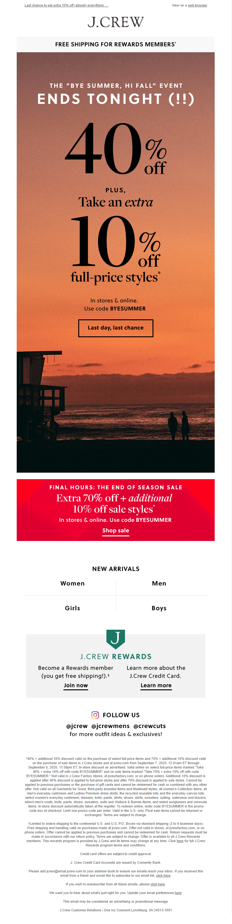
8. J.Crew
Any sunset lovers out there? Well, then, this email is for you.
They have used the most commonly encountered gradient in the best way.
See how J.Crew has used the hues of crimson red and orange to promote their “Bye Summer, Hi Fall” event.
Wrapping Up
In case you are worried about the coding hassles that go into creating gradients in email, let me relieve you of your apprehension.
Just leave your coding woes to our email experts and we will create a beautiful gradient email for you.
…Or you can get a gradient image designed and add it to your email with the help of <img src> tag. Simple, right?
Disha Bhatt (Dave)
Latest posts by Disha Bhatt (Dave) (see all)
Personalization Builder: The Recommendation Setup in Salesforce Marketing Cloud
Lead Forms in Marketo: A Handy Virtual Manual