It’s just about a month to go for Halloween and we are sure you must have already planned a few Halloween campaigns around your products and services.So, how should you design your creative Halloween email so that they look really spooktacular with pumpkins, haunted houses, bats and other related imagery?
Let’s feel the nirvana by looking at some heavenly Halloween inspirations from the Uplers
1) Walmart
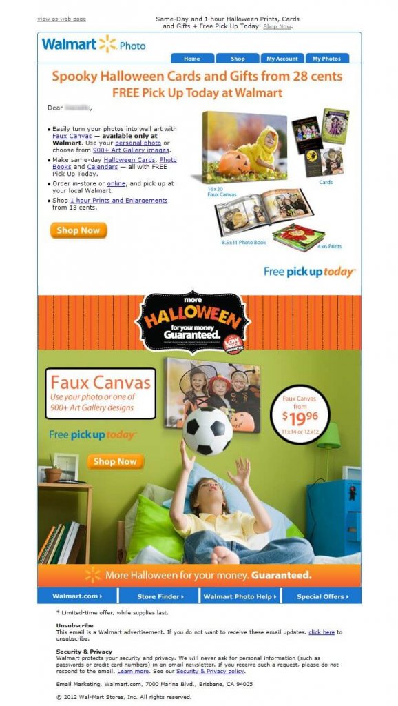
Walmart’s Halloween email is designed with a good use of images mentioning different sizes of photos on a white background. The CTA is crisp and to the point.
2) Old Navy
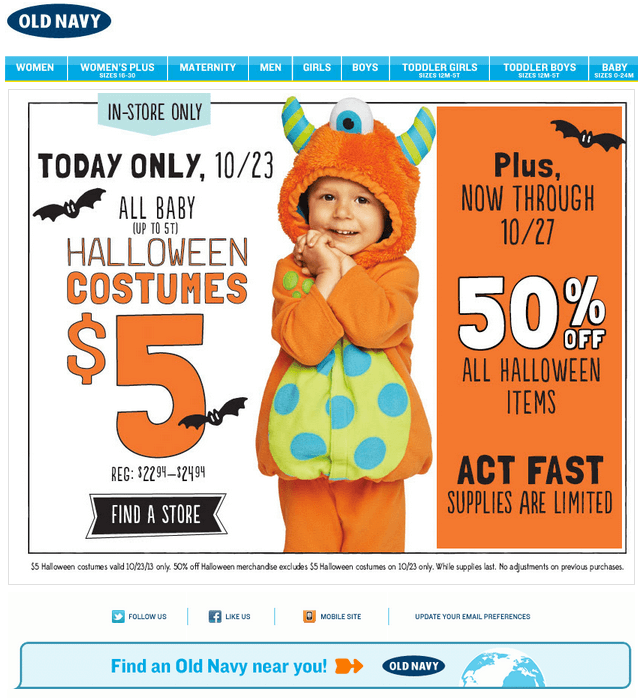
A chic design by Old Navy. The copy is written to the point and the bright colors have been used well.
3) New Look
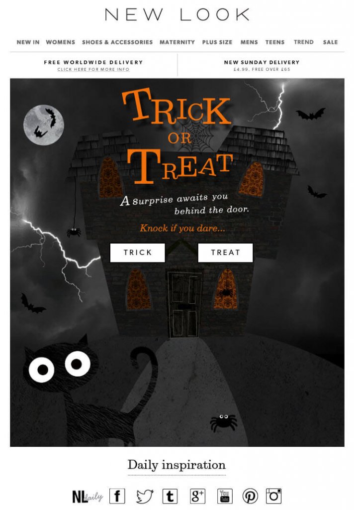
New Look has used the dark background image well. The copy is short and crisp and there is an element of surprise in the CTAs which is an add-on.
4) Krispy Kreme
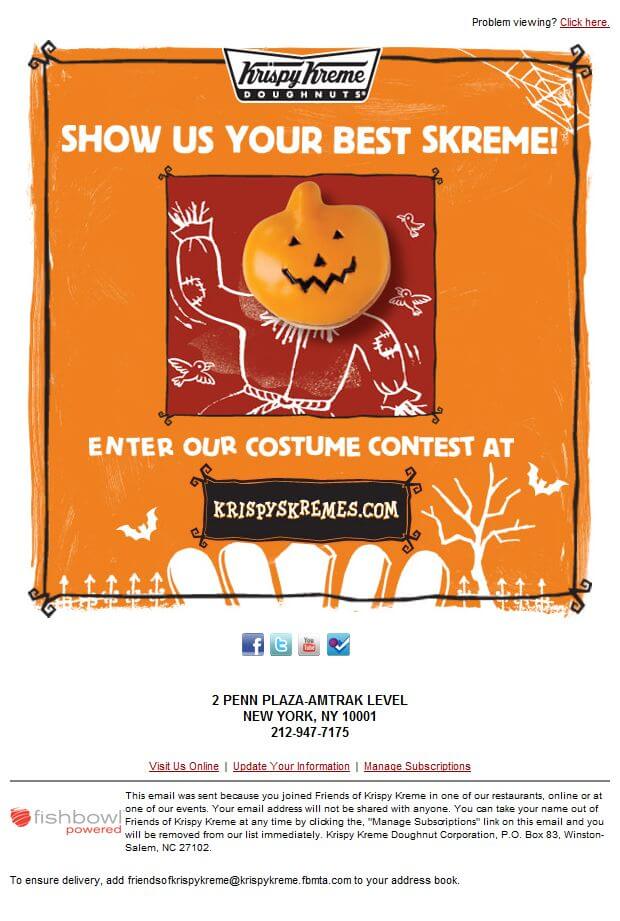
An email, flawlessly designed by Krispy Kreme to showcase the Halloween theme. Beautifully designed CTA, is placed to perfection.
5) J.Crew Factory
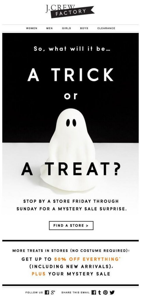
The black and white theme by J.Crew looks different and catchy. The copy is neat and the CTA is crisp to grab all the attention.
6) Early Learning Centre
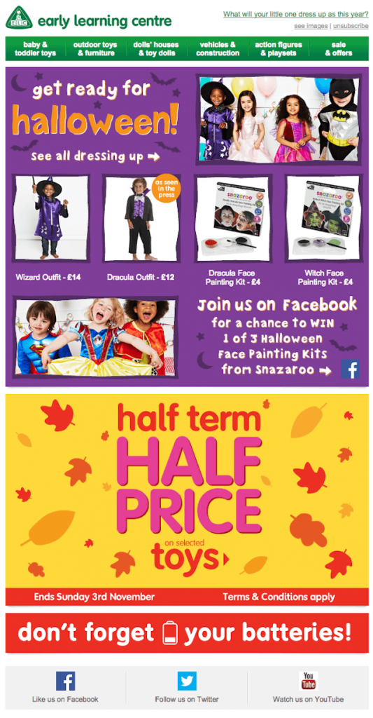
Early Learning Centre has designed the mailer with a good use of images. The copy grabs a lot of attention and the social media icon for the competition is gripping.
7) Dollar General
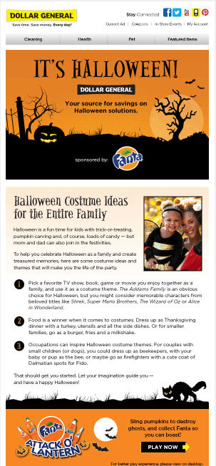 Dollar General’s Halloween email successfully brings on the spooky effect. Juxtaposed colors help in spreading the effect even more. Well-balanced email with compelling copy and eye-catchy CTA.
8) CWD Kids
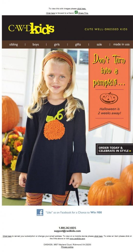
CWD Kids’ email is glued to their there theme and it looks Halloweentastic!!! The copy is captivating enough and the CTA is tells the subscribers what to do.
9) Colgate
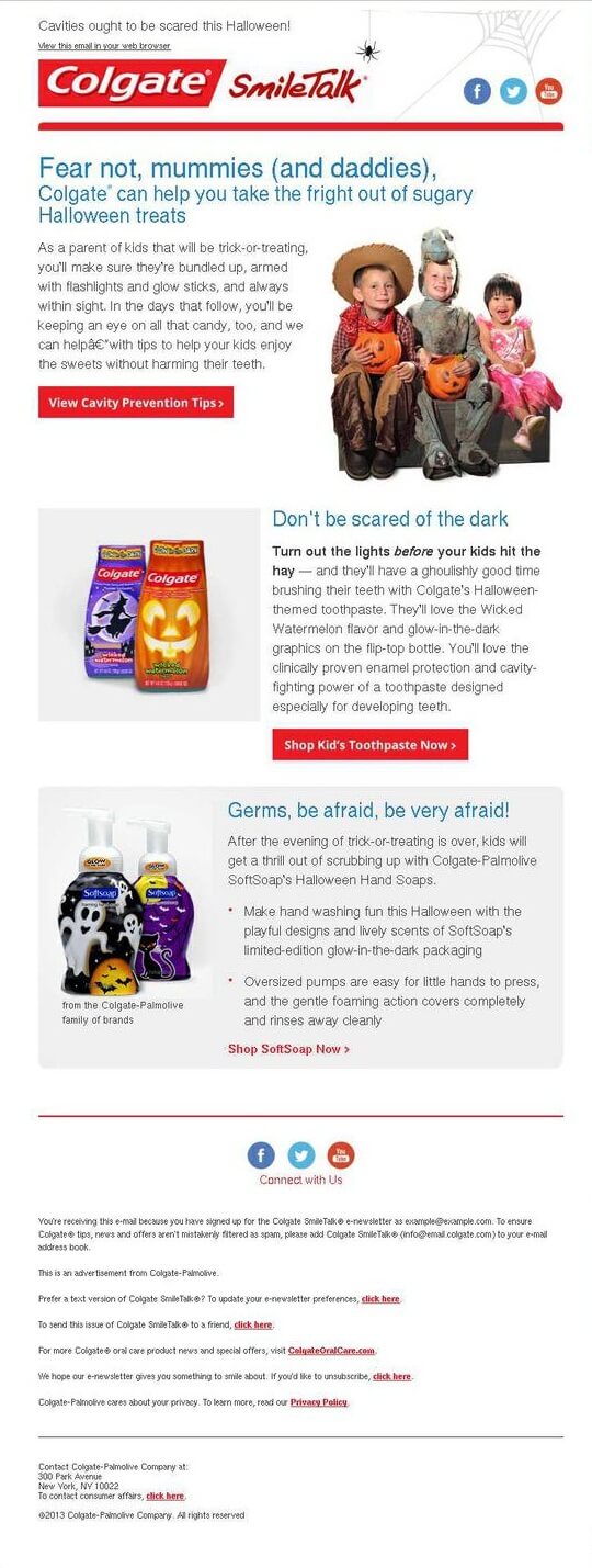
A chic design by Colgate for Halloween email campaign. Good use of different images on white background and the self-explanatory CTAs is an add-on.
10) Coca-Cola
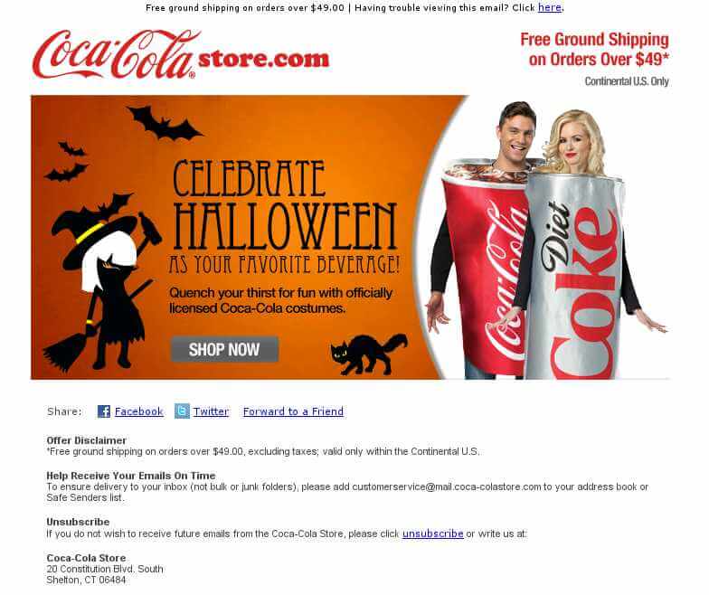 Coca Cola has created a nice blend of images and text to offer the official Coca Cola Halloween costumes.
11) Carter’s
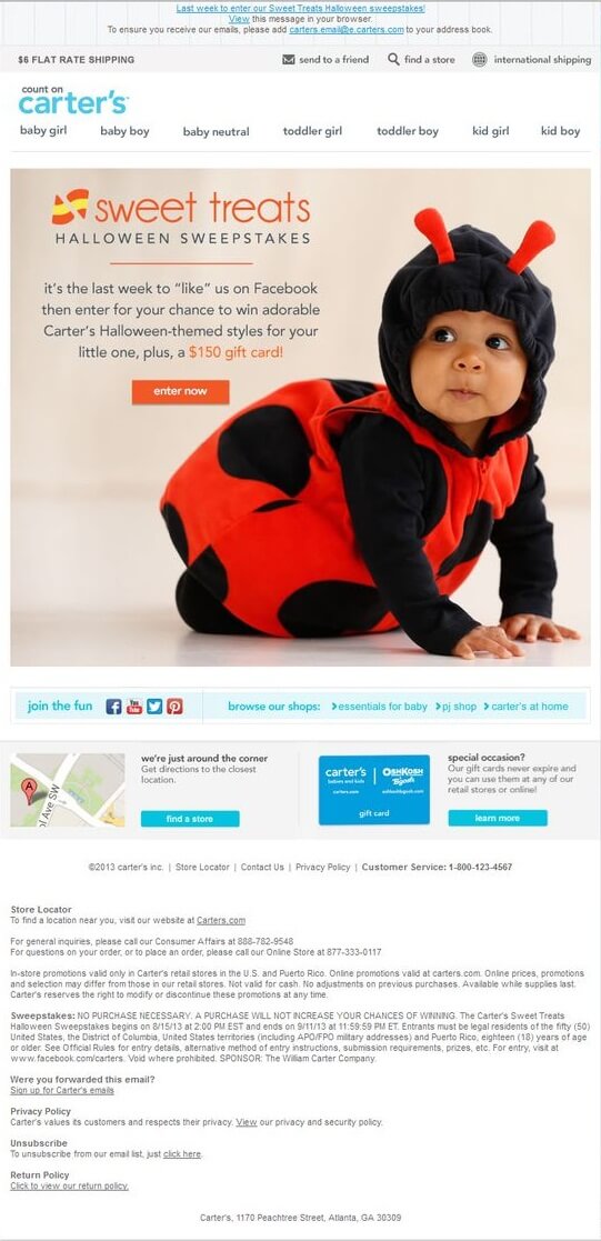
A simple design layout by carter’s for Halloween email grabs the attention. The white space has been used wisely and the copy is simple and clean.
12) Cartoon Network
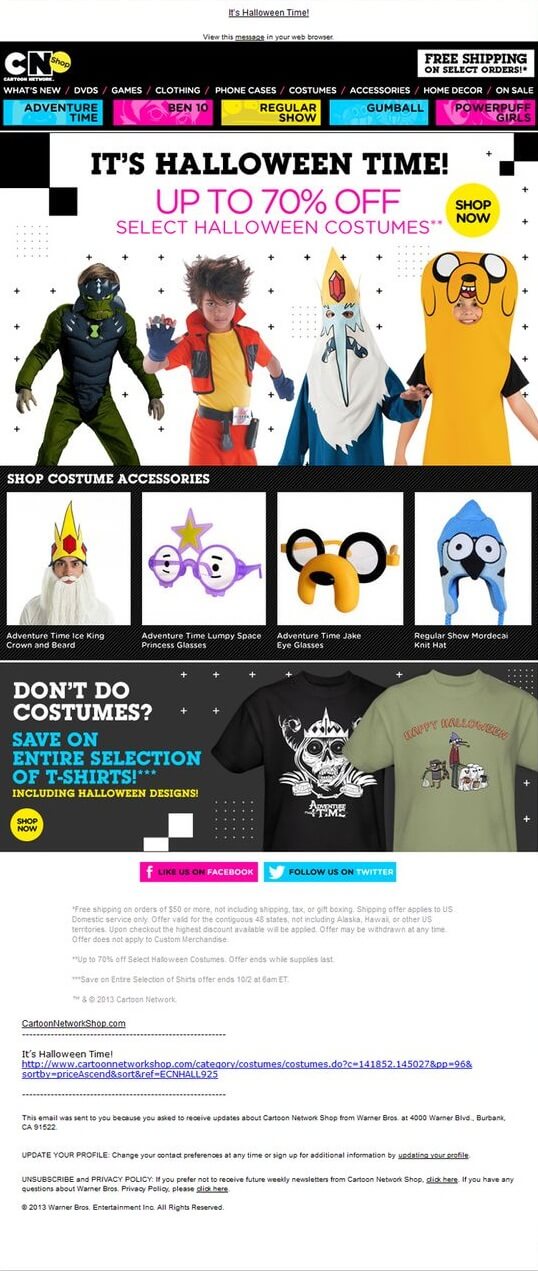
A fine email by CN shop showcasing their range of Halloween costumes and the accessories. Good use of bright colors in the Johnson box is an add-on.
13) ACE
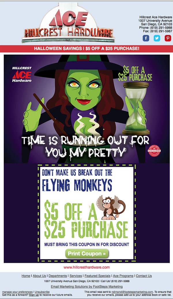
Ace’s Halloween email successfully bring the message on the table while bringing the Halloween theme. Compelling copy & contrasting yet appealing CTA makes this Halloween email more tempting.
14) Cadbury
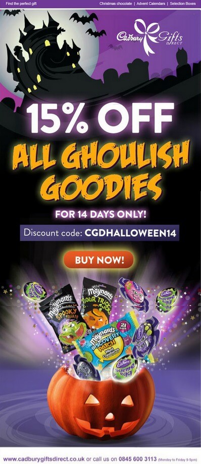
Glued to theme, Cadbury’s Halloween email beautifully brings the spooky effect. The pumpkin & the Halloween effect certainly brings the goosebumps in the first blink.
15) Accessorize
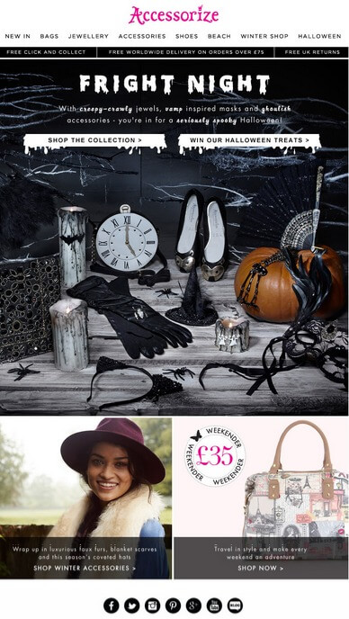
Accessorize’s email perfectly showcase their Halloween theme based products. The CTA’s are clear, specific, and vibrant.
Uplers can help you design and code your next email campaign that is surely gonna be looking ‘Tricked’ and surely be ‘Treat’ to your subscriber.




Kevin George
Latest posts by Kevin George (see all)
Rotating Banner: Advantages, Application & Sample
Interactive Graphs