Irrespective of niche, the newsletter is one of the best ways of familiarizing people with a brand. Not surprisingly, therefore:
- In 2023, 70% of publishers identified the newsletter to be one of the major investment hotposts.
- By 2025, 27% of creators plan on launching a dedicated email newsletter.
- Followed by blog posts, articles, and books, the newsletter is one of the most popular forms of content being created.
- In terms of engagement, newsletters enjoy the highest open rate at 38.7%.
You get the drift: The newsletter is arguably your best engagement tool. It is in your best interest, therefore, to examine what a successful newsletter looks like.
You may have tried to xerox popular newsletters, but to no avail. Why?
Usually, it’s because designers put the cart before the horse. If you want to send out engaging newsletters, you must first examine the anatomy of a newsletter.
In this guide, we’ll do exactly that. Over the last 10+ years, we have designed over thousands of newsletters for global brands and agencies. Let’s begin!
Anatomy of A Newsletter: The Key Components
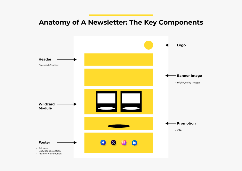
The above image shows a simplified anatomy of a traditional newsletter. The key components of the newsletter are as follows:
- Brand logo
- Visual header
- Hero banner/banner image
- Body (text and image)
- Footer
Now, let’s examine each of these components in detail. (Note: Newsletter design varies from brand to brand. However, the framework is more or less consistent.)
1. Brand Logo
The logo of your brand is the first thing that the reader will see. You want to make it prominent, solitary, and immediately recognizable.
Do not design a separate logo for your newsletter.
Consider the following example: Xtool features their brand logo in the centre of the header of their newsletter. Note the absence of any surrounding element. The logo should have its own space above the header.

Here are a few expert tips on adding a brand logo in your email newsletter:
- Choose the right image format for your logo. PNG is usually recommended.
- Optimize the size of your logo. You want to make it visually appealing without pre-cluttering the header space.
- Make sure that the logo aligns with your brand identity.
- Determine the best alignment. You can go left, centered, or right. In the above example, the logo is centered.
- Your brand logo should be clickable and redirect to the home page.
- Provide a brief but descriptive alt text to make your brand logo accessible.
Let’s study email newsletter headers next.
2. Header
When it comes to the header of an email, you need to understand the differences between the technical header and the visual header.
The technical header consists of automatically-generated sender details.
But the visual header is part of the email template. Here’s Xtool’s header.

The header usually contains what is known as the primary navigation bar. Clicking on each of these menus redirects the user to the corresponding page.
That’s the goal of the email navbar: To get the reader to your website.
It’s important to note that not all newsletters necessarily contain a primary navbar in the header. But for starters, it’s best to stick to the established framework.
Speaking of visual headers, you may want consider these expert tips:
- The navbar needn’t be exactly the same as the one on your website. Email is space-constrained. Add only the most relevant/popular pages.
- You may have to scale it down further, if not remove it altogether, for mobile devices. Make sure to test it across various mobile devices.
Concerning that last point, Jordie van Rijn says, “The links are like clusterbombs, with a big chance of mistakenly tapping on the wrong link with your finger.”
3. Hero Banner
The hero banner is what introduces the newsletter. Most email newsletter examples would feature a hero banner. But keep in mind that the hero space can be variously designed. Sometimes it may not feature an image banner at all.
The point is that the hero space acts as an introduction. For instance, Xtool’s email newsletter doesn’t feature an image, but a textual introduction.
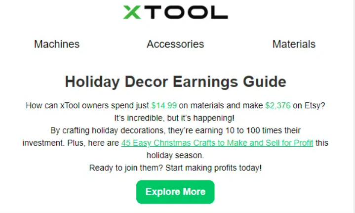
Xtool’s “Holiday Decor Earnings Guide” is the primary headline/heading. But you can use a hero image if you need the introduction to be as vivid as possible.
We’d recommend using a hero image. Not just because it’s how most brands do it, but to enhance the viewing experience as well.
In addition, it improves email readability. Which is a big deal in the email world.
As Mark Morin, CX and email automation expert, explains, “Poor email design makes reading slower. More difficult. More strenuous. Poor design adds friction to the communication process. On mobile device, it only gets worse. Unfortunately, eyes are imperfect devices. And the older they get, the less they work properly.”
For example, this newsletter has a hero image banner.

Here are a few tips on how to design a successful hero banner for your newsletter:
- Use solid colors and bold fonts to make the banner stand out.
- Choose the right size for the hero text: 28-30px for headlines and 18-24px for subheads. Keep the character count between 40 and 80.
- For mobile experience, stick to narrow emails, usually 500-650 px wide. But for desktop, use wider templates that are 960-980px wide. It’s template width that determines how the image displays on different viewports.
- Determine the right alignment. We recommend “centered.” It fits the inverted pyramid flow, guiding the eye downward to a CTA button.
- Maintain standard line spacing. Neither too tight nor too spaced.
Before we move on to the email body, remember to add a View Online link, issue number, date, and a Subscribe link above the visual header.
4. Email Body
The body is where you add the newsletter’s meat and potatoes. You can use a single column or multiple columns to feature content.
Xtool, for instance, stacks their content in a two-column format.
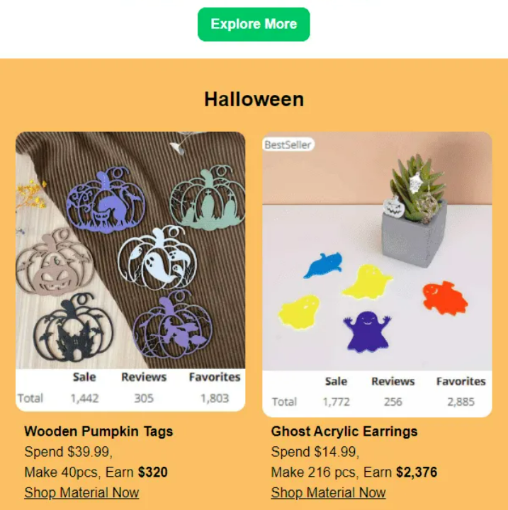
Most email newsletter examples would use just one column. Unless your newsletter is promoting stuff, you wouldn’t need a product grid like Xtool’s.
Because newsletters are meant primarily for readers, not buyers, the single-column format is ideal. Doug Morneau classifies newsletter format into three types:
- The traditional format offers a mix of content such as news, blog posts, and promotions. Use this format if you want to keep readers informed.
- The digest format allows you to offer “multiple pieces of content.” Morneau recommends this for brands that put out a high volume of content. The typical newsletter digest acts as a teaser to encourage readers to click through.
- The curated content format includes valuable content from other sources in your niche. This is best for when you want to reinforce brand credibility.
Here are a few tips to help you nail the newsletter body:
- Employ storytelling techniques to keep the readers engaged. It could be in the form of success stories, milestone events, character portrayals, etc.
- Leverage multimedia elements, such as GIFs, infographics, high-res images, videos, ticker GIFs, to name a few. But don’t go overboard.
- Use emojis wherever relevant. Include relevant CTAs and anchor text.
- Remember to add alt-text to the visual elements for better accessibility.
- Talk about upcoming events, webinars, popular reads, testimonials, etc.
- Make sure every piece of content within the body is distinguishable. Feel free to add visible dividers or white space to mark the territory, as it were.
The body is the space to invent. You can add anything relevant to your audience in any way you want to. It is what we like to call the wildcard module.
In fact, it’s the wildcard module that marks off the best newsletter examples from the rest.
5. Footer
Finally, the footer. The footer of a newsletter consists of the following elements:
- Proof of Consent
- Unsubscribe link/preference center link
- Social media icons
- Privacy policy
- Brand-specific riders, Terms & Conditions, etc.
- Physical mailing address
- Support team email address
- A View Online link (if not already displayed in the header)
- Copyright notice
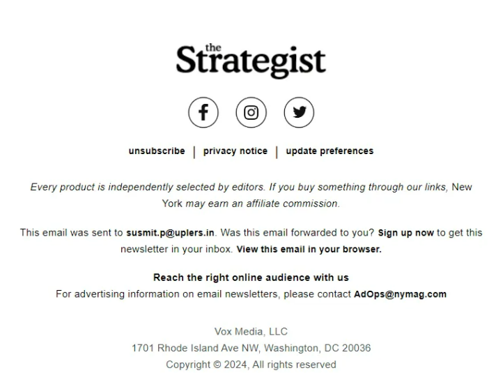
The footer is usually the legal eagle’s Happy Place. It can be brief or descriptive as per your legal requirements. See The Strategist’s footer below.
Email Newsletter Best Practices
Now that we’ve examined the anatomy of a newsletter, apply a few best practices:
- Avoid relying on AI for content; your newsletter subscribers are readers first. Make your copy engaging but visually concise.
- If content feels repetitive, vary your subheadings with questions, remarks, or even jokes.
- Use a conversational tone and storytelling. Include multiple POVs.
- Focus on user-friendly design. Break up text with relevant images or simple decorative elements.
- Use white space to reduce visual clutter in longer newsletters.
- Don’t overload with links. Place them strategically and diversify with emojis, icons, and buttons.
- Encourage engagement by asking subscribers to take polls and quizzes.
Want to explore more email newsletter examples? Go through our expertly curated nonprofit newsletters. Or try these holiday newsletter examples.



This is an excellent breakdown of newsletter anatomy! The insights into subject lines, preheaders, and CTAs are invaluable. I’ll definitely be implementing these tips to improve my email marketing campaigns. Thanks for sharing!”