Being an e-commerce brand, you depend on visuals to showcase products.
However, creating aesthetic value in your email requires more than just a breeze of creative inspiration. You’ll need to marry aesthetics to functionality and optimize your best design for sales. That’s where the buck starts. But with the holiday season pressing closer and inspiration also coming in feeble drops, getting started is hard and paralyzing.
So, to help you get started, we have selected some top e-commerce email templates that are both visually appealing and sales-oriented.
From GIFs to interactivity to unique layouts to persuasive design, here’s a curation worth scrolling for.
- 1906
- Joy Creative Shop
- Apotheke
- Levenger
- Feals
- Gladskin
- Smalls
- Pizza Express
- Mizzen+Main
- Lands’ End
- Shinesty
- United Sodas
- Fussy
- Keen
- dbrand
15 e-commerce Email Template Examples
1. 1906

Our first e-commerce email template is an interactive, animated email.
That sells it already! Because according to Litmus, 91% of users want to see interactive emails, but no more than 17% of marketers provide it.
Admittedly, 1906 does something rare here! From the large rotating pill to the HTML text to the laser-specific CTAs, this new arrival email is right on the money. We also love the gummy-shaped bullets and the alternating letter case that command’s the viewer’s attention. Way to go, nineteen o!
What 1906 Does Right
- Uniform color scheme
- Slow-paced GIFs
- Functional interactivity
- Benefit-focused copy
2. Joy Creative Shop
Joy Creative Shop’s colorful email asserts itself with a nifty hero image.
Emily Ryan, founder and email strategist at Westfield Creative, also gushes about this email, “I love the huge “FRIDAY” hero image and the large buttons and category sections. This email was just delightful to open in the morning!” Couldn’t agree more!
What Joy Creative Shop Does Right
- Single-column layout for greater accessibility
- An elaborate social block
- Eye-friendly color combinations
Good extended use of the brand palette
3. Apotheke
This burgundy-topped e-commerce email design from Apotheke is suave, warm, and nice to look at. It captures the fall vibe with a clean layout, minimalist design, and well-spaced content. We love how the aesthetics of the email coordinates with that of the product.
What Apotheke Does Right:
- Image-aligned typeface
- Customer testimonial
- Brilliant use of white space
- Inverted pyramid layout
4. Levenger
We’re fans of eccentric layouts, and Levenger’s zig-zag product-focused layout makes for a great viewing experience. Instead of using the Z-shaped layout the way it’s usually done, Levenger lets it bleed across the template.
Let’s not forget the color scheme though: the light-blue shades all the way down lend a balance to the imposing layout.
What Levenger Does Right:
- Masterful product photography
- Consistent use of tints
- Easy-to-remember offer copy (Was vs. Is)
- Product illustrations
5. Feals
It’s one thing to show up with a product and quite another to educate others about it. Customer education increases product adoption by 38%.
And that’s the road Feals takes with this e-commerce email template.
The extent to which they go to explain their products through one email is impressive. This is e-commerce marketing at its peak. From the comparison chart to the animated GIF, Feals does tick all the right boxes.
What Feals Does Right:
- Product education
- Uniform color scheme
- Tight, relevant copy
6. Gladskin
Gladskin’s zodiac email bowls you over with a sparkling hero image. This is a nice way to add a personalized touch to your e-commerce emails. Kicking things off with bold design, the template lightens as it progresses, striking a perfect balance. The single CTA also contributes to it.
Relatedly, integrating astrology into marketing is a thing now. So, feel free to leverage it in your email campaigns. Just don’t overdo it.
What Gladskin Does Right:
- Elaborate recovery module
- Well-executed invert pyramid
- Single CTA
- Aesthetic balance
7. Smalls
We adore this e-commerce email template by Smalls for so many reasons!
The benefit-focused heading adds a playful touch, immediately engaging the audience. The hero image, featuring a cat gazing upward, cleverly directs the viewer’s attention to the hero copy. The middle section is informative and easy to read, offering clear value to the reader. To top it off, the email ends with a hilarious GIF, adding a memorable and fun element to the overall experience. Straight from the Old Possum’s book!
What Smalls Does Right:
- Value-intensive content
- Impressive hero copy
- Cool use of humor
- Effective use of emojis in place of bullets
8. Pizza Express
Pizza Express nails it with a bold, animated hero image.
We love the rounded CTAs, the product photography, and the alternative product cards right before the recovery module. The balanced color scheme and the use of gradients in the hero block really light up the space.
What Pizza Express Does Right:
- Good use of color gradients
- Overlaid hero block, freeing up space for design
- Well–designed CTAs
9. Mizzen+Main
Mizzen+Main’s cart abandonment email defines what appropriate means.
With a spot-on hero image, liberal spacing, and prominent CTA buttons, this e-commerce email template is such a treat of a cart reminder. From the blue shirt of the running man to the blue CTAs to the blue pants in the alternative product category to the blue font, the email leverages Gestalt coloring for a good viewing experience.
What Mizzen+Main Does Right:
- Gestalt-embracing coloring
- Extensive bottom navbar
- Liberal application of white space
- Abandoned product image
- Succinct, checkout-optimized CTAs
10. Lands’ End
Very few order confirmation emails are helpful as well as useful. Lands’ End shows the way to a good order confirmation email.
Bear in mind that order confirmation emails enjoy a high open rate with 64% of consumers finding them to be the most valuable messages in their inbox. For many of the colder subscribers, an order confirmation email may be the first point of contact with your emails. It’s a great opportunity to make a good first impression.
LE’s email is customer-focused, full of helpful links, and personalized. It scores high on accountability. It doesn’t just let the buyer now sit and wait, but educates them on how to keep tabs on the delivery process.
This is part of the post-purchase strategy. In fact, according to eMarketer, 93% of buyers want a good post-purchase experience.
The embedded tracking feature is helpful as the buyer doesn’t need to stay hooked to the website just to track the order status.
What Lands’ End Does Right:
- Product showcase
- Informative below-the -fold tiles
- Store locator feature
- Good use of text
11. Shinesty

Image source: Inbox
Shinesty is a recurrent contender for the best email templates for e-commerce. Known for their quirky, crass yet intelligent use of humor, Shinesty doesn’t disappoint when it comes to cracking people up.
We love this e-commerce email example. While not exactly an instance of transparency marketing, Shinesty does a fine job hooking subscribers to their product recommendations. The two-column layout is nice and the all-red CTAs keep the viewing experience consistent.
What Lands’ End Does Right:
- Superb copy
- Great hook
- SMS subscription push
- Mobile-optimized two-column layout
12. United Sodas
United Sodas’ voting campaign is a masterpiece in off-brand selling. With its colorful GIF, bold typography, and direct messaging, this e-commerce email marketing template educates, engages, and inspires.
With the elections around the corner, many brands and retailers are busy promoting voter engagement through dedicated campaigns. As United Sodas show, email can be a great way to sharpen the trend. Only beware of stepping on a landmine. Act responsibly. Test your emails to bits.
What United Sodas Does Right:
- Nicely-juxtaposed monochrome and polychrome
- Prominent bottom navbar
- Simple yet persuasive copy
- Great use of white space
13. Fussy

Image source: Inbox
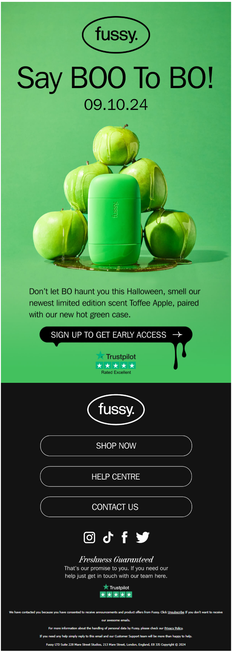
Fussy’s Halloween email is a treat to look at. This early-bird email inspires with a fun heading, beautiful image, and a well-designed dripping CTA. The dripping button is consistent with the dripping apples, which adheres to the rule of symmetry in Gestalt design.
Using the product color as the background, the sheer simplicity of Fussy’s two-block email is enviable. No fuss, Fussy!
What Fussy Does Right:
- Simple, one-column layout
- Well-styled product reveal
- Soft color palette, easy on the eye
- Exquisite duochrome design
14. Keen
What a creative way to illustrate time running out!
Keen’s BFCM e-commerce email template is a blast of entertainment. Bright colors, well-framed content blocks, prominent discount offers, attractive banners — what’s not to like! It’s hip and happening. One of those emails which you wouldn’t mind scrolling up and down.
What Keen Does Right:
- Amazing hero image
- Bold typography for offers
- Delicate use of negative space
- Single CTA
- BFCM-optimized navbars
15. dbrand

Image source: Inbox
dbrand’s Dark-Mode customer testimonial email takes its design inspiration from user-generated content. The testimonial stack is nicely framed with a loose border. We love the candy apple CTA. And did you notice? What a great way to leverage space to share their strategy!
What dbrand Does Right:
- Full-screen Dark-Mode template
- Stunning use of red and black
- Out-of-the-box single column layout
- One prominent CTA button
Get Your Own E-commerce Email Template Designed with Us!
To sum it up, here are a few tips derived from what all these e-commerce email examples have in common:
- Use a balanced combination of images and text to streamline the design.
- Let the copy convey the message, with design elements serving as support.
- Keep the template clear, concise, and visually appealing.
- Focus on the customer with every line of copy and design.
- Maintain a positive, friendly, and engaging tone.
- Include all necessary links and a clear call-to-action (CTA).
- Add social media links and social proof where relevant.
- Prioritize building your subscriber base, but always offer an easy unsubscribe option.
Get your best ideas to work for your e-commerce brand. Get in touch with our email template team and design to sell.


Susmit Panda
Latest posts by Susmit Panda (see all)
Understanding the Impact of Apple iOS 18 on Email Marketing
10 Free Email Subject Line Testers Your Marketing Team Can Use