
Why do businesses love banner ads? Well, because, if done right, they are super-effective, helping them build brand awareness and drive traffic in the same breath. However, it is the “if done right” bit where most businesses seem to fumble. You see, banner ads have been around for as long as the internet itself. So, the tips and tricks that go into crafting the ideal one have evolved a lot over time. Safe to say, they’ll continue to morph in the days to come as well, but by now, the best in the business have managed to pick up a handful of evergreen ideals that will continue to hold true irrespective of the era that embraces banner ads from hereon.
Designing a banner ad is a precise art in itself and if you’re new to them, feeling a touch overwhelmed is the natural order. But, fret not. We’re here to show you the ropes. Technically, not us but some of the best brands in the business. Today, we share with you a compilation of 11 impactful banner ads samples and dive deep into them to give you a thorough understanding of what makes a winning one. Hope you have your notebooks and pens at the ready, because trust us, there’s going to be a lot to jot down. Can’t wait to get started? Us neither. Let’s go!
1. Samsung
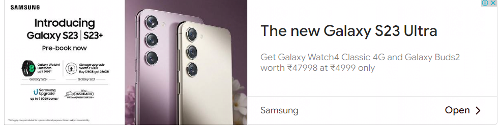
Samsung’s banner ad here aims to shed light on its latest product, “Galaxy S23 Ultra”, and does a stellar job of it. Firstly, the placement of the logo at the top left is an excellent move for it helps the viewer identify whom the ad belongs to as soon as they set their eyes on it. This is important, because your ad is not the only one on a particular page; it’s forever competing with a dozen others. Hence, unwavering attention to branding is something you’d observe across all the best banner ads examples out there. The job of a banner ad is to spark interest in the visitor’s mind and for that reason you need only to divulge the information that is most relevant. In this case, they are the product name and the price. To further accentuate this interest, the ad contains a sleek, high-quality picture of the product itself. Inviting visitors to pre-book the device, the ad also informs them of the offers available across a couple of other Samsung accessories.
2. Swarovski
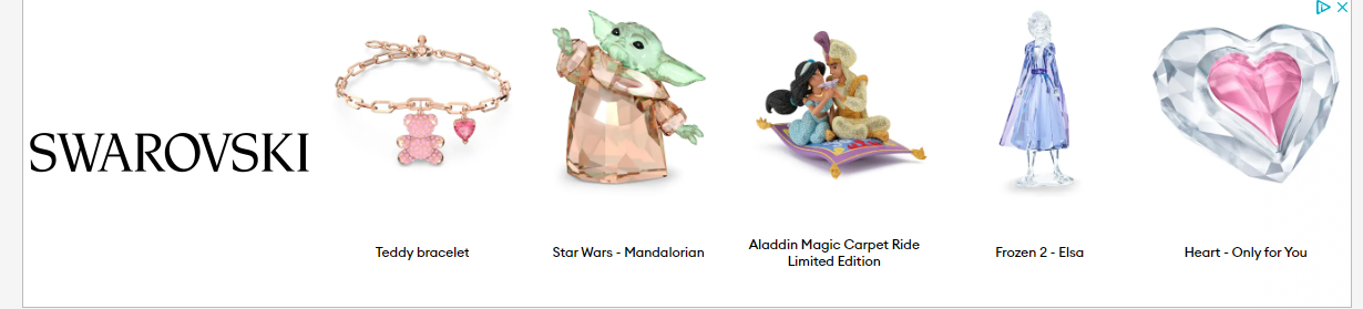
Swarovski aims to captivate the imagination of visitors solely by giving them a peak into what all they have to offer. The logo is perched loud and clear on the left so that there’s no ambiguity regarding identification, and is followed by images of some of its top-selling products. Website banner ads are better off when kept minimalistic so this ploy of letting visuals do all the talking has our stamp of approval.
3. Cake Maternity
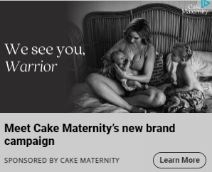
Cake Maternity’s banner ad, here, casts the spotlight on its new brand campaign. There’s plenty of things to appreciate and pick up here, starting with the copy- crisp, addressed directly to the reader (thereby establishing a personal connect), and stirring. Next, the image in the background. Existing in monotone, the picture is extremely powerful and lends ample context to the text that flangs it, giving readers a decent idea of what the campaign could be about. So riveting and intriguing is this combination of text and image that one can’t help but click on it to find out more, don’t you agree?
Something that all the best banner ads examples have in common is that they give visitors a clear idea of where they’ll be led upon interacting with it and have always a better shot at fetching clicks than those that don’t, and the team at Cake Maternity is well aware of it. For this reason, they have clearly stated the objective below the visual. If one were to swap the placement of the elements in this ad- stating the objective in the top half and placing the visual in the bottom- would the ad still drive the same impact? In our opinion, no. The charm of the objective, if you ask us, derives heavily from the magnetism of its visual. Tweaking the chronology of the placement, thus, stands to greatly undermine the ad’s appeal.
4. ZeroBounce
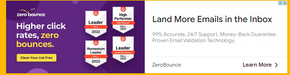
What’s common across the most successfu website banner ads? They’re able to effectively address the reader’s pain points. To be able to pique their curiosities, your offering must be able to talk about problem statements that are directly relevant to them. Yes, talking about your product’s or service’s USPs is alright, but you can’t discuss them in an isolated fashion; you must strive to make them customer-centric. Explain how your offering can slot into your audience’s lives (personal or professional) and enhance it. Only then will your banner ads be able to grab eyeballs and fetch you traction.
Read More: Tips To Help You Crack The Responsive Banner Ads Code
This banner ad from ZeroBounce epitomizes everything we just discussed. Sure, the virtues of the platform are highlighted, but not in and of itself. They are put forward as solutions to problems that might be plaguing prospective users. Another brilliant thing that this ad has done is list out the brand’s accolades; this goes a long way towards establishing credibility. Care has been taken to add them in the segment of the ad that has bright colors so as not to compromise its visibility.The CTA here is worth appreciating too- it not only offers readers a solid incentive to interact with it but in doing so subtly highlights yet another USP beyond those already mentioned in the ad. On the design front, the color of the CTA has been chosen carefully to contrast sharply against the background, thereby making it highly prominent.
5. Hitachi
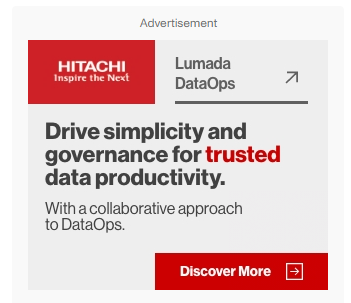
Hitachi’s banner ad is all about generating curiosity about its patented software, Lumada DataOps, which it does so deftly with a single line of text. The merit of this copy lies in how incredibly focused it is. Despite being brief, it helps readers accurately understand what they’ll be able to achieve through using this solution. The brand’s promise is represented in the word it has chosen to emphasize in the copy- trust.
6. Toradex
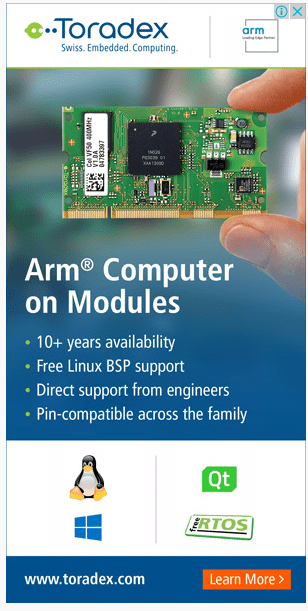
Banner ads that look cluttered will never be able to give you the engagement you desire of them, any reputable agency offering banner design services will tell you this. Therefore, you must look to structure and optimize your text and visuals in a manner such that even if they’re in excess, they shouldn’t be visually demanding. Toradex has been able to deliver faultlessly in this front with their ad. Listing out the benefits of their product in bullet points has allowed them to make best use of the ad dimensions at their disposal. Even though clicking on a banner ad leads one to the business’ website, Toradex have mentioned their website URL, nonetheless, in the ad itself.
7. Grammarly
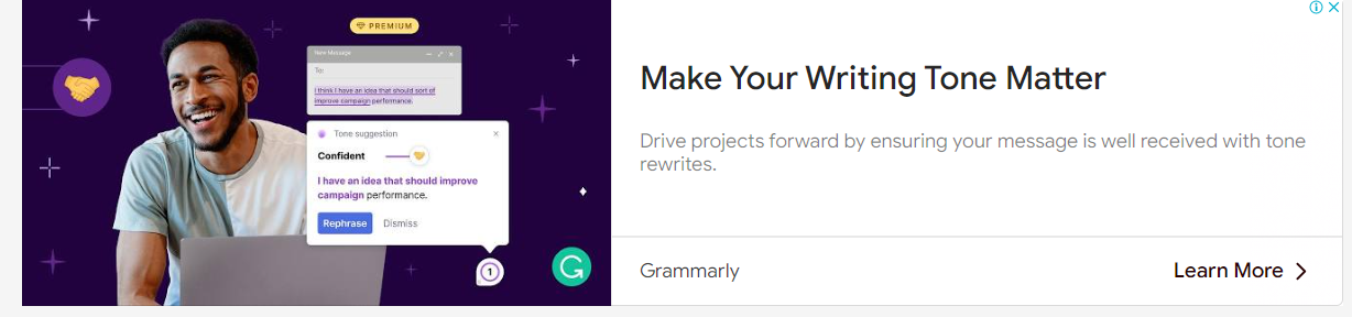
What we like about this banner ad from Grammarly, is that besides talking about the merits of the platform, they’ve also strived to give visitors a look and feel of it as well. On the ad’s left, few features of it have been put under the spotlight and wrapped in a visually attractive envelope to engage the reader. Grammarly is used by humans, not bots. The stock photo of the guy with the laptop subtly peddles across this messaging in the ad. Safe to say that there are a lot of website banner ideas to be derived from this particular example.
8. Breitling
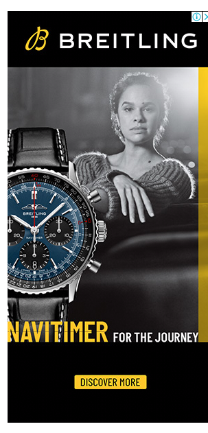
The allure of Breitling’s banner ad lies in its dramatic composition; awash in a singular beam of light, the model in the ad fixes your gaze with a resolute expression, a firm and proud ambassador of the entity that occupies the ad’s foreground- the Breitling Navitimer. The frame being in monotone enhances the iconography of the ad by leaps and bounds.
9. Van Cleef & Arpels
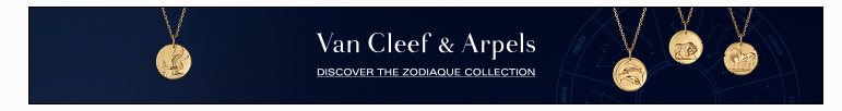
In a bid to make their banner ads vibrant, attention-grabbing, and click-conducive, businesses, more often than not, forget to maintain their brand identity in these designs. The folks at Van Cleef & Arpels, however, have been extremely mindful of it. While the contents of the ad call the viewer’s attention to the brand’s “Zodiaque” collection, the design language reeks of elegance and sophistication, attributes that are second nature to Van Cleef & Arpels.
10. Adidas
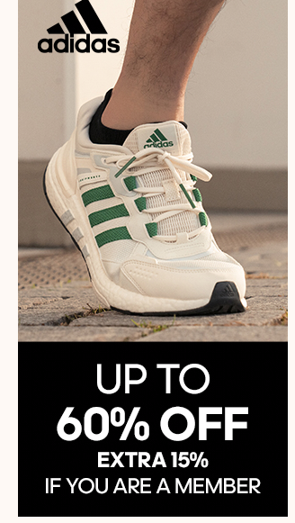
Adidas’ banner ad is extremely unfussy – appropriate use of whitespace and a neat layout. The product is clearly the hero here, and the information accompanying it has been laid out with the utmost clarity. Besides the product, the ad gives visitors one more reason to interact with it- Adidas membership. By talking about the perks members can avail, the ad generates curiosity in the viewer’s mind, one that can only be resolved by clicking on the ad and visiting the website.
11. Semrush
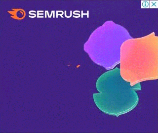
A surefire way of amplifying the appeal of your banner ad is to make it dynamic, much like Semrush have done over here. In this simple GIF banner ad, Semrush’s offerings make an elegant case for themselves, giving visitors a solid reason to interact with the ad. Observe how the copy is framed to make readers understand the value Semrush can add to their lives and not in a way that talks about Semrush’s virtues in a standalone fashion.
Wrapping It Up
Banner ads are tough to crack, and will, without doubt, take you multiple attempts before you arrive at one that truly satisfies you. We hope the banner ads samples shared above are able to get your creative gears rolling in the right direction and will fill you with stunning website banner ideas for your business!
Rohan Kar
Latest posts by Rohan Kar (see all)
Using Inline CSS in HTML Emails- The Essential Guide
Modular Template Systems vs Master Email Templates: Spotting the Differences