
Identity entails consistency. Since identity is a synthesis of patterns, each pattern must correspond to the next, giving rise to a coherent conception.
Brand identity is no different. Therefore, whenever there is a conflict among recognizable patterns, brand identity suffers, disrupting UX. Trust operates on the principle of basic uniformity. Your subscribers should be able to recognize your brand’s core identity at every touchpoint.
In this post, we will learn how to achieve and maintain brand consistency in email marketing, primarily through email design. Let’s get cracking!
1. Be Mindful of Your Brand Palette
The thing that immediately distinguishes your brand from the next is its color palette. You need to stick to your chosen palette in all your emails.
This is what we meant by “basic uniformity” in our introduction. There is no bar on creative/seasonal deviations, provided the basic visual identifiers remain intact. These include your brand logo, typography, and any other aesthetic peculiarities that define your brand.
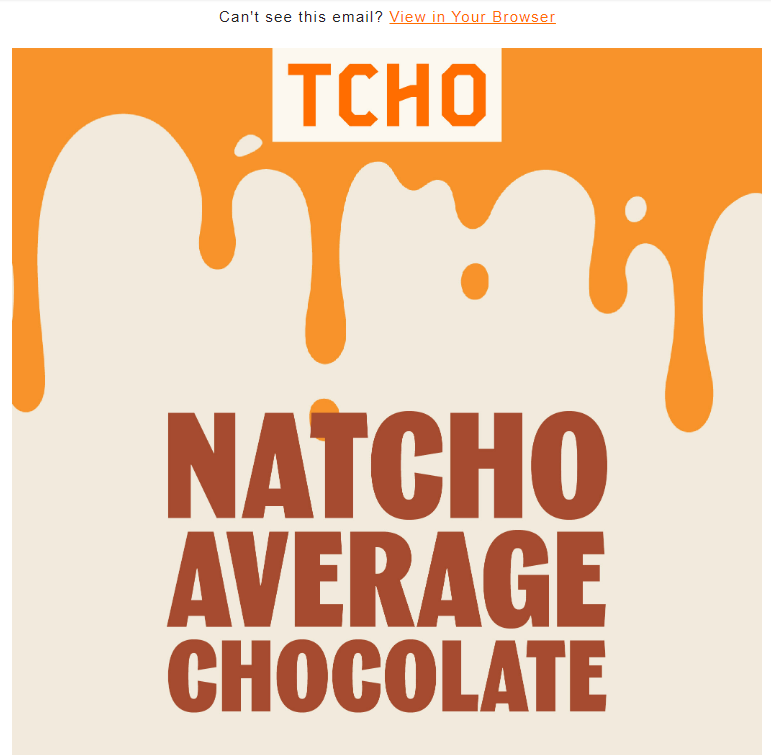
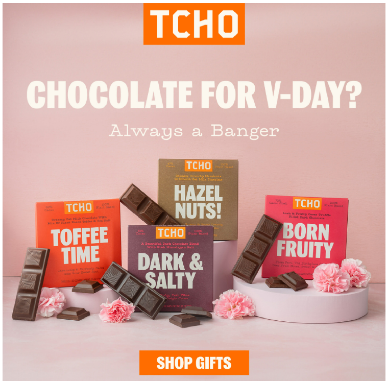
As an example, consider these two emails from TCHO Chocolate. The first email is about a new product, and the second is a V-day promotional. Both emails differ in content, but TCHO sticks to their brand color, orange, in both.
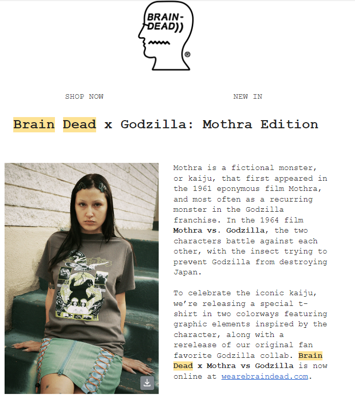
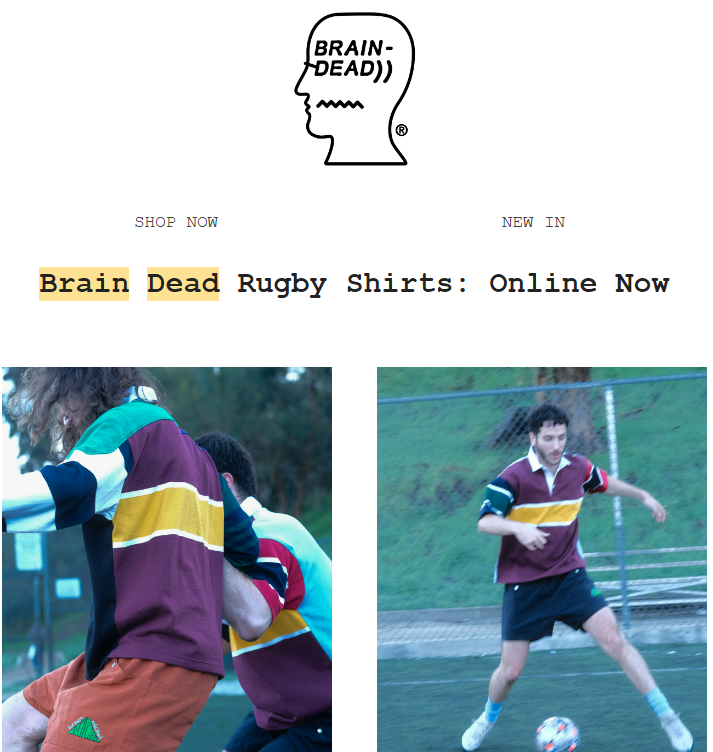
So far as typographical consistency is concerned, look at these two email templates from Brain Dead. The first email introduces a special t-shirt to mark an occasion. The second email promotes Rugby shirts. However, in both emails, the font is Courier New.
2. Maintain The Tone of Your Brand
Apart from visual identifiers, voice, and tone also constitute your brand identity. Through these, you convey your brand’s attitude.
Consequently, you need to be consistent in the way you communicate with your subscribers. You can’t afford to stray from your attitude, especially if it defines your brand. Unlike visual identifiers, which may accommodate deviations, the tone of your brand needs to be consistent, except on extraordinarily rare occasions.
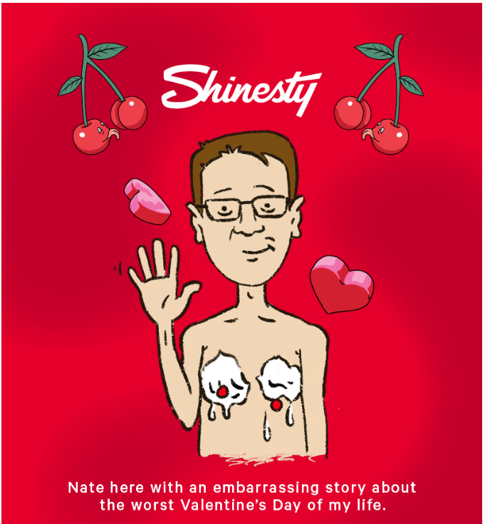
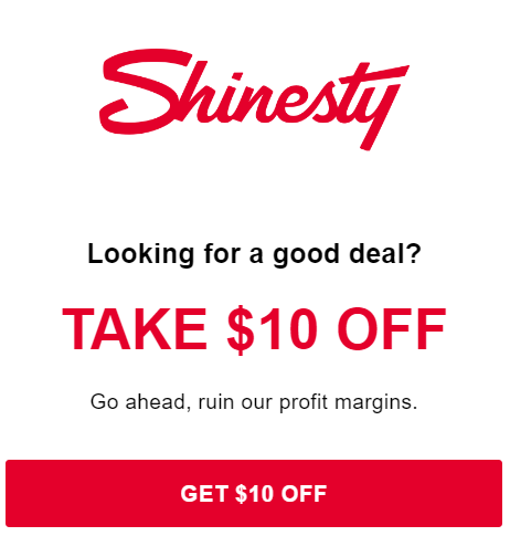
To illustrate, a brand like Shinesty thrives on wacky, titillating humor. That’s what defines them. As a result, all their emails are wildly funny, irrespective of their content.
Take these two emails. The first is about V-day. Note how they incorporate humor into the story. The second email offers a special discount. The copy is a scream!
3. Standardize Your Email Templates
Previously, we talked about visual identifiers with respect to particular visual aspects of your brand in email communications. But maintaining a consistent overall look is no less vital.
Email presentations play a critical role in defining your brand identity. Over time, your subscribers come to associate your brand with a particular kind of presentation. For instance, if minimalism is your thing, standardize it across your emails.
Anya Hindmarch is minimalist. As a result, their emails are typically short, unfussy, and, for the most part, whitespace. Goldbelly, on the other hand, is dazzling, and their emails are longish, intense, and colorful. Compare Anya Hindmarch and Goldbelly below.


4. Be Consistent with the Header And Footer
Make sure that every email you send displays the brand logo in the header and an unsubscribe link in the footer. But that’s generally speaking. When it comes to brand identity, you need to standardize how you use the header and footer in your emails.
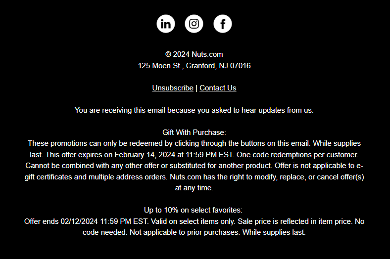
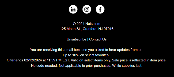
Nuts.com is never content with simply providing an Unsubscribe link in the footer. In every email, they provide detailed information about something relevant to their message. Doughp, on the contrary, always only includes their address in the footer.
In the following example, there are two different emails by Nuts.com. The information in the footer varies accordingly.
Similarly, Doughp’s footer remains intact in all their emails, as shown here.


5. Pay Attention to Email Signatures
Many companies overlook the importance of email signatures in contributing to brand consistency in email marketing. The signature block is also part of your email template. It equally guides your subscribers in forming a homogeneous conception of your brand.
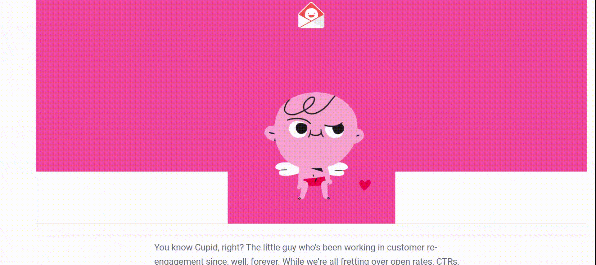
Your employees may need to send out occasional emails to a segment of your subscribers, usually those who have not engaged with your emails for a long time. In that case, it’s a trust-building exercise by default. So, you need to be consistent with how you sign off.
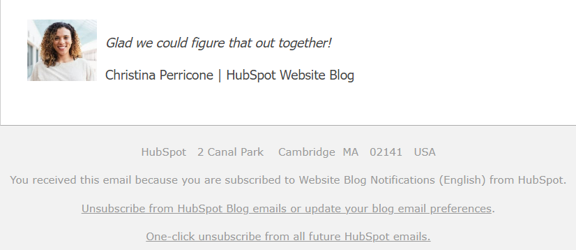
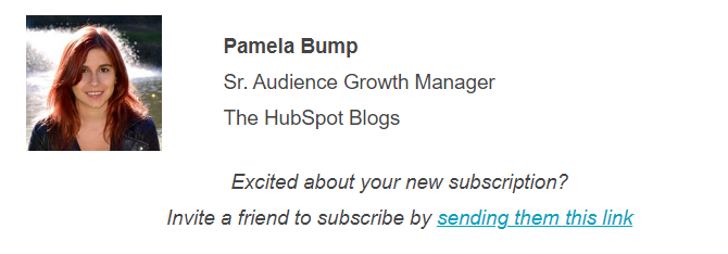
In this respect, HubSpot is a good example. The signature block in all of HubSpot’s personal emails includes the sender’s headshot and their HubSpot vertical. Take a look below. The first email is a re-engagement email, and the second is a welcome email.
6. Dark Mode or Light – Stick with One
Dark Mode is increasingly gaining popularity with email users. Many brands have shifted to Dark Mode, while others are starting their email marketing journey with Dark Mode. But whether you choose Dark Mode or Light Mode, stick with your choice in every email.
Huel is a case in point. Over time, the brand has shifted to Dark Mode, though once in a while, you might come across Light Mode. But that’s few and far between. Keep in mind that Huel’s brand palette is predominantly black and white. So, even if they go for Light Mode, they make sure to include black in their CTA buttons, thus maintaining brand consistency.
In general, Huel does not resort to Light Mode. Take a look at the following Huel email screenshots.
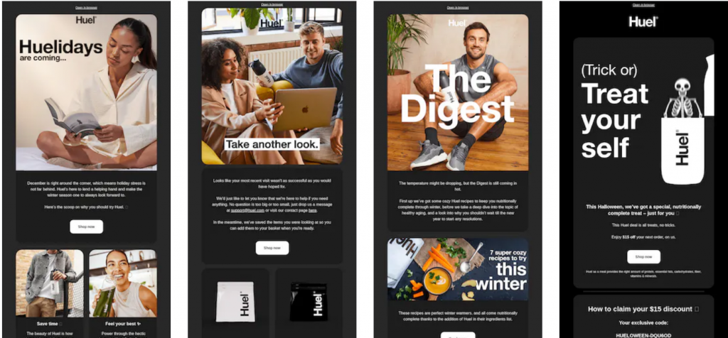
Apart from Dark Mode, Huel has standardized the use of round-edged content blocks in all their emails – another notable instance of brand consistency in email marketing.
7. The Case for GIFs
We are not concerned with the general use of GIFs in emails. Almost every brand likes to add at least two GIFs in their emails from time to time. But when it comes to using GIFs as a rule, we are concerned with brand identity.
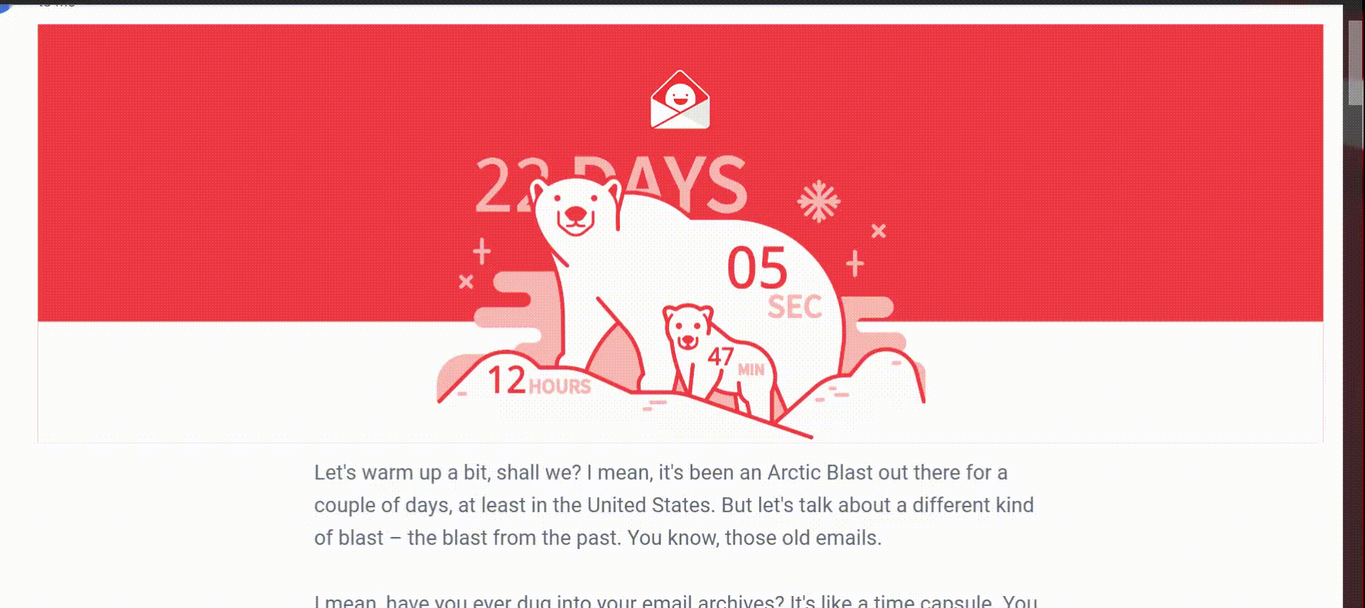
An obvious representative of this paradigm is Really Good Emails (RGE). In all their emails, RGE incorporates a GIF in the heading. These GIFs are highly contextual. They set the tone for the rest of the content. Consider the following two examples.
The first email contains RGE’s curation of their favorite emails from previous years, hence the timer. The second email talks about re-engagement in the context of Valentine’s Day.
8. Standardize Your Email Layout
Could you standardize email layouts? Yes! It’s a useful way of cementing your brand identity. You can prime your subscribers to view your email content in a particular way.
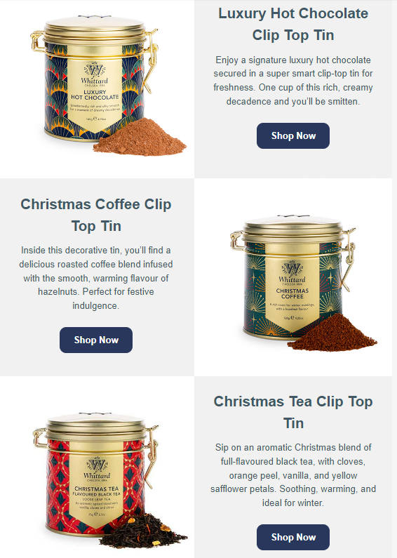
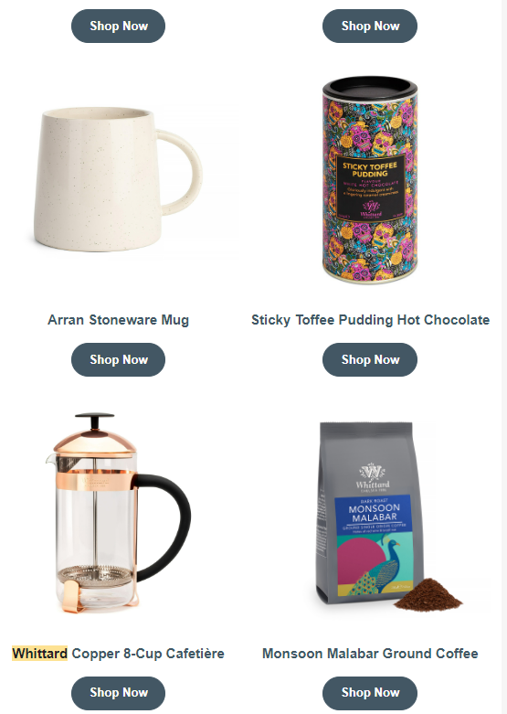
If you prefer a single-column layout, use it in all your emails. If the double-column layout best suits your email programs, use it consistently. Whittard of Chelsea is a perfect example of a brand that employs the double-column layout in almost all their email communications.
Here are two instances of Chelsea’s use of the double-column format. The first email lists the products in a Z-pattern (their go-to style). The second email uses adjacent columns.
9. Define And Distinguish Your Copy
We touched on email copy a few sections back. Email copy is crucial to distinguishing your brand from the competition. We’re not just talking about bytes of copy spread across your email. The point of that is to bring across the persona of your brand.
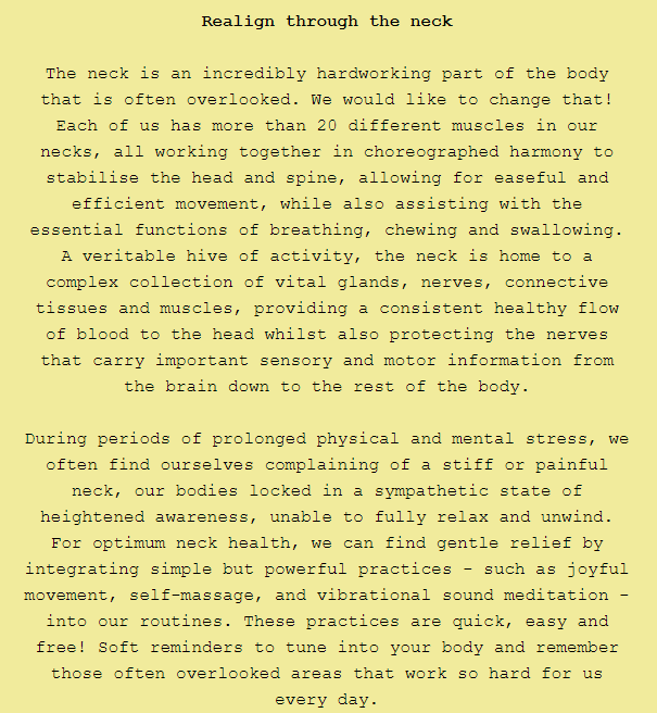
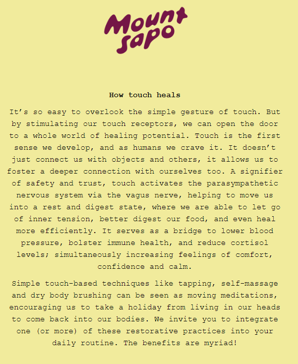
Our focus is on how you can leverage comprehensive copy to differentiate your brand and be consistent at it. This is exactly what Mount Sapo does. Apart from strictly promotional emails, the quintessential Sapo email is a treasure trove of knowledge.
Mount Sapo’s emails explain in great detail the science behind their products. Subscribers expect to learn new things every time they open these emails.
Take the following two emails. The first talks about neck-supportive techniques and the second expounds on the science of touch. In both emails, the copy is detailed and invested.
Wrapping Up!
Maintaining brand consistency is not necessarily hard work. If you know your brand, have clearly defined brand guidelines, and are mindful of how you have primed your audience, being consistent is just a matter of being yourself!
Importantly, since audience perception plays no less important role in defining your brand, you would need to give your audience some measure of freedom to interpret your brand. Ultimately, brand identity is a confluence of internal and external influences.
Susmit Panda
Latest posts by Susmit Panda (see all)
Expert Guide: Creating Dynamic Emails in Klaviyo
From Leads to Loyalists: Navigating Salesforce Lead Conversion Strategies