One might wonder what’s so difficult about designing for Christmas. The season suggests its own aesthetics, doesn’t it?
But for marketers like us, designing email templates one holiday after the other can be overwhelming. Inspiration takes a hit while the calendar hops on. Come December, you’ll be freewheeling for Christmas inspirations, hoping something sparks your imagination so that you can get started with your design project.
But you can start early. How about starting from here? Catch what inspires our designers — who deliver over 3000 templates every month — this holiday season.
We’re sharing some of our favorite Christmas email templates. Go, unwrap!
1. Sabon
Inspired by Baroque design, Sabon’s pre-Christmas email template excels in elaborate ornamentation, floral motifs, and gold accents.
We love the ornate typography. The featured product, part of Sabon’s advent calendar theme, shines within an intricate border. The art nouveau dividers stand out with their creeper/vine motifs, reminiscent of rococo styles.
What we like about this email:
- Thematic consistency; the ornate theme is not limited to just one part of the email, it extends to all the components.
- Serif typeface, which encourages the typical skimmer to pause.
- The festive vibe, but notably different from stock X-mas tropes.
- The floral backgrounds in each block, the overall curvilinear style.
2. Anya Hindmarch

Anya’s Christmas grotto is well-known among Chelseans in London. Anya’s Xmas newsletter incorporates the grotto theme with the help of fun animated GIFs, single CTAs, and double inverted pyramids in both halves of the email.
So if you’re wondering what Christmas newsletters should look like, take a hint from Anya Hindmarch.
What we like about this email:
- The typical British humor, so reminiscent of Anya Hindmarch herself. In fact, it’s this element of brand personality that marks off the newsletter.
- Accessible, non-flashy GIFs.
- One-column, traditional layout.
- Proper image-text ratio.
3. Steve Madden
Steve Madden’s Christmas email template impresses with its photography edit. The full-bleed arrangement is detailed and immersive.
The Christmas theme is obvious and the whole design is economical.
What we like about this email:
- The subtle inverted pyramid in the hero section where the sandal toe points to the copy and CTA button.
- Minimum text and just two primary single CTAs.
- Alternating group shot and single shot.
- Solid CTA buttons in the bottom navbar.
“Think twice before investing in videos and gamification during the holiday season.”
— Chad S. White, email marketing expert
4. Firebox
Firebox’s Christmas email template is funny and frank. The header is hilariously candid and the copy is right on the money.
We love the hero image made up of Firebox’s own products.
What we like about this email:
- The focus on rounded edges throughout the template, starting from the hero space all the way down to CTA buttons.
- The well-padded CTA buttons extended to the border of the template.
- The use of emojis as pointers.
- The two-columned product grid.
5. Nasty Gal
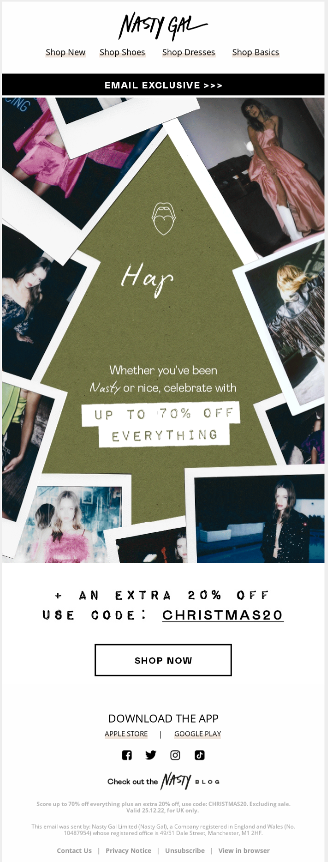
Nasty Gal’s Christmas email nails it with an out-of-this-world hero image.
The slightly off-color Christmas tree outline, coupled with the scratched-off HTML text, gives off a strong retro vibe. The split-tone design is dead-on.
What we like about this email:
- Brand confidence and the subsequent absence of a product showcase, the staple of promotional holiday emails.
- Minimal design, no flashy aesthetics.
- Just the one ghost CTA button.
- Buttoned links in the top navbar
“Have fun with season favorites like the 12 days of Christmas that reveal a new offer each day via an animated reveal.”
Michael Pattison, Lead Digital Strategist, Klaviyo
6. Mendo
Utilizing pastel colors and split-tone design, Mendo’s last-minute Christmas email has a calming effect on the eyes. Extensive white space, single CTA, and desaturated colors make this a highly accessible email. The minimalist design and the hard, boxy content blocks heighten the “spatiality” of this email.
What we like about this email:
- Left-aligned copy, optimized for the natural reading flow. We love how the email’s major headings are also left-aligned.
- Minimum, highly focused text in skimmable chunks.
- Real photos, with a hint of gradient, overlaid on a solid palette.
- Dark color scheme, a nod to Dark Mode.
7. LIV Swiss Watches

Image source: Inbox
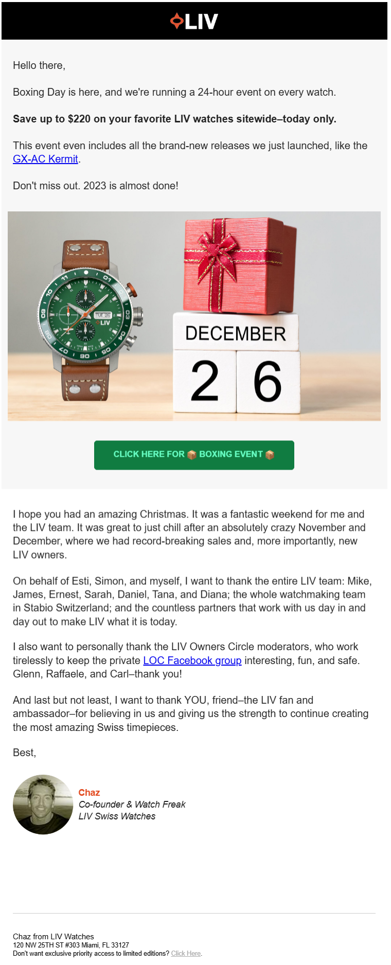
Our final Christmas email template is a post-Christmas email from the cofounder of LIV Swiss Watches. Once Christmas is over, most brands continue to invest in elaborate design. While there’s nothing wrong with it, sending out a thoughtful, toned-down after-Christmas message might be more memorable, almost implying a post-holiday “return to the grind,” which is relatable too.
Speaking of LIV’s email, although a personal note, it retains the HTML header and also includes a relevant image. In fact, it retains the hero section in full.
Note also how the featured watch and the CTA button echo each other’s colors.
“Focus on crafting a concise, heartfelt message (like a simple letter from the founder/owner) that gets straight to the point, capturing attention without overwhelming your readers,” advises Emily Ryan, cofounder and email strategist at Westfield Creative.
What we like about this email:
- Super-specific banner in the middle of the email.
- Simplicity, yet not devoid of aesthetic appeal.
- Plain text but not the expense of brand identity.
8. Email Uplers

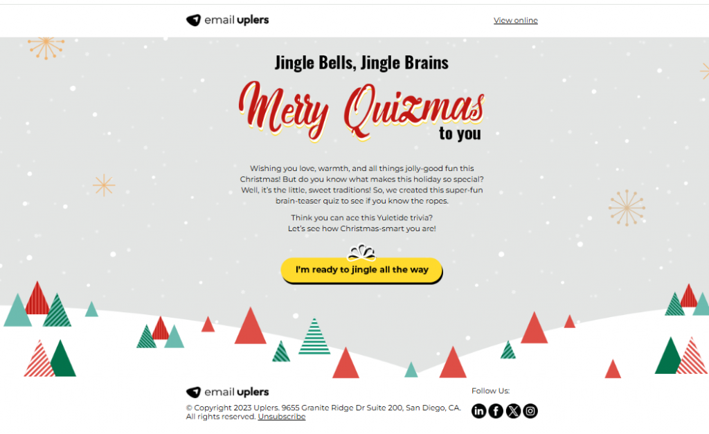
Our last Christmas example comes straight from the horse’s mouth.
Gamification is one of our holiday staples. The above Christmas email features a Christmas quiz. You’re welcome to try the game yourself.
Now, if you remember, Chad S. White recommends not trying high-res visuals and interactive elements in your holiday design. However, his advice is aimed at B2Cs, which makes perfect sense. Consumers are in a hurry during the holidays, so it’s wise to not expect them to play a game when all they want to do is buy.
But if you’re a B2B and are not running any holiday offers or releasing or updating products, you may try gamification as it can be fun and entertaining.
If you’re a B2C and want to try email gamification, we recommend gamifying one of your pre-Christmas emails; the pre-hustle window is best for such tryouts.
Get Conversion-friendly Christmas Emails Designed by Us!
So those were a few of our favorite Christmas email templates.
Each email shows the creative possibilities of this medium. In spite of their design differences, they all focus on innovation, entertainment, and informative content.
Technically speaking, the emails on our list excel in these areas:
- Accessible, responsive design
- On-trend design
- Consistent branding
- Clear, strategically placed CTAs
If you need responsive email templates, we can help! Share your ideas with us, and we’ll turn them into effective email templates that boost conversion rates. We’re offering 10% off on all template orders. Go claim it now!
For more information on how to approach Christmas email marketing, catch these 7 ways to manage your Christmas campaigns.


Susmit Panda
Latest posts by Susmit Panda (see all)
10 New Year’s Email Inspirations Cherry-picked by Our Designers
Top 8 Holiday Newsletter Template Ideas for Effective Seasonal Email Campaigns