Relevant images, crisp text, what goes where in the layout…. phew! Email designing can be tough. But it is equally important as it drives results and revenue. A well designed email template with all its elements in the right place ensures that it will be opened and read. So, what must you do to ensure that your email design is perfect? Sift through these email design trends jotted down by us to be sure you are on the right track.
1. Template tales
Choosing the right template for your email is one of the most important factors to consider while designing an email. According to a latest study by Litmus, 56% emails are opened on mobile. So, it is important to either choose single column or mobile responsive template.
A misaligned email might skew your ROI significantly. Test your emails across devices of varying screen sizes; just like our expert email developers do.
2. Laying out dimensions
Ideally, your email components (email copy, images and CTA buttons) should be accommodated within a width of 600 pixels – even for a full width email. For mobiles, design your emails in a single column layout which makes it cross device compatible. The optimal width when designing a layout for mobiles is 320px minimum and 640px for retina.
3. Font facts- what type, what color
It is essential to keep your design professional, hence, use less than four types of fonts in a single email. A good practice is to use one font style for headlines (a fancy one to grab attention) and another (a simple font) for the email body copy. If possible, stick to system fonts. As far as colors of the fonts are concerned, again restrict to less than four for maintain that formal touch. A light color background is best as it enhances the font colors.
4. From Name and Address- It’s from us!
People tend to open emails when they recognize who the email is from. Be sure to use your brand name as from name and identifiable email address as from address. ‘Rue La La’ is the brand name and ‘RueLaLa@communication.ruelala.com’ is the brand address in the example given below.

5. Personalizing subject lines
A personalized subject line delivers 26% higher unique open rates overall, according to an Experian study.
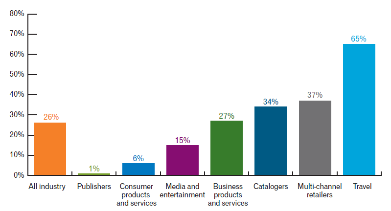
Source: Experian Marketing Services
Keep it short (50 characters or less), clear, and crisp. Using all caps, special characters and spammy words should be avoided while crafting a subject line. Here’s a subject line personalization example from Facebook:

|
Sometimes even a personalized subject line might not be able to unlock the full potential of your email. Regular audit of your emails helps you tweak your emails for better conversions. |
6. The preview
That line which appears below your subject line in the inbox- that’s the preview/pre-header text. Try to limit it to 75-100 characters. More importantly, the first 5-8 words play a crucial role in holding the attention of readers and beckoning them to open the email; make sure you give your best when you write this text.
7. Call to action – let it take the centre stage
Unarguably the most important part of an email as far as conversions are concerned, it must be placed above the fold because content placed above the fold gets 84% more attention than content placed below it. Also it must get maximum visual attention. Keeping it short and crisp – that’s the way to write an ideal CTA.
8. Linking up with subscribers
Providing links to your social media pages can make a hell lot of difference in grabbing the attention of your email reader. It helps to expand the visibility of your brand. Integrating live feeds for social media platforms like Instagram, Facebook, Twitter, etc. is what is trending now. Apart from social media links, limit the number of links you provide to 3 or 4. A forward-to-a-friend link is also a great idea to extend the life of your email.
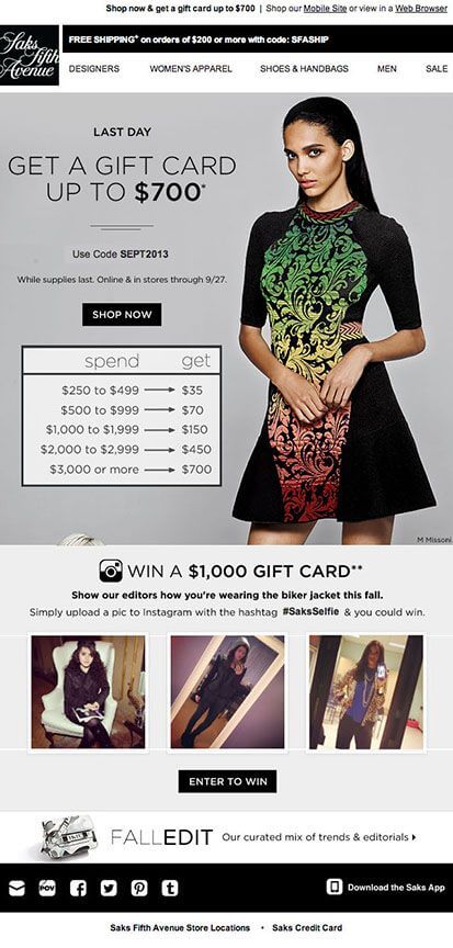
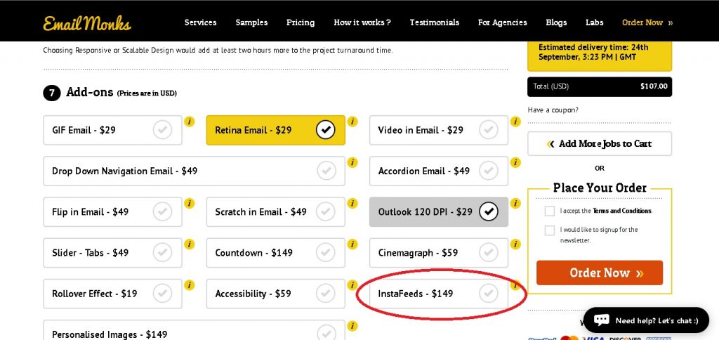
Wish to replicate this same effect in your emails? Delight your subscribers with a live Instagram feed right in their inbox. Try out Instafeed add-on.
9. A copy that shines
With hardly any time to read your emails, remember that many people are going to scan your copy fast, especially when reading on mobile. Keep the copy crisp and to the point. Write in a way that provokes them to take action. Personalizing emails helps to improve click-through and conversion rates; don’t forget to tap this benefit.
To avoid ending up in the spam folder be sure to use the right balance of text and images.
10. Images speak beyond words
Images spice up an email but never go overboard. According to a study by Constant Contact, click-through rates perform best among emails with 3 or fewer images. Add eye-catchy and relevant images with links.
Unfortunately, even today, not all ESPs support images in email or they turn off the images by default, so don’t forget to add an alt text to all your images. For background images, add a fallback color. Moreover, add an alt text to your CTA as well because that too might get blocked by an ESP.
11. Interactivity to jazz up your email
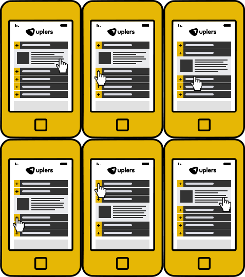
Interactivity in emails is the talk of the town, and why not? Most ESPs are already supporting interactivity in emails. Menus, Accordions, GIF, Flip effect, Rotating carousels, Sliders, etc. – with options galore, your emails can now be made truly enticing. Moreover, interactivity also offers good CTRs. What more could you ask for?! Here is a sample of accordions in email:
12. A scintillating signature
Email signature is your business card and beyond. It is a low-cost and high-return marketing tool. Do not miss out on this footer space hero that will enhance your brand’s visibility. But make sure you know what to add and what to avoid while designing an email signature.

13. Respecting their preferences
Including an unsubscribe link is not only essential according to the law but it also enhances your brand reputation. Another good way to try to retain your subscribers is to take them to your preference center so that they can manage the kind of communication they are interested in.
All said and done about email design best practices for 2020, never ever forget to test your emails thoroughly on all devices and across all ESPs.
|
Is designing of emails leaving you in the lurch? Let the experts help you proudly say that “my first email template was coded at zero cost by this team”. |
Wrap Up
Email Design Best Practices to consider while designing the perfect email:
- People judge a book by its cover. Choose an appropriate email template
- Use less than four font types and colors
- From name = your brand name, From address = an identifiable email address
- Personalize your subject lines
- Give your best while you write the preview text
- CTA must be conspicuous and placed above the fold
- Adding website / social media links is more important than ever before
- Keep your email copy crisp and to the point
- Add images to spice up your email but don’t forget alt text
- Make your email stand out with a dash of interactivity
- Make the most of your email signature
- Allow subscribers to unsubscribe or let them tune their preferences


Kevin George
Latest posts by Kevin George (see all)
Top 8 Business Email Examples to Revamp your Campaigns
Boost Email Marketing ROI with Data Cleansing & Data Appending