[This blog was originally posted on Nov, 2023 and has been updated on Sep 2024 to showcase new examples]
The fourth quarter of every year brings in Holiday cheer and festivities. Alongside, it also brings in lots of opportunities to generate conversions and drive business growth.
In the US, retail sales are expected to rise by 4.8% YoY to clock $1.353 trillion during November and December in 2024. With such a huge revenue opportunity, marketers ought to put in extra effort and leave no stone unturned to attract customers. That applies to emails too.
Emails give you a platform to send personalized communications tailored to the user’s preferences. Unlike social media platforms, you own the data of your email subscribers. No tricky algorithms dictate the reach of your emails. That’s why you must pay special attention to your email marketing strategy during the Holiday season.
Being a dynamic field, there are new trends emerging every year in the world of email design and development. So, marketers have new tactics to try out and readers have something exciting to look forward to in their crowded inbox. Almost a win-win for both!
For this year, here are the holiday email design trends that will smarten up your Holiday email campaigns.
Let’s get started.
1. Animated GIFs
Animations in emails have been around for 15 long years. And it continues to be among the topmost email marketing design trends.
Even today, animated emails are the hot favorite among marketers and subscribers alike. If you check your inbox during the Holidays, more than half of the emails have some kind of an animation, So in a way, it is a best practice besides being a name in the holiday marketing trends.
GIFs are so popular because they can be used by email marketers from all industries. Whether you are in the travel, eCommerce, or B2B industry, you can never go wrong with GIFs.; with them you can infuse surefire vitality into your holiday email ideas.
Here’s an email by Anthropologie in which they have used a lovely GIF to extend Christmas wishes to their subscribers.
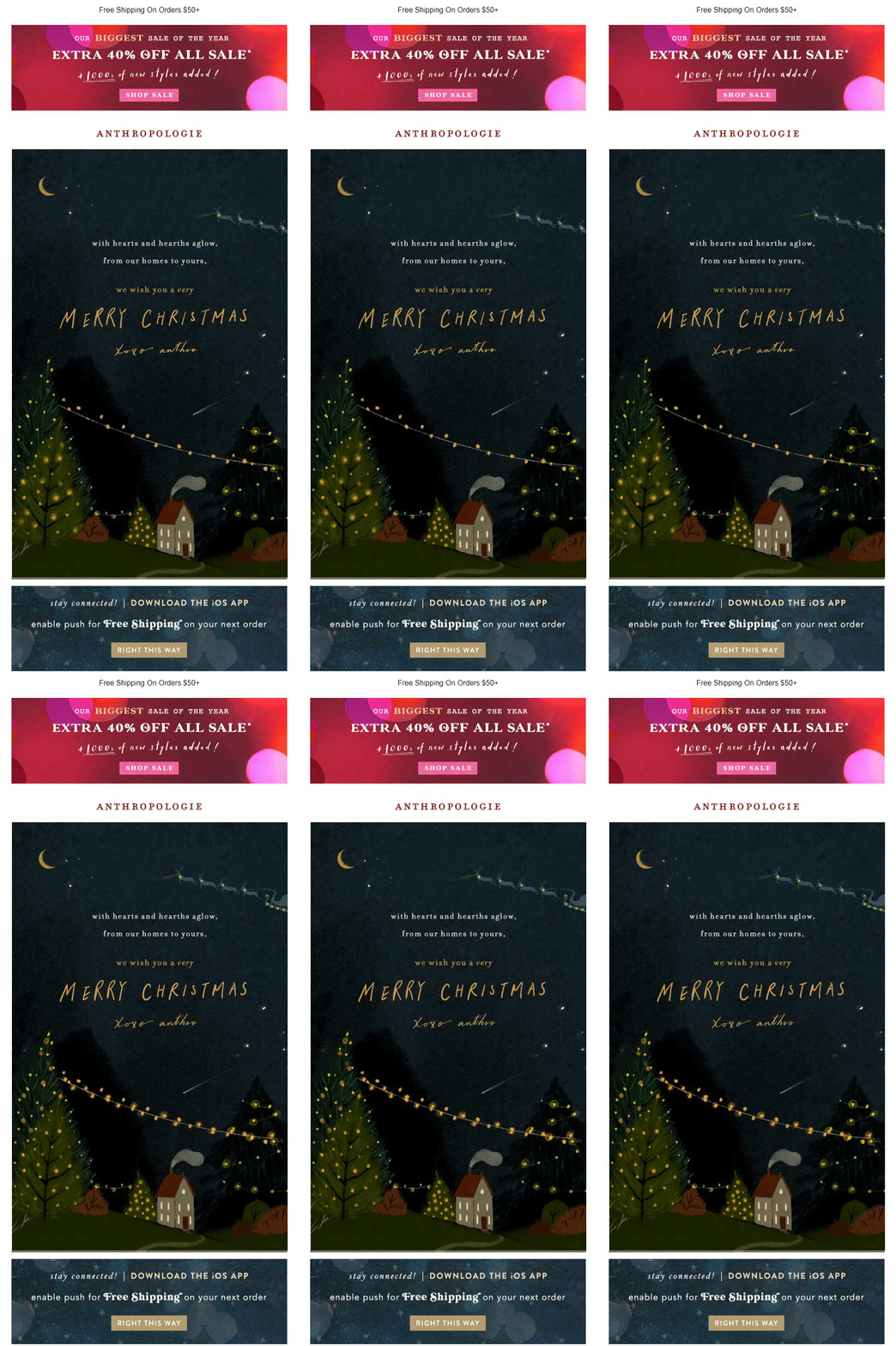
A special type of animation that is in the limelight, especially for the Holiday season trends is a cinemagraph. Cinemagraphs are illusive GIFs that are extracted from a video. They emulate a moment in the past and take the reader back to that lost time. These animations are prettier than GIFs because they are like moving photographs. The entire image is static with movement in a single element, and that’s where the magic lies.
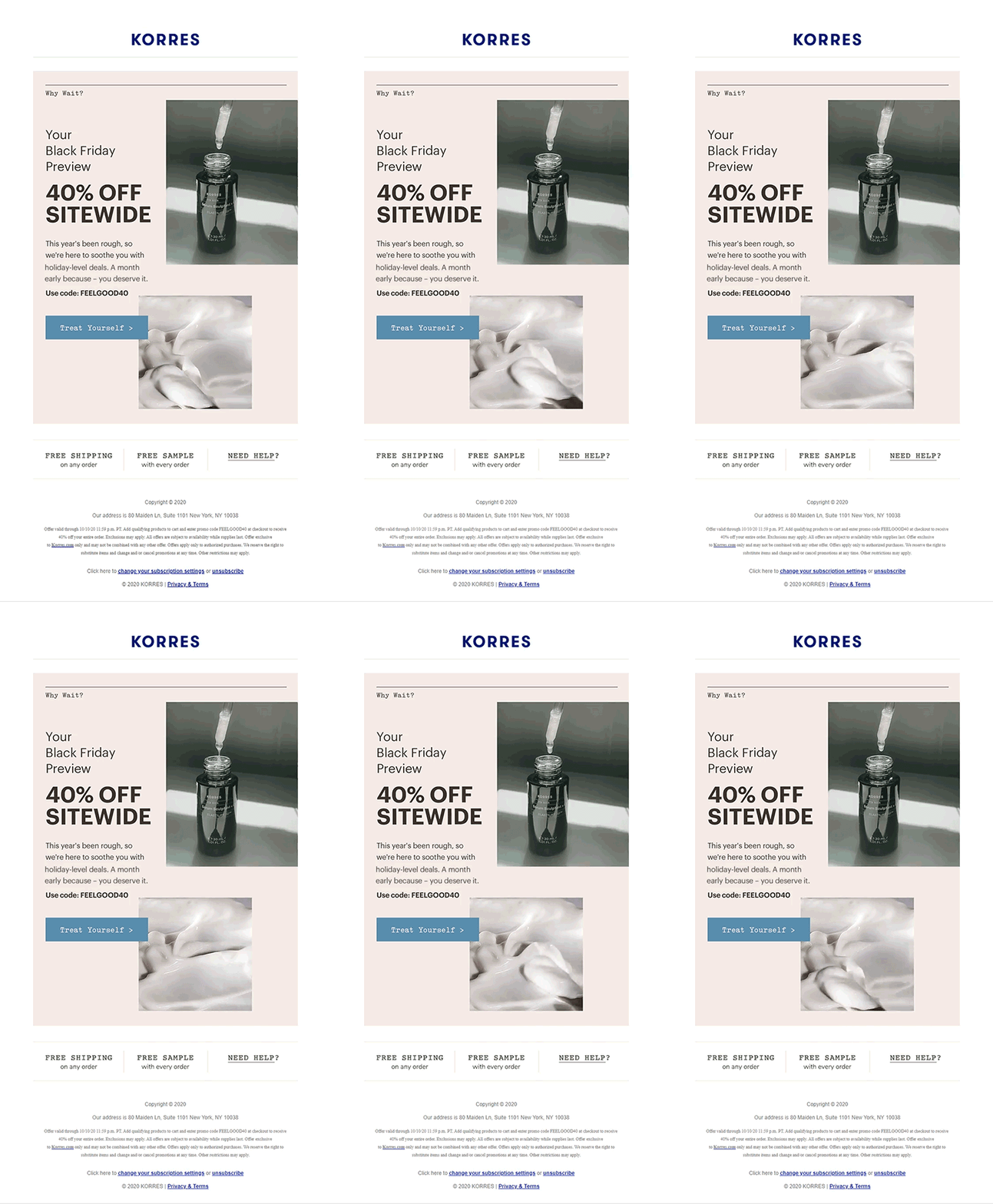
Korres uses a combination of GIF and cinemagraph in their Black Friday email to showcase their products and get conversions.
2. Use of Gradients
Colors are an important aspect to be considered for the Holiday emails. Of course, you must use plenty of red, blue, green, and all those vibrant colors but we have one amazing trend to talk about, and that is multi-shade gradients.
- Multi-shade Gradients
Multi-shade gradients is a color trend that can bring life to your Holiday design. We have a natural tendency to move our eyes from a light to dark color of the gradient. Your subscribers are extremely busy during the Holiday season, and gradients encourage the readers to scroll till the end by supporting visual hierarchy.
It is a versatile trend that imparts a unique look and feel to your holiday email designs. They add depth to an otherwise flat email design. Gradients help reinvent new possibilities by adding captivating color textures to the email background. Some brands even go a step ahead and add gradients in their CTA button. It helps draw the subscriber’s attention and encourages the user to click through.
You can either blend similar colors
or completely different or contrasting colors.
CJ Affiliate has made beautiful use of two colors in their Holiday email.
3. Prominent and Bold typography
Remember those professors who always pointed out the importance of presentation in your answer sheets? Consider your emails as answer sheets and your subscribers as the examiners or paper checkers. Your conversions can be compared to the report card. So, make your emails as easily readable as possible. That’s where bold typography comes into the picture as one of the critical email marketing design trends.
It helps enhance brand personality and outline the hierarchy and action areas. As the Holiday season inbox sees intense competition for the reader’s attention, there is a lot of pressure to stand out. The right kind of typography can work wonders by building impactful emails that emerge as a winner.
Take a look at how hers have made masterful use of bold typography over here.
4. Interactivity & Gamification
Interactivity! How I love the word and this feature for Holiday emails!
Interactive elements make the Holiday emails all the more engaging for the readers and pave avenues for a two-way ‘interaction’. Using interactive elements like sliders, hamburger menus, accordions, hover effect, and click-based events, you can really get your holiday email ideas to jump to life and amp up your holiday email campaigns. They make the email experience fun for the subscribers and also contribute to word-of-mouth marketing. It’s one of those recurring email marketing design trends.
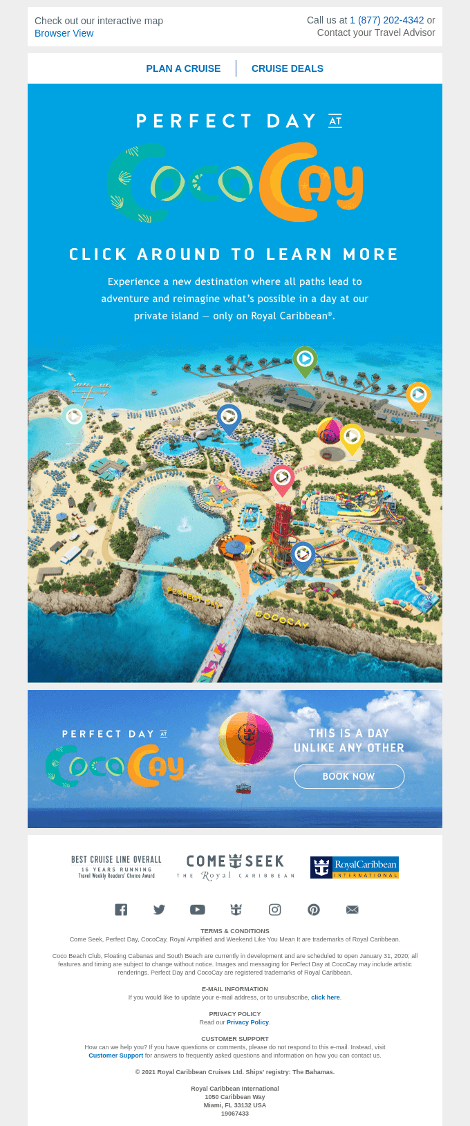
Check out this email by Royal Caribbean International that has included an interactive map in their emails. Travel industry email marketers can use this tactic in their next Holiday season email to get more people to travel with them.
Gamification is the most compelling aspect of interactivity in emails. It warrants the subscriber participation and also encourages the readers to share your email.
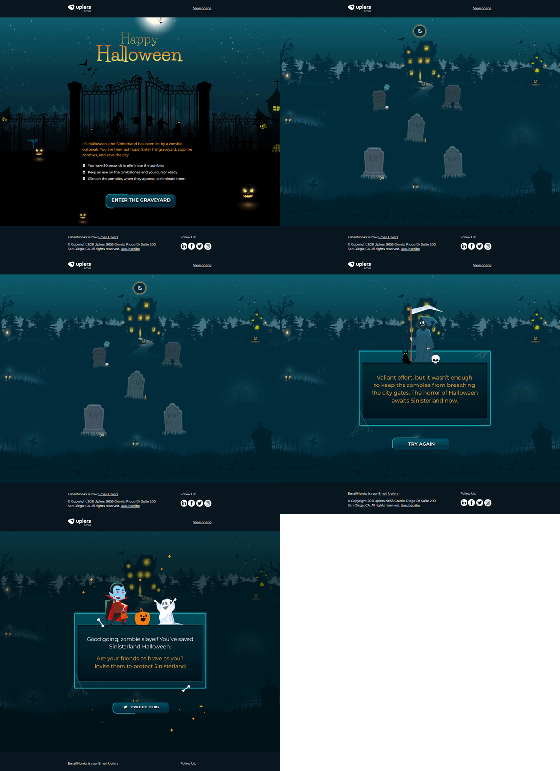
The Halloween email by Email Uplers perfectly uses gamification and encourages people to participate in the email. It will enhance the click-through rate which will in turn improve the deliverability and inbox placement. At least for the foreseeable future, interactivity and gamification will continue to be among the top holiday email marketing trends.
5. Adorkable Email Designs
Adorable, dorky, and awkward — that’s the latest fad in email designs for the Holiday season. Dorkily awkward and adorably real has emerged as a trend to connect with GenZ subscribers. If you find mismatched fonts, bold and idiosyncratic layout sprinkled with some maximalism, that’s adorkable designs for you.
Take a look at this holiday email design by WeTransfer that demonstrates the usage of adorkable email designs.
6. Shapes and Wavy Lines
Shapes have been a quintessential element in the world of graphic designing. There are three types of shapes, namely:
1. Organic shapes derived from nature
2. Abstract shapes that represent familiar objects
3. Geometric shapes like triangles, squares, and circles
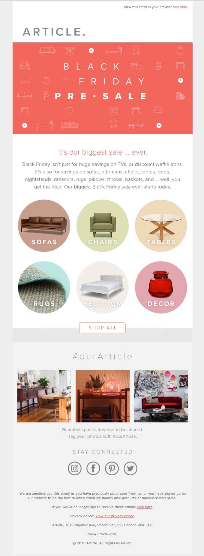
This is not a holiday email marketing trend per se, but something foundational to email design. Article has incorporated circles and squares to promote their Black Friday sale. Those shapes also make the email look neatly organized.
Now, let’s talk about wavy lines — again, something elemental, not particularly related to holiday marketing trends in 2024.
Wavy lines in emails can be used for several purposes. It does not have too deep a meaning but it is still a popular trend for emails. It can be used to separate compartments or simply depict playfulness or flow.
Cricut uses wavy lines here as section demarcators, thereby successfully reinforcing the festive vibe of their email.
7. High-res Product Photography
Product photography has got more sophisticated owing to the advanced cameras and mobile devices. Including product images in Holiday emails can result in pleasant shopping experiences and drive better conversions. Including better product visuals has led to 40% reduction in the returns. So it’s not surprising that it continues to be among the holiday email marketing trends.
In a way, product images in emails can be compared to actual physical products in brick-and-mortar stores. Your subscribers interact physically with these images. Therefore, they work as trust building elements and prompt the users to purchase. eCommerce email marketers must use larger image real estate with product photographs relative to text and CTA buttons.
See how Finn places beautiful photographs of its products and taps on the reader’s aspirational instinct in their holiday email design.
8. Full-bleed Emails
Designing in full width is the best thing you can do tfor your holiday email design.
Full-bleed layout has an edge-to-edge appearance extending in the entire screen. The reason for including this point at the end is that combining this feature with interactivity, gamification, bold typography, and other trends can give a stunning visual appeal to your emails.
Email Uplers has used a full-bleed layout, combined with gamification in their Christmas email.
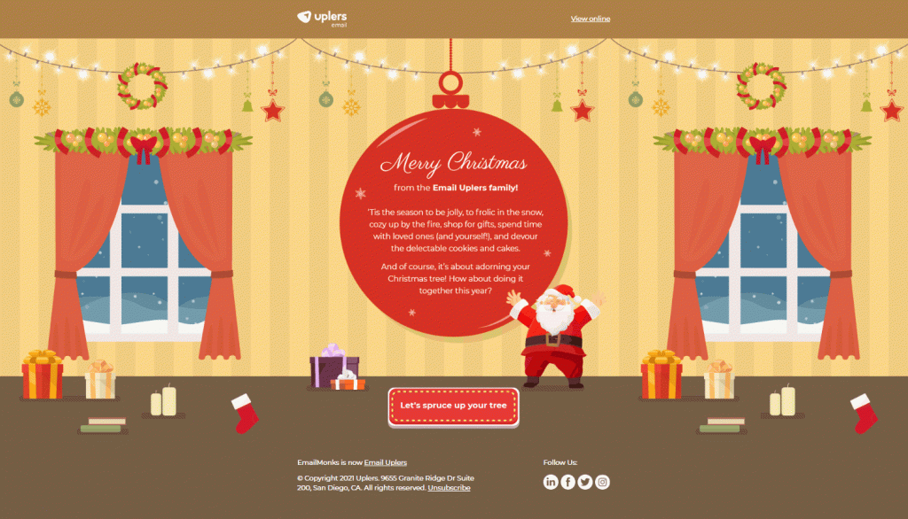
Experience the live email here: https://emailmarketing.uplers.com/glam-up-your-christmas-tree-1
Wrapping Up
So these were some of the email marketing design trends for this year. If you want to get your holiday emails designed, get in touch with our seasoned email design and development team right away!









Susmit Panda
Latest posts by Susmit Panda (see all)
How to Increase Email Newsletter Subscribers During the Holiday Season?
Building A Stunning Pre-launch Landing Page: Know What Goes Into It!