Fall is approaching. For most brands, this is also the time to prime consumers for the holiday season. And what better way to do that than via email?
MasterCard has called 2024 the year of the ‘empowered consumer.’ After splurging during the post-pandemic years, consumers are now cautious about spending money. In fact, according to MasterCard, consumer spending this year has gone back to “2019 levels.” So, consumers worldwide will be looking for deals and discounts.
Once again, the burden is on email designers to create emails that are not just beautiful, but effective at converting the empowered consumer into a trusting customer.
Designers, the buck stops with you. Poor design equals poor subscriber experience equals poor sales. Horse sense! But it took us over ten years and 5,000 clients to say that with confidence. (Coloring up here; but it’s close to fall! 🥵)
Because it’s not so simple out there, is it? Inspiration does not strike when it should, nor, even after years of experience, is taking the first step less unsettling.
Fret not! In this post, we are sharing 8 fall email templates straight from our inbox, along with tips, to give you designers a head start into fall email marketing. Let’s roll!
- Display Discounts & Deals Prominently
- Don’t Deviate Too Much from Your Brand Colors
- Leverage the Pre-hero Space
- Really Invest in The Recovery Module
- Design for In-store, After-dark Shoppers
- Use Overlays to Widen Design Scope
- Experiment with Album Aesthetics
- Use the S-curve Pattern to Maneuver Focus
1. Display Discounts & Deals Prominently
Because consumers are looking for discounts, make sure to feature it on the top of your email, preferably in the hero banner.
This no matter whether your subject line mentions the discount or not.
Importantly, create a display hierarchy for your discount. First, reveal how much the discount is. Second, add the related details in the body. Third, include the fine print in the footer. In this fall email template, Copper Cow Coffee does it exactly right.

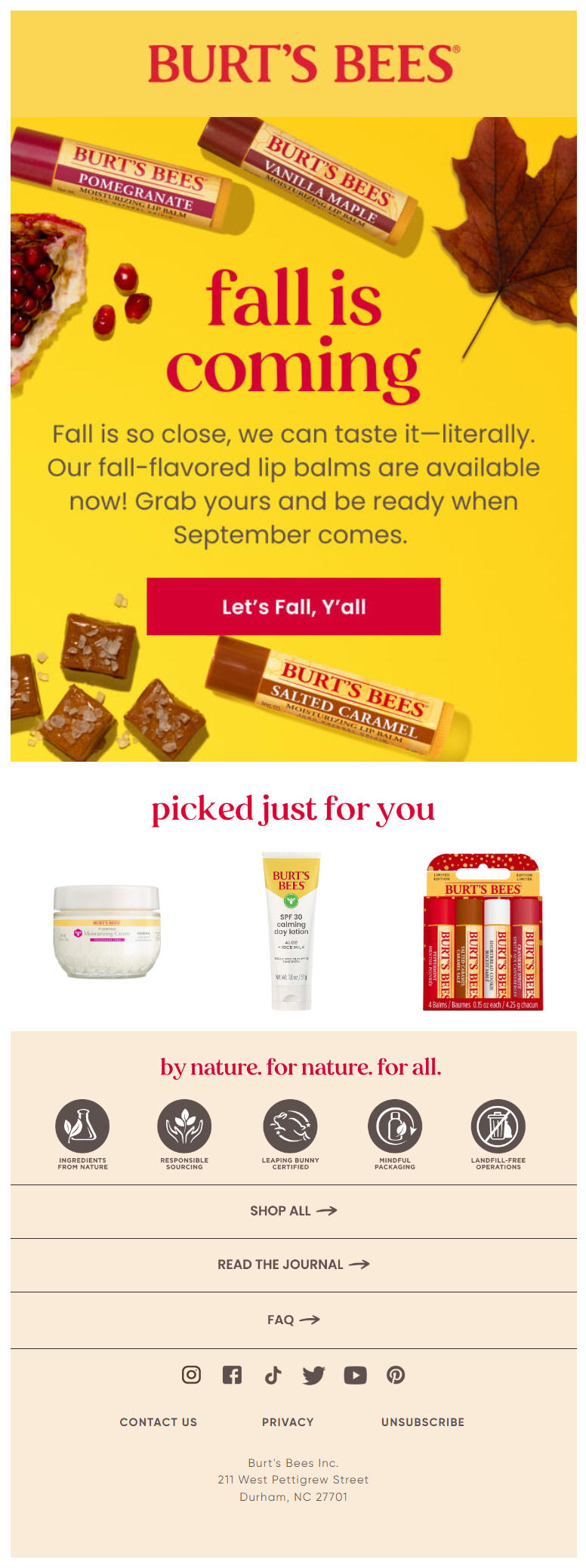
2. Use Fall Colors without Deviating Too Much from Your Brand Colors
You may occasionally deviate from the corporate color scheme. However, if you want to launch a series of interconnected emails, it’s best not to deviate too much.
If you’re doing a gradual product reveal over a series of 4-5 emails, it’s critical to stay on-brand as well as thematic. Because you don’t want the recipient to be re-trained on your brand identity.
In this regard, Burt’s Bees does a fine job with their fall sale email.

3. Leverage the Pre-hero Space to Create Urgency
The hero banner usually introduces the main topic of the email. However, technically, the hero banner isn’t the first thing in the email. The first thing that the viewer sees is the Free Shipping offer in plain text, right at the beginning of the template.
Most brands don’t bother to support the offer with an image. However, given the demand for deals this year, especially in the pre-holidays, it’s not a bad idea to include a pre-hero visual announcement with a nice CTA button.
Bonobos’s fall email template leverages the pre-hero space to announce their product launch, along with a free shipping offer. This is particularly useful if your email is long.

4. Really Invest in The Recovery Module
The recovery module is the secondary navigation bar, containing links to popular destinations on your website. The point of the recovery module is to re-engage the viewer to consider exploring these pages, in case the primary navigation bar and the email content did not interest them enough.
“Nav bars can drive upwards of 20% of all click engagement,” points out Peter Briggs, Director of Analytic & Strategic Services, Oracle Digital Experience Agency. “While less important than a top nav, a bottom nav or recovery module can be critical because it’s your last chance to stimulate a click from the email.”
More often than not, brands that do realize the significance of recovery modules skimp on them, content just to add the links. We recommend designing the bottom navigation bar as you would the entire email. Make it stand out. Nuts.com leads the way here.

5. Design for In-store, After-dark Shoppers
Store traffic has gone up post-pandemic, says this report by the Oracle Digital Marketing agency.
More importantly, Gen Z has surprised market leaders by their ever-increasing interest in in-store shopping. Therefore, it’s critical that you design your fall sale email for offline shoppers as well. In addition, since it’s close to the holiday season, many stores start operating after dark. You should design for after-dark shoppers as well.
We recommend ditching the product grid to display these products. Instead, list your product images across the template, one product per view pane. This is because it’s a one-off fall email campaign idea, so you don’t want a product grid to minimize the focus on your products. Generally, the grid acts as a supplement to the featured products.
Take a cue from Decor Steals’s fall email template.

6. Use Overlays to Widen the Scope of Fall Design
When it comes to themes, designers often have to negotiate for space.
In general, the theme is usually confined to the hero space or conveyed through visual cues throughout the template. This is because the important textual content and product images need space, so it’s a helpful trade-off. However, you can incorporate thematic designs throughout the email without sacrificing space for informative content by using overlays.
In our next fall email example, we showcase Thyme’s skillful use of overlays. As seen, the informational content of the email is superimposed on the fall theme.

7. Experiment with Album Aesthetics
Take inspiration from albums and wall art to design your fall email template.
Remember, while the hard goal of email is sales, the soft goal is to create a memorable experience. Using album or wall art styles is a cool way to engage your audience.
However, successful execution of this idea depends on how well you can pull off the layout and hierarchy of the components. To that end, it’s a good idea to get in touch with the web team designers if you need help. Web designers have more varied experience than email designers because of obvious reasons.
In the meantime, take a look at the following fall sale email from Terrain. Terrain’s composition, including its distinct hierarchy and frame positioning, as well as the photo quality and the use of natural backgrounds, is exceptionally well-done.

8. Use the S-curve Pattern to Maneuver Focus
The S-curve design isn’t going anywhere. It’s smart, practical, and resourceful.
The S-curve is one of the best ways to leverage space in email templates. What makes it more special is that there’s no one way of using it.
Depending on how well you can manipulate the pattern, you can make maximum use of space, add more content assets, and still make your email look uncluttered. The basic principle is maneuvering focus. Where do you want the viewer to focus? Once you’ve answered this question, it’s just about shifting and sliding your content tiles all the way.
Consider this fall sale email by Wantable. It’s a brilliant use of the S-curve style. As you can see, each product has two images to itself, not one, which allows the potential buyer to explore the products in more detail.

Turn Your Fall Email Campaign Ideas into Reality!
Fall is here. Inspirations are here. Time to rise this fall!
If you need help designing fall emails, get in touch with us right away!
Also, September is just around the corner, and with the holiday season approaching, it’s time to start thinking about your holiday campaigns. If you haven’t begun planning yet, don’t worry – there’s still time to get started. Discover the right time to start planning for holiday email marketing.


Good and informative blog
Fantastic blog post! The 8 colorful fall email templates you shared are truly inspiring and perfect for kickstarting any fall campaign. I love how each template captures the essence of the season with vibrant colors and engaging designs. The tips on how to customize and use these templates effectively are very practical and helpful. One suggestion: it would be great to see some examples of successful campaigns that used similar templates. Overall, excellent work and very timely for the upcoming season. Thanks for sharing!
The main challenge in E-mail marketing is to land on the primary inbox!! Find your content helpful thanks!!
Thank you for the inspiring fall sale email ideas! The examples are fantastic and offer great insights into creating visually appealing and effective campaigns. I’m excited to use these ideas to craft engaging fall promotions that really capture the season’s spirit. Your suggestions will definitely help elevate our email marketing efforts. Thanks again for the inspiration!