The National Retail Foundation (NRF), the largest association of retailers in the world, does not list Labor Day as a major holiday. However, as per Klaviyo’s research into marketing trends, Labor Day email campaigns tend to perform better than those of 4th of July, Mother’s Day, and Father’s Day.
This is not surprising since Labor Day is a significant eCommerce event, providing businesses the opportunity to revitalize sales after a dry patch in summer. In 2020, for instance, consumers spent over $2.6 billion on Labor Day.
Plus, ever since Covid hit the world, eCommerce has had a field day. Shoppers have embraced online marketing like never before.
So, while some Americans gear up for family get-togethers and weekend gateways, others sit with peeled eyes, expecting Labor Day sales emails in the inbox. What’s more, with the rise of AMP-powered emails, people can shop their favorite products without needing to click out of the inbox.
If done rightly, Labor Day emails can strike gold. Luckily, we have curated a list of attention-grabbing Labor Day emails to whet your marketing shovel. Let’s dig right in!
1. Canyon
One of the distinguishing attributes of a good email template is visual lucidity. Your email will make an impact on the subscriber to the extent that it is designed to convey, rather than obstruct, information.
Canyon’s Labor Day email is designed to simplify communication. The template layout, with its masterful application of white space, does not demand too much of the viewer’s cognitive capital. In fact, the design is minimal. The product images, shot against both natural and artificial backgrounds, speak for themselves, and achieve way more than uber-inventive design ever could.
2. Tattly
Tattly’s all-yellow Labor Day email strikes the summer chord with style. One of the advantages of monochrome in email design is that it reinforces a focused view of the subject without depending too much on white space. Monochrome evokes a successful semi-illusion of white space, leaving you room to add more content.
Tattly’s email consists of six product images. Note that they are not carousel images either. They’re displayed all at once. Now, imagine the arrangement in a polychromatic scheme. Do you see clutter? Well, there you go!
Tattly successfully exploits monochrome to exhibit their products without cluttering up the email.
3. HotelTonight
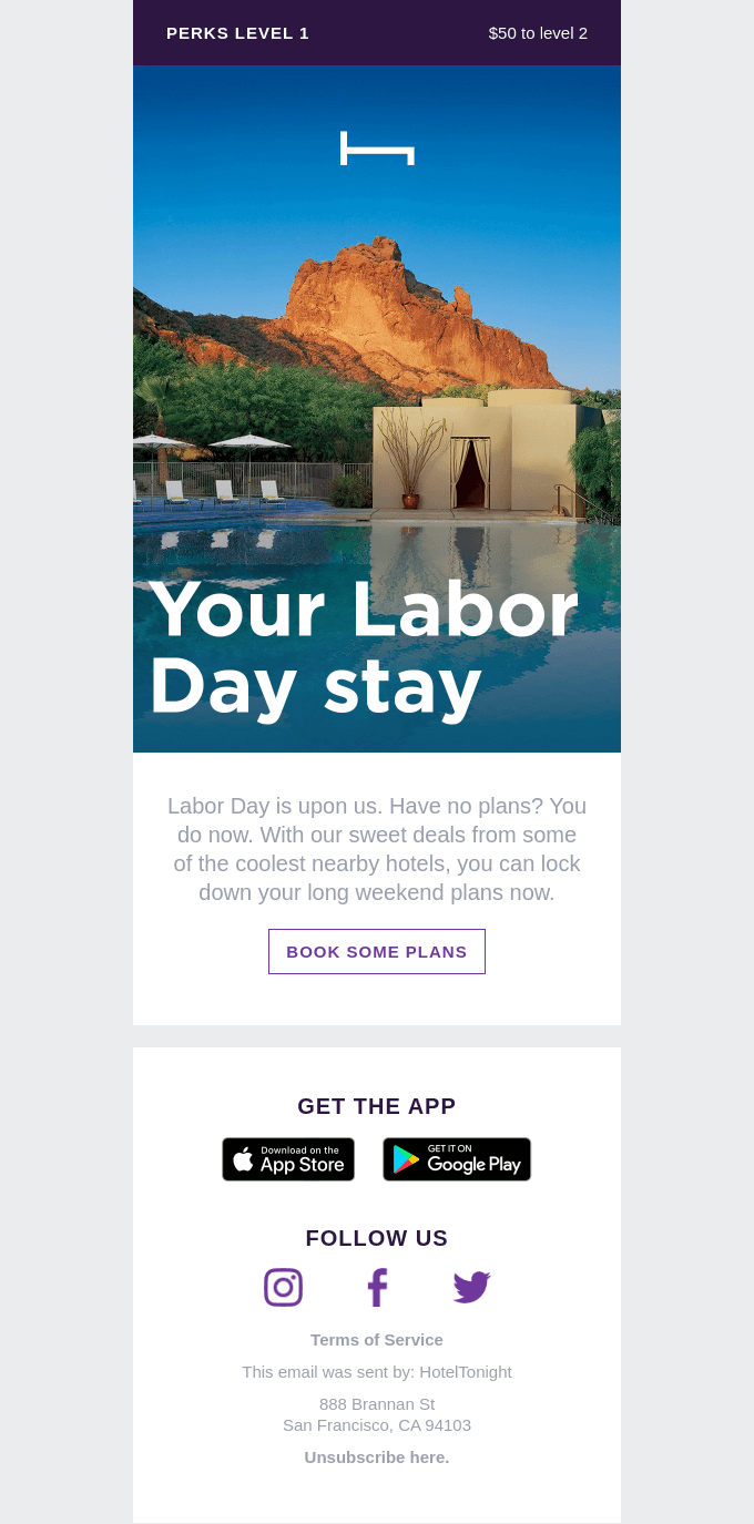
HotelTonight uses a vibrant hero image in their Labor Day email to capture attention within seconds of viewing it. Not for nothing! Placing a large banner image at the head of your email eases the viewer into the much-coveted engagement mode.
So, the hero image prepares the viewer for more content below the fold. More often than not, a good, large-sized image compels the viewer to scroll down and read the rest of the email. Usually, this would mean being able to view the CTA button, as in the case of HotelTonight.
As you can see, HotelTonight relies solely on the hero image to make the necessary impact. Consequently, the template is 50% white space punctuated by minimal text and just one season-specific call to action.
4. Everlywell
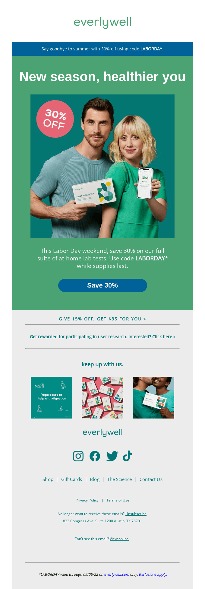
Everlywell has chosen to organize their Labor Day email around their brand identity.
Brand identity is crucial for differentiating your business from the competition. While some prefer to confine their brand identity in seasonal emails to the logo, others insist on laying it out, no matter the seasonal underpinnings.
As far as Everlywell’s email is concerned, this is not just a matter of preference.
Everlywell sells health-testing kits. Given the nature of their service, trust and authenticity are their customers’ topmost priority. The ethos of Everlywell demands a formal, sober representation of the brand in order to reflect the nature of their service and its significance to their customers, at ALL times.
Imagine Everlywell going all splashy-summery like Tattly! Right?
5. Everlane
We have seen the use of visuals in Labor Day email campaigns. But sometimes you only need a brilliant copy to turn heads. Everlane’s stunning introduction is proof. The effect begins right from the subject line which reads: “No Sale Today. Here’s Why.” While others spend hours trying to come up with catchy Labor Day email subject lines, Everlane claims the dollar in less than six words.
At a time when users increasingly prefer visual content to written web content, Everlane’s text-based email sheds light on the precedence of mind over medium. The entire email runs on text, white space, and product images. No fussy design. No creative stunts.
Resourceful imagination can do so much at so little a cost.
6. GetAround
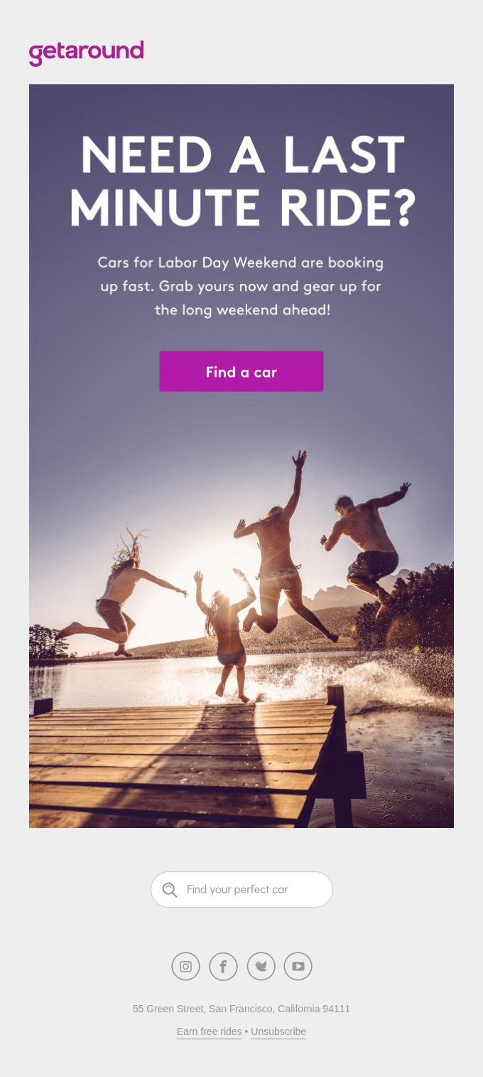
Sometimes a search bar CTA is just what you need to fire the pistol. While GetAround does include a prominent traditional CTA button at the center of the image, the search bar CTA toward the end is more practical and user-oriented.
The search bar is ideal when you want your subscribers to browse the website immediately. In the case of brands like GetAround, dependent as they seem to be on a lookup, the search bar is fitting. It improves navigability and triggers quick action.
7. Postable
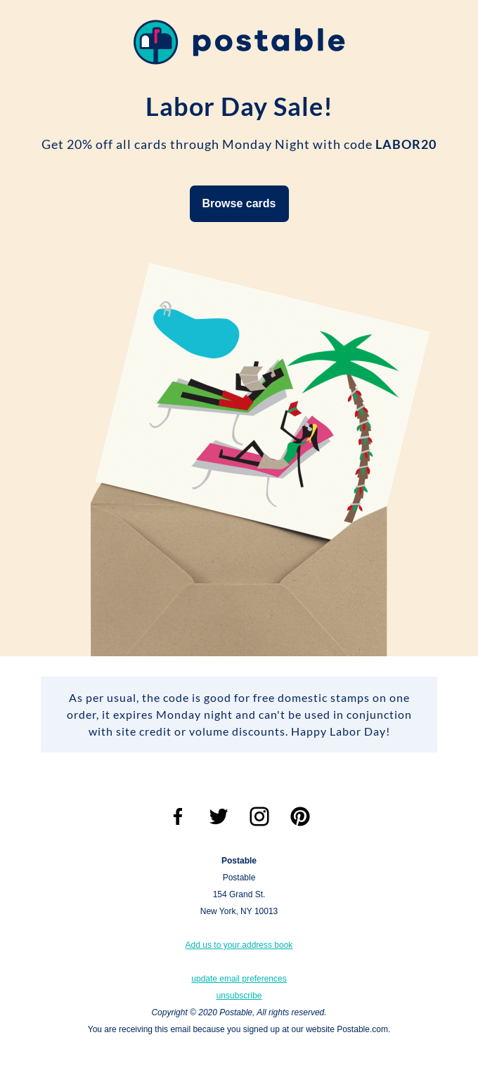
Postable’s Labor Day email marketing is a testament to what is commonly known as clarity design. The design is user-friendly, functional, and does not miss out on aesthetic allure.
The email has only one Labor-Day-specific call to action. As usual, the footer is dedicated to the brand’s social media handles. The textual content above the fold is direct, unfussy, and information-focused. The heading too is very straightforward.
It is tempting to shrug off no-frills emails in an age of HTML and AMP-heavy variants of the same. However, according to one HubSpot study, repeated A/B testing showed that simpler emails outperform HTML-rich emails. This in spite of the fact that users said they preferred highly visual emails to their vanilla counterparts.
What’s more, HubSpot also found that HTML-rich emails had lower open rates and click-through rates.
8. Reverb
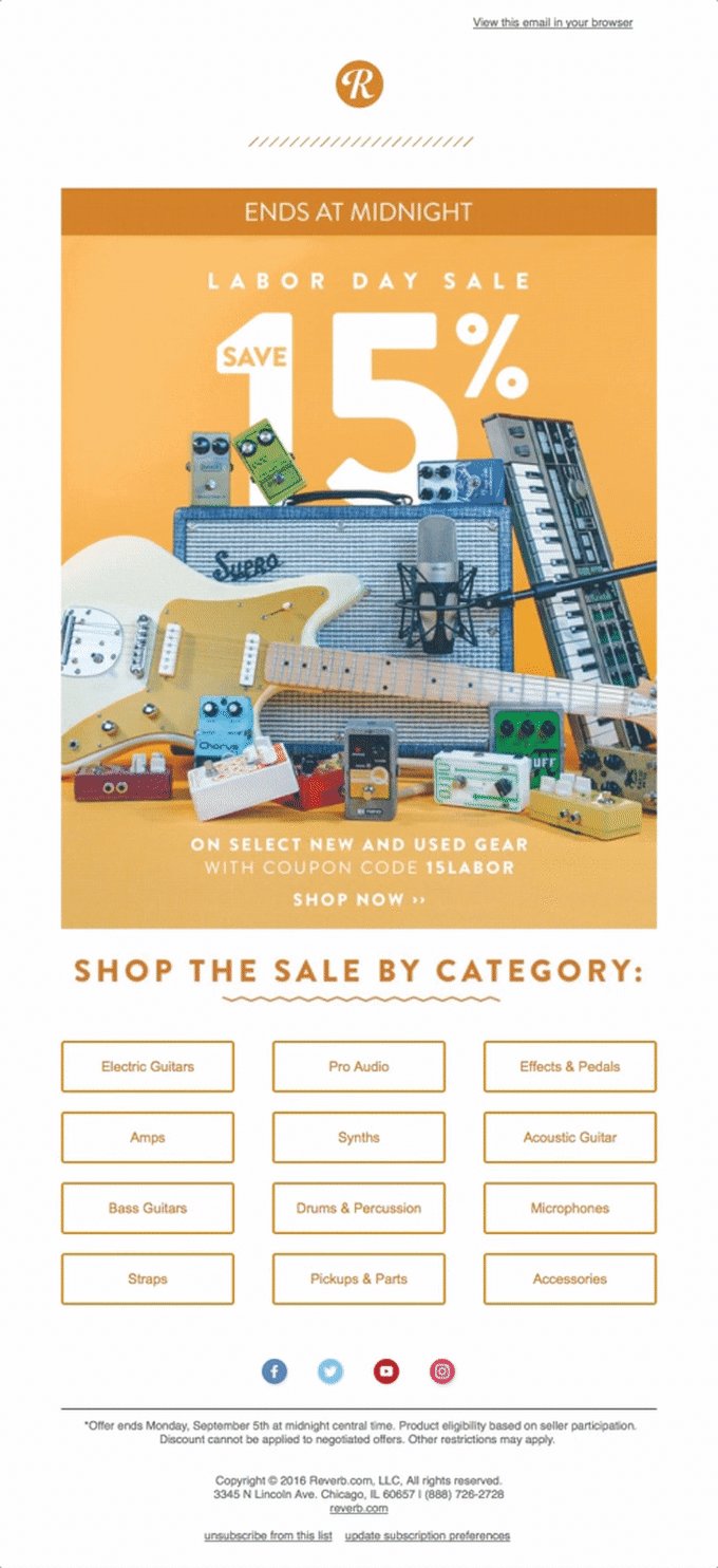
Instead of making their email content-heavy and dependent on a single CTA button that redirects to the website landing page, Reverb has categorized their products within the email.
Now, rather than click on ‘Shop Now’ to visit the webpage and then go to the product section, subscribers can click on the categories and be redirected to the concerned page.
Note, however, that fewer clicks do not always guarantee user satisfaction.
For instance, during checkouts, customers prefer viewing the Reconfirmation page before making a purchase. This would introduce another step in the buying process, which, instead of frustrating the users, would add value to their experience.
Wrapping Up!
Email design is design plus architecture. In other words, the goal of email design is functional aesthetics. Good design is no more than a signifier: it points beyond itself. it leads the user to something actionable. That’s the whole point of email design in the first place. If your email is not instantly recognizable; if the content is not scannable; and if the CTA buttons are not properly padded, your email is next in line to the spam folder.
We hope that our Labor Day email examples have made the above points more than clear. Let us know in the comments section below.






Susmit Panda
Latest posts by Susmit Panda (see all)
Want To Wave Your Banner High? Here Are 10 Best Practices For Designing And Testing Banner Ads
Migrating To A New ESP? Common Pitfalls And How To Overcome Them!