A well-designed or well-written email drives not just engagement, but potentially sales conversions. Now, 64% of small businesses leverage email marketing to connect with their customers. This is made possible by email templates.
Let’s be clear: Email is not a vanity channel. The goal of email marketing is sales. Sending out well-designed emails is the first step toward that.
Okay, you know that. Great! But how to design professional email templates? Are you struggling getting one designed? DIY? Stuck?
That’s what this blog post is about. Tips, types of templates, examples, benefits, and everything in between!
We deliver over 3000 email templates each month. You’ll be getting not just a peek into our design methodology but be more confident submitting your project requirements to your preferred marketing agency, whoever that might happen to be.
So, let’s begin! First up, why do you need professional email templates in the first place? What are its elementary benefits that lead to sales?
- Benefits of Professional Email Templates
- Types of Professional Email Templates
- Tips on Professional Email Template Design
- Bonus Tips on Professional Templates
Benefits of Using Professional Email Templates
The benefits of professional email templates include:
- Efficiency: Email templates are pre-coded and reusable. You don’t have to design your templates every time from scratch.
- Brand consistency: Email templates ensure consistent brand identity, which helps your audience recognize and differentiate your brand.
- Increased productivity: Because templates are pre-coded and reusable, the email creation process is streamlined. Editing templates based on campaign type is not a time-consuming process, provided you have standard templates for all potential campaign types.
- Minimum errors: Because drafting or designing emails doesn’t have to be a from-the-top approach, there’s less cognitive demand. A few modifications here and there, and you’re done! This reduces the scope of errors.
- Scaling: Email templates allow you to scale your email marketing efforts, making it possible for non-developers and non-designers to create and send emails.
“Effective email design and compelling body copy help propel subscribers on to the next and final stage of email interaction.”
— Chad S. White, author of Email Marketing Rules
Types of Professional Email Templates
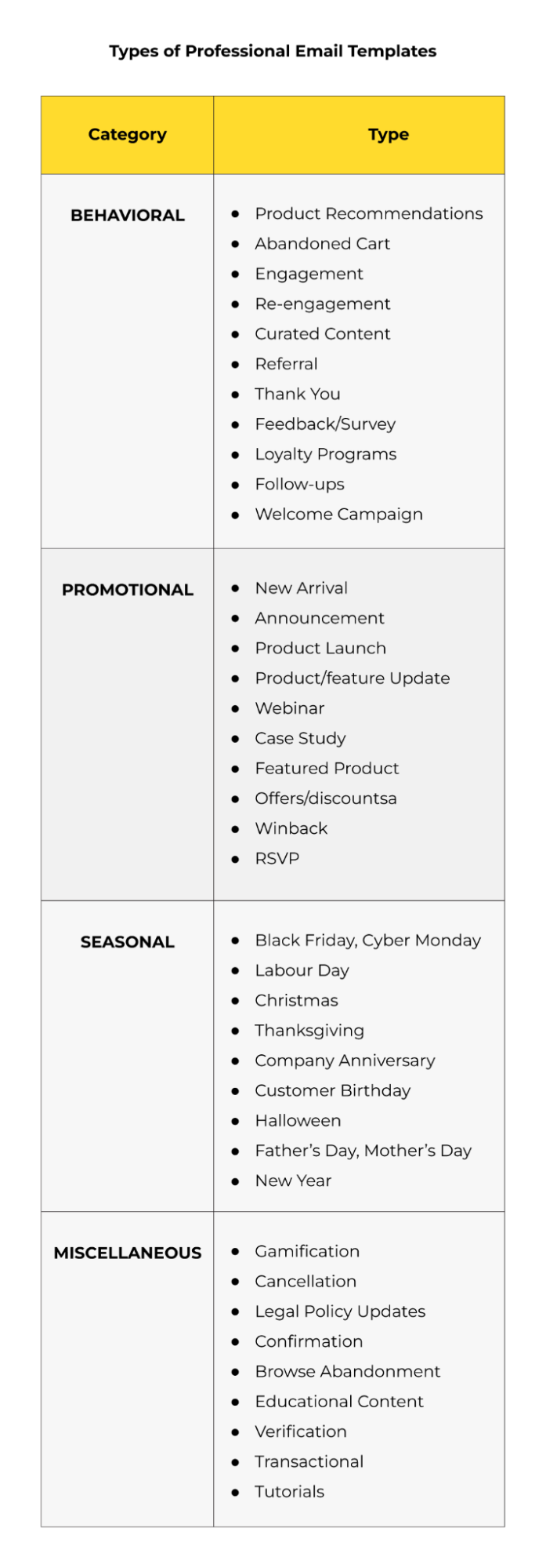
The categorizations can be endless. But for starters, here’s a list of the basic types of professional email templates. The list is NOT exhaustive.
Tips on Professional Email Template Design
1. Create A Master Template
First things first, you want to create a master template for the few, absolutely fundamental emails you want to send.
Now, what’s a master template? It’s the go-to skeleton template for your brand. It will include your preferred font type and size, header, subheader, logo, etc.
Resist the temptation of creating a master template for each type of email.
Speaking from experience, maintaining numerous templates can be challenging. Start with the categories listed in the table above. Four flexible, modular templates should be enough, and you can always add or remove content blocks as needed.
2. Choose The Right Layout
An email layout can be single-column, double-column, or multi-column. Determine which is the right layout for your campaign.
Single-column and double-column layouts are the most common because they keep email designs simple, creating a minimalist look and highlighting the important parts of the email. There’s the added benefit of improved mobile viewing as well.
The following holiday email which we designed for Hartness Living uses a single-column layout.

3. Maintain Brand Consistency
Your emails should be harmonious with your brand design as seen on the website and other channels.
This is so critical for your brand identity. You don’t want to give your subscribers mixed signals about your brand. It’s high-stakes; it’s about who you are.
At the same time, your email shouldn’t be an exact replica of your website. Harmonious, not identical, is the goal. Appreciate the essence of each digital marketing channel.
Check out this email we designed for Pakenham Mazda. Once you’ve viewed it, do visit their website to see the brand consistency for yourself.

4. Take A Mobile-first Approach
More people are opening emails on mobile than ever before. Any professional email template for business should be designed with a mobile-first approach.
This is where responsive design comes into play. You want to optimize your emails for desktop, mobile, and wearables. But start with mobile, so:
- Use a single-column layout
- Use high-color contrasts for easy outdoor viewing
- Use large text, with a minimum of 14px for body copy and 18px for headlines
- Use negative space liberally
- Add fewer but larger buttons (at least 44×44 px)
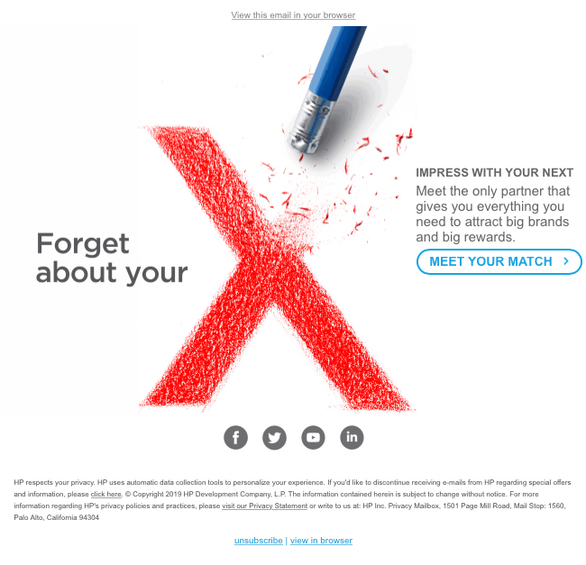
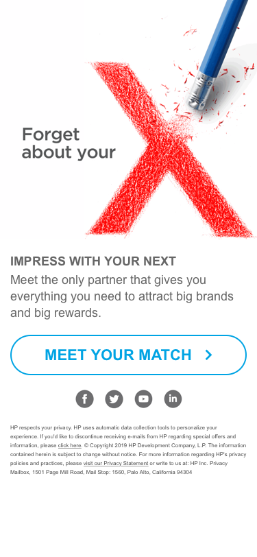
Check out this email we designed for HP. Appreciate the differences between the two versions.
Desktop View
Mobile View
5. Place Your CTAs Strategically
Designing and positioning the CTA button are separate concerns. As far as designing is concerned, ensure it’s well-padded and designed for a mobile-first experience.
CTA placement is a bit tricky. What’s the best place to feature your CTA? Here’s where:
- If it’s a time-sensitive, promotional, or preference management email, place it above the fold just below the relevant copy.
- For long emails such as newsletters, consider placing one above the fold and one at the end of the body copy.
- For emails with product grids, place one CTA at the top and multiple CTAs for each product in the grid.
As a rule of thumb, keep your CTAs simple and prominent. Take a look at how the CTAs are placed in this email that we designed for The Niobrara Lodge.

6. Balance Images & Text
Too many images, too much text — neither is recommended. Image-heavy emails take longer to load. Text-heavy emails lack visual appeal. So you want to have a healthy mix of both.
If you’re an ecommerce brand, your image dependency is higher. If, on the other hand, you’re a B2B brand, you should probably use more text.
Ditto for when you’re sending out policy updates, legal emails, or messages from the CEO and experts at the organization.
But in all cases, refrain from plain text-only emails. Your most text-heavy emails should still feature an image or two for the tracking pixels to measure engagement.
“It is…extremely important that your plain text email is just as well-designed as its HTML counterpart.”
— Jason Rodriguez, author of Professional Email Design and Modern HTML Email
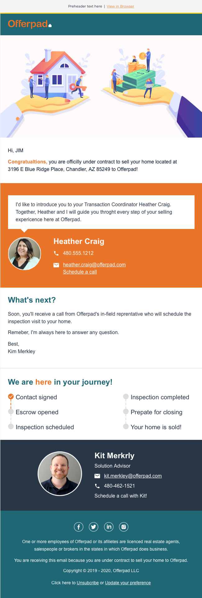
Here’s an email we designed for Offerpad that illustrates the point of having a healthy mix of text and images in a professional email template for business.
7. Establish A Content Hierarchy
Since subscribers scan emails, your design should maintain a content hierarchy to make your template skimmable. The best practices include:
- Making headlines larger than the rest of the text
- Making the primary content block larger, more prominent, than secondary content blocks
- Using large primary CTA buttons and smaller ghost buttons for secondary CTAs
- Using bullets instead of run-on sentences
- Following the inverted pyramid pattern so that the content leads to a CTA.
Slightly tangential, but not diverting too much from the above points, here’s one of our own professional email templates.

8. Design for Dark & Light Mode
The Dark Mode craze continues and it’s going to be this way for at least the next decade.
Any professional email template design should therefore consider both Dark as well as Light Mode. Remember, many of your subscribers prefer viewing emails in Dark Mode even during the daytime. Increasingly, it’s a matter of habit, not choice. It’s high-stakes now, since it involves user experience.
Keep the following in mind while designing emails for Dark Mode:
- Add images with transparent backgrounds.
- Add a translucent outline to transparent PNGs with dark text to ensure your email displays well on email clients that don’t support dark mode.
- If your logo is black, add transparent images to ensure the background color transitions smoothly in dark mode.
- It’s a good idea to add a white stroke to your black font in images or icons.
- Always test your emails to ensure they render properly in dark themes.
For more information, check out our comprehensive infographic on Dark Mode in emails.
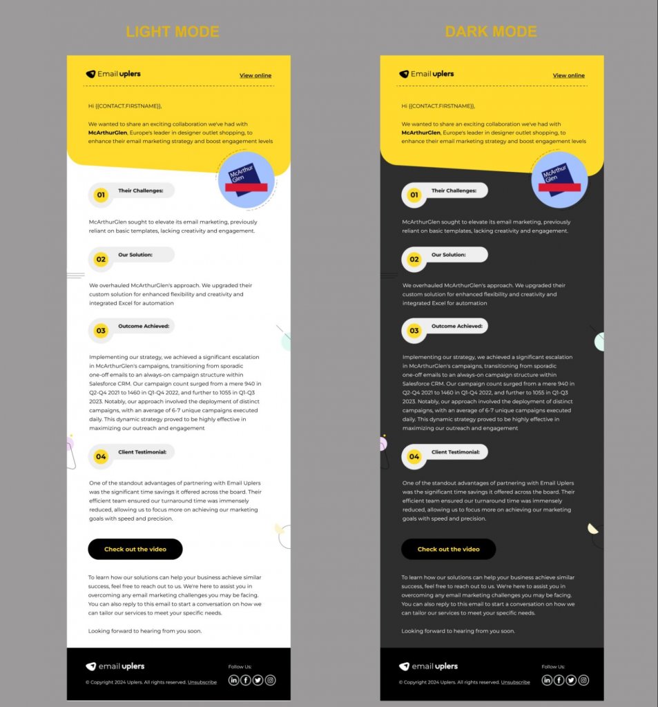
Meanwhile, check out this Dark Mode-optimized email.
9. A/B Test Your Emails
Your emails may look nice—in a static environment! But you are going to send those emails out. Real people will be viewing them. Which is why A/B testing is critical.
Some of the important elements you should test include the subject line and preview text, fonts, colors, CTA buttons (see below), navigation bars, etc.
| CTA Button Clicks | Increase (%) | |
| Test A | 120 | 80 |
| Test B | 143 | 131 |
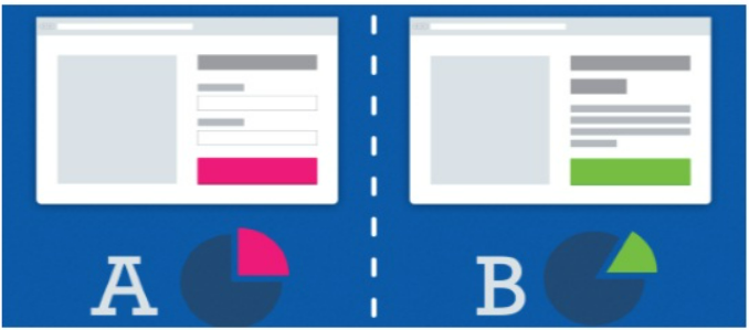
Here are a few foundational tips on A/B testing your email templates:
- Test keeping in mind the email client your subscriber is using
- Test one variable at a time.
- Create a testing schedule to set a deadline for all relevant departments, streamlining your email development process.
- Keep a control version to make it easy for you to compare findings
“Design like you are absolutely right, then optimize like you were wrong from the start.”
— Jordie van Rijn, Founder of Email Monday
Bonus Tips
- Include the View in Browser or View Online link in all your emails at the top
- Add the Unsubscribe link in the footer, make it prominent
- Use web-safe fonts in all your emails
- Leverage the preview text as a secondary subject line
- Embrace defensive design techniques so that people can view your emails even when images are blocked
- Keep above-the-fold content well-branded and featuring the primary CTA
- Design keeping in mind how our eyes view content online
Ready for Your Next Professional Email Template?
It’s easy to get caught up in technical details, but remember that you’re designing for the customer ultimately, not for yourself or your brand.
If you want to learn more about email design, the next logical step would be to learn what responsive design is.
Alternatively, you can have your emails designed by our team of experts. Feel free to reach out to us!





Susmit Panda
Latest posts by Susmit Panda (see all)
All About Email Marketing Audit Checklist
Email Signatures: Understanding the Limitations