[This blog was originally posted on Aug 2023 and has been updated on Sep 2024 to showcase new examples]
This is what an overstatement doesn’t read like: Your emails enjoy a far greater reach than your social media feeds.
Contrary to social media, where ‘reach’ is mainly a statistical entity, in email marketing, ‘reach’ is measured by how deeply an email connects with the individual recipient on a personal level, which includes psychological/behavioral parameters as well.
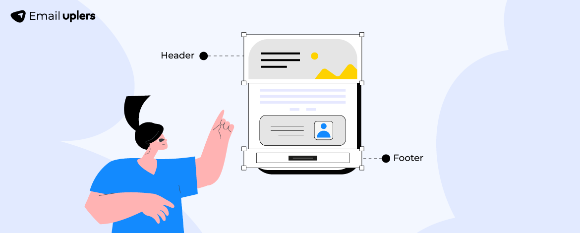
After the subject line and preheader, the primary component of this reach is the email header. And the footer, appearing at the bottom of your email, is a cumulation of bona fides, cementing the reach in a final flourish of brand authenticity.
If you haven’t seen the header and footer in this way before, it’s time to do so now. It’s time to take care of these important things.
Because in our experience of delivering over 3000 templates every month, the stress on bells and whistles is, sadly, much too prevalent. It doesn’t make any difference to your subscribers.
In this post, you’ll learn 10 design best practices, along with examples, to transform your email header and footer into powerful marketing hotspots. Let’s get started!
- Make Your Logo Stand Out
- Keep Your Logo Subtext
- Announce A Sale
- Leverage Photography
- Use Animated Header & Footer
- Use HTML Header & Footer in Text-only Emails
- Add Navbar in the Footer
- Expand on Your Offer
- Make Your Social Icons Prominent
- Add A Handwritten Signature
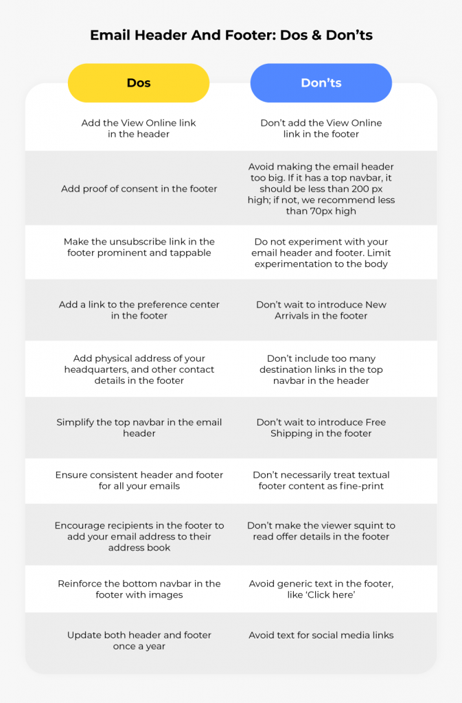
- Email Header And Footer: Dos & Don’ts
- Bonus Tips!
Email Header And Footer: 10 Best Practices
1. Make Your Logo Stand Out
Your brand logo is the principal component of the HTML header. While brands do get this right, where they go wrong is making the logo stand out from the rest of the email.
The trick is not to enlarge your brand logo, but to position it nicely: It should be centered and surrounded by white space. Here’s Chamberlain Coffee’s email header template for example.

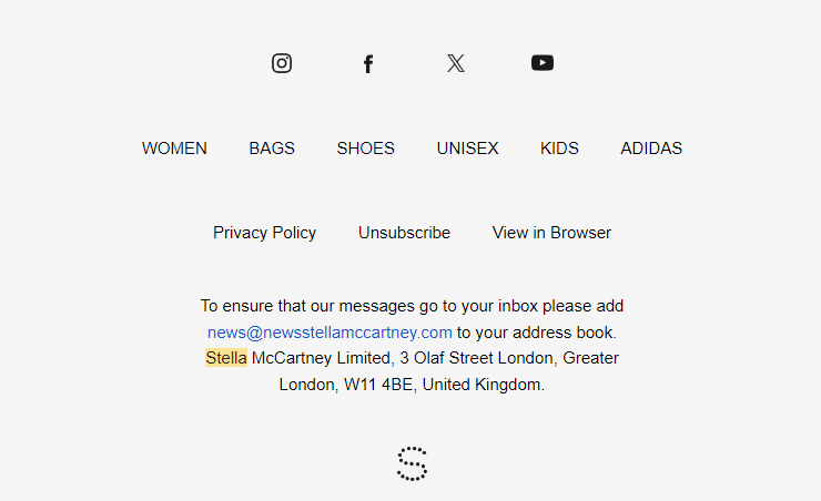
Incidentally, you may also feature a second logo in the footer in the form of a signoff. Here’s how Stella McCartney does it. It sort of rounds off the email. But remember to always add the primary logo in the header.
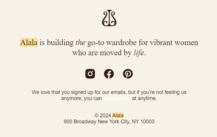
Alala does something similar.
2. Keep Your Logo Subtext
We have seen quite a few brands who tend to drop the tagline from their logo when including it in emails.
But one doesn’t have to. If you have a tagline under your logo, it’s part of it. You should add the entire logo, just like Hobby Lobby does in their email header design.

Here’s another example from Purity Products where the email header features the logo with the tagline.

Feel free to include other subtext as well if your logo features one, such as copyright information, as in this email from Sneakers n stuff.

3. Announce A Sale
Including an offer, such as Free Shipping or other seasonal offers in the email header is a cool way to draw attention to an ongoing sale. Here’s an example from Tuft & Needle.

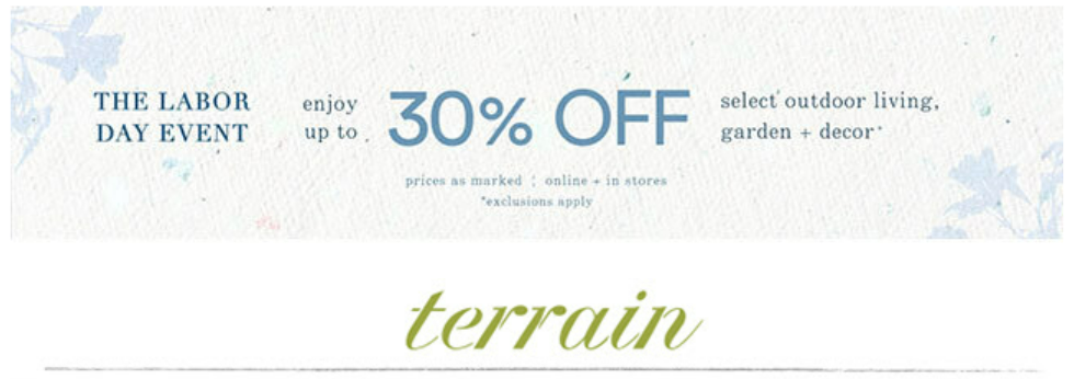
The header is the first thing that the subscriber sees on opening the email. Most brands add offers in plain text. But you can design a dedicated offer banner as well. Take a look at Terrain’s email header template which features a Labor Day sale.
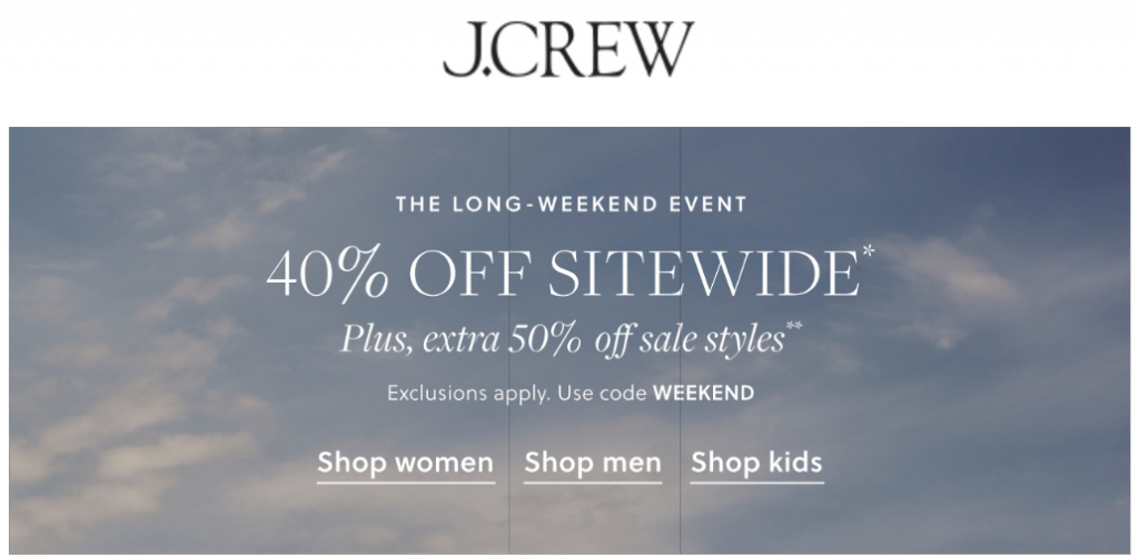
You can also add the banner just below the logo, like J.Crew does it in this email header template.
Generally, brands leave the details of a sale for the email footer (more on this later). So, if you want the offer to be concise, you can add it alongside the email header the way Nuts.com does it here. Interestingly, this partial revelation also encourages the viewer to scroll through the entire email.

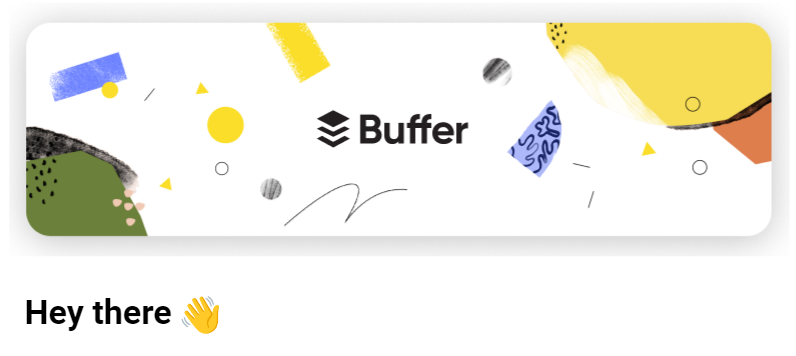
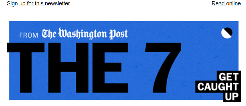
4. Leverage Photography
Consider using a photographic header for your emails. Take a look at this email from Buffer, which features a cool photographic header.
Here’s another example of a photographic header from The Washington Post.
5. Use Animated Header & Footer
Using an animated header, particularly to highlight a sale, can be very effective. Usually, it takes the form of an animated ticker. Take a look at this email from Wolf & Badger.
And here’s an animated footer in an email by ActionRocket.
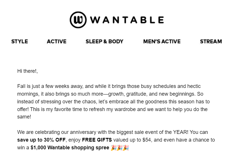
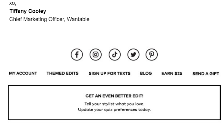
6. Use HTML Header & Footer in Text-only Emails
Whether it’s a personal note from the CEO or product manager, a text-only email may feature an HTML header and footer.
The following email from the CMO of Wantable keeps the HTML header and footer intact.
7. Add Navbar in The Footer
The bottom navigation bar, which is traditionally pre-footer content but can be added to the email footer as well, is known to have a significant impact on the click-through rate. The idea is to re-engage the viewer with sitewide links a second time.
“Nav bars can drive upwards of 20% of all click engagement,” points out Peter Briggs, Director of Analytic & Strategic Services, Oracle Digital Experience Agency. “While less important than a top nav, a bottom nav or recovery module can be critical because it’s your last chance to stimulate a click from the email.”
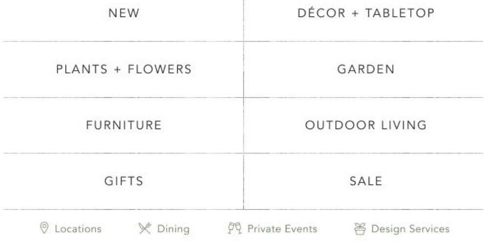
Consider Terrain’s bottom navigation bar in their email footer design. It’s best practice to make the second navigation bar more comprehensive than the first.
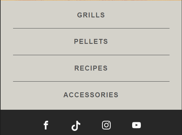
Here’s another example of an email footer template with a secondary navigation bar. This email is from Traeger.
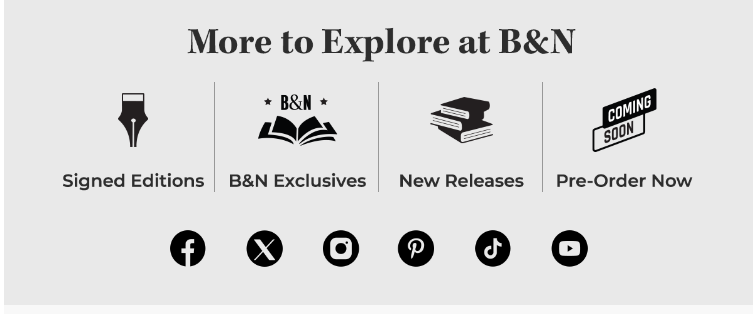
You can also arrange the bottom navbar horizontally like Barnes & Noble does in their promotional email.
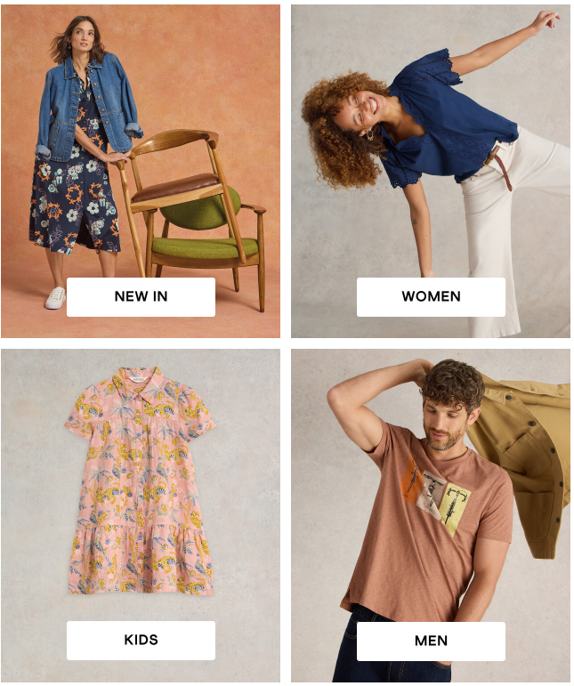
Or, try to reinforce the email footer template with a photographic navbar. For instance, check out this email from White Stuff. (However, bear in mind that this may cause Gmail to clip your message, so do add a View in Browser link in the header.)
8. Expand on Your Offer
Use the footer to provide the details of your offer, which you announced in the header. It can be brief or extensive, depending on the type of sale event.
TCHO Chocolate provides a brief description of their offer in the email footer.

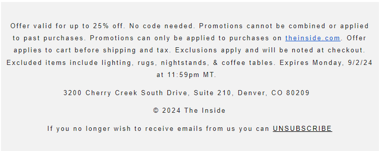
Compare this with the details offered by The Inside.
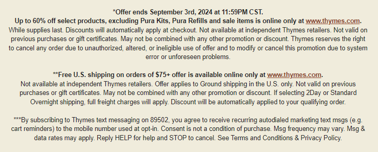
Thymes’s email footer is still more detailed.
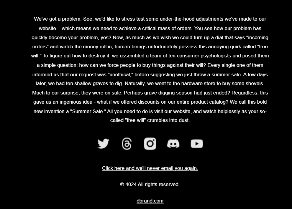
But here’s the winner, from dbrand.
9. Make Your Social Icons Prominent
Almost all brands add links to their social media presence in the footer. However, from the perspective of design, it is critical to make these links prominent and tappable.
We’d rather use social media links with deep contrast instead of grayscale ones. Subscribers may have multiple tabs open, and frequently switching between them strains the eyes. Grayscale links may appear dimmer than they actually are when the subscriber returns to the email from another page, causing the viewer to squint.
For example, compare TCHO’ Chocolate’s social sharing block to that of Doughp’s. The latter is way more on track with the visibility aspect.


Speaking of visibility, if you’re using text, make sure to enlarge it. Hawthorne’s social sharing text appears tiny, not in proportion to the sizing ratios in the rest of the email.
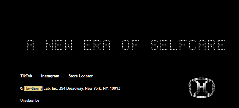
To be on the safe side, ditch text and let social media logos do the work.
Still, try to make the icons prominent as well. And spaced out. In the following email from Seth Godin’s blog, the social media icons are small and look cluttered.

10. Add A Handwritten Signature
If the email contains a personal message from the founder or a representative of the brand, including a handwritten signature is more impactful than simply typing the name. This personalizes the email and makes the message more valuable and endearing.
Anya Hindmarch enhances the email footer design by including her handwritten signature, complementing the message.
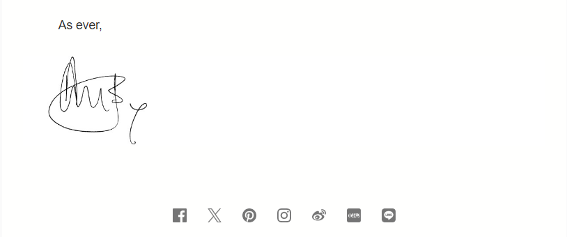
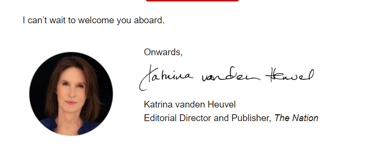
Here’s another example of a handwritten signature, this time from the Editorial Director and Publisher of The Nation. (Yes, it’s a good idea to include a headshot!)
Email Header And Footer: Dos & Don’ts
Email Header And Footer: Bonus Tips!
Here are some bonus tips on email header and footer design:
- Carry a signup link in the email header of your newsletter. Make it a call to action.
- Add a Store Locator or Store Finder link right in the header.
- In addition to including a handwritten signature in the email footer, consider adding the sender’s photo in the header.
- Feel free to add the link to your Preference Center in the header as well. It’s particularly relevant to mobile viewers. They can update preferences on the go.
- You may add custom fonts to the primary navigation bar in the header and the bottom navbar in the footer. However, do not vary it too frequently.
- Some brands add the social media buttons in the header. If you want it that way, send such emails only to subscribers who are most engaged on social media. The point is to make it quicker for subscribers to act on their unique preferences.
- Besides social media buttons, add app download links in the email footer.
- Use an HTML background color in the footer to distinguish it from the rest of the content blocks.
- Make sure the color scheme in the email footer template is more or less consistent with that of the rest of the email.
- Feel free to sign off with something more interesting than legal and policy page links in the footer. It could be a quote from the CEO, or any quote relevant to the content of the email.
- Arrange email footer content in a logical hierarchy, placing the most important CTA or information at the top.
- If you’re adding lots of information in the footer, leverage negative space and allow the content to breathe.
- Utilize the footer to ask subscribers for their feedback/thoughts on your emails. Encouraging user participation is a smart way to sign off.
- Make sure to optimize both email header and footer for mobile devices.
- Finally, consider adding a whitelist request in the footer in order to ensure that your emails get delivered, instead of being junked or spammed.
Want to See ALL THIS in Action?
If yes, let’s talk! Share your email header and footer design concepts with us.
Our email template production team delivers over 3000 templates every month. We can get a beautifully designed, custom-coded responsive email template tailored to your brand guidelines within just 2 days, starting from scratch.
For more insights into the current topic, feel free to update yourself on the limitations of email signatures.




Excellent, what a blog it is! This webpage presents helpful facts to us,
keep it up.