You transact in trust, not in dollars and cents. As a financial service provider, you need your clients to feel comfortable committing their money matters to you.
It’s this trust, this exclusivity, that email marketing offers you. But there’s more:
- Only two years ago, financial service emails enjoyed an open rate of 27.1%. It leaped to 41.44% in 2023. In 2024, it’s 45.1%.
- High-performance financial service providers were converting at a rate of 23% in 2022.
- 60% of people in the United States prefer receiving company updates via email.
- In the second quarter of 2024, 99.1% of all emails sent by financial services and insurance companies were successfully delivered.
As email marketers with 10+ years of experience on our side, you can trust us when we say that email is right for your business.
In this guide, you’ll catch a glimpse of how email marketing can help you acquire, maintain, and retain customers. Let’s get started!
Benefits of Email Marketing for Banks
1. Low Customer Acquisition Costs, High ROI
Banks and other financial brands spend tons of money in paid media to justify the high potential lifetime value of their customers. However, only a handful of financial service providers have a rock-solid lead gen strategy in place.
Email is the missing low-cost, high-yield slice of the omnichannel pie. Marketers who recognize it incorporate email opt-ins in all their campaigns.
In addition, email enables marketers to provide proactive customer service, aligning well with the current trend of self-service. Especially among younger consumers. It can also decrease the need for expensive traditional service options like call centers and in-person consultations.
2. Email Is Permission-based
Permission is a priceless commodity in marketing, especially in financial marketing.
“Businesses must provide clear and truthful information about how individuals’ data will be used. Consider how the Consumer Financial Protection Bureau filed the U.S. Bancorp for illegally exploiting customer data; this type of relationship can only hurt past and future customers,” reminds Will Kenton, founder of Falcon, a private equity talent platform.
The good news is: Email marketing is permission-based.

Businesses that engage in email marketing aim to send messages that are closely related to what their subscribers want, respecting their choices and privacy.
Those who follow best practices build their email lists organically, only contacting customers who have chosen to subscribe.
3. Emails Can Be Personalized
The digital space is cluttered, and people face an overwhelming amount of content. Excessive irrelevant content can annoy subscribers.
But email can help clear this clutter by delivering personalized messages that align with subscribers’ interests and behaviors. Sending the right email to the right person at the right time prompts user action and keeps them engaged with a brand.
In the current financial services landscape, over 70% rate personalization as Highly Important. In view of that, email is your top horse.
4. Emails Can Be Automated
After launching your email marketing campaign, you can create multiple campaigns for your business and set up workflows to manage them effectively.
Email marketing automation tools help you send automated emails that are highly relevant to your leads and subscribers.
5. Email Marketing Is Measurable
Email marketing is measurable. You can track the performance of your emails after sending them to subscribers and analyze the results.
Metrics like open rates, click-through rates, bounce rates, etc. provide insights into what worked well and what needs further improvement.
6. Higher Conversions & Sales
The more you engage with the audience, the better the scope of conversion. Smart marketers send regular email newsletters, promotions, and triggered emails.
Best Practices for Email Marketing for Banks
1. Establish the Highest Security Standards
To have a successful email outreach, brands should ensure their emails are not only well-designed, but meet the latest email security standards, too.
Andriy Zapisotskyi, founder of GrowthMate, tells us that security standards and protocols for email software focus on:
- Message privacy and encryption: Ensuring only intended recipients can read the email.
- Email integrity: Confirming that sent and received messages are the same, without any alterations.
- Authentication: Working with integrity to prevent forgery.
- Non-repudiation: Verifying that the sender cannot deny having sent the email.
Catch Zapisotskyi’s detailed rundown on email security.
Financial brands need to confirm that their ESP vendors have ISO certification. ISO 27001 is a highly effective standard because it provides guidelines for an information security management system (ISMS), which helps manage confidential information and ensure safety.
2. Use Double Opt-in Subscription
Double opt-in is an approach used by email marketers to ensure that subscribers really want to receive emails from them.
This process involves an extra step for subscribers, who must click on a link in a confirmation email to finalize their subscription. This is how it works:
A person becomes interested in your brand and signs up for updates, discounts, and insights. After entering their email, they receive an automated email asking them to confirm their subscription. This email contains a link that they must click to agree to receive content from your brand. Once they click the link, they are added to your email list and will start receiving your content.
3. Segment Your Audience
Segmentation is a valuable tool for email marketing. To connect with your audience, you need to understand them better and craft campaigns that speak to them personally. Each subscriber is unique and wants to be recognized as an individual.
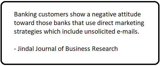
If you don’t segment your audience, you might end up pushing away many of them, leading to unsubscribes or spam reports.
By segmenting your list, you can customize your messages to better address the needs of different groups of subscribers.
4. Personalize Your Campaigns
Building a personal connection with your subscribers is key for boosting audience engagement. Here are a few ways of personalizing email campaigns:
- Address your subscribers by their first name.
- Use their first name in the subject line.
- Share user-specific data or status updates.
- Offer promotions tailored to their demographics, needs, or purchase history.
- Craft customized email copy.
Send birthday or anniversary emails for a personal touch.
5. Craft the Right Subject Lines
Crafting an urgent, transparent, and non-salesy subject line is considered a critical deliverability best practice.
Chad S. White, email marketing expert, recommends the CUE-DIVE method of writing good subject lines and preview text. The CUE-DIVE framework requires your subject line to be Contextual, Urgent, Emotional, Detailed, Intriguing, Visual, or Earned. Consider the following real-life subject lines:
- October tax news: Deductions that affect you
- 💰🏡💍 What could a personal loan do for you?
- Building credit is tough. But we made it easier.
- Need help with Child Tax Credits?
- Don’t miss out on the best of Venmo
- Price alert: Bitcoin (BTC) is up ↗ +8.15%
- Welcome to Credit Karma! Let’s make some magic.
- Battle of the Premium Travel Cards
- The Prospa App has launched 📲 🎉
- Get your $10 for viewing your SoFi Mortgage rate.
- 🧘♀️ Stress-Free Tax Strategies Inside
- Make life easier. Try autofunding.
- Is this new card yours?
- March Business Account feature highlights
- Understanding Loan to Cost in the real estate industry
- Compensatory time explained
- Your monthly personalized tax insight
- We found your info in another company’s data breach.
- Introducing Portfolio View on Bitski iOS App! 📈
- Earn $5 when you split a purchase
- Important notice regarding Silicon Valley Bank (SVB)
- There’s money in your account with PayPal
The above subject lines all fit into the CUE-DIVE framework.
6. Leverage Email Automation
In email marketing, email automation is a process whereby relevant, personalized emails are “triggered” based on subscriber engagement.
Triggers form the basis of automation. Any action a subscriber takes will trigger the relevant email workflow, which will send the right email to the subscriber.
Here are a few scenarios for automation in email marketing for banks:
- Mr. X opened a new account at your bank. Your email system then triggers a welcome email or a series of welcome emails.
- Mr.X has a low savings balance. A personalized email is triggered where you share tips on high-return investment options.
- Mr. X has been inactive for the past 30 days. A re-engagement email is sent.
- Mr. X closed an account. A Thank You/customer feedback email is triggered.
Now, that’s just a template. In reality, email automation can be quite complex. Why? Because customer journeys are complex.
As Jordie van Rijn and Gavin John emphasize, “A long path to purchase requires lead nurturing. The path to purchase in finance can be quite extensive. Financial products aren’t impulse purchases.”
7. Create Drip Campaigns
Automated drip campaigns can be highly effective when done correctly. The goal is to send a series of emails over time without overwhelming subscribers.
“Every time there’s a change in economic conditions, bank marketers react by sending more emails,” points out John Hendricks, founder of ERGO.
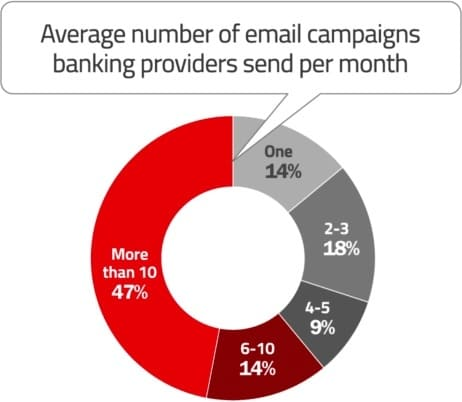
Email frequency can be tricky to master. But the rule of thumb is: Send relevant content to your audience.
For a new subscriber, a typical drip campaign might look something like this:
- Welcome email: Sent immediately after sign-up.
- 2nd email: Promote specific products or services.
- 3rd email: Offer discounts on select services.
- 4th email: Upsell additional products or services.
Drip campaigns quicken and simplify connecting with the right people at the right time with the most relevant content. Provided you’re doing it right.
“People view automated drip campaigns as ‘set it and forget it.’ This is partially true. But to constantly improve performance you need to constantly test,” argues Jean Jennings, founder, Email Optimization Shop.
8. Experiment with Send Times
What’s the best time to send marketing emails?
There’s no single answer to this question. One reason is that your audiences may have different behaviors when it comes to email opens. Some may have more opens over the weekend than on weekdays, while others may have more opens on weekdays than over the weekend. Similarly, some may have higher opens in the morning hours compared to other times of the day.
There’s no single best time or day to send emails for everyone. Instead, you need to find the optimal time for each subscriber and send emails accordingly.
9. Create Mobile-optimized Emails
Creating mobile-optimized email campaigns is a must. This is where responsive design comes in. Designing for devices. Designing for people. Email marketing and responsive design are intrinsically linked. Here are its key advantages:
- Responsive design enhances subscriber experience by increasing the scope of interactivity.
- Responsive emails lead to better engagement, potentially reducing the number of unsubscribes.
- Next to consistent design, responsive emails maintain brand consistency, eliminating UX disruptions across devices.
- Emails that are responsive have a higher chance of generating conversions than those that are not.
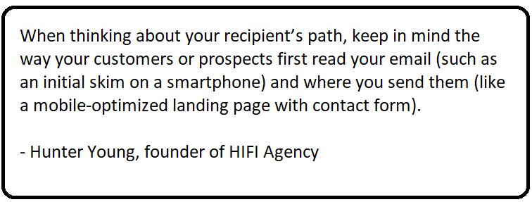
“Many subscribers will read emails on their smartphones before jumping onto your app to manage their banking,” reminds Monica Hoyer, founder of Emfluence.
Consequently, mobile-first design is non-negotiable in email marketing.
10. Leverage Transactional Emails
A transactional email is sent to a user after they take an action. Examples include order confirmations and welcome emails.
Because users are expecting them, transactional emails enjoy a high open rate. In fact, these emails generate 6 times more revenue than marketing emails because they include links to other products or services.
“Leverage your transactional emails (like statements, receipts, and alerts) to include additional marketing messages. Since these emails typically have high open rates, they provide an excellent opportunity for cross-selling or upselling,” Hoyer confirms.
11. Simplify the Unsubscribe Process
You should make it easy for your audience to unsubscribe from your email list. For more information on this, check out our post on email unsubscribes.
The unsubscribe button allows subscribers to manage the number and type of emails they receive. It is essential for any email provider to include this option, as laws in the U.S., Canada, and the EU (GDPR) require a clearly visible unsubscribe button in every email.
“…if you can’t get somebody’s attention and you can’t get them to engage with you, you’re gonna be punished for that. So, obviously, I would prefer that people unsubscribe, rather than ignore my email or just push it into the spam folder,” points out Doug Morneau, celebrated email marketing pro.
12. Perform A/B Testing on Your Emails
Before sending an email, test it on a small segment of your target audience. This allows you to make adjustments and improve your chances of success.
Here are some tips for effective A/B testing:
- Define a clear hypothesis and goal. What are you aiming to achieve?
- Use the largest sample size possible for accurate results.
- Ensure both versions have the same sample size.
- Test one variable at a time and start as early as possible.
- Wait at least 24 hours before choosing a winning version.
Jessica Stewart, email marketing expert, says, “When you’re measuring by email metrics like opens or clicks (rather than conversion), typically a segment size of at least 10,000 is a good minimum for testing.”
But the segment choice may vary depending on what your target metric is. “If your target metric is conversions, you may need larger segments and a bit more time to let the results ‘settle in’ for a real finding,” she adds.
13. Track, Analyze, Repeat
Email marketing is not a one-time effort. After making a campaign live, you should review its performance against your KPIs.
And review it on a regular basis. “The problem is,” asserts Kath Pay, founder of Holistic Email Marketing, “that we don’t continue to measure performance over the long term. Often, any activity that happens after the reporting window closes — say, a week to a month or even more after the campaign goes out — doesn’t get counted.” So it’s highly critical that you consistently track, analyze, and repeat.
At a minimum, analyze these metrics:
- Open rates
- Click-through rates
- Conversions
- A/B test results
- Bounces
- Spam complaints
Additionally, compare your campaign performance with industry benchmarks for a broader perspective.

Examples of Email Marketing for Banks
You’re now more or less aware of how email marketing for banks works. Now, let’s look at a few examples of financial emails.
We’ll study these examples from the financial marketing email design perspective. Let’s get started!
1. Educational Email
TurboTax’s newsletter is educational, urgent, and nicely designed. The hero theme is spot-on, the color scheme consistent, and CTA buttons prominent.
Speaking of CTAs, each button is optimized for its relevant page.
The primary navbar is sleek. The footer is sufficiently informative.
2. Financial Newsletter
This newsletter, even more informative and educational, from Empower Finance uses minimal design to keep viewer distraction at a minimum.
One of the best ways to aestheticize long, text-heavy content is to feature emojis where appropriate. That’s what this email does. And nicely, too.
We love the hero image. It’s fun. It’s cautionary. Plus, the use of circular colored blobs to section off different pieces of content is lovely.
3. Welcome Email
That’s an example of double opt-in subscription doubling up as a welcome email.
It features a single column layout and uses brand colors. It’s light, minimalist, and sits easy on the eye. Brilliant use of white space, too!
Informative, reliable, and optimized for accessibility, M1’s maiden communication with the new subscriber is done to a T.
4. Promotional Email
Toyota Finance Australia kicks off with a nice hero banner and solid hero CTAs.
Using the double-column layout, the email’s content is set along the S-shaped curve, which is known to enhance readability.
The greyscale scheme lends a touch of sophistication to the blocks. The rounded buttons also enrich the viewing experience.
5. Product Update Email
This email from Starling Bank introduces their latest feature, Spaces.
The email kicks off with a 360-degree view of the feature in the hero banner. The “steps” format is nicely put inside the Z-pattern layout. The purple color scheme mirrors that of the brand palette. The CTA buttons, once again, are round-edged, evergreenly suitable for readability.
6. Loan Approval Email
American Express has sent a personalized email that notifies the customer of being pre-approved for a personal loan.
We like how the customer’s account info is featured right in the email header, which is reassuring. Take a look at the footer, too. It’s informative and very detailed.
The quick comparison also acts as a nice credibility push.
HTML text is used to show the loan benefits prominently.
Email Design for Financial Marketing: Top Tips
- Include a “View in Browser” or “View Online” link at the top of all emails.
- Make the “Unsubscribe” link prominent in the header/footer.
- Use web-safe fonts for all emails.
- Apply defensive design techniques for accessibility when images are blocked.
- Ensure that your above-the-fold content contains the primary CTA button.
- Design with the way people view content online in mind. Leverage the inverted pyramid flow in your promotional emails.
- Take a minimalist approach to email design.
Email Marketing for Banks: The Key Takeaways
- Email marketing is the best fit for banking and financial services alongside the more recent marketing channels; it’s part of the omnichannel pie.
- Email is a closed system and suitable for “relationship” finance. It is a one-to-one medium, which further establishes its credibility.
- Email marketing can be measured, automated, and personalized.
- In order to succeed at email marketing for banks, strategies like A/B testing, send time optimization, simplified unsubscribes, etc. are key.
- From the financial marketing email design perspective, bank customers prefer well-designed, accessible, and readable templates.
Email is a direct way to communicate, making it ideal for financial service providers who need to build trust with their audience. With a solid strategy, you can enhance your outreach efforts and improve your return on investment.
And possibly outperform a couple of big uglies as well!
Need more information on email marketing for banks? Consider a quicker guide on email marketing for financial services.




Susmit Panda
Latest posts by Susmit Panda (see all)
Anatomy of A Newsletter: An Expert Study
10 Animated Banner Ads Examples to Help You Get Started on Your Next Campaign