
Can the case be made that given the inherent excitement of “new arrivals,” design should not be the primary objective? In other words, should the email design be intentionally understated so as not to overshadow the core message?
Now, it’s quite logical to argue in that manner. But, such an approach is only logical. While marketing does not eschew logic, it is more behavior-driven; the focus of design is to engage our senses; it is not strictly utilitarian.
The archetypal new arrivals email is characterized chiefly by its sense of urgency. However, there are additional best practices that can elevate such emails to a higher level. These are the aspects we will delve into in this post. Let’s get going!
Arrived versus Arriving: Maneuvering Suspense
The traditional email announcing new arrivals tends to feel sudden. Many brands build email campaigns and start sending emails as soon as new products or content are made available.
While there’s nothing inherently flawed with this approach, which emphasizes immediacy and exclusivity, creating anticipation can be equally, if not more, near to the bull’s-eye. This is because the satisfaction of releasing pent-up anticipation can be highly rewarding and can prompt immediate action.
That’s exactly what this new arrivals email template from Endurance Conspiracy does. Check it out.
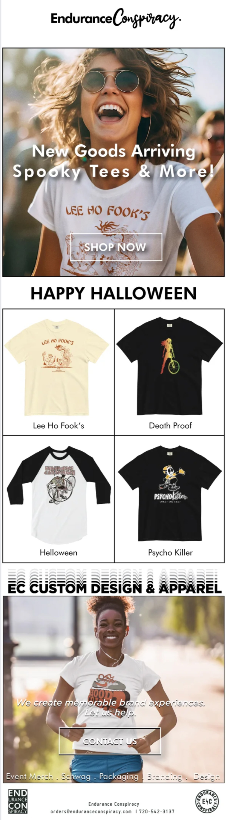
Thumbs Up: The email is designed simply. The template’s compartmentalized arrangement benefits from a clear visual distinction.
Thumbs Down: The translucent CTA button obscures the text within, making it slightly strenuous for the eyes. Not particularly viable from a customer retention perspective.
Engaging The F(r)ontal Lobe: Bold Typography
Bold typography is part of what is popularly known as maximalism. Bold fonts aim to deliver a shock value. The message is communicated with a force, making it inspiringly clear. This is one of the excellent methods for emails to distinguish themselves in the inbox. Ergo, it is also suitable for new arrival emails.
In this regard, take a look at this new arrivals email from 1822 Denim.
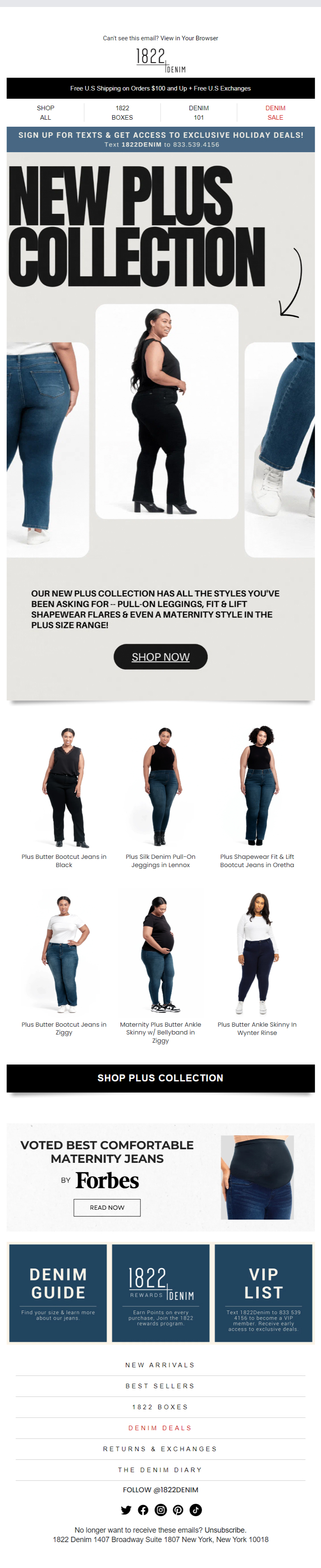
The heading is vivid; it reels you in. It prompts you to slide the trigger finger over the mouse, doesn’t it?
Thumbs Up: The white background of the template perfectly complements the highly intense black aesthetic of the email.
Thumbs Down: None.
Keeping The Thread Knot-Free: Brand Consistency
The argument we introduced at the beginning of our post may have some merit when considering brand consistency.
How? Well, launching a new collection should not give you permission to deviate from your brand identity. Barring minor changes, a major aesthetic overhaul is not advised.
Keep in mind that over time, your brand is not just about you; it’s primarily about your audience. You want to stir excitement about new arrivals while also maintaining the dynamics of habituation on your customers’ part.
Fortunately, Antonioli, a prominent global fashion brand, follows this path. The color scheme of their email is consistent with the duochrome facade of their website. So here’s our next new arrivals email template.
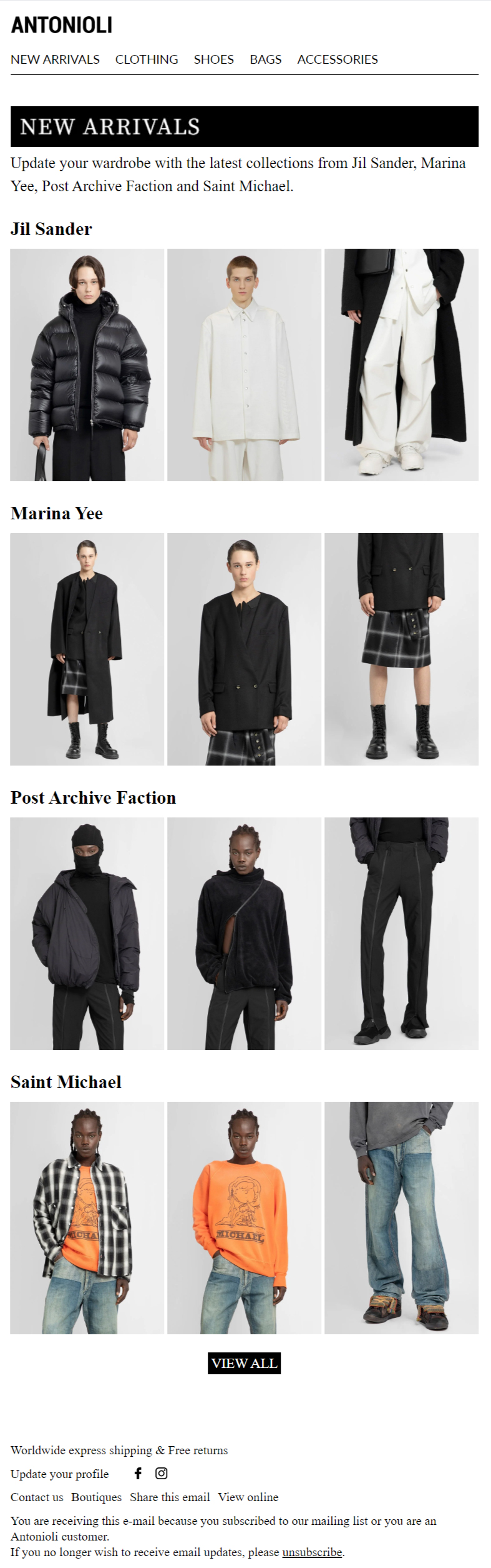
Thumbs Up: The template’s segmented layout not only aligns with current trends but is effective in giving each new product a distinct identity, thanks to its sharp outlining. This is crucial because the email introduces the designers, and their unique personalities cannot be compromised.
Thumbs Down: The CTA box does not have sufficient padding, which may hurt mobile accessibility.
Mixing It Up: The Use of Mixed Media
Combining illustrations, shapes, patterns, and photography in a single composition is the ideal foundation for introducing new arrivals. Of course, it’s eye-catching, hence perfect for a new arrivals email, but equally, it lends a movement to the email, which keeps the viewer delightfully engaged.
Consider our next new arrival email template, which comes from Red Dress Boutique.
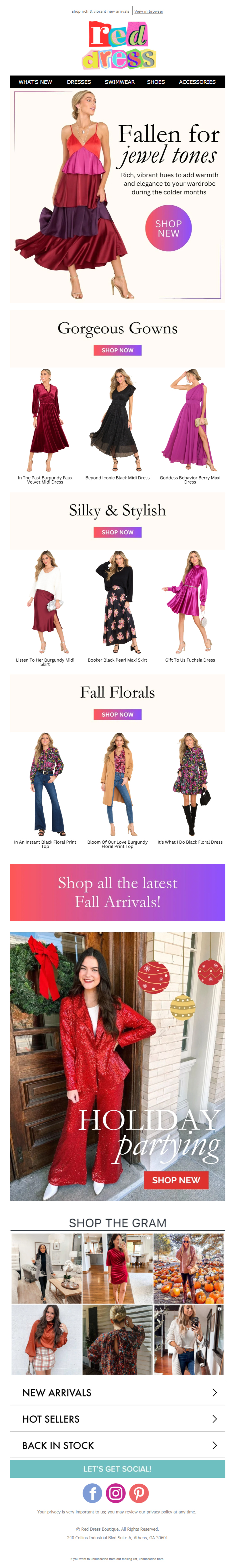
The immediate verdict? Colorful! The first CTA box is circular, while the rest are square. Keep scrolling, and you hit upon what looks like a second hero image, electrifying and vivid. Still keep scrolling, and you step into social media territory. The font use is varied as well, alternating between italics and non-italics, and between serif and sans serif.
Thumbs Up: Given the rather overwhelming, cluttered look of their website (go figure), their email is quite sober and breathable. There aren’t too many images per section in the frenzy of promoting new arrivals.
Thumbs Down: The last CTA seems unnecessary, at least from the perspective of design.

Your Viewer Is The Real Subject: Impactful Subject Line
Ah, the subject line again! Well, you have heard a lot about making an impact with the subject line. When it comes to new arrivals emails, it’s no different – with one slight exception: shift the POV of your subject line. In other words, instead of focusing on your new arrivals, turn the spotlight on your audience.
This is how Michele Watches makes an impact with their new arrivals email subject line: “Re: Your New Holiday Look.” The entire focus is on how the new collection will look on the potential buyer. Check out their new arrivals email in full.
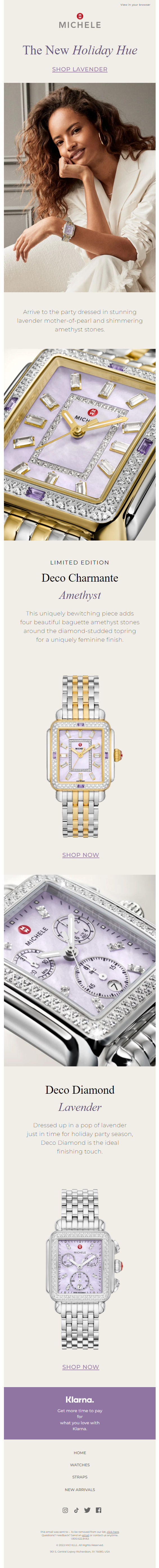
Thumbs Up: The simplicity of the template is entirely justified, as the focus of the email is the photography, which excellently captures the intricate details of the products. Consistent with the products, the light, lavender template radiates an air of sophistication. Brilliant use of negative space as well.
Thumbs Down: None.
Discount Stuffing: Against Overdrive
Limited-time offers and exclusive discounts are part and parcel of the new arrivals email template. Plus, it’s the holiday season now, so brands tend to push the envelope— at times over the edge and beyond the recipient.
Our next new arrivals email example is fundamentally a study in brief of negotiating the placement of discounts and offers in an email. Check out the email first.
The email opens with a short GIF, which is all right. Right next to the animation, the discount is appropriately presented with a smaller font size than the main announcement. However, it’s still within the hero frame to avoid being underemphasized.
So far so good. If you continue scrolling, there are no bumps in your journey – except for the abrupt Halloween banner that looks cluttered with discounts and is rather oddly colored. This section seems to have been wedged in by force, disrupting the overall visual flow and the thematic consistency of the email.
This is a new arrival email. There is no intimation either in the subject line or the preheader of it being a Halloween announcement. The better approach would have been to highlight the main discount no more than two times across the template.
Thumbs Up: The email starts off with a fine animated GIF. Limited to just two loops, it is not intrusive, is easy on the eye, and is modestly presented. The tri-line design is nicely incorporated to add a discreet zing to the opening.
Thumbs Down: The blended headshots featuring both man and mannequin could have been avoided by sticking to either one for representation. The grammatical error toward the end of the email is inexcusable.😶
Keep It Short, Stupid: The Other K-I-S-S
It’s not laid down as an iron rule. But sometimes, it’s wise to plump for shorter emails, especially when you’re trying to improve customer retention.
First, it eliminates clutter at the outset. Second, shorter emails are visually appealing and more readable. Third, shorter emails load faster, which is conducive to mobile accessibility. Fourth, shorter emails feature smaller collections, facilitating faster decision-making. All of these factors contribute to an increase in your click-through rate.
Look at Coldwater Creek’s new arrivals email template. Short and sweet. The GIF almost surreptitiously blends with the static vibe of the email. The duotone color scheme (red and gray) is consistent with the current trends in email design.
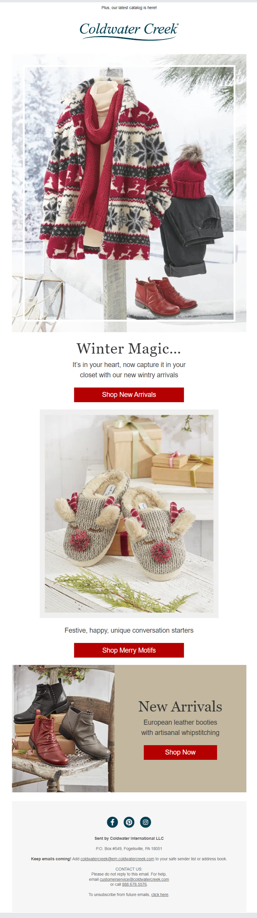
Thumbs Up: The uncomplicated, near-Hygge-like feel of the email. The Coca-Cola-red CTA splashes are highly effective at encouraging immediate action.
Thumbs Down: None.
Wrapping Up!
Thomas Watson Jr., the former CEO of IBM, is said to have remarked, “Good design is good business.” Speaking of emails, the statement is particularly true. While design is not strictly utilitarian, as we philosophized in the beginning, it’s irrevocably so as a consequence. Good design seeks to engage; engagement leads to business.
If one were to summarize the import of what we have been talking about, it is ultimately what Mr. Watson captured so pithily back in the day.
Susmit Panda
Latest posts by Susmit Panda (see all)
Understanding How Salesforce Marketing Cloud Intelligence Allows Email Marketers to Breathe Easy
How to Boost Email Engagement Using Salesforce Pardot AI?