Your final end-of-year campaign, and you wish you were as inspired as before.
Sadly, creative work is not something that you can power through. And when you have to design back-to-back emails during the holiday season, you may feel tested, if not overwhelmed. It is already one of the most stressful times of the year. Plus, designing emails is only one aspect of your campaigns.
In fact, at Email Uplers, where we ship out over 3,000 templates every month, we depend on a large team of designers to get us through. But even then, it gets tight. One can only imagine how hard it must be for smaller teams.
But small or large, you can’t afford to ease off on your New Year campaign:
- This is when you set the tone for your brand communication for the next year.
- You have a highly expectant audience, looking for new deals and offers.
- If you’re a B2B, your subscribers may be expecting year-end updates/recaps to reinforce their trust in your products or services.
- You need to capitalize on the holiday shopping momentum before it slackens.
The stakes are high, time is at a premium, and you’re not sure where to begin.
Since you can’t force yourself to be creative, our designers have cherry-picked six New Year email examples that can get you out of the creative rut. Let’s roll!
10 Expert Tips on Designing New Year Email Templates
- Feature a countdown timer in the hero block of your email.
- Leverage color blocking to amplify visual interest.
- Prioritize raw and unfiltered photography to make emails more realistic.
- Optimize for Dark Mode, but also utilize dark color schemes.
- Focus on strategic CTA placement; use round-edged buttons.
- Experiment with unconventional content block dividers.
- Include simple, purposeful, and slow-looping animated GIFs.
- Use bold, prominent HTML text to get your message across.
- Throw a couple of full-screen monochromatic emails into the mix.
- Look back. Incorporate retro vibes in your emails.
10 New Year Email Examples Just for You!
1. Absolut.
Absolut’s New Year email template features a countdown timer — a New Year’s absolute, if you will, one that never seems passé.
The dark hero space coupled with bold typography really stands out.
The featured product is nicely shot; the mosaic frame adds gravity to the festive vibe of the email. The blocks are by turn vivid, lush, and wildly colorful.
The whole email seems to be a nod to brutalism, what with its bold typography, stark colors, and aggressive graphics. We love it!
2. Rivian
Rivian’s lookback New Year email template capitalizes on what Really Good Emails referred to as “raw and unfiltered”. “It’s about capturing images in their raw, unfiltered, most natural state with minimal editing or retouching,” explains Kristy McCarley, founder and managing director at Pure Firefly.
That’s what Rivian’s hero image does, striking a human-to-human connection. It makes the message more genuine and trustworthy.
In fact, going further down, you see Rivian applying the style to their product shots as well. As Justine Jordan from Beefree also points out:
“You can have some fun with the human trend, especially the raw and unfiltered, by introducing humans in their raw and unfiltered state without being scripted.”
Apart from that, split-tone layout, round-edged banners, and left-aligned text make Rivian’s email highly readable, engaging, and accessible.
3. Tempo
Featuring a bold animated GIF in the hero space, Tempo’s New Year email dazzles from the get-go. With only 2 frames, it meets the accessibility standards. The grayscale, with its grunge texture, sits easy on the eye. Tempo’s product features are set on the S-curve, which takes care of scannability and readability.
Full points to the testimonial featured in a dedicated banner. The CTA button right below the testimonial is a good example of strategic placement.
Bear in mind though, Tempo’s email is based on their brand palette. As Bernard Meyer, Sr. Director of Communications & Creative at Omnisend, says:
“Using your brand’s color scheme in your emails strengthens brand recognition. It also helps you build an emotional connection with your subscribers.”
4. Nuts.com

Image source: Inbox
Nuts.com’s New Year email engages instantly with its bold images and typography. We love the simple animated GIF and the elegant color pairing.
Speaking of which, the highlight of this email is color blocking.
Color blocking is used to make each section of your email more visible. “These big, bold areas of color usually help differentiate visual hierarchy and emails or, in this case, help a section stand out,” explains Justine Jordan.
From high-res product shots to dark borders, it’s a visual feast.
5. Barrel
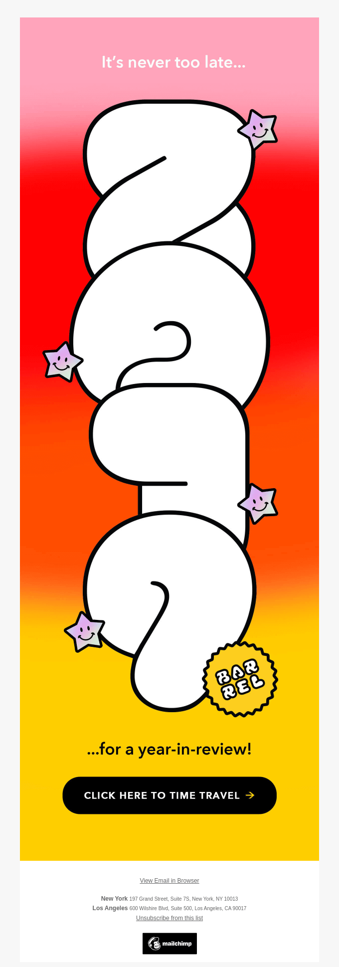
Our designers had to feature Barrel’s ripping New Year email template. This is what “unconventional” looks like.
With just one CTA, phenomenal use of color gradient, and a standalone image, this email is sick! It brings home the fact of a new year so effectively. It’s not just another event, it’s a grand occasion, calling us to reflect. And Barrel’s email utilizes just one image to tell you all that. A truly epic sample of typographical artwork.
We also love how the viewer is made to scroll through the email in order to read the full message and spot a CTA button. It’s nothing short of immersive design.
6. Macy’s
Alternating between solo shots and product grids, Macy’s New Year email allows the viewer to explore products in detail. Kicking off with a navbar just below the hero image and featuring distinct headlines for each block, the user is not led to hit a cognitive brick wall. There’s a lot of information neatly displayed.
Macy’s above-the-fold color blocking also makes the viewer pause and read the important details. High-res typography is used to spotlight the discount.
Diverse CTAs, multiple shopping options, and an in-store invite make this email a rounded experience.
7. Tommy John
In our annual holiday infographic, Chad S. White, in relation to holiday emails, has this to say: “Inboxes are full and subscribers are moving quickly from message to message and often don’t take the time to engage with interactive elements like they would at other times of the year. The right content can break through, but recognize that the bar is extra high.” Tommy John’s New Year email gets this just right.
With a tight navbar, a striking hero banner, and a modest product grid, Tommy John nails their New Year email with a gentle hammer.
And did you notice? The hero colors match those of the featured underwear. These details contribute to the overall viewing experience.
8. Shopbop

Shopbop’s New Year email is unlike any other in that it is not sales-focused only. The major highlight is the forecast by Shopbop’s fashion director.
But, keeping in mind the significance of sales, the New Year’s offer is featured just below the top navbar. Following which, in a separate hero block, the focus shifts to the theme of the email announced in a beautiful collage.
We love the salmon-pink aesthetics of this email. Which is Shopbop’s brand colors, mind you. We extra-love the product shots. Shot in natural light, the backgrounds, colorful and varied, enhance the overall look of the template.
9. Zoox
Zoox, an electrical vehicle company, dazzles with a unique hero image in their New Year email. The image is an animated GIF. See below.

The template epitomizes what a balanced layout looks like.
Banner-button-banner-button – all the way to the end.
That’s a perfect balance of image and text. Plus, the cascading order of multiple inverted pyramids superbly guides the eye to the hotspots.
We love the use of negative space, too. The footer employs color gradients, which in itself is something unique. Overall, nice job, Zoox!
10. Mavlers
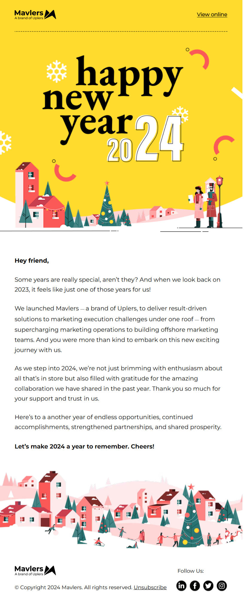
Our final New Year email, designed by our team, captures our minimalist approach to email design. As a B2B, the focus of our emails has always been simplicity, usability, and accessibility. And when it comes to gratitude emails like this, nothing should distract from the core message; because gratitude needs its own space.
For this New Year email, our objective was to express our thanks to our subscribers and to announce our new venture into full-scale digital marketing.
As a result, it’s all pretty stripped-down, with no CTAs, and the palette restricted to our brand colors. It’s a traditional layout and optimized for mobile.
Loved this Curation? You’ll Love Working with Us, Too!
Not just because our template production is what sets us apart, but we’re offering 10% off all email template orders this holiday season. Claim it now!
For more information on New Year email marketing, catch this all-inclusive guide to holiday marketing.


Susmit Panda
Latest posts by Susmit Panda (see all)
Quick Guide: Email Marketing for Financial Services
Top 8 Christmas Email Templates: Your Go-to Holiday Marketing Gift Box!