Email is complex. It takes time, requires expertise, and insists on a by-the-book approach. And, most people do it wrong.
However, businesses seeking to adopt email don’t like to hear these things. Why? Because they’re primed to look at email as the ultimate giving tree.
High ROI — that’s the phrase that fires one up, so much so that the complex infrastructure of email is not considered. Email is treated as a tag-along, the principal focus being on other channels such as social media.
If all this sounds like you, you should reconsider. Email is complex. (There, we said it again.) But if you take it one step at a time, you can succeed.
So the first step is knowing what email templates are. That’ll be the focus of this guide. You’ll learn what templates are, types of email templates, how to design, test, and optimize emails, and a lot of other things as well. Let’s get started.
- What Is An Email Template?
- Components of An Email Template
- Pre-built, Custom, & Modular Templates
- Features of An Email Template
- Plain-text, HTML, & Responsive Emails
- Types of Emails
- Where to Find Email Template Examples?
- How to Build An Email Template?
- How to Code An Email Template?
- Common Mistakes to Avoid in Email Templates
- Experts Speak…
- Wrapping Up!
- FAQs
What Is An Email Template?
An email template is a preformatted, reusable email file that includes a logically arranged stack of content blocks, starting from the header all the way to the footer.
Below is the anatomy of an email template.
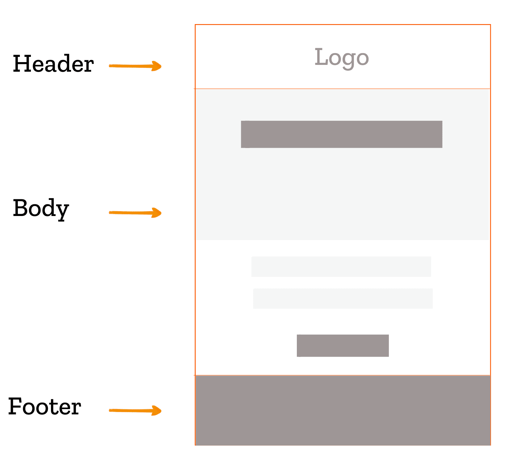
Components of An Email Template
An email template typically comprises the following key elements:
- Subject line and pre-header: The subject line and pre-header are the first things that the recipient looks at in the inbox. It is meant to hint at the email’s content, effectively communicating its purpose without being misleading.
- Header: The upper part of the email where you place your brand’s logo.
- Body copy: The core content of your email is found here. The body copy is where you showcase your products/services.
- Call to action (CTA): As the name suggests, the CTA is a call to the viewer to take a desired action. The call to action is ultimately a call to convert.
- Footer: The bottom portion of the email features social media buttons, preference options, website URL, your business’s physical address, phone numbers, and your brand’s privacy policy.
Pre-built, Custom, & Modular Templates
Based on structure and customization, there are three ways to design email templates:
- Pre-built templates
- Custom templates
- Modular templates
Let’s explore each of these in some detail.
What Is A Pre-built Email Template?
A pre-built email template is a pre-designed, customizable template provided by email service providers (ESPs).
Email service providers (ESPs) offer a collection of email templates that you can utilize for your campaigns, which is especially valuable for new email marketers. Additionally, these pre-designed templates incorporate the latest graphic design trends and are ideal for launching last-minute campaigns. Many of these templates are available at no cost or for a nominal fee, making them an excellent option for lowering overall email production expenses.
However, using ready-made templates can compromise brand identity, customization options, and exclusivity. They are becoming less favorable, as most people now prefer personalized, tailor-made, custom emails.
What Is A Custom Email Template?
A custom email template is designed and hand-coded from scratch. It requires excellent coding skills and ESP-agnostic expertise.
Custom-coding an email template for a specific ESP demands a solid practical understanding of the ESP’s technical conventions and ecosystem. It certainly comes with a steep learning curve.
For instance, Mailchimp often removes the attributes that specify the height and width of images. Without these attributes, the images may appear larger than intended, disrupting the viewing experience.
Likewise, HubSpot mandates the use of specific HubL variables for custom-coded email templates to function correctly.
These quirks, unique to each ESP, can restrict the effectiveness of custom email templates if your developer lacks experience with various platforms. However, when managed well, the primary advantage of custom email templates is the potential for innovation.
Which brands should opt for custom solutions? Brands with distinct identities and complex design needs. For companies with multiple in-house design teams, the control and flexibility provided by custom email templates are essential advantages.
What Is A Modular Email Template?
A modular email template consists of flexible designs, with reusable, interchangeable, content blocks or modules.
A master email template serves as a versatile framework that allows you to create any type of email using various content blocks within a specific ESP editor. This is especially helpful when branding is consistent, as the header and footer sections can remain the same.
A modular email template is a component of a master email template and is useful for:
- Email marketing agencies sending similar-looking emails for different brands.
- Brands with multiple sub-brands that have distinct branding guidelines.
- Transactional emails, such as invoices, cart reminders, and abandoned cart notifications.
- Automated emails like welcome series, social media follow-ups, and birthday greetings.
Features of An Email Template
Any email design is based on four pillars:
- Email layout: An email layout determines the arrangement and hierarchy of various elements within your email. A well-designed layout lets subscribers quickly scan the content while grasping the main message.
There are two primary styles of email layouts:
- Single-column layout: In this layout, email elements are arranged in a single column, minimizing eye movement. It is often preferred for mobile emails, as it effectively uses the narrow screen width to display all elements without clutter.
- Two-column/Multi-column layout: As the name implies, this layout divides email elements into two columns. Typically, the elements are arranged in a zig-zag pattern since subscribers tend to scan content in an ‘F’ pattern. This zig-zag layout, along with sufficient white space, effectively directs the subscriber’s attention in the HTML email template.
2. Typography – While the email copy delivers your message, the presentation of that message is equally important.
This is where typography and formatting come into play. Different fonts evoke different emotions, so selecting the right font is crucial. Although emails have limited support for custom web fonts, there are various methods to implement them.
3. Colors – Similar to typography, different colors convey different emotions. Background colors, CTA button colors, hyperlink colors, and images all contribute to the brand guidelines and shape the personality of an email.
4. Images and visual media: A picture is worth a thousand words. By balancing text and visuals in your email, you foster greater interaction from your subscribers, ensuring that the message isn’t obscured by too much text. This is particularly crucial in the online retail and eCommerce sectors, where product visuals enhance the overall description.
Plain-text, HTML, & Responsive Emails
Based on design style, there are three types of email templates: plain-text, HTML, and responsive. Let’s look at each of these in some detail.
What Is A Plain-text Email?
Before HTML coding was introduced in the early 1990s, emails were only available in plain text, using Unicode formatting with left-aligned text.
But even with the widespread adoption of HTML, plain text emails remain important, and ESPs still send a plain text version along with the HTML one. Many email marketers ensure they create a plain text version to prevent emails from being flagged as spam.
The benefits of using plain text emails include:
- Bypassing spam filters in email clients like Outlook and Gmail, which require plain text versions of HTML emails.
- Ensuring compatibility with email clients that do not support HTML, preventing emails from going to spam.
- Catering to recipients who prefer plain text emails.
Although plain text emails tend to have higher open rates compared to HTML emails, they lack the visual appeal of HTML and therefore rely heavily on strong copy to drive click rates.
What Is An HTML Email?
An HTML email is an email that is created using HyperText Markup Language, allowing for the addition of various design elements such as images, layouts, fonts, colors, etc. An HTML email can feature interactive elements such as links, buttons, and multimedia, lifting it to a higher aesthetic level than plain-text emails.
In simple terms, an HTML email is the feature-rich version of a plain-text email. For instance, the following email by tentree is an HTML email.
The benefits of using HTML email templates include:
- They help brands maintain a seamless experience across websites, emails, and landing pages.
- HTML allows for the aesthetic placement of multiple hyperlinks within different buttons.
- Image support in HTML enhances communication, as pictures can convey more than words.
- HTML emails enable tracking of campaign performance.
What Is A Responsive Email?
A responsive email is designed to adapt to various devices and screen sizes, including desktops, mobiles, and wearables.
In the past, fixed-width emails required mobile users to swipe horizontally to read the content. Responsive design eliminates this issue, enabling users to view emails comfortably on any device. Here’s an example of responsive design in action.
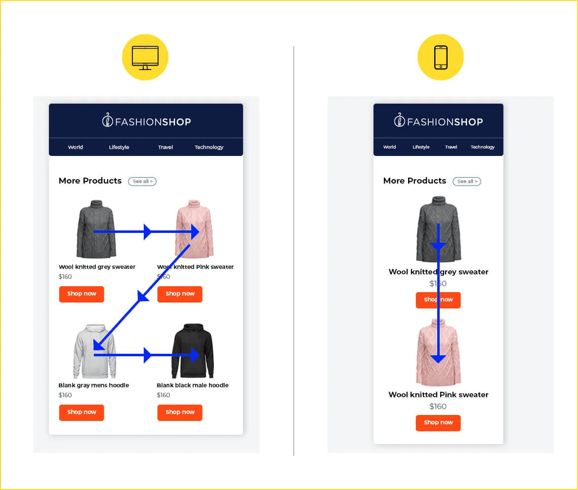
Responsive design is essential, especially during special events and certain times of the year, such as limited sale campaigns.
Limited offers, countdowns, and back-in-stock emails require quick action. If these emails are only viewable on desktops, what happens to those checking their emails on the go?
During the holiday season, when people are often traveling, mobile devices and wearables are their main access points to the online world. If your emails aren’t optimized for these devices, you risk losing potential revenue and alienating subscribers.
Here are some key benefits of responsive email design:
- Enhanced subscriber experience through increased interactivity.
- Improved engagement, which can lead to fewer unsubscribes.
- Consistent design and branding across all devices, ensuring a smooth user experience.
- Higher conversion rates compared to non-responsive emails.
Types of Emails
Based on campaign purpose, there are various types of emails, such as welcome emails, promotional emails, transactional emails, cart abandonment emails, etc.
- Welcome Email: This email welcomes and expresses gratitude to the subscriber for joining. It should introduce your brand and include a call-to-action encouraging the subscriber to complete their profile or update their preferences.
2. Newsletter email: This periodic email keeps subscribers informed and educated about your brand as well as its products and services.
3. Sale Promotion/Announcement Email: These emails aim to convert subscribers into customers. They should have a marketing-focused tone and convince the subscriber that their purchase will address the issue that initially drew them to your brand.
4. Order Receipt Email: This email confirms a subscriber’s purchase and should be triggered upon completion of the transaction. It can also promote related products, but the content should be 80% transactional and 20% promotional. A simple HTML email template from Polaroid effectively illustrates this approach.
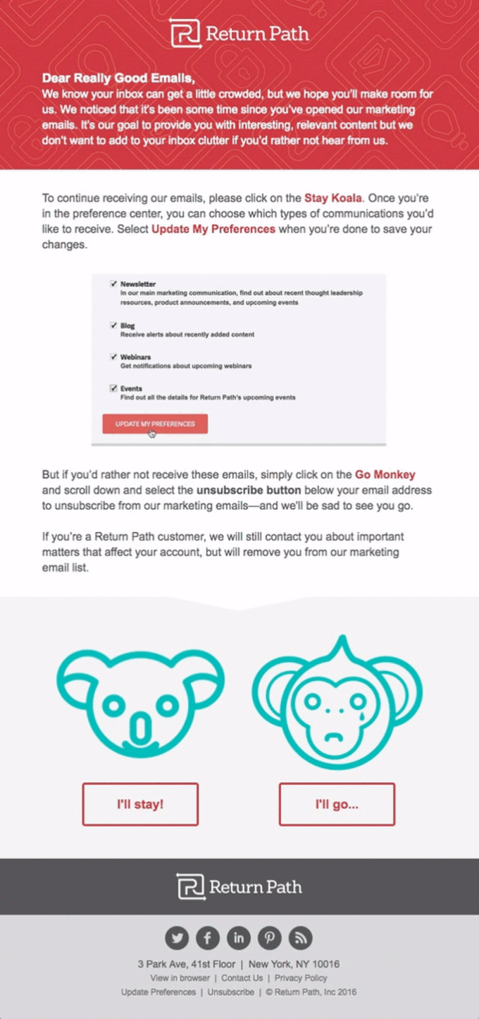
5. Re-engagement Email: Since not all subscribers remain active and engaged, this email aims to gently encourage dormant subscribers to reconnect with your brand and re-enter the sales cycle.
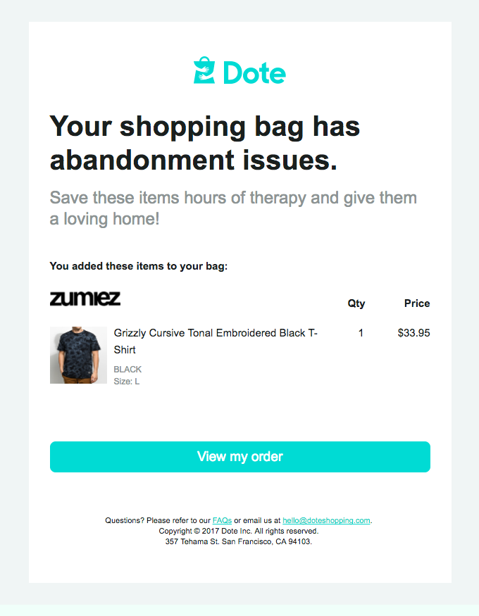
6. Cart Abandonment Email: Due to various reasons, a well-engaged subscriber may leave their purchase incomplete. This email aims to bring those customers back and reconnect them with their abandoned carts. It’s an essential email for eCommerce businesses. Check out this simple HTML email template from Dote for a better understanding.
Depending on your brand’s industry, you may also require additional emails, such as birthday or anniversary emails, survey or review requests, and reorder reminders, among others.
Where to Find Email Template Examples?
Having some competition is beneficial. By analyzing the email template designs of your competitors, you can gain insights into current industry trends and decide whether to adopt them or carve out your own unique approach.
Regardless of your choice, the following websites can help you find email templates for inspiration, allowing you to stay ahead of the competition:
How to Build An Email Template?
Once you finalize your email type, the next step is designing the template. This stage is crucial as it shapes your visual identity and defines your brand personality. Before sending your design requirements, consider the following prerequisites:
- Your brand guidelines
- Images of your products
- Target audience or buyer’s persona
- Plans for A/B testing
- Whether the mobile layout will be separate
- Email content copy
- Hyperlinks to the landing page
- Any interactivity involved, and if so, what kind
Building an email template requires considering the following three factors, to begin with:
- Brand guidelines
- Visual hierarchy
- Personalization & dynamic content
Brand Guidelines
Brand guidelines are a collection of rules that dictate how to use your branding elements, including colors, fonts, logos, watermarks, and brand tone. An email that adheres to brand guidelines is more recognizable and helps subscribers build trust in your brand.
Visual Hierarchy
Every campaign you create has a specific purpose, and it’s crucial to ensure that your subscribers recognize that. Certain elements must capture their attention as soon as they open the email. This is why establishing a visual hierarchy is essential.
Many email designers visualize an inverted triangle while designing, positioning the most important information—such as sale announcements, hero images, CTA buttons, and navigation links—in a way that guides the subscriber’s eye from a broad opening to a focused point, which is the CTA button.
In the following example email from inVision, you can see that proper text formatting and semantic tags contribute to a textual hierarchy that enhances the overall visual hierarchy.
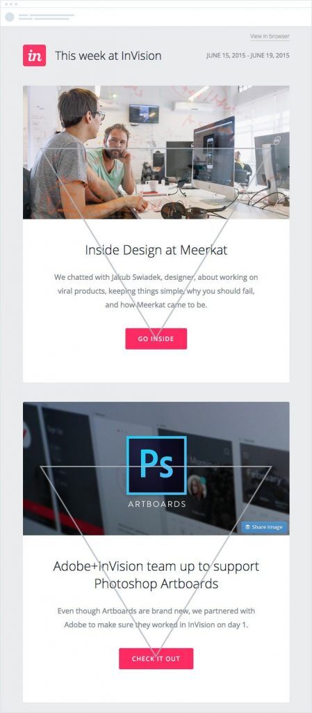
Let’s explore two elements of visual hierarchy that are sometimes placed together and sometimes at opposite ends.
- Hero image: Hero images are placed in the first fold to introduce the email, often featuring compelling text to prompt subscriber action.
These images can be real-life photos or illustrations. Real-life photos help subscribers visualize products, while illustrations convey abstract concepts.
Photographs are commonly used as hero images in online retail, eCommerce, and the travel and hospitality industries. For example, see the email from HomeAway below.
2. CTA placement: This is crucial. As mentioned earlier, the CTA button is a key indicator of how effectively your email converts subscribers into customers.
The placement of the CTA button is a debated topic. Many marketers believe that subscribers need to read the email copy before clicking the CTA button. However, this approach has a drawback: fewer people may scroll back up to click the CTA, reducing click rates if there isn’t a secondary CTA button at the bottom of the email.
Ensure your CTA placement is strategic, and consider A/B testing to find the best position.
We suggest adding another CTA button at the bottom of the email if it extends beyond two scrolls. This practice ensures that subscribers have an easy opportunity to take action without having to scroll back up. In the following example, the CTA is placed toward the end of the email.
Personalization & Dynamic Content
Personalizing emails by using the subscriber’s first name is a good start, but it’s just the beginning. Subscribers provide their email addresses in exchange for engaging content tailored to their preferences, not what you want them to read. To create customized emails, observe their online behavior and the stage of their buyer’s journey to meet their needs.
This is where dynamic content comes into play. In email marketing, a dynamic approach focuses on timing rather than the quality of a campaign. It’s crucial to avoid using “dynamic” in a vague sense. Dynamic emails mean sending the right message to the right people automatically, without manually adjusting each email’s content.
To fully leverage dynamic content, gather extensive data beyond just first names and email addresses. Ensure criteria match exactly with your contact’s profile, or the system won’t recognize it, and the dynamic content won’t display. Include a default content block to ensure visibility for recipients who don’t meet the defined criteria.
How to Code An Email Template?
Learning how to make an email template involves quite a bit of coding knowledge. This is where you need the help of an email developer. But we’ll just go through the basics.
An email marketer doesn’t need to dive deeply into email coding, but having a basic understanding of commonly used HTML tags can help you troubleshoot minor email issues independently. So here they are.
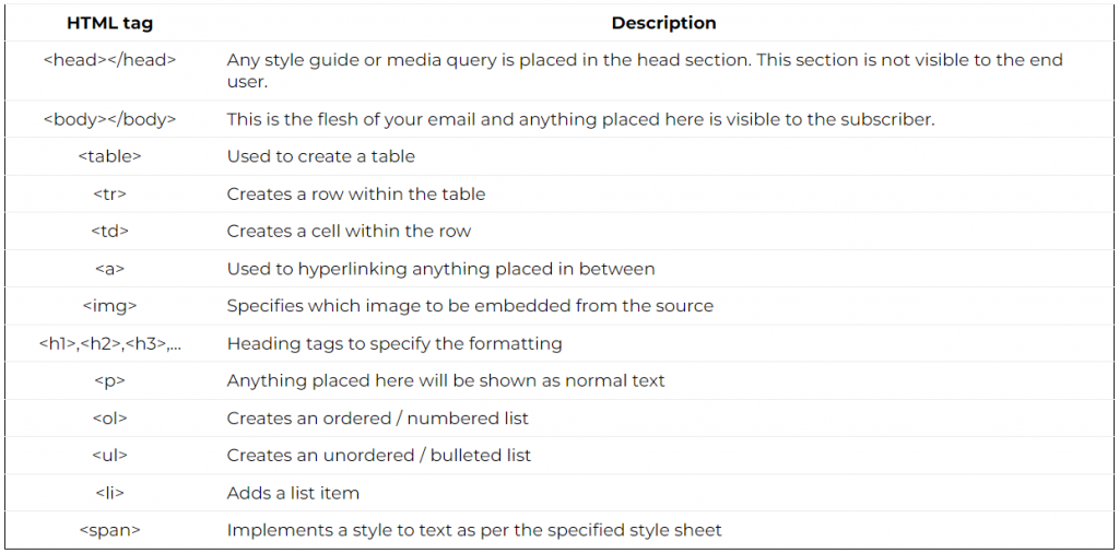
Responsiveness & Compatibility
Around 81% of emails are opened on mobile devices, each with varying display sizes. Therefore, it is crucial that your emails render flawlessly on all your subscribers’ devices. Most email marketers adopt a ‘mobile-first’ approach when designing emails.
A mobile-first approach involves creating a one-column layout at 600px width and adjusting to a two-column layout for desktop views if necessary. Additionally, responsive email template design should consider the following factors:
- Use preheader text
- Keep body copy minimal
- Include a clear and easy-to-click CTA button
- Increase the font size of the body copy compared to the desktop layout
- Resize images appropriately
A simple, plain email without many bells and whistles will typically render well across all email clients. However, it’s important to address rendering and workarounds for three main email clients:
- Apple Mail
- Gmail
- Responsive design
- Incompatibility with non-Gmail IDs
- Material design glitches
- Responsive design
- Outlook
- Background image support
- Bulleted lists
- DPI scaling
- Unnecessary spacing
- Background image support
HTML was originally used for coding web pages, and developers adopted this practice for emails. While web page coding has evolved with various technologies for a better user experience, emails are still coded using <table> layouts.
Though email clients like Apple Mail, iOS Mail, Gmail, and Yahoo support the <div> tag, developers stick to table layouts because Microsoft Outlook relies on outdated rendering engines that don’t support <div>. Each <div> can be nested inside individual <td> tags, but this increases code weight. If the email exceeds 120kb, Gmail will clip it.
Coding for Maximum Compatibility or Selective Email Clients?
Different email clients use various rendering engines, so some subscribers might not see the email as intended. While a ‘View Online’ link helps subscribers view the original email, it requires extra clicks and may hinder conversions.
You must weigh the pros and cons and code for maximum compatibility. If you include interactive elements, adding fallback support is advisable, though it may limit creativity. Alternatively, segment your email list by email client and send emails only to those with supporting clients.
CSS Inlining
Web developers specify styles in the <head> section or link to an external stylesheet. Email developers must inline styles, increasing code bulk but improving email loading speed.
Building Accessible Emails
Accessibility in emails has become a crucial topic, with many emphasizing its importance. Designing for accessibility involves following specific regulations and respecting certain limitations when creating an email.
Following these guidelines makes emails accessible to over a billion people with disabilities worldwide and enhances readability for all subscribers. Additionally, it can significantly improve the conversion potential of your email list.
4 Things to Consider While Coding
- Use Semantic Code: People using screen readers rely on semantic code to understand emails. Using appropriate tags for headings (<h_>) and paragraphs (<p>) allows screen readers to differentiate between them, enhancing the reading experience.
- Add a Relevant Title: Including a title in your emails can serve as both the preheader text and context for subscribers using screen readers.
- Use Tables for Presentation: Adding role=”presentation” to tables ensures screen readers focus on the email content rather than reading each cell individually.
- Accommodate Ample White Space: Whitespace is essential for readability, especially on devices held at arm’s length in crowded environments. It provides breathing space between elements and helps subscribers easily scan the email.
Common Mistakes to Avoid in Email Templates
- Balance Between Promotion and Problem Solving: According to inbound marketing principles, customers should approach your brand, believing your products or services will solve their problems. Some marketers overly promote their offerings, neglecting the problem-solving aspect.
Solution: Transactional emails should be 80% transactional and 20% promotional. For lead nurturing automation, focus primarily on educating the subscriber. - Single Image Emails: Many marketers make the mistake of relying on a single image for their email content. Since email clients often disable images by default, text within an image can remain unseen, especially without alt-text.
Solution: Avoid placing your entire message in a single image and always include relevant alt-text for your images. - Illegible Email Copy: Custom fonts may look attractive but can lose their effectiveness if they’re hard to read in the email copy. Some fonts work well for headlines but not for paragraphs. Ensure proper line spacing and appropriate line length for readability.
- No CAN-SPAM Compliant Footer: The CAN-SPAM Act of 2009 requires commercial emails to include specific information in the footer, such as a valid physical address and an unsubscribe link, to avoid penalties.
Solution: Always include a CAN-SPAM compliant footer in your email template. - Misleading Email Copy: Avoid misleading email copy. While it may get clicks, it can lead to unsubscribes and damage your reputation. ISPs monitor unsubscribes and may flag your email address as spam, affecting deliverability.
- Not A/B Testing: A common mistake is assuming you know exactly what your subscribers want. Preferences change over time, so regularly perform A/B testing to determine what works and what needs improvement.
Now that you know how to create an email template, let’s turn to the experts now.
Experts Speak
[Keep the experts panel image as is]
Sam Hurley |
John Thies |
Matthew Smith |
Kath Pay |
Kait Creamer |
Dave Charest |
Annette West |
Erik Harbison |
Dennis Dayman |
Michal Leszczynski |
Nick Crawford |
Syed Balkhi |
Nout Boctor-Smith |
Alex Papadopulos |
John J. Walsh |
Paul King |
Veronica Williams |
Tammi Myers |
|
|
|
|
|
|
|
|
|
|
|
|
|
|
|
|
|
|
Wrapping Up!
Email templates are crucial for your email marketing strategy. Knowing the process behind email template production can help you create effective templates. This guide will assist you in creating templates for Mailchimp, Pardot, Marketo, Salesforce, and other ESPs.
FAQs
Q) Can you help me code a responsive HTML email template?
A) Yes, we can assist you in creating a custom responsive HTML email template. After coding, our experts will test the template across 40+ email clients and 15+ devices to ensure a great user experience for your subscribers.
Q) Can you recommend a service that provides free email template coding?
A) Absolutely! You can get your first email template coded for free with us. We offer a pixel-perfect email template valued at $131 as part of our first order free service.
Q) I don’t know how to code HTML email templates. Can I hire an HTML expert from you?
A) Yes, you can hire an HTML email developer from us. Coding HTML emails can be complex, especially for platforms like Klaviyo. Our developers are certified experts in 50+ ESPs, and they will ensure quality assurance on 40+ email clients and devices. Learn more about our dedicated HTML email developers at Email Uplers.
Q) Can you help me code multiple HTML email templates?
A) Yes, Email Uplers is a full-service email marketing agency. We offer various services for email template production. You can share your requirements with us, and we can code an HTML email for you. Alternatively, our master modular email template service allows you to create multiple templates from a single master template. You can also hire a dedicated resource for your email template production.
Q) Can you help me create HTML templates for Gmail and Outlook?
A) Yes, our team of email experts will design and code a pixel-perfect email template tailored to your needs and target devices. We also test the template across 50+ ESPs and 40+ email clients, including Outlook, Gmail, Apple Mail, and more.








Susmit Panda
Latest posts by Susmit Panda (see all)
A Complete Guide to Create Your Own HTML Email
Can’t Code? Try “Sliced Images” for SFMC Email Templates