[This post was originally published on 19 Feb 2021. It has been updated on 11 Dec 2024.]
Your welcome email represents the first communication with the subscriber. Here’s how you can nail it…
Recently, I was looking to buy a business card online when I came across the website Moo. I was greeted by a popup when I was just scrolling through the home page and trying to understand their offerings.
I entered my email address and received a welcome email in my inbox instantly after I confirmed the subscription.
After receiving this email, I was keen to buy from them — firstly because I loved the products and secondly because of the discount offer.
That’s the power of a well-designed welcome email newsletter campaign. It will make people take action. If you do it right, that is. That’s what we’ll talk about in this post. Let’s roll!
Welcome Series Emails: Brand-by-Brand Study
Let’s take a look at some examples of welcome series emails. See how every brand has taken a different approach as per their business type and industry.
1. Topshop
Topshop has sent out four emails to welcome the subscribers and present their products.
In the first email, they have sent a warm welcome with a first-time discount.

The second email introduces the brand to the subscribers along with their USPs and an animated preview of their store.

In the third email, they have let the subscribers know about their social media presence across different platforms like Snapchat, Facebook, Instagram, YouTube, Twitter, Pinterest, and TopShop Blog.

Through the last email of the series, they have introduced their products and influencer collaborations.

2. Office
Office schedules three emails in their welcome series automation workflow. The first email simply welcomes the subscriber and shares their USPs.
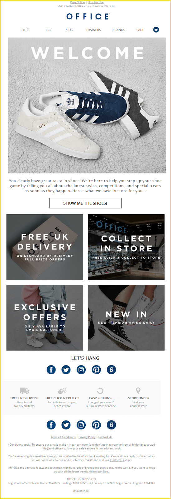
The second email goes a step further and showcases their popular products to the new subscribers.

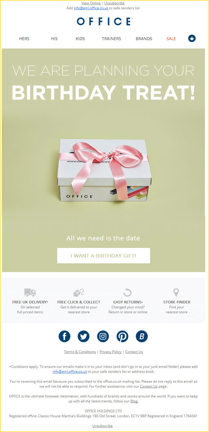
In the last email, they cleverly asked the subscribers for their birthday so that they can send out a birthday gift email to them.
3. Birchbox
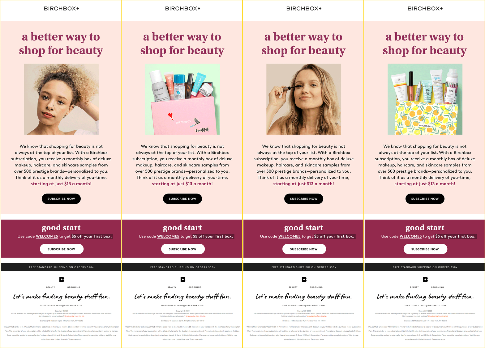
Birchbox includes three emails in their welcome series. The first email invites the new users to purchase their subscription box at a discounted price.
The second email explains to the users how they can sign up for their subscription box and earn loyalty points.

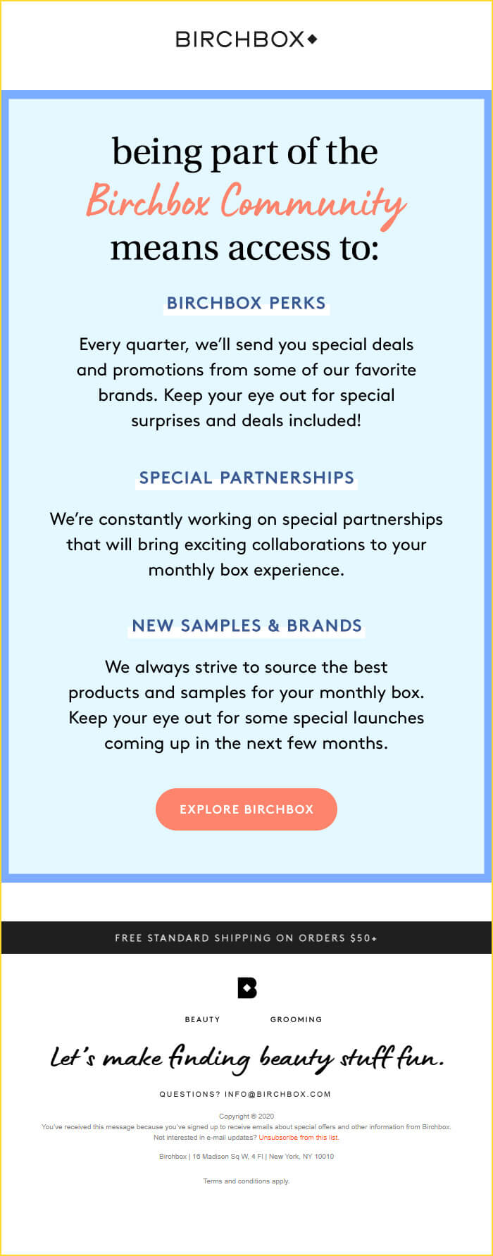
The third email helps the subscribers to know more about the brand and the products that they have.
4. Sur La Table
In the first email of the welcome series, Sur La Table has promoted their 15% off for the new user and talked all about their cooking classes, their online store, perks they have, and the link to find the nearest store.

The second email talks about their journey and mission statement.

On clicking through the CTA, the subscribers will be redirected to a relevant landing page that elaborates on their story.
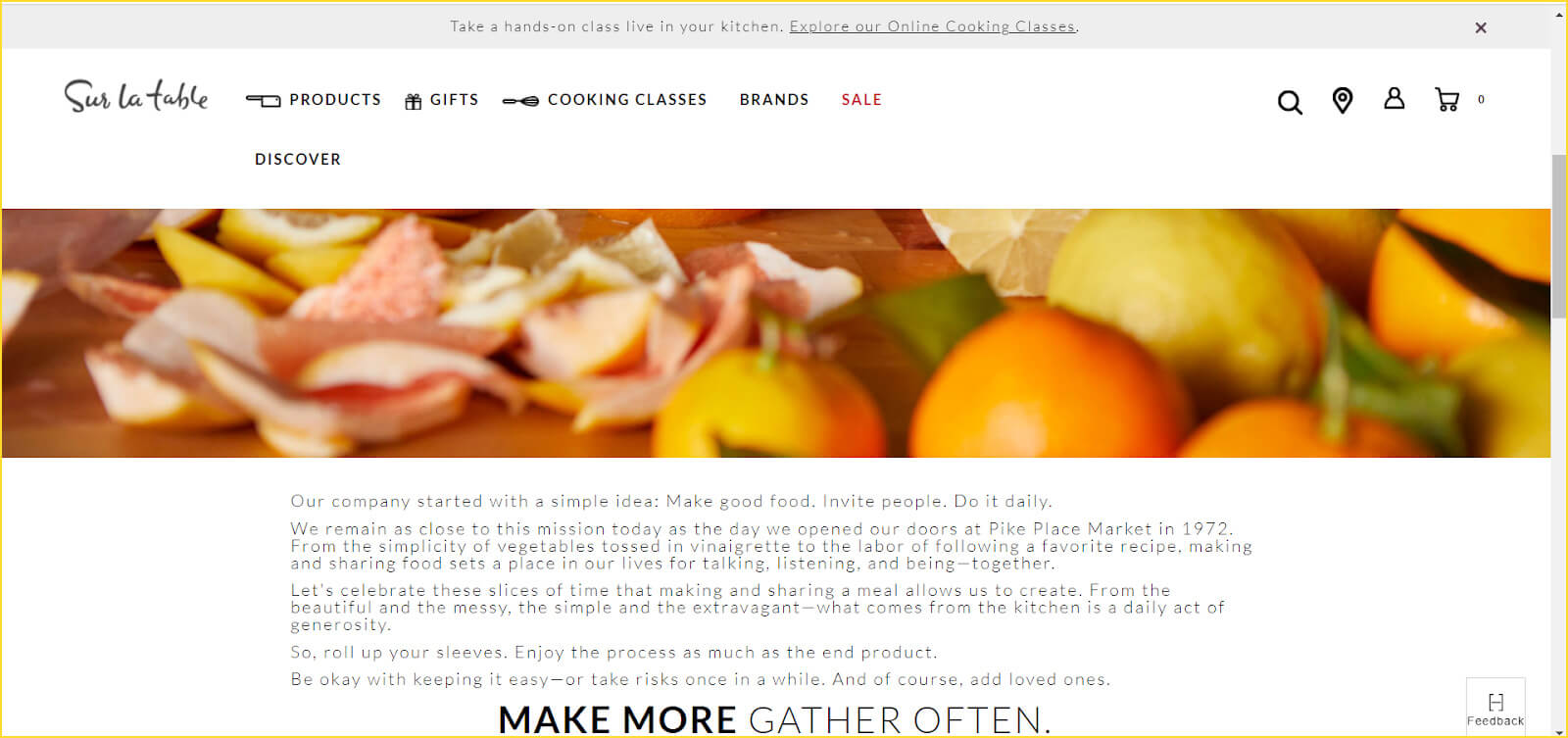
This goes to show that a landing page is also an important part of your email marketing strategy.
5. Reebok
Reebok sends out a series of three welcome emails wherein the first email welcomes the subscriber with 15% off coupon code and 40% at Reebok Factory Outlet.

The second email asks the users to set their preferences so that they can send out relevant emails. Also, they remind the new subscribers about the offer they shared in the previous email.

In the third email, they have gone a bit more specific and sent out product recommendations that might interest the subscriber. They have also highlighted their loyalty program to encourage the recipient to convert.

Sending out a series of welcome emails is a lot like treating your guests with warm hospitality. After inviting the guests inside your house, you ‘converse’ with them and offer them cookies, cold coffee, or ice cream. That’s exactly how you leave a good impression on your new guests (subscribers).
Note that this does not go to show that you must bombard your customers with welcome emails one after another.
As an alternative, you can also send out a single welcome email and wait for the subscriber to take action. If they do not buy from you, send them another email that talks about your USPs and incentivize them. Use a persuasive tone that would convince them to convert and make the purchase.
Let’s now move on to some more welcome series email best practices that you must remember while sending out welcome emails.
20 Email Welcome Series Best Practices
1. Send a welcome email as soon as the user subscribes
74.4% of subscribers expect a welcome email as soon as they sign up. Therefore, you must send a welcome email immediately after they complete the subscription process. Besides, 45% of the first-time purchases by new subscribers are noticed within 24 hours of sign-up.
The odds are that the subscriber is still online and stalking your website or social media handles to learn more about you. Sending a welcome email at this time will help to attract the subscriber further in the funnel.
I registered on Brooks Brothers in the morning 10:50 AM and received the welcome email at 10:52 AM while I was still on their website browsing for the products I wanted to buy. The products they had highlighted in the email tempted me and made me even more interested in buying from them.

2.Craft a catchy subject line
Your subject line is much like your body language and etiquettes. Just like your personality decides whether someone would want to talk to you, your subject line decides whether your subscriber will open your email or want to hear from you again. Bearing this in mind, you must pay special attention to your subject line. Make it as engaging as possible for the reader so that you can ensure a higher open rate.
Here are some subject line inspirations for your welcome email.
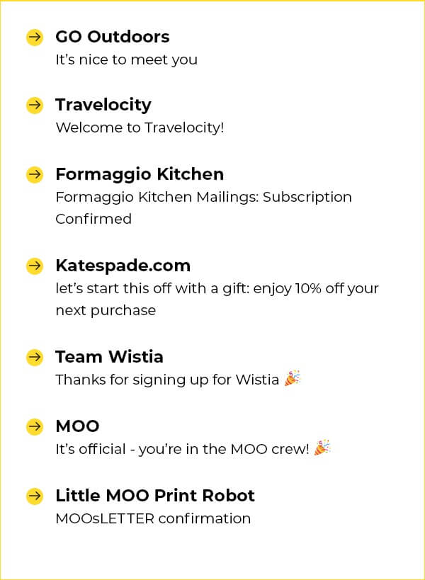
Each brand has greeted their new subscriber in a different way based on their niche and business type. While Travelocity has used a simple subject line saying “Welcome to Travelocity”, kate spade has tried to attract the user by using the word ‘gift’ and emphasizing 10% off. Moo and Wistia have used a party emoji as an expression of gratitude and celebration. Go Outdoors has expressed their pleasure to onboard the new subscriber with the subject line “It’s nice to meet you”.
If you are looking for an email marketing specialist to design such emails for you, Email Uplers can help.
3. Personalize your welcome emails
Although your welcome email is automated, it need not look like one. Needless to say, you must use first-name personalization in your welcome emails; that’s a best practice. However, we have advanced to a world where first-name personalization would not suffice. You have to go a step ahead and send out a welcome email that gives the feeling that it has been exclusively created for the recipient.
To do so, you can use tools like Convertkit that allow you to set conditional tags with the help of an “If-else” statement. As a result, you will be able to create relevant emails that are more valuable for the user.
For example: If a subscriber has signed up on your ecommerce website and expressed their interest in home decor items only, you must send out a welcome email that talks more about those products rather than apparels or anything else.
4. Express gratitude to the subscriber
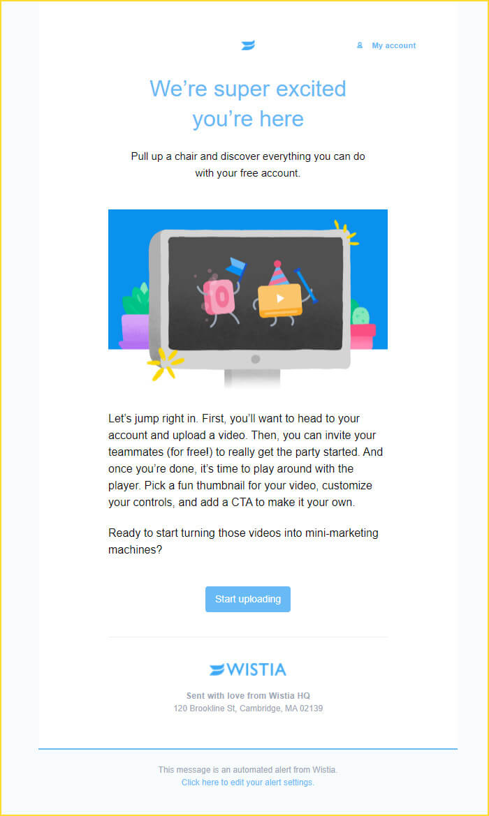
Say “thank you” to your subscriber for choosing you. The competition in the marketplace is so intense that you must be grateful to the subscriber that he or she singled out your brand to subscribe. Let them know that you are happy to have them on your subscriber list.
Take a look at this welcome email by Wistia that expresses their excitement and shares tips to get started.
5. Set the right expectations
Through the welcome email, you can inform the subscribers about the future communications and what they will get from your emails. Let them know how often you will be sending the emails — whether you intend to send weekly, bi-weekly, or monthly emails.
Additionally, allow your subscribers to choose for themselves how frequently they want to hear from you. Also, make sure that you stand true to these expectations. This means that if your subscriber has set the frequency to once in a month, do not send them emails every week. Just like your friends or spouse would expect you to stand by your word, your subscribers do too. Do not forget that there is a human on the other side of the screen and they like to be treated well.
Here’s a welcome email template by The Sports Car Digest. See how they have set the expectations right at the outset and let the subscribers know what the future communications will be about.

6. Let the subscriber know who you are
More often than not, your subscribers will not know much about your brand except the name and some of the products or services you deal with. Start off your relationship with the newest subscribers by introducing your brand. Welcome email furnishes the best platform to let the users know about yourself and how you can make their lives easier. An engaging introduction will strike the right chord and inculcate trust in the subscribers’ minds. They will, then, be more open to purchasing from you or trying out your products or services.
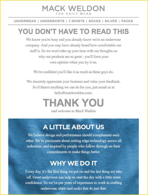
Mack Weldon does a great job at explaining all about themselves with a catchy headline: “YOU DON’T HAVE TO READ THIS”. The subscribers will surely have a smile on their face after reading the email and who knows, they might even make a purchase.
7. Tell your subscribers a story
As an extension of your introduction, you can share your story with the subscribers. When the subscriber just signs up, they are curious to know more about how you started and how things rolled by. Take this opportunity to bring them down the memory lane and tap on their emotional instinct.
Make your story interesting to read for the subscribers. Many brands send out heartwarming stories in the welcome email about how they started from a small room and then expanded their foothold across the world. Such stories carry a huge potential to get subscribers to convert as they give them the feeling that you are ordinary people just like them.
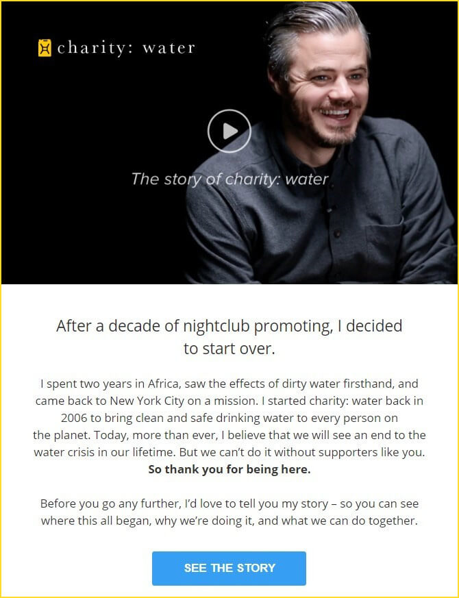
Charity: Water has sent out a touching message in the form of a story. The video thumbnail in the hero image makes the email more engaging for the reader. It will increase the click-through rate as more people will be interested in ‘seeing’ the story.
8. Add a pinch of humor to your welcome emails
By sharing your brand story, you add a flavor of emotion to your welcome emails. Similarly, sprinkle some humor to make your welcome emails fun to read rather than the same old “welcome” and “thank you” messages. Being able to make your subscribers smile goes a long way in establishing a stronger rapport with them and encouraging them to convert.
However, do not go overboard with sarcastic or slapstick humor that would offend the subscriber. In case humor does not go well with your brand, you might as well avoid being funny. Do not add humor in emails just for the sake of it.
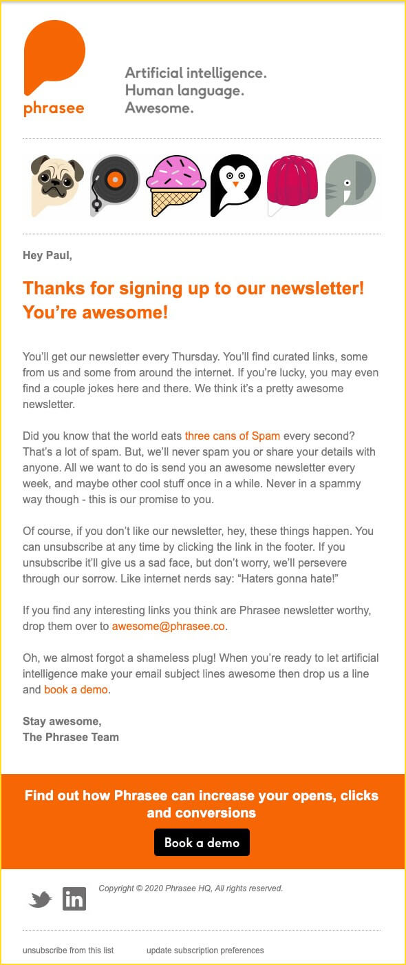
Phrasee is one of the best examples of brands using humor in their communications. While their welcome email is pretty straightforward and talks about what’s in store for the subscribers, it has used few expressions of humor to keep the subscribers engaged.
9. Incentivize Your Welcome Emails
Your customers love receiving gifts and incentives. The same goes for your new subscribers. As a welcome gift, you can offer them a discount coupon code or free trial of your product or an insightful resource that would be relevant for them. If you have promised a freebie in the signup form, keep that promise and deliver it in the welcome email.
In addition, you can also provide links to useful blog posts and how-to guides, FAQs, and explainer videos. Even if you do not have these resources on your website, you can always curate the best of such resources and share them with the reader. Some brands also employ referral marketing strategies and offer additional discounts to people who help them acquire new customers.
Sur La Table sends out a simple, yet impressive welcome email incentivizing the subscriber with a coupon code for $15 off. On scrolling further down, they have shared the link to their store, details about their cooking classes, and other perks they offer.

10. Share social proof
Your subscribers trust other users more than they believe the claims of a brand. Therefore, make it a point to share customer reviews and testimonials from people who have already availed your services and tried them out. Such positive feedback will build the subscriber’s confidence and relieve them of any apprehension before buying. Since your welcome email is the first touchpoint, sharing the testimonials therein will increase the likelihood of your subscriber reading it.
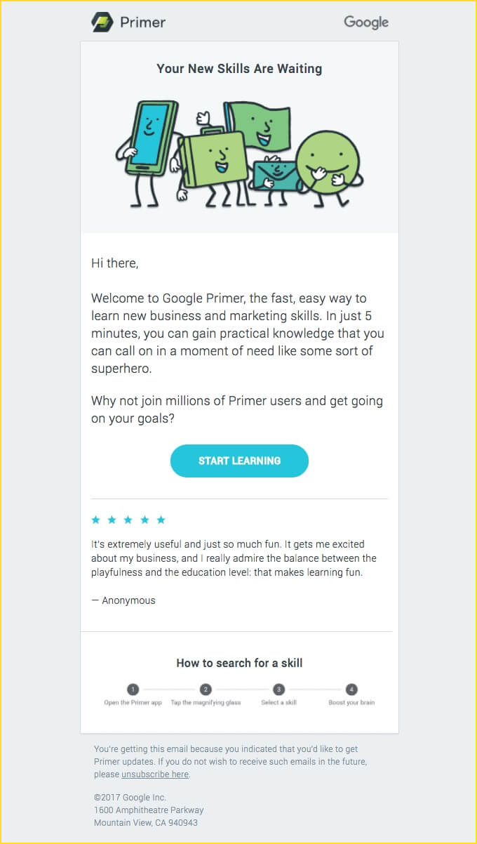
See how Google Primer has shared a testimonial to instill a sense of trust in the subscriber’s mind and prompt conversions.
11. Highlight the alternative channels for communication
There will be times when the users will engage with your welcome email and a few emails following that, but later end up being inactive. So, it is a good idea to let the subscribers know about your alternative communication channels. You can include your social sharing links, your customer support email address, as well as the location of your physical address.
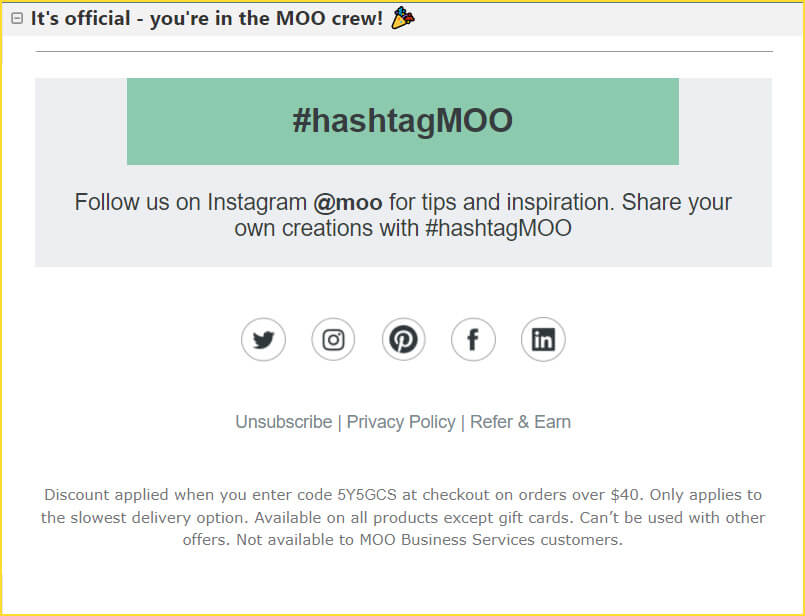
See how Moo has promoted their Instagram hashtag to build visibility and establish their active social media presence.
They have also shared Twitter, Pinterest, Facebook, and LinkedIn links apart from that.
12. Ask your subscriber to whitelist you
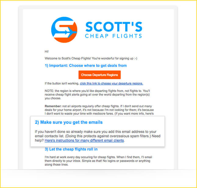
Whitelisting is one of the most important things when it comes to effective email marketing. Ask your subscribers to add your email address to their address book so that your emails do not land in the spam folder or promotions tab. This process is known as whitelisting. It will help you to improve your email deliverability by ensuring that all your future emails reach the subscriber’s inbox.
Here’s an example by Scott’s Cheap Flights that requests the user to whitelist their email address.
13. Inform the user about the next action
Your user will want to know “What’s next”. Do not leave them hanging with just a welcome message. Tell them about the next action they can take. It can either be signing up for their free trial or downloading a whitepaper or simply checking out the products on your eCommerce store. Whatever it may be, highlight it in the welcome email. Without knowing what to do next, your subscribers will not take any action. Therefore, you must direct them to the next course of action.
For this, include an actionable CTA in the email that is clearly visible. It must be in contrast with the remaining email design so that it immediately catches the recipient’s attention.
Go Outdoors has welcomed the new subscriber and redirected them to “start their adventure”, right in the first fold. As the users scroll through the email, they have enlightened them about the perks of joining the email list.

14. Showcase the range of your products or services
Use your welcome email to flaunt off the products and services that you deal with. Tell the subscribers about your best-selling products and hottest deals. In case you have an ongoing sale, let them know about it. These offers will entice the user to go to your website and check out the products or services.
You can use static and animated images to draw the subscriber’s attention and convince them to make the purchase.
Have a look at this welcome email by Brooks Brothers in which they have displayed all the awesome products for men, women, and kids. The last part of the email encourages people to get social and interact with them through Facebook, Twitter, Pinterest, Instagram, and YouTube.

15. Make the emails visually rich
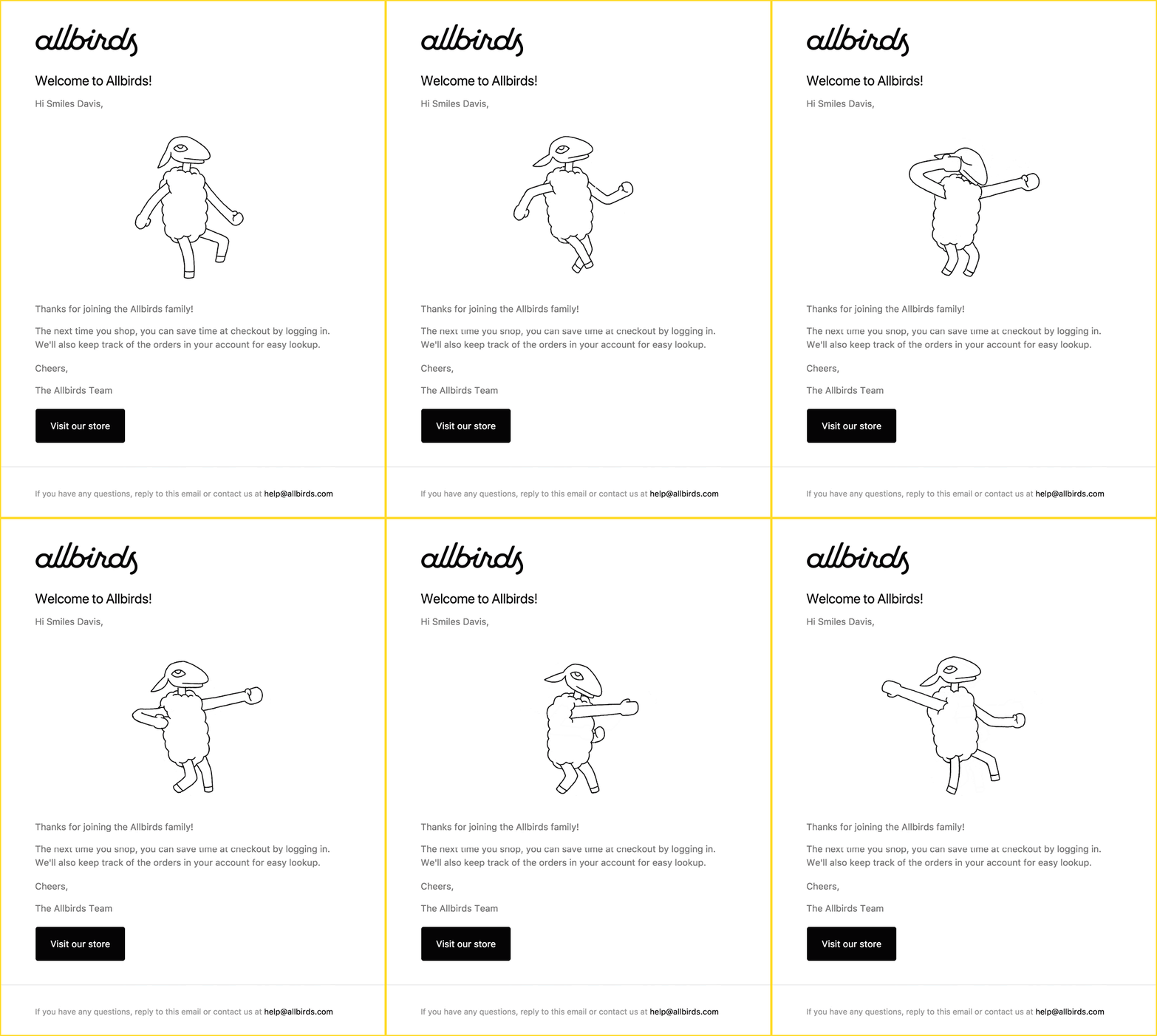
Talking about images brings us to this point. Include visuals to make your emails appealing. According to the message you wish to convey, you can add images, GIFs, and embedded explainer videos in your welcome emails to make it more aesthetic. For instance: If you are from the B2B sector, you can include a video in your welcome email explaining the usage of your product.
On the other hand, eCommerce stores can take help of GIFs to showcase their products to the subscribers.
Marketers who want to stand out can go a step further and include animated illustrations or 3D images in the welcome email. It will make your subscribers look forward to your future emails.
If you are looking for some inspiration on how to add GIFs and make your emails more attractive, here’s an example from allbirds.
16. Use the Email Body Wisely
Many marketers try to stuff every detail in their first welcome email. That’s the worst thing you can do. It will make your email too cluttered and confusing for the reader. There will be too many things to distract the user and ultimately, the subscriber will simply close the email. To make sure this is not the fate of your welcome email, you must use your email space tactfully.
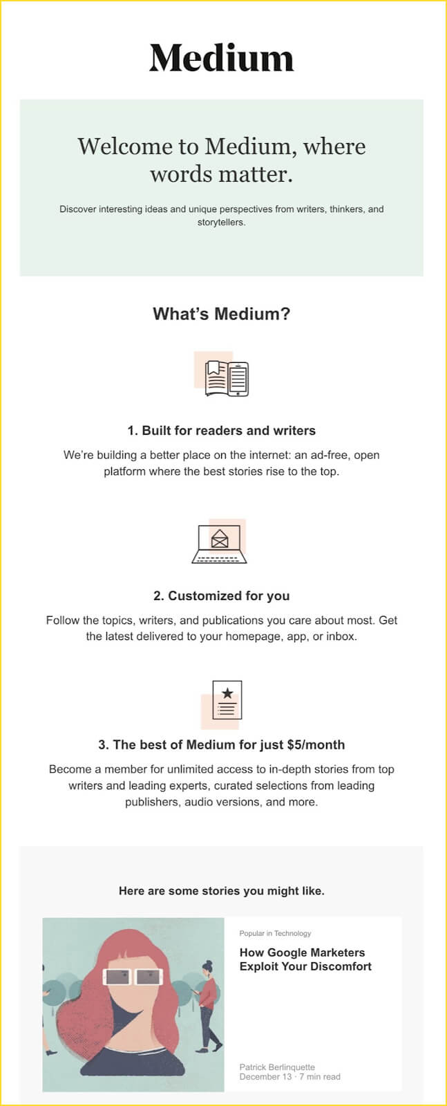
Make it more readable by breaking the text into smaller chunks. Use bullet points or the 1-2-3 formula that will make the email easily understandable.
Medium has perfectly used the 1-2-3 formula in their welcome email to describe their features. They have added simple icons to make it easily readable.
17. Always follow the brand guidelines
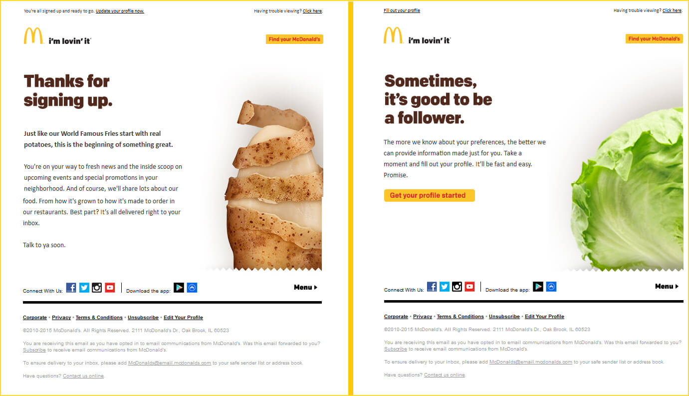
You must always follow the brand guidelines and this applies to every marketing communication, including your welcome emails. Whether it is the colors, the font face, or the logo, make sure every element is aligned with the branding guidelines laid out by you.
If you do not follow this practice, your subscribers will not be able to relate to your brand. Ultimately, this will hamper the brand recall.
Here’s how McDonald’s maintains a consistent design layout throughout their emails.
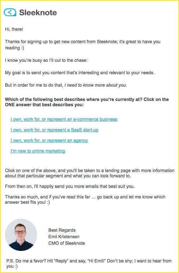
18. Prompt your user to ‘reply’ and get in touch with you
Ask your subscribers a question in the welcome email and encourage them to hit ‘reply’. Brands have started implementing this trick and subscribers are actually quite open to getting in touch with the brands and responding. Communication is the key to effective marketing. Rather than sending your email as a ‘monologue’ welcoming the subscriber, make it interactive by presenting it as a dialogue like Sleeknote does.
19. Give them an option to leave
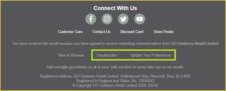
Letting your subscribers go is not a very pleasant thing, but it is better to allow them to leave rather than having a disinterested subscriber in your email list. Always include an Unsubscribe link in all your emails; welcome email is not an exception.
There are some marketers who believe that why would you ask someone to leave even though they have just joined your email list. That’s not a good idea. Nevertheless, according to anti-spam guidelines, you must always include an unsubscribe link in the email footer.
As another option, you can add a link to your preference center and ask your subscribers to set their preferences instead of unsubscribing from all emails at once. Take a look at this email footer by Go Outdoors. They have not only included the Unsubscribe link but also allowed the subscribers to update their preferences.
20. Keep optimizing your emails
Monitor the performance of your welcome emails and see if you are getting the open rate, click-through rate, and conversion rate as desired. If not, optimize the emails for better results.
A few months back when I signed up for Wistia for my personal use, I received this welcome email.
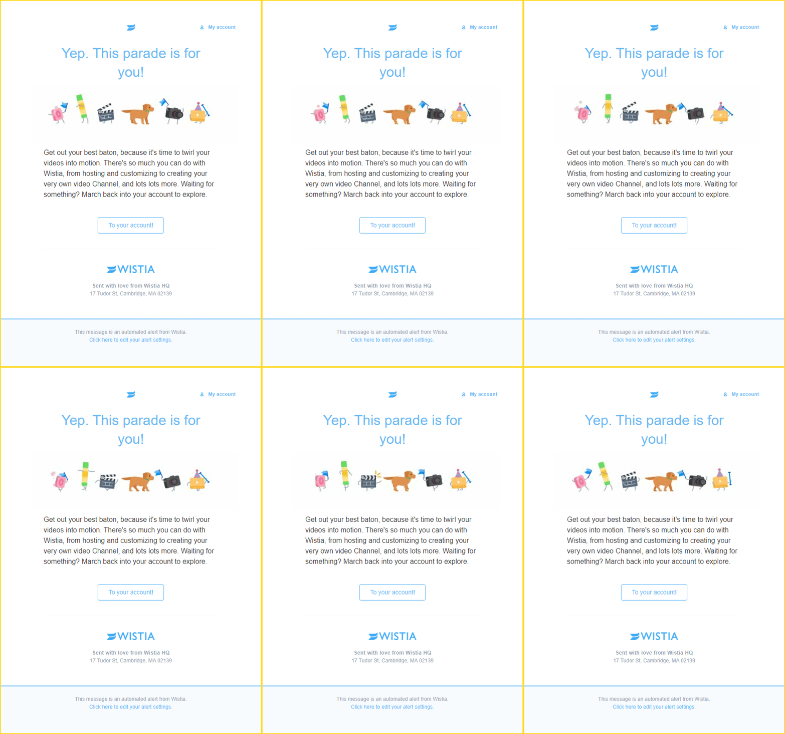
Recently, when I joined them with my official email address, their welcome email had changed.

That’s how brands must keep innovating and looking for better ways to engage their subscribers.
You can even carry out A/B testing and test different variations of your welcome email subject line, copy, design layout, CTA copy, and its placement. Then, you can send out the winning version to your future subscribers.
Bonus tips:
- Always test your welcome emails and the automation workflow to see that the right people are receiving the emails.
- Do not send your welcome emails (or any type of emails) with a no-reply email address. Keep the sender name familiar so that the user can instantly recollect the brand.
- While introducing yourself in the welcome email, add a picture of your team or workplace. It will build a personal connection with the reader and make them feel like they know you.
Wrap-up
Whether you want to foster trust with your new subscribers, build your brand, or bring in a higher ROI, welcome emails set the foundation for all this and more.
Applying the tips shared here will surely give you an edge over your competitors. In case you still need more inspiration beyond the examples shared here, or assistance to design your welcome email campaign, just get in touch with us.
We can even audit your existing strategy and help you revamp your welcome campaigns as per the industry trends and best practices.


Disha Bhatt (Dave)
Latest posts by Disha Bhatt (Dave) (see all)
How to Code Mailchimp HTML Templates
How to Do Klaviyo-Shopify Integration: A Step-by-step Guide